
Introduction
Project name: Rotary
Project date: Jan 2023 – Mar 2023
Team members & roles:


[From left to right: Carina Fung, Serena Kravantka, Annabelle Wang (Product Manager), Madison Fan, Jared Poblete (Visual Designer)]
All team members equally participated in every phase of the project including UX research, UX/UI design, and usability testing (apart from the additional roles noted above).
Project Overview
Maintaining relationships becomes increasingly challenging as one enters their 20s—busy schedules, differing life paths, relocation, and new social circles mean that maintaining old and new friendships gets harder.
Our goal was to urge people to maintain relationships with more intentionality so that they can keep their relationships genuine despite stressful life transitions. This is Rotary, a photo-memory reflection-based app that helps you build self-awareness and self-motivation in your existing relationships.
Problem Finding (The Challenge)
Justification
Our group began with several members interested in the problem space of maintaining relationships. Naturally, the rest agreed. Humans are naturally social creatures, after all.
We need family, friends, and strong support systems to get by. Forging these relationships is crucial for our well-being and happiness, and it even affects our physical health. Life transitions such as the move to university afford students a new world to explore, new stories to tell, and new lifelong friendships to blossom.
However, with all the ups and downs that life throws at us, it isn’t always easy to maintain relationships in a sustainable fashion. Students naturally struggle with miscommunication, incompatible schedules, and ever-changing circumstances. Often, these invaluable connections wither away or are outright abandoned. (There’s only so much a When2meet can solve!) How many times have you and a friend agreed to “grab coffee” as a gesture, an appeal to niceties, only to forget the moment after? With our group comprised mostly of upperclassmen, we’re personally invested in tackling the problem of meaningfully maintaining relationships throughout the transition of graduation.
Literature review
We conducted a literature review to explore academic perspectives on the challenge of relationship maintenance. This research helped us further understand the importance of our problem space: forging relationships is crucial for our well-being and happiness, and it even affects our physical health.
Key insights gathered from our literature review include:
- Life Satisfaction: Positive life satisfaction is correlated with intense (i.e. frequent interactions) quality friendships.
- Generally, happiness in life is associated with close personal relationships.
- Reciprocity: Every relationship requires some degree of reciprocity to last, yet there are different expectations of reciprocity for different levels of relationships.
- Satiation theory: The need to belong conforms to patterns of satiation and substitution. People need a few close-quality relationships, and forming additional relationships has less and less impact beyond those few.
- Distance and Time: The time of the last contact may not affect emotional closeness. Larger social networks beget longer time to contact individual friends despite emotional closeness. Distance might be more relevant than time to fostering emotional closeness.
See our full literature review with links and summaries here.
Comparative Analysis
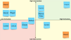
We also conducted a comparative analysis to examine how existing products and services address this problem space. We identified ten social apps that approached maintaining relationships differently including automation, signals and photos over text, and social media messaging systems.
Our comparative analysis showed that some automated suggestions proved very effective in helping users track how and when they reach out. Reminders were the main feature of some apps and while notifications are sometimes effective, our team wanted to steer away from heavy reliance on reminders because repeated context prompts were also shown to be overwhelming for many users which drove them from using the app.
We saw the impact that photos could have on increasing mood and emotional connection through many of today’s popular apps. We would like our app to help users build up their individual relationships, so our goal is somewhere between being extremely personalized (e.g. photos album) and extremely network-based (e.g. social media).
Using our findings, we drew out a comparative matrix measuring activation against intervention and identified two potential areas in the market to disrupt. We decided to move forward with the High Intervention + Low Activation quadrant; it was the clear middle ground between creating a social media app and a passive app like BeReal.
[Our comparative analysis matrix]
See our full comparative analysis here.
Baseline Study and Synthesis
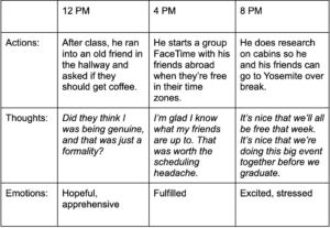
Our original target audience primarily consisted of young adults between the ages of 20-30. We used our screener to narrow our focus to college students who indicated that they wanted to feel more connected to their friends than they currently did. Based on this metric, we had 21 screener responses and 12 participants for the study, who we then conducted pre-study interviews with. The main purpose of the pre-study interviews was to determine how each participant currently chose to maintain relationships through anecdotes of their attempts to maintain relationships with others—successfully and unsuccessfully.
Once pre-study interviews were completed, we began our week-long diary study. Participants were asked to fill out a Google Form after every in-person interaction. Through this, we were able to obtain 128 responses which allowed for some fallout buffer amongst the 12 participants.
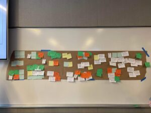
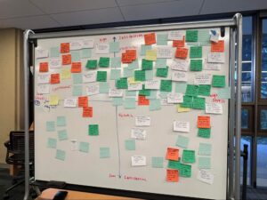
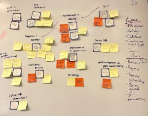
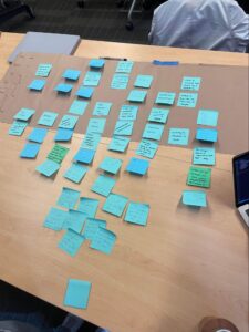
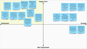
[Baseline Study Synthesis from Class: Chunking into Affinity Groups]
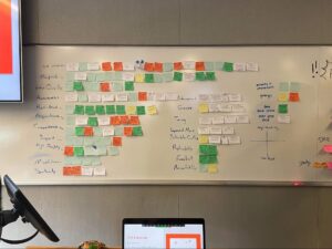
[Baseline Study Synthesis from Class: Finding Where Post-its were Concentrated in Affinity Groups]
To synthesize our findings from the baseline study, we created affinity and frequency groups with key insights. Our main takeaways on self-initiation and convenience led us to create 2 different comparative matrices studying intersections of different qualities.
Comparative Matrices
The first comparative matrix we made measured Quality of Relationship versus Effort of Interaction, with our second matrix iterating on the idea: Satisfaction versus Stress. We defined “stress” here as both effort and emotional investment. High Quality + High Effort was our most populated quadrant, where conscious efforts such as planning proved to be the most emotionally rewarding. This led us to believe any app we would make would have to convey a user’s intentionality behind their actions.
[Quality of Relationship and Effort of Interaction Matrix]
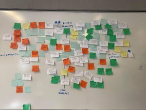
[Quality x Effort Matrix]
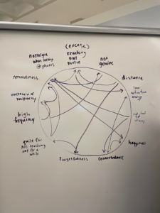
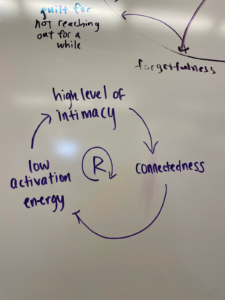
Connection Circles
To flesh out our understanding of how people interact, we constructed a connection circle dedicated to failure in maintaining relationships along with reinforcement loops to visualize the role of the key factors of stress and satisfaction in relationships. From these, we determined that “reaching out” is one of the main hurdles in establishing and maintaining relationships; fear of social norms and fear of not being reciprocated make relationships more difficult to navigate.
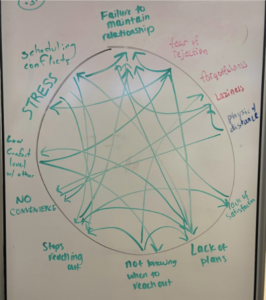
[Baseline Study: Connection Circle]
See our full baseline study synthesis here.
Personas and Journey Map
First, we settled on two personas that dealt with major problems we saw in affinity grouping and could experience problems on our connection circle. The next step in developing these personas was story mapping in order to hone in on some pain points throughout their experience. In doing so, we brainstormed more practical everyday motivations and actions toward maintaining relationships.
Our first persona is Convenience Clara, who is a full-time undergraduate student and is currently a junior. Clara’s social interactions are mostly unplanned and spontaneous. Although these do make Clara feel connected to her friends, she realizes most interactions are out of convenience and she rarely initiates. She expresses the will to be more intentional with reaching out but often does not end up doing so.
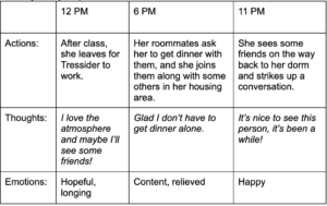
[Clara’s journey map]
Our second persona is Life Transition Lance. Lance is a full-time undergraduate student and a current senior. As Lance faces graduation, Lance worries about what his social circle after college would look like. He wants his friends in college to know that he cares for them so that they don’t fall out of contact. At the same time, he is also assessing his relationships to see who he wants to maintain relationships with. Lance believes that being intentional about how one spends time with a friend is indicative of how much one cares about the friendship, and he wants to become more intentional about how he spends time with people he cares about.
[Lance’s journey map]
We realize the two personas share the trait of wanting to become more intentional about their relationships. We want to create social interactions that do not happen purely out of coincidence(e.g. running into each other in the hallway). Lance’s wish of wanting to assess his existing relationships also made us think— how can we get our users to reflect on their relationships, and how can this reflection motivate them to be more intentional in how they maintain relationships, which led us to our intervention study.
See our blog post on personas and journey maps here.
Solution Finding
Intervention Study
For our intervention study, we recruited participants to go through their album every night, reflect on a picture that represents a good memory, and text a person related to that picture. Our study was designed to test the effectiveness of individual reflection on maintaining relationships and how past memories could potentially facilitate reach outs.(For more details on the study read here for a quick overview and here to see more about our potential intervention studies and deliberation process).
Our central question with this research was whether or not individual reflection can lead to improved interpersonal relationships. Adjacent questions included “what is the best frequency for reflection” and “what kind of media is most appropriate to reflect on”. We decided to test a daily frequency using photo-based reflection, so our hypothesis was that those choices would be most effective.
We then sent nightly email reminders to our participants to fill out a Google Form with questions about their reflection experience before bed and that form (viewable here) automatically collected and visualized the data.
We synthesized our findings using 3 strategies: cluster grouping, connection circles, and reinforcement loops. The result of the strategies is shown below.
[Cluster grouping]
[Connection Circle]
[Reinforcement loop]
Some of our main insights from this study include:
- Reflecting on photo memories creates happy and nostalgic feelings for most participants.
- Some participants realized reaching out was easier than they thought with the study.
- Reflecting and reaching out every day was too much. Overly frequent reach outs can feel disingenuous to the user and is a lot to keep track of.
- Reaching out, even with sharing memories as an initiation, raises the stress of whether the other person would be reciprocation
See more insights from these unpacking strategies can be found in the “Intervention Study: Synthesis” section of our midpoint writeup here.
Design architecture
Moving forward, our hypothesis that individual reflection facilitates interpersonal relationships was validated—reflecting on photo memories not only provided people happy feelings, but also created an “excuse” for reaching out that makes reaching out easier than complete self-initiation. On the other hand, we noticed some barriers (reach-out anxiety, too-frequent reach-outs, etc.). We wanted to create a solution that maximizes the positives of photo-memory reflection and minimizes the barriers of reaching out.
With the insights from our intervention study, we employed different types of mapping techniques to help us understand what we want our solution to look like. We used three types of mapping techniques: story mapping, bubble mapping, and system mapping.
Story mapping gave us a clearer idea of how our solution would fit into our target audience’s daily life. For instance, during our intervention study, we tied our reflection to going to bed so we could create the reflection habit quickly. However, after story mapping we agreed that in practice, our solution fit better when tied to mood rather than time. When our users feel dips in their relationships or motivation to reach out to a friend, it makes more sense that they would open up our app and reflect rather than just pairing the habit with their nighttime routine.
[Story Mapping]
Bubble mapping helped us visualize how our components connect to each other, without even having to design screens. At this stage in the design process, we imagined that we would use a widget as an entry point and that is represented by the pink circle (for more details about the bubble map itself read here). Bubble mapping assisted us in later screen creation since it gave us a rough idea of what features were most related and how they should be connected together.
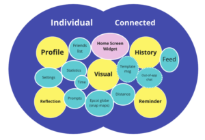
[Bubble Mapping]
System Paths inside and outside class helped us to understand how different types of users would travel through our app. This became incredibly helpful once we started creating our screens and flows as it gave us a better understanding of what should be on the home page, what features should be grouped together, and what were the most important screens to be accessed via a navigation bar. Since the system path diagram most directly helped us to come to an agreement on how our app experience would be realized, there was a full consensus among the five of us that it was the most helpful diagram for us to start designing. Completing the exercise twice also allowed us to see what was most necessary while also leaving room for creativity in each attempt.
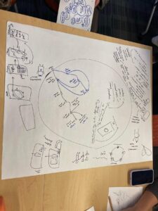
[In Class System Path Diagrams]
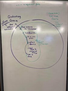
[Additional System Path Diagram]
Assumption Mapping & Testing
[Our assumption testing matrix]
In this section, we list the three assumptions we tested, our goal in testing each one, and our main insights.
- Assumption 1: Reflecting on memories with written prompts helps people stay intentional and mindful in their relationships.
- Goal: Our goal is to help our users be mindful and intentional in their relationships and we need to ensure that our solution reaches that goal. The way we decided to fulfill this goal was using written prompts so we test that assumption.
- Insights: We found that the effectiveness of the prompt depended primarily on its content. Some questions made participants feel negatively about their photos, like making them more aware of their appearance, while others affected them positively like asking what made this moment photo-worthy.
- Assumption 2: People want to share their reflections with the friends they’re reflecting on.
- Goal: We wanted to decide if we wanted our app to be entirely self-reflective or if sharing could reintroduce a social component to our solution. We planned to introduce sharing given a green light so that became our assumption to test.
- Insights: Sharing depended largely on external factors. Some participants would chose not to share at all, others said they’d share the fact that they made a reflection, and we also got some who would share the reflection itself. We decided to leave the decision to share in the hands of our users by making it an optional step after creating a reflection and only initially sharing that they had written a reflection.
- Assumption 3: People want to write about their relationships as a way of reflection.
- Goal: There are many modes of reflection that could be used – audio, video, emoji, reaction photo, and writing just to name a few. We were most interested in pursuing a written reflection model and needed confirmation that it was a desirable reflection medium for our target audience.
- Insights: Written reflection was the most popular media form out of the ones we suggested (writing, audio, video, and emoji) with it being the top ranked mode from the majority of the participants and never being the lowest ranked mode by any participant. It was a strong signal to continue pursuing written reflections.
If we were to tweak our assumption tests and redo them, there are some adjustments to consider. For assumption #1, we could provide an explanation of a reflection to participants. Some participants were confused about what a reflection looked like until given a prompt and that could’ve affected our results. Assumption #2 was tested well since it was straightforward, to see if people would share we asked if they would share. A step further would be to have them actually send a text or call to the person in the photo they reflected on. Finally for assumption #3, we could’ve let the options be open-ended instead of ranking to see how desirable written responses are out of any possibility.
After our assumption testing, there are a few assumptions remaining that we could explore if we continued working on our project. We don’t give any explicit nudges for users to open the app so we could test the assumption that mood alone is a strong enough trigger to prompt opening our app. We also could run more testing around privacy and data sharing like sharing contacts and photos to our app.
See details on all of our assumption testing can be found here.
Wireflows to Sketchy Screens
Our team came up with several flows that we deemed essential to our app to create initial sketchy screens. Our final happy path looked like the following:
- The user can add a contact to the app.
- The user can navigate to the contact’s page.
- The user can select a photo of the contact.
- The user can reflect on the photo through writing.
- The user can view their past reflections.
See our blog post with sketchy screens for each flow and feedback from the team for each set of sketchy screens linked here.
Branding: Final Mood Board and Style Tile
[Our team’s final style tile]
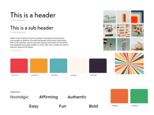
Each of our team members individually created style tiles to bring to a meeting and decide on the final aesthetic of our app. Everyone agreed on moving forward with tones that were casual and effortless because many of our interviews had noted inconvenience as a barrier to supporting high-quality relationships. The majority of the group picked more pastel, inviting color palettes. Two group members chose cooler palettes to evoke calm, while another chose colors that evoked succulents: soothing plants. One group member had the idea to use bright and bold color palettes to separate Rotary; as our app toes the line between wellness and social media, we were looking to strike a balance of invigorating and inviting. From here, we decided to desaturate the harsher color palette and employ an off-white background to further separate it from the clinical aesthetic of other apps.
One of our group members recognized the typeface “Neue Kabel” from a poster online and was interested in exploring its use as the primary font. This further skewed our aesthetic toward an authentic feel, easily achieved by the retro nature of all the parts of our new style tile coming together e.g. the muted tones and thick, fun fonts. We unanimously agreed to use the typeface Lexend—it was playful, but not playful enough for use as our display or header font, so we opted to use it as a secondary font as a result of its legibility.
With our new retro direction we explored 60s and 70s themed photography that aligned with the colors we chose. We decided to hand-draw our most featured asset (the Rotary) to stay in touch with the rounded, bold lines and fonts in the rest of the app.
We want our app to be both user-driven and user-motivated i.e. we want people to be the focus of our app, and we want them to go out of their way and deliberately use Rotary. To achieve this, we want to find our way around corporate art styles or any other cliches we’ve found in wellness and social medias. We’d like people to use this app when they’re feeling nostalgic, sentimental, or want to have some fun. To combat the sleepy nature we observed in other wellness apps and all-too-clean nature of other social medias, we’ve chosen a retro vibe to deliver some deliberate splashes of color while still maintaining that near-analog, clean, approachable aesthetic.
Usability testing
We conducted 3 usability tests with classmates in CS247B. Each testing session asked the participant to complete the following tasks:
- Add Serena as a friend.
- View Serena’s profile.
- View past memos (photo-based reflections).
- Try to choose a picture and write a memo based on it.
Our tests unearthed 7 issues of different levels of severity with our current prototype. Below are the three biggest issues we uncovered and how we addressed each of them:
- Issue 1: Users had difficulty understanding the difference between “add” and” pin”
- Description: In our app, we used “add” to describe adding a contact into the app as a “friend” and “pin” to describe adding a “friend” to the rotary phone visualization on the home page. The original intention of this design was to give users control over which photos they’re importing in the case they don’t give access to their entire camera roll, but users were unable to differentiate between what friends meant (were they actually on the app?) and the relevance of having a friend on the app vs a pinned friend.
- Solution: Removed “adding” contacts in the profile so that users would only be able to pin contacts in the rotary visualization. Added a search bar to the Editing Rotary screen to simplify finding and pin a contact.
- Issue 2: Users had difficulty finding where to import photos
- Description: Importing photos was originally handled by “adding” contacts, which would automatically add photos of that friend from the user’s system album. However, several usability testers mentioned that they expected or found it more intuitive to import photos in the Discover Tab than in a friend’s profile.
- Solution: No more manual adding photos: users can just resync photos from their system album that they gave us access to in the onboarding process.
- Issue 3: Clarity issues surrounding search
- Description: We use the search bar in various contexts (past memos, discover, etc.). It was difficult for some testers to differentiate between different uses of search and what some cases would be used for in a certain context.
- Solution: Updated example text in search bar to reflect the current context and what an example search would look like.
See our usability report for details on the remaining usability issues we found here.
Clickable Prototype
Scan the QR code or click here for the prototype!
From the onboarding to memo writing, Rotary essentially consists of 7 different flows that are all interconnected, making the application as intuitive and easy-to-use as possible for new and existing users. Below are quick links to more in-depth information about each flow.
- Flow 1a: Onboarding – Sliding Screens
- Flow 1b: Onboarding – Account Creation & Contact Access
- Flow 1c: Onboarding – Contact Selection, Photo Access & Finish
- Flow 2: View Profile
- Flow 3: Edit the Rotary
- Flow 4: Discover a Photo
- Flow 5: Write a Memo
- Flow 6: View a Friend’s Profile
- Flow 7: View Past Memos
Rotary Flows
Flow 1a: Onboarding – Sliding Screens
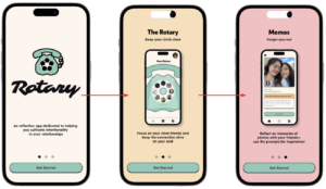
This is a slightly updated version of the beginning of the onboarding flow—we realized that people were still expecting Rotary to be more social-media-esque because of the optional sharing aspect. As such, we wanted to really make it clear that our app is focused on increasing individual intentionality by adding several informative screens explaining the purpose of our app and our main flow of writing a memo. Users can swipe between these screens to learn more, or click the “Get Started” button on any of the above to begin the onboarding process.
Flow 1b: Onboarding – Account Creation & Contact Access
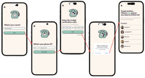
After clicking the “Get Started” button, users are taken through a straightforward account creation flow. Users are only asked to input their name and their phone number for their account creation, and their phone number is then verified to ensure that the entry is valid. Something else worth noting is the step-by-step rotary visual at the top, where every step taken in the onboarding process equals another circle filled in, so users are able to see how far along they are in the onboarding process. The user is then asked to allow access to their contacts, which is critical to the rest of the application. For the sake of simplicity, we ask the user to only select 1 contact to focus on for the rest of the onboarding process.
Flow 1c: Onboarding – Contact Selection, Photo Access & Finish
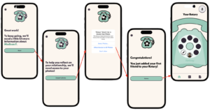
Since the previous contact selection screen automatically navigates to the next screen after the user taps on a contact, we added a transition screen to confirm that the user clicked the correct contact. We purposefully show the contact name in an accent color to make sure there are no misclicks. After the confirmation, we ask users for access to their photos with a short explanation message. In an ideal flow, we assume that the user will allow access to all photos. The onboarding process then ends with a congratulatory screen explaining what the user has done, and then takes the user to the Rotary home screen with one friend pinned on the rotary.
Flow 2: View Profile
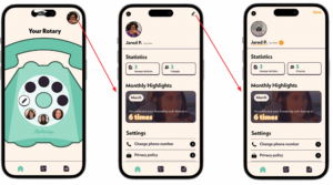
Every user has an account profile that is created after they input their phone number, and we wanted there to be a personalized aspect to the app, so users are able to edit their own profile by clicking on the profile icon at the top right. This leads them to a page with their profile, Rotary statistics and highlights, and system settings. We also included an edit button at the top right of the page where users can change their profile picture, name and pronouns for flexibility.
Flow 3: Edit the Rotary
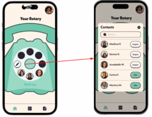
The main visual on the home screen is the user’s “Rotary” phone. It shows the user what contacts they are currently focused on for photo discovery, as the only photos shown in the app will be photos of contacts that are pinned to the rotary. As such, users are able to pin and unpin up to 7 contacts onto the rotary phone by clicking on the pencil icon on the phone. We placed the edit button on the phone to keep in line with the rotary theme, and also to make it easy for users to edit the rotary should they want to focus on their relationship with a different contact.
Flow 4: Discover a Photo
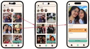
The discovery flow starts off on the discover page, where the user sees all the automatically imported photos of their pinned contacts. There is a floating re-sync button at the bottom right of the page for when the user has pinned/unpinned a contact or the camera roll is not up-to-date. The user is then free to peruse all of the filtered photos, and can choose to apply more filters if desired. They have the option to filter by user if they want to focus on one specific relationship that day, and can also search for images containing a specific tag, such as “grass” or “food.” Clicking on any photo then leads to the memo page with a larger image, but users can choose to go back via the back arrow at the top left if they do not want to write about that specific photo.
Flow 5: Write a Memo
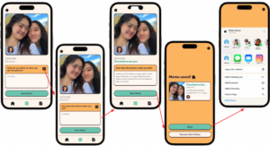
After selecting a photo through the discovery flow, users begin the memo writing flow. The starting page consists of 4 main components—the larger version of the selected image, the photo metadata, the text box with prompts, and the “Save Memo” button. We used different accent colors to draw attention to the different possible actions on the page (the prompt box and the save button). We also found from our feedback that people enjoyed looking at the different prompts, so we added a refresh button in the prompt component that allows for users to try a different prompt. Post memo-completion, users click the “Save Memo” button and are presented with a confirmation page, and are presented with two button options: to share the memo, or to go look for more photos. Clicking “Share” leads to a popup where users can choose to share the memo outside of the app. This was intentional so that only the individual user needs to have the app, and also because the sharing aspect is very secondary to the app’s purpose. The “Share” button is presented in green as it is an active action that leads to a new screen rather than leading the user back to an already-visited screen (the discover page).
Flow 6: View a Friend’s Profile
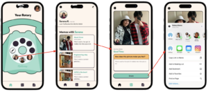
From the home page, users can also choose to view a friend’s profile and revisit past memos of that friend by clicking on a friend’s profile icon on the rotary. The friend page then contains the friend’s profile picture, name, and metadata regarding when the user last reflected on a photo of that friend. Below that are previous memos the user has written about photos of that friend, sorted in chronological order where the most recent memo is at the top. The name of the friend is intentionally shown in an accent color in the header, so that the user is very clear on what past memos are being shown. Clicking on any of the past memos leads to a completed memo page, which is very similar to the memo page from the discovery flow, only without a “Save Memo” button since the memo has already been saved. However, the “Share” button is still present, since the date that the memo was written isn’t that important to whether or not the user shares it—the purpose of sharing is simply to let another person know that the user was thinking of them and putting intentionality into their relationship. As such, the sharing view is exactly the same popup, where users can share the past memo outside of the app.
Flow 7: View Past Memos
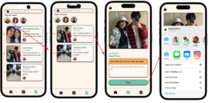
The last flow also concerns viewing past memos, but via the “past memos” page instead of from a specific friend’s page. By clicking on the memo icon on the bottom left of the navigation bar, users are shown a view of all of their past memos sorted in chronological order, with a timeline visual on the left side to indicate that they are sorted by recency. The difference between this past memos view and the one in flow 6 is that these contain memos of all contacts, but again, just like on the discover page, the user can filter the view by clicking on the profile icons at the top, or by searching for keywords in the search bar. After that, clicking on a memo leads to the exact same past memo view as in flow 6, and the rest of the flow is the same for sharing.
Ethics
We read and discussed several articles that challenged how we thought of ethics in design. Here are some design decisions we ideated (and some we implemented) from those discussions.
Nudging and Manipulation
We read Nudging and Manipulation by T.M. Wilkinland early on in the quarter and immediately recognized that much of what we see on Instagram and Snapchat is a manipulative nudge. Notifications like “Ashley is typing…” and “Ashley liked your post” are to get users to spend more time on the respective apps, which could lead to wasted productivity and addiction. We realized how manipulative social media was and wanted to find a way to avoid falling into that hole. Early on from our baseline study, we saw that people wanted to be present in their relationships and felt like they had to be more and more conscious when life transitions came up. Social media created a culture of seeing and not remembering, as in people would see their friends on social media but didn’t feel connected to them or didn’t know how to let their friends know that they were appreciated. We tried to incorporate aspects of reflection that were intuitive to help mitigate the “seeing” phenomenon, and made the app user-focused, not network-focused. We weren’t hoping users would be on the app 24/7, but meeting with their friends and reflecting on the memories they shared instead.
Rewards
We read a chapter of Good Habits, Bad Habits, and knew we wanted to incorporate some kind of reward into the app since the behavior we were targeting was not a behavior that is commonly tracked. Our main goal was the reward to be a more fulfilling relationship for the user with their friends. To add elements of rewards into the app, we first added a celebration screen when the user finished writing a memo (something that should take time and some amount of mental effort). To help the user celebrate their progress every month, we added a monthly recap (like a Spotify Wrapped, but Rotary Monthly…?) with some stats and colorful designs that incorporated their friends. In the future, we were hoping to implement a nudge from the user to their friend every time the user wrote a memo about them to spark what we hoped would be a rewarding conversation or interaction.
Accessibility
We read “The Invisible Work of Accessibility: How Blind Employees Manage Accessibility in Mixed-Ability Workplaces” in class towards the end of the quarter, which helped us ideate what further accessibility could look like in our app. Ultimately, a lot of our ideas fell to the side because of our fast deadlines. Here are some things we would have wanted to implement:
- Our app is extremely based on photos and being able to understand what a photo represents. In the future, we would have liked to add a flow to add alternate captions, which would have made the app more accessible for visually impaired people. We even could have used AI (*magic*) to auto generate these captions so that users would not have to input captions for every photo that is imported (and we expect a lot to be on the app!).
- We talked about accessibility when discussing our app’s branding, and used plug-in tools on Figma to help us make sure the colors we decided on were accessible. We would have loved to test this with real visually-impaired users to make sure we were not blindly trusting the plug in tools without having properly researched its source.
Conclusion
Our team really enjoyed working on this project together. If we had more time to continue this project, we’d want to create more personas that would introduce other audiences to our app and test our prototype with those personas. We saw in the class paper on soft resistance that one way of introducing audiences that matter to the designers is by way of creating personas and making clear how those personas are profitable to upper management. Since we’re just a tiny team of 5, we can just focus on the first part by means of creating a better app for all individuals potentially going through life transitions, not just college students which we focused on for the sake of this class.
We’d also want to focus on testing specific features of the app more. We had a lot of flows built out, and not all seemed intuitive to our classmates at our final class session. Some classmates didn’t find the branding intuitive either and others also thought we were a social media app (we’re not). In the future, we’d like to test features and branding more incrementally so that we have a better idea of what’s working and what’s not to better design the app.
For our next behavior design effort, we’d want to approach using the knowledge we learned later in the quarter with accessibility as the forefront of our design process. This project also gave us so much space to have fun from the styles to the text, and we will most definitely be taking that energy into our future projects.
Signing off,
Team 18 (Rotary)


