
Based on the rudimentary system paths and individual bubble maps we created in class 6B, our group reconvened to distill down our ideas even more to become more focused on the idea of maintaining mindful relationships. We had a difficult time defining intentionality in reciprocated conversations and wanted to focus on an individual feeling of awareness instead.
System Paths:
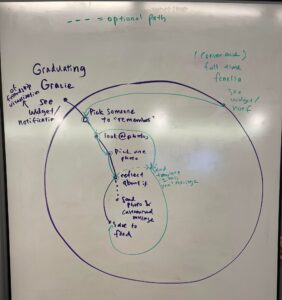
We first decided to create system paths for our two main personas—Graduating Gracie and Full-Time Fenella. Both of these personas have the end goal of maintaining their relationships, but Graduating Gracie is specifically worried about losing relationships during a life transition, and Full-Time Fenella is more concerned with how convenient it is to maintain her relationships because she lives a very busy life. We walked through how each persona would interact with our product, from the starting point of clicking a widget or notification on the home screen to sending a message to a friend. Both personas follow very similar paths, with the only difference being whether they choose to send a tailored message and photo to a friend or if they simply use a template “I miss you” type message. The entire system is fairly simple and does not require a lot of activation energy, so it works for both Graduating Gracie and Full-Time Fenella. This visualization of the system paths helped us create a cohesive user flow that addressed all the major pain points for Graduating Gracie and Full-Time Fenella.
Bubble Maps:
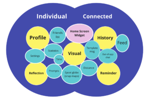
(key: pink = entry, yellow = component group, blue solid = required, blue dotted = optional)
For the bubble maps, we realized that each feature would fall into one of two categories: purely individual use, or to connect to others. Under these two categories, we found 5 important component groupings to our app: the visualizations, a user profile, the reflection, the reminders, and the user’s saved history. After creating these 5 groups, we added bubbles of different product areas around each component group. This allowed us to clearly see how each product area related to each other and also to think clearly about what product areas were more important (e.g. the historical feed) or more “optional” (e.g. the template message). This helped us greatly with the visual design hierarchy and prioritization of product area implementations.
Wireflows:
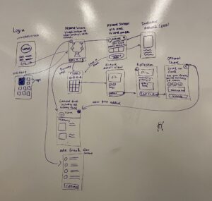
For the wireframes, we decided to work on the entire system flow as a team rather than individually because there were so many different components. Since we were already together, it wouldn’t be productive to create such small snapshots.
We divided the flow into 5 parts, being the login flow, the home page flow, the reflection flow, the sharing flow, and the friend page flow.
The login flow was fairly self explanatory—after logging in, users are immediately directed to the home page. After that though, it took us some time to figure out which component should come next and what should be displayed. We finally decided that we could have a navigation bar at the bottom with options for the home page, a discovery page, and a user profile page. The home page will display the visualization of the user’s relationships with friends in some sort of circular fashion. Then, the discovery page will lead to the main feature of our product and part of the reflection flow—a compilation of photos from the user’s camera roll, with a search bar component if user’s already have an idea of what relationship they want to reflect on or search for a certain kind of photo.
Once a photo is selected, it leads to a detailed picture view, which includes the people featured in the photo and any relevant tags. If the user is certain they want to reflect on that picture, it leads to another page with a short reflection prompt, and a text box where users can choose how much they want to reflect on the picture. The user is then prompted to “save” their reflection to their feed and given the option to message that friend with either a template message or a tailored message. This is very important as it is the main part where users can choose the level of energy they want to put into the message, if at all. Finishing this flow leads to a general feed, where all of the photos and reflections the user has completed are shown and sorted by recency. This view can also be accessed via clicking the profile button in the bottom navigation bar.
This is not the only place for people to see their past posts— from the home screen, people are able to click on a specific friend to view the friend page flow. Each friend page has a few core components: the friend’s name, an option to edit that friend (i.e. remove them), a scrolling view of the past photos whereupon clicking on one leads to a more detailed view of the past reflection, and a button that leads to a filtered search of that friend’s photos on the discovery page. Finally, the last page that has not been addressed is the add-a-friend page, which allows users to add friends from their contacts.
Drawing out our wire flows in this way was very intentional— we wanted to make the flow as accessible, intuitive, and connected as possible so that we could increase the intentionality and mindfulness behind relationships, whilst still making sure nothing requires a lot of activation energy.
Signing off,
Team 18



