
Sketchy Screens
Onboarding (Millie)
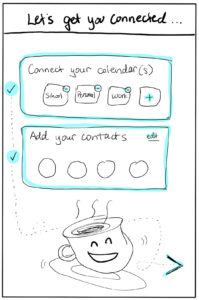
When users onboard, they will have to share their calendar and add their contacts – a potentially tedious process that they should instead feel excited about.
The previous version of the onboarding screens was boring – it would just say “Onboarding” at the top, first take users through the calendar connections, then connect their contacts, then unceremoniously dump them on the homepage of the app. There was not a sense of progress or excitement; it was purely practical.
Thus, this screen here is a progress screen – showing the whole onboarding process and their progress (and how close they are) so far – should feel more exciting and affable, getting users excited like the happy teacup is, ready to social with acquaintances and friends.
Homepage (Ni)
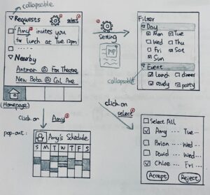
- As shown in the top left screen, the first tab in the bottom bar will be our homepage with two sections: “Requests” and “Nearby”.
- These two tabs are a triangle in front of them to make them collapsable, so that users can easily opt in and out of unwanted information.
- We want to provide users with a condensed view of all pending invitations, so “Requests” will list them with only the basic information: who, when and what. It’s ordered by the proposed meeting time by default to give users a glimpse of what’s coming. Invitations are clickable for users to get more detail.
- “Nearby” advertises events around the user. This would be our channel of profit by letting organizers promote their events. We think it will actually benefit our users because they can explore these fun activities with friends and socialize more.
- Requests look like “Amy invites you for lunch at Tue 12pm.” If you click on “Amy”, Amy’s photo and her calendar will appear in a pop-up window, so users will know what Amy’s been up to and what other time works for Amy. Click on blank space to close the window. (bottom left screen)
- Next to “Requests” is a settings icon. In settings, you could filter the invitations by checking days you want to keep, and event types you’re interested in. (top right screen)
- There’s a select button next to settings, and a selection box in front of each request to improve efficiency. When users click on any of those, They enter the bottom right screen that allows for quick group acceptance or rejection.
Calendar (Safiyah)
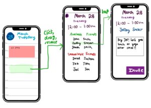
This part of the app allows users to view their own schedule and identify free-time for hanging out with their friends. After iterating through several designs, we landed on a “day” view broken up by hour—since other views resulted in an information overload. Scrolling allows you to look further in the day, and swiping left/right takes you to next/previous days, respectively.
To schedule a hangout, you click and drag on the time slot you want to schedule something. We modeled this after the Google Calendar app, since many are already familiar with this input style. After that, a pop-up appears showing all your friends’ availabilities. You can click on an available friend, and this brings up the “invite” page.
The invite page allows you to add a custom message in order to invite your friend to hangout. We considered adding additional fields like location, driver, pickup, etc, but figured that would be too complex and may not be applicable to every hangout session. Once the user presses invite, their friend will receive a notification and either accept or decline the invite.
Calendar and Friends’ Calendars (Helen)
This part of the app allows users to see their friends’ calendars. Its goal is be extremely fast and easy in sending meetup texts. Typically, finding time to meet involves a lot of back-and-forth time negotiations and texting on both people’s ends. This part of the app aims to streamline all that, by 1) Let user see their own availability and friends’ availability, and then 2) Select available slots and send pre-composed texts to hangout.
Chat (Erfan)
This section of the app will have a list of ongoing conversations, and the users won’t have to leave the app to chat back and forth to finalize the details of meeting each other.
Critique: How is this section different from any other messaging app? They can just use iMessage or Messenger as the communication channel, and it seems like this section of the app won’t be as appealing to the users.
Respond to critique: We didn’t want to make the app overly complicated and add features in many other messaging apps that are not core to our value proposition. The messaging section of this app can be used for more quick chats and quick scheduling rather than extensive conversation.


