

Individual Moodboards
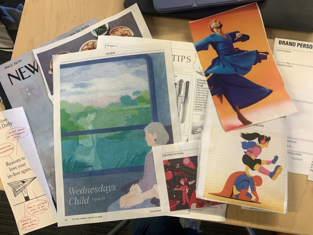
Anooshree

For this prototype, I wanted to explore two feelings: the freedom of no longer worrying about decisions and the reward of supporting friends from afar. As a result, I gravitated towards bright colors, explicitly optimistic language, and images evocative of growth and celebration. While I think that the vibrancy of this mood board draws the eye, I think it is a little chaotic at a second glance, and the final moodboard/style tile would likely benefit from more cohesiveness in color and clearer language. However, I did really enjoy the graphic on the lower left with the woman juggling while hula-hooping and think it does a good job of encapsulating our target user.
Alahji

Based on my moodboard, I aimed to create a peaceful and calming atmosphere for our product. The use of colors such as teal, aqua, pine green, and crystal blue was meant to evoke a sense of serenity and tranquility, with inspiration drawn from Bali, a place known for self-care and reflection. I believe that this approach can be effective in reducing stress and anxiety associated with decision-making, making the process more approachable and manageable. Additionally, the association with self-care and reflection can help users approach decision-making in a more mindful and intentional way, which could lead to better outcomes. However, I recognize that the emphasis on personal wellness and mental health may not align with my group’s intended focus for the app. There is a risk that the peaceful and calming atmosphere may not be appropriate for all decision-making scenarios, especially those that require urgency or assertiveness. Overall, while I believe that my moodboard effectively creates a relaxing and comforting ambiance for decision-making, I recognize that it may be worth exploring other design directions that are more aligned with my group’s intended focus for the app.
Elyse
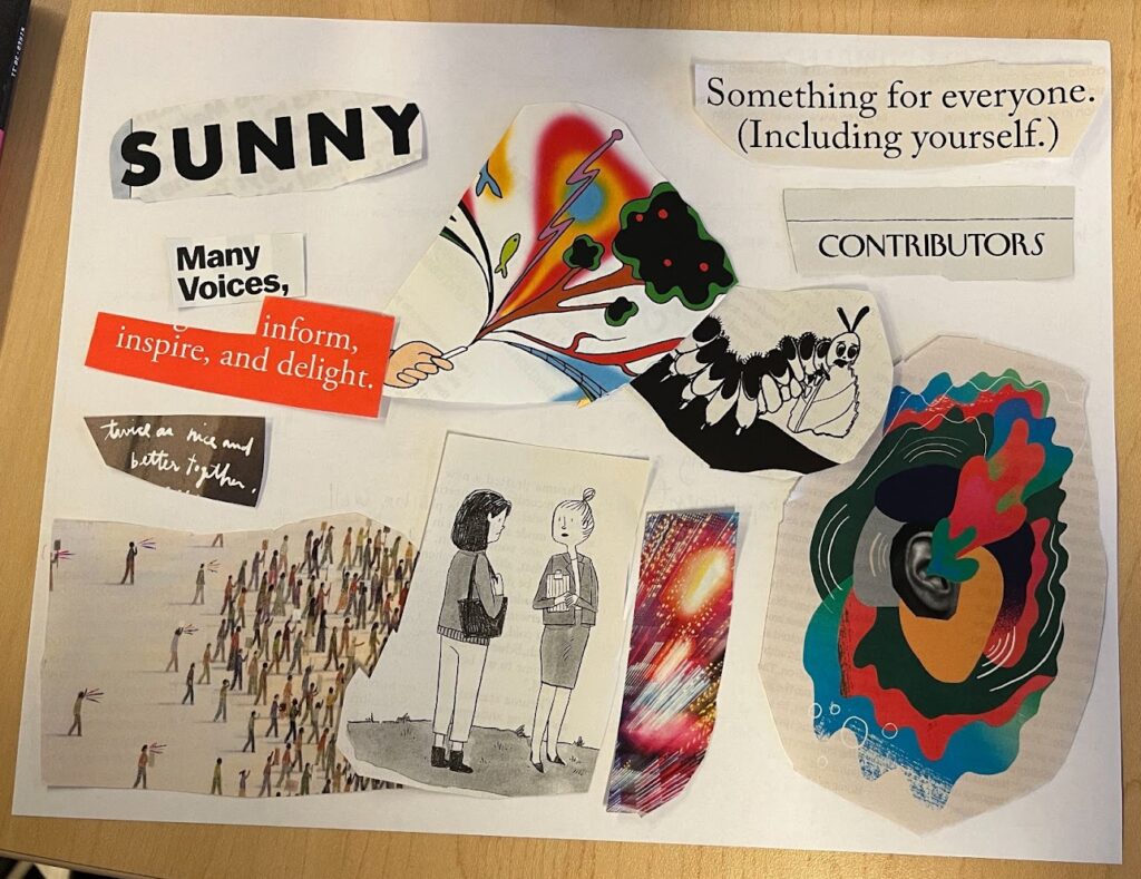
Since our app centers around positive affirmation and reflection, I chose some pieces that felt bright, happy, and positive. This led to some multicolor graphics, and words like “SUNNY” and “inspire, and delight”. On the other hand, I wanted to incorporate some of the personas we aimed to serve, worriers and deliberators, which is why I chose the nervous caterpillar and two women looking seriously at one another. These themes contrasted pretty strongly, which I think is a con of my moodboard. We should probably focus on the vibes we’re trying to evoke (positivity), not the problem (lack of confidence) when designing our brand. I think the pros of my moodboard are how pops of color play well with simpler fonts and black-and-white graphics. I’d like to incorporate this balance of color into our brand moving forward.
Cecilia
For the following moodboard, I was trying to select calming colors with a natural base. I came across a few blends of pastel blue and green that seems to fit that theme, so I decided to use that as the main colors. This is also proven to invoke “calmness and spirituality as well as security and trust.” I was hoping that these colors would create a more reflective friendly atmosphere for the users, allowing them to critically think without the interference of other emotions or thoughts. I also took into consideration that while I like natural earthy tones, a project with only those colors may be too boring in a way that people may not trigger them in wanting to use it. Thus, I also picked a few pieces from the magazines that would add a pop of color to lighten and add a hint of positivity towards the whole project. This was intended to bring “feelings of warmth and comfort to feelings of anger and hostility,” which is also the psychological emotions that bright colors such as yellow and orange would bring. I feel like these are the emotions that our project attempts to highlight within someone when decision-making, which is the reason why I selected the colors. However, while the colors palette is geared towards my liking, I do not know whether I would actually use a project with these colors as based colors as it could significantly influence my mood when utilization.
Kaitlin

I aimed to create a moodboard that gave a calming, comforting, and casual feeling because I want users to relax and feel secure when using our app, since reflecting on the past can be distressing at times. There are a lot of neutral and pastel colors in the moodboard since they’re the colors I think invoke calming feelings the most. There’s a lot of blue in particular since it’s the color I associate reflection with the most. The images of the chairs, coffee, and plants aim to give it a peaceful and cozy/homey feel, which I think would help users reflect on their decisions more in depth. The images of the people/otters hanging out and talking with each other encompasses the social feature of our app in a soothing way, which I think is important in helping people be open when sharing with others.
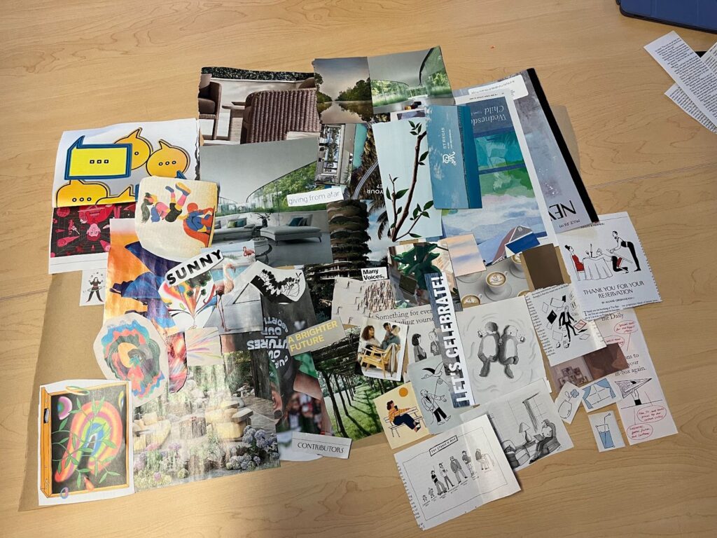
Final Moodboard
We started by combining the components of our individual moodboards by theme and feel, kind of like what we did when we mapped our post-it data by theme earlier in the course. We found that a gradient from bright colors and bold graphics to more earthy, muted tones naturally formed. We found that because our app had two sides, positive encouragement and personal reflection, our moodboard ranged between these two themes. After discussing which direction to pursue, “are we a relaxing app or an exciting app?” we decided that the answer was both. We wanted different parts of our app to use different accents that evoked either calm or excitement depending on the task at hand, while keeping a cohesive base theme throughout. While we think achieving this cohesiveness will be tricky, we want to give our duality idea a try; we want to evoke the right feelings in the right places, while keeping a consistent and clear brand.
Thus, our final moodboard had a range from brighter colors and social language to a more muted side that featured images of meditation and calm:
Individual Style Tiles
Elyse

Anooshree
Cecilia

Kaitlin

Alahji

Final Style Tile
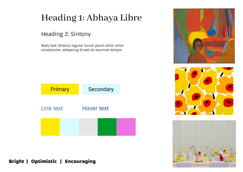
In order to converge on our final style tile, we each briefly presented our individual style tiles to the rest of the team. We noticed a few unifying themes: we each included light blues and grays as primary colors to cultivate a sense of calm and reflection, and several team members pulled colors directly from the image of our final moodboard, resulting in their inclusion of pale yellows, pinks, and greens as accent colors.
For our final style tile, we decided to center the light blues and grays, and to vary the accent colors associated with each page on the app depending on the page’s functionality; for example, the reflective portion of the app would contain more blues than the social component, where we would use pinks and greens for a more visually exciting experience. When it came to fonts, we wanted to vary serif and sans-serif text in our headers and subheaders for contrast (and to follow basic design principles). Key words in the style tile mostly stemmed from overlap in our individual work.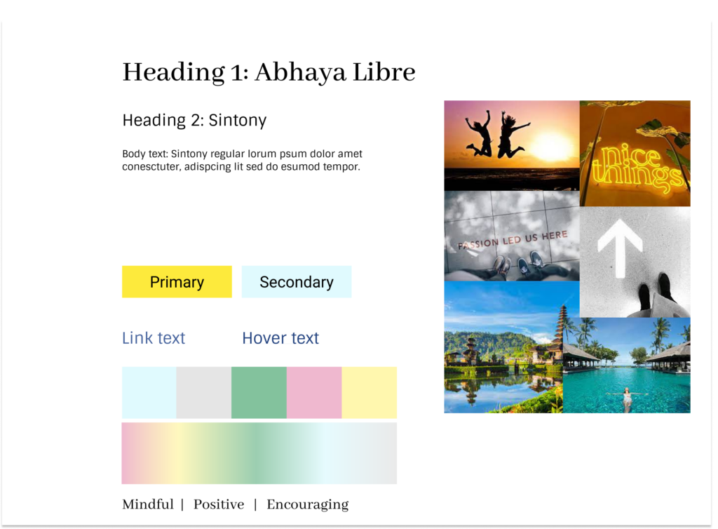


Comments
Comments are closed.