Introduction
Project name: Affirm
Project date: 01/16/23 – 03/19/23
Team members:
Our goal is to help people struggling with unconfident decision making, especially those who overthink and regret their past decisions.
We designed Affirm, a recharging mobile app that gives users a safe place to reflect on the positive outcomes of their decisions and send/receive positive affirmations for their reflections.
Problem Finding (The Challenge)
Problem Domain
Our team of 5 found that we all had trouble making decisions and wanted to change our decision-making habits. As college students, we make a lot of decisions, from what to eat for lunch to what career path to pursue, and we found it was hard to find peers who didn’t consider themselves bad decision makers. We were excited about exploring decision making because we were personally invested in the issue, and we knew it would resonate with those around us.
Literature Review
We conducted a literature review, in which we explored 5 different areas of decision making to determine which had the most potential for behavior change. For a more in-depth review, see our literature review blog post—in this report, we focus on the two most influential areas for our project: confidence in and speed of decision making.
Confidence
We found that people’s confidence in decision making is subjective; when people think they don’t know the “right” answer to a decision, their confidence deteriorates and they will try to gather more information. We also found that when people make important decisions, they feel more confident after manually aggregating data about their choices.
Time
Despite it being optimal to spend less time on decisions when choices are similar, people tend to spend significantly more time on these types of decisions. We reviewed two papers and found somewhat contradictory results: (1) suggests that in intense work environments, rationality and extensive analysis speeds the process, but (2) argues that faster, more instinctual decisions are more helpful. Finally, under time pressure, people tend to default to familiar decisions.
Our key takeaways from this literature review were that people struggle to feel confident about their decisions, and that decision making speed doesn’t necessarily predict the quality of decisions. We wondered whether we could give our users the flexibility to use our app for fast or slow decisions, while still maintaining their level of confidence in their decision.
Comparative Analysis
For more information, check out our detailed Comparative Analysis.
We selected 10 apps and websites that addressed different decision making needs for a more holistic review. We found that most apps fell into one of two categories: apps for fast, random decision making and apps for slower, calculated decision making.
Applications in the “fast decisions” category used randomness to help the user quickly decide between several options. For example, to choose a representative out of a group of people, users can place their fingers on the screen, and Chooser will select one of their fingers.



Finger Selection on the Chooser App
Other apps that focused on fast decision making, like Tiny Decisions, took on a similar form. While these apps might be useful for deciding between a group of equally appealing options, random selection doesn’t lend itself to all types of decisions; important decisions might require more thoughtfulness than these solutions offer.
Many of the existing “slow decision” solutions enabled users to specify the exact factors that they would like to influence their decisions. This allows users to weigh the pros and cons of each option, like in the Definitive Choice app. Users can quantify their values and preferences with criteria, and then see the winning option according to the app’s calculations.
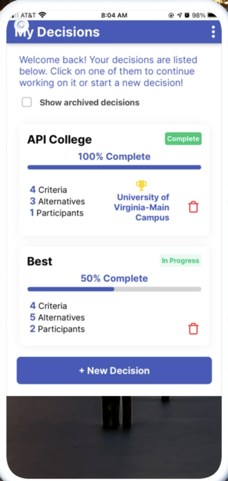
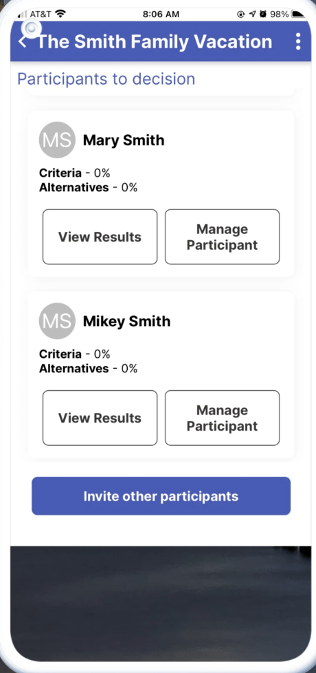
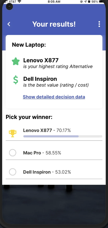
Key Screens of the Definitive Choice App
Solutions like Definitive Choice give the user control, but risk paralyzing their users with even more decisions. Even after seeing the winning choice, a user might second-guess their rankings and go back to adjust criteria, making this process even slower. In general, translating values and priorities into numbers might make it hard for an app to truly predict a user’s best option.
We created a matrix that maps where the current solutions lie, along two axes: speed and importance. We found that apps used for making less important, short-term decisions tended to be faster to use. In contrast, long-term decisions required more deliberation, and therefore these apps took a while to use. These are two opposing sides, leaving the middle portion of the map wide open.
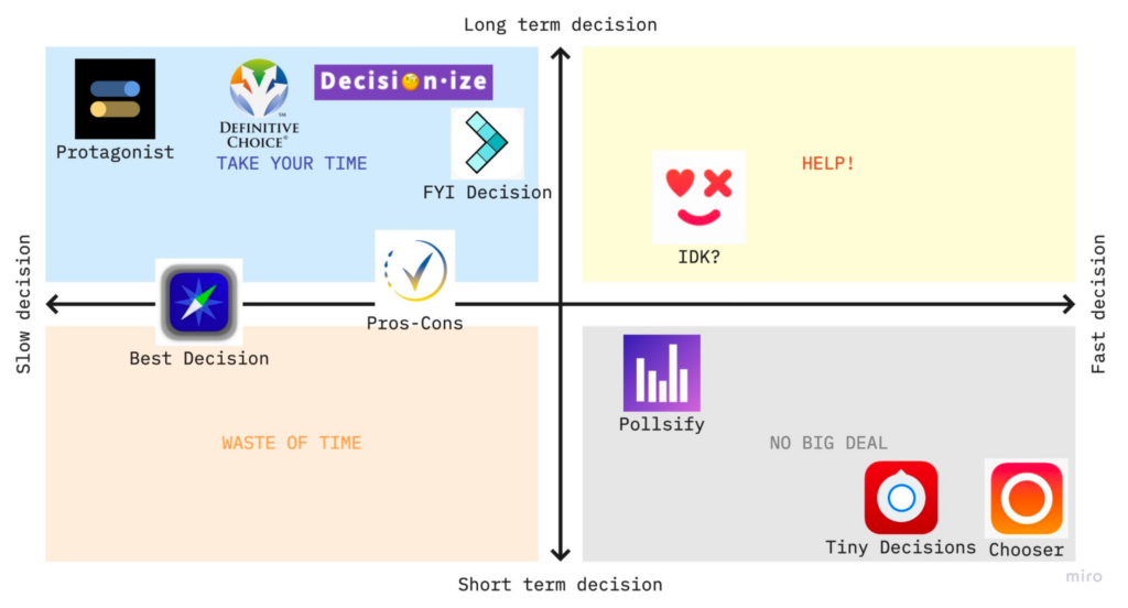
While most competitors focus on one of two extremes—rapid decisions or slow, deliberate ones—research does not show that either extreme yields better results. A key insight from this research was that we’d need to make our app work for any type of decision, and that there might be some other way to ensure decision making confidence, rather than simply speeding up or slowing down the process.
Baseline Study
Audience
Our target audience for the baseline study was college students and recent graduates who have trouble with decision making, specifically those who find themselves making decisions slowly or with a lack of confidence. We were also looking to recruit one “power user”—someone who makes decisions easily.
Selecting Participants
We first recruited possible participants through this screener, then conducted a pre-study interview to confirm the participants fit our target audience and were articulate in sharing their thoughts. We were also looking for information on how the participants approach decision making and possible leads into what causes people to find decision making easy/hard. See here for the full interview script.
Key Questions
In our diary study, we wanted to investigate which decisions people spent the most time thinking about, and how they felt about the outcomes of their decisions. We were curious about what factors made people feel good, so that we might encourage this with our solution. We were also interested in figuring out what might lead our participants to feel regretful, so that we might minimize those behaviors.
Protocol
We asked our participants to log 3-5 decisions they made each day for 5 days, with details about what they were deciding, how much time they took, and what they decided to do. Then, every night, they were asked to respond to reflection questions such as, “How do you feel about the results of this decision?”
More details about the protocol and nightly reflection questions can be found in this baseline study introductory document.
Findings
For more detailed explanations on our synthesis and key insights, see the sections titled “Unpacking Our Data” and “Models” in our 5A blog post.
Here are some of the techniques our team used to synthesize our data:


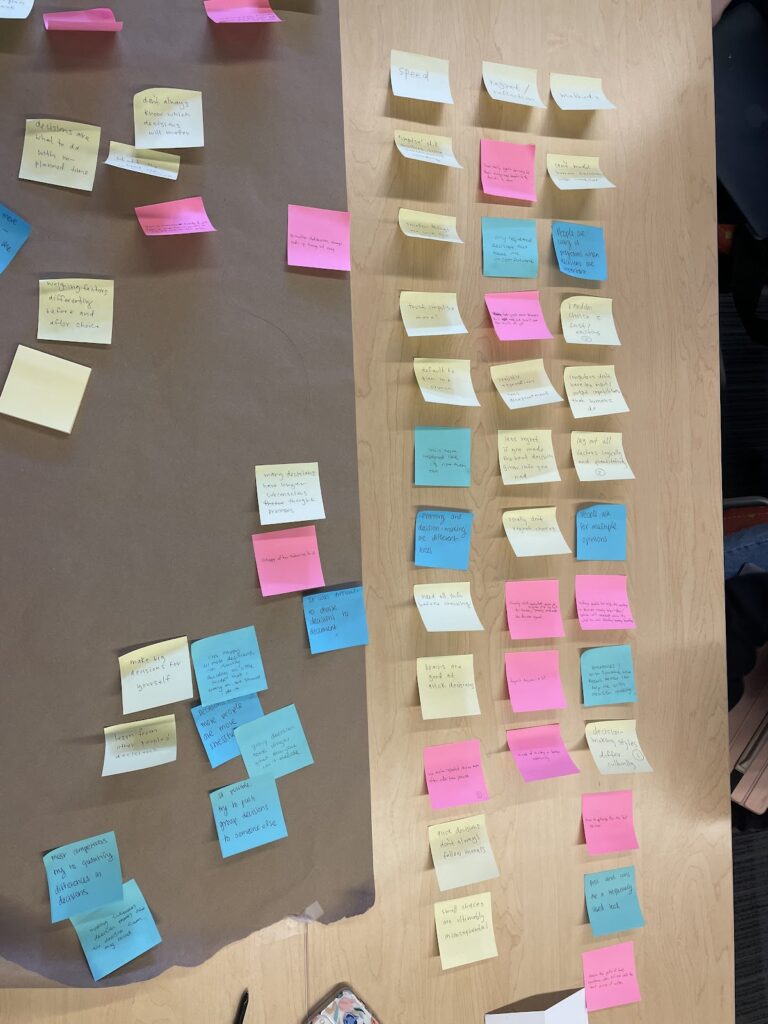
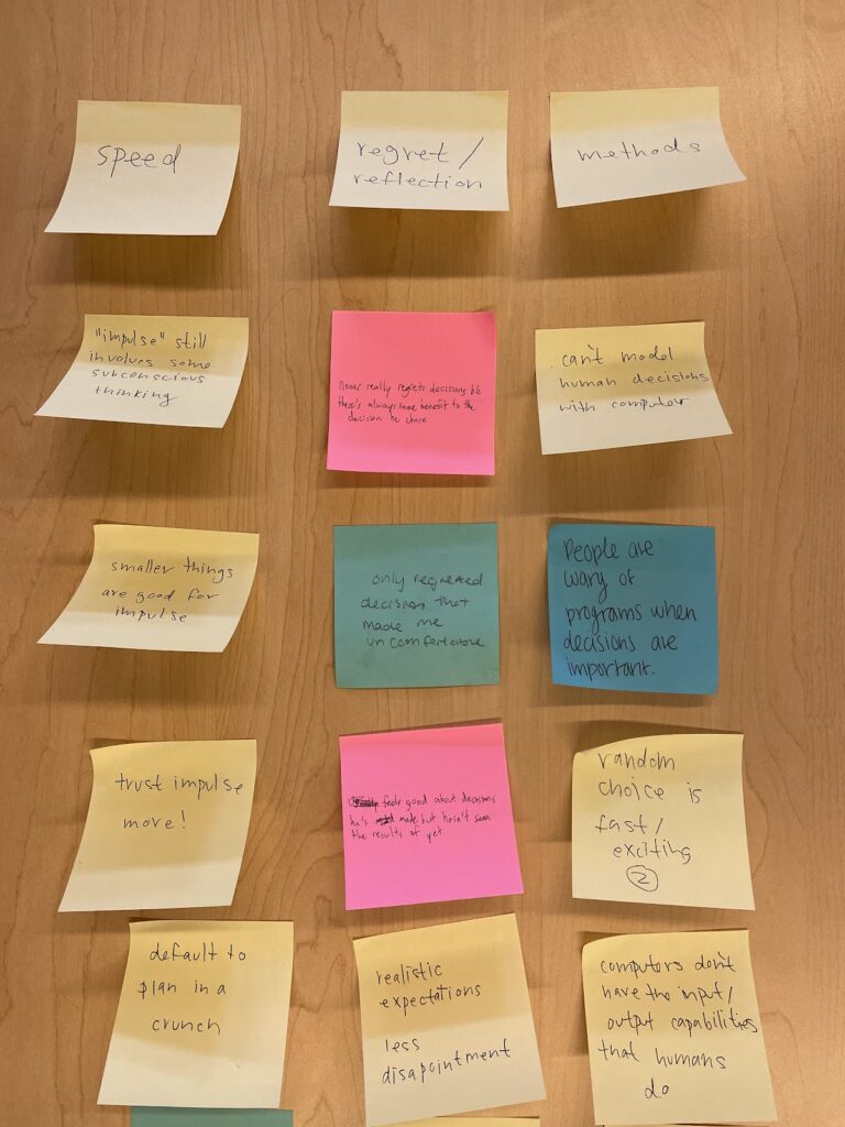

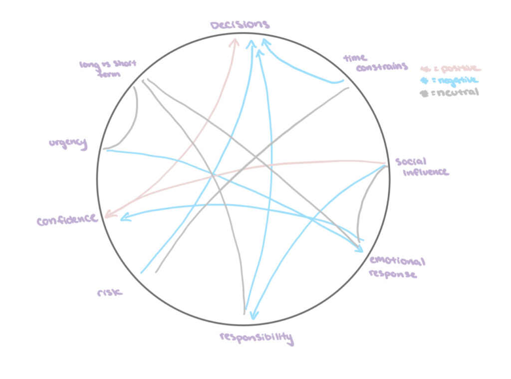
Key Insights
We discovered that participants’ pain points in the decision making process fell into three main categories:
- Making fast decisions
- Making “the right” decision
- Feeling confident in their decisions
Furthermore, participant data clustered around issues of confidence and importance, and a category with high frequency was “Regret/Reflection.”
Moving forward
Looking at our insights, we decided to shift our focus to helping users feel more confident about their decisions by minimizing regret and negative reflection after making a decision. Our problem statement narrowed in on feeling confident about decisions, whereas previously we had considered indecisiveness and the quality of decisions as well.
We hypothesized that people might feel more confidence and less regret if they made decisions that aligned with their personal values and current priorities, but we needed to test this with our intervention study.
Personas and Journey Maps
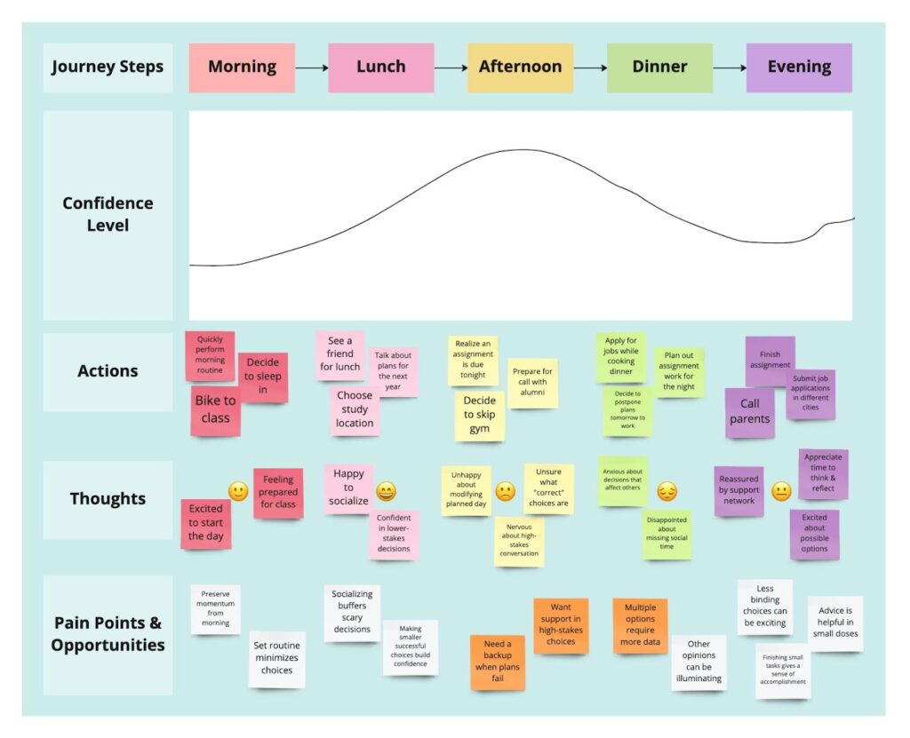
In our baseline study, we noticed that college students face multiple smaller decisions throughout the day, and all of our participants struggled to identify their priorities. For our first persona, we wanted to deep dive into the mindset of someone preparing to leave college:

This journey map catalogs a single day in the life of “Anne.” We chose to track her confidence level, with the lower end indicating regret and the higher end indicating pride and comfort. Pain points are in orange, and opportunities are in white.
Another prevalent theme from our baseline study was the stress participants incurred when dealing with ambiguous choices. For our second persona, we wanted to understand the feelings of someone facing big and amorphous decisions. Walt recently graduated from college and is experiencing a huge lifestyle change.
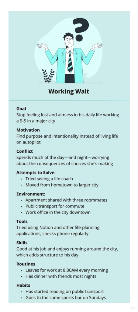
Walt’s journey map tracks his confidence level throughout the day:

These journey maps helped us identify when target users reset and evaluate their decisions: at the beginning of the day, during mealtimes, and when going to bed. This influenced our intervention study design. Furthermore, we realized that our personas struggled with significant changes to their initial plan for each day, which raises the question: how can we minimize this change, or make it more comfortable to experience?
Solution Finding
See here for a concise overview of our 3 intervention ideas and why we chose the idea that we did, or here for a more detailed description of them.
Intervention Study Details
Hypothesis: People find it easier to make decisions if they have a clear list of priorities they can base their decisions off of. Being able to reassess priorities throughout the day gives more flexibility to participants and helps with burnout and productivity.
Who was recruited: 10 college students/recent graduates who have completed the previous screener and were determined to be an eligible participant, but NOT a power user (i.e. recruited participants have a hard time making decisions).
Length of study: 5 days
Details: Participants were given instructions to make an ordered list of priorities when they started their day and make decisions throughout the day based on the list. During lunch, participants went through a short list of reflection questions (detailed in the next section) to help them think about their day so far and reassess their priorities. They will then noted down their new ordered list of priorities. During dinner, participants followed the same procedure. At the end of the day, participants completed a few short reflection questions about how the lists affected their decision-making.
Data being collected each day:
- 3 ordered lists of priorities (start of day, lunch, dinner)
- (Optional) Impactful decisions they made that didn’t follow their priorities
- Short answers to checkpoint reflection questions
- How satisfied are you with decisions you’ve made since the last checkpoint?
- What are the biggest factors that led you to change/not change your priorities at this checkpoint?
- (Optional) Any other methods used to reassess priorities
- End of day reflection questions
- How often did you find yourself making decisions that weren’t at the top of your priorities?
- Do you feel the list of priorities made decision-making easier today?
- What, if any, effect did reassessing your priorities throughout the day have on your feelings about your decisions?
Questions addressed by the study:
- Do people find it easier to make decisions if they have a clear list of priorities they can base their decisions off of?
- Does reassessing priorities throughout the day help reduce stress and regret?
Synthesis
We followed a similar synthesis process as we did for our baseline study. We started with affinity mapping:


We found that many participants interpreted priority as current goals or to-dos. Although we left “priorities” open ended, we had expected that people’s priorities would be broad – e.g. “be more conscious about what I eat” – but instead we saw more literal priorities like “eat lunch”. A main takeaway here is that our solution will need to clarify this definition of priorities, either by providing some examples, or thinking of a better term. Otherwise, participants will be making to-do lists instead of tracking priorities.
Next, we did frequency mapping of our data:

The theme with the highest frequency was “What is priority?”, which echoed our previous findings that users had different definitions of priorities, which our solution will need to clarify. The next highest frequency was “Why prioritize?” which highlighted the benefits of writing out priorities that some participants noticed. Having explicitly stated what they wanted to work on, participants found it easier to remember these priorities when making decisions. One participant noted that “[documenting priorities] helped me remember to enjoy my day” after writing down “fun” as a priority.
We also noted that every participant was able to list a positive outcome of one of their decisions from that day, indicating that this kind of positive reflection is a feasible future direction. Surprisingly, even when participants harped on the negative outcomes of their decisions in other parts of their reflection, they didn’t seem to regret it after their positive reflection: “I made the decision to go to my language class today instead of skipping. The positive was that I got dressed earlier and did not receive another absence in the class.”
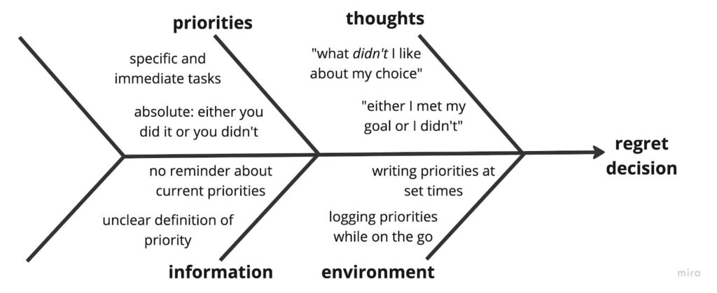

These diagrams helped us identify some areas to focus on as we develop our solution: 1) clarify our definition of “priority” so that users don’t turn the app into a to-do list, and 2) encourage positive reflection. Because both diagrams explored how participants came to regret their decisions, we need to figure out how our solution will interrupt these flows.
Assumption Mapping & Testing

Top assumptions shown in bold:
- WBT people are willing to take time to reflect on their decisions.
- WBT positive reflection will make people feel better about their decisions.
For more detailed descriptions of our insights from our assumption testing, see here.
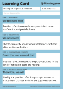
In our assumption mapping, we identified two key assumptions that needed to be tested to validate our solution. The top two assumptions we tested were the effectiveness of positive reflection in increasing users’ confidence and comfort in their decisions, and the feasibility of short and frequent reflections.
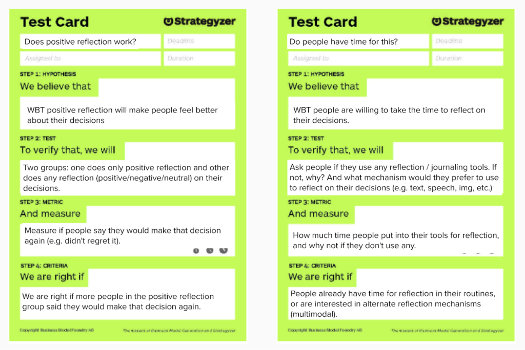
To test the first assumption, we conducted a survey with five participants who were asked to rate their confidence in a recent decision and list three positive outcomes of their decision. After reflecting on their decision, they were asked if they wanted to change their confidence rating and to explain their reasoning.
The results showed that the majority of participants updated their confidence score following reflection, with 67% of those who changed their score increasing it. This validated our assumption that positive reflection could increase users’ confidence and comfort in their decisions, and informed the design of the final product.
For the second assumption, we recruited four participants with different reflection habits and asked them about their experience with short and frequent reflections. We found that people need flexibility and want to reflect on their own time, invalidating our second assumption that users could sustain daily reflections. As a result, we decided to allow users to decide when to reflect on their decisions themselves rather than requiring them to do so on a daily basis.
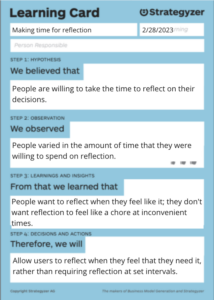
These insights shifted our approach to the solution by informing the design of the final product, which allows users to reflect on their decisions at their own pace and provides a positive reflection component to increase users’ confidence and comfort in their decisions. In the future, we would approach the assumption tests differently by recruiting a larger and more diverse group of participants to ensure that our insights are representative of the target user group.
Building a Solution
Design Architecture
Our team found that mapping exercises played a crucial role in identifying our target audience and determining which features would provide the most value to our users. These exercises helped us to clarify our target audience, identify the most important features of our app, and determine which user actions would be most beneficial.

One particularly useful exercise was story mapping, which allowed us to explore directions for our product and determine which features would be the most helpful for users, such as a decision-making framework or a reflective journal.
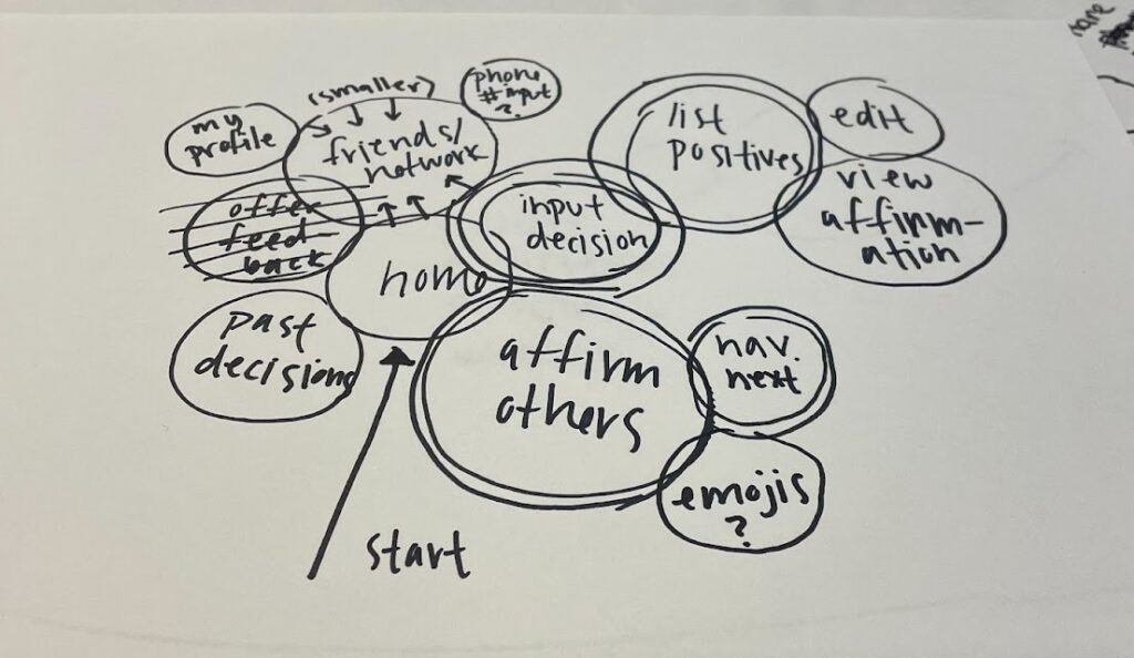
Secondly, the bubble mapping helped us to identify and organize the key features of our app, allowing us to prioritize which ones to focus on during the wireflow creation process. This exercise involves creating a visual map of the features and functions of your product, organizing them into bubbles or clusters based on their relatedness.

The system path diagram was also beneficial in clarifying our target audience and determining the focus of our app. We were able to develop a path for our target user and determine whether our app should focus on helping users make decisions or minimize regret. This exercise also helped us to understand the different user segments that we needed to cater to.
Wireflows to Sketchy Screens
We began building the visual design for our solution with wireflows of what we considered the 5 main flows in the app:
- Onboarding: Sign up/login with name, email, and password
- Settings: Has options to change profile settings (e.g. who can view your posts), change notifications, and reset password
- Reflecting on a past decision: Follows a “I chose… I’m glad because…” prompt and allows the user to input text, photo, audio, and/or emojis for the reflection. The confirmation screen gives the user the option to share publicly with all users, with friends only, or privately
- Present decision making (deprecated in final solution): Post a current decision and have other users give advice about the situation/vote on choices
- Affirming others’ decisions: Give affirmations to other users’ posts with an emoji reaction or comment
See here for a more in-depth look at our wireflows.
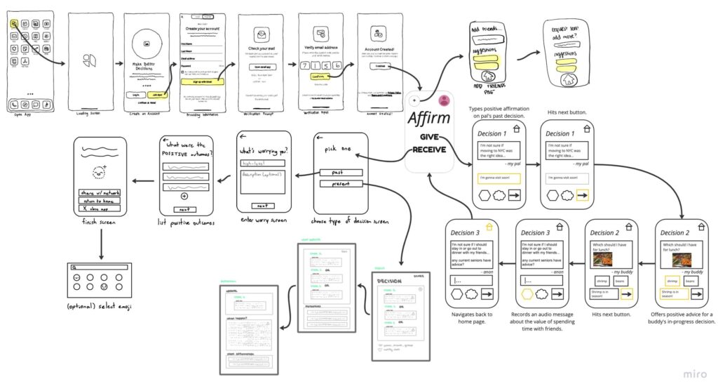
See here for a higher resolution of the image
We then created sketchy screens for each of the flows described in the wireflow. To see the sketchy screens and explanations on the UI designs for each flow, see our sketchy screens blog post.
Importantly though, a lot changed from these wireflows/sketchy screens to the initial prototype (e.g. deprecating the present decision making flow). Please see the Prototype section for the finalized main flows of the app and elaborations on those UI decisions.
Branding
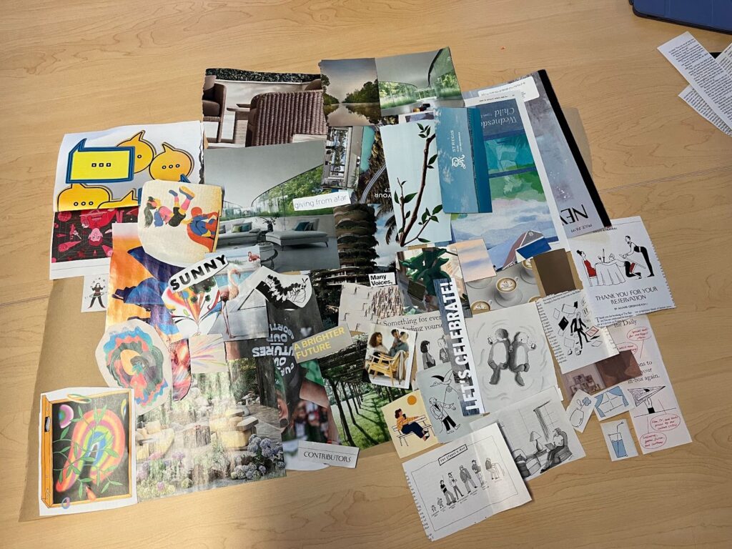
When compiling our individual mood boards into our final, cohesive one, we noticed a few unifying themes: we each included light blues and grays as primary colors to cultivate a sense of calm and reflection, and several team members chose pale yellows, pinks, and greens as accent colors.
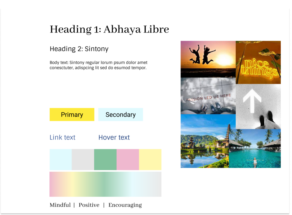
For our final style tile, we decided to center the light blues and grays and vary the accent colors associated with each page on the app depending on the page’s functionality; for example, the reflective portion of the app would contain more blues than the social component, where we would use pinks and greens for a more visually exciting experience.
When it came to fonts, we wanted to vary serif and sans-serif text in our headers and subheaders for contrast (and to follow basic design principles). Key words in the style tile mostly stemmed from overlap in our individual work (visible in our 7A submission) and are intended to evoke feelings of support and reflection.
Usability Testing
We performed usability testing during class in Studio 9B on 4 total participants. We had each participant walk through our initial prototype as we followed our usability script; participants were specifically asked to perform the following tasks in order: complete the onboarding flow, post a reflection on a recent decision, and affirm a friend’s decision. Our three biggest issues were as follows:
- Home screen feels unnecessary and has no functionality
In order to address this issue, we documented each user’s past decisions in a personal feed, which lives on the home screen. Doing so added a previously-missed key functionality to our product while also making its entry point more meaningful. - It’s not clear where to add friends
Instead of having users add friends from their profile, which also contains personal preferences, we had users add friends from the social page. This made it clearer that the social features of our app—the social feed, friends list, and friend management features—live on a single page.
- The “I’m Done” button is confusing
We compiled the multiple steps necessary to make a reflection into a shorter, more cohesive flow: users will draft their reflection on one page, then select media/privacy preferences and confirm on a second.
If we were to move forward with our product, we would make custom reactions—beyond labeling existing emojis—so that users can channel specific sentiments while supporting their friends. We also received peer feedback advising that we encourage accountability and reflection that isn’t just positive, which means researching the repercussions of exploring alternate emotions and adding them to our prompt drop-down on the reflection page.
Finally, we found that users were occasionally confused by the symbols we chose for the bottom navigation bar. Future work could include generating custom icons that better represent the reflection page and social feed.
Prototype
Draft Prototype
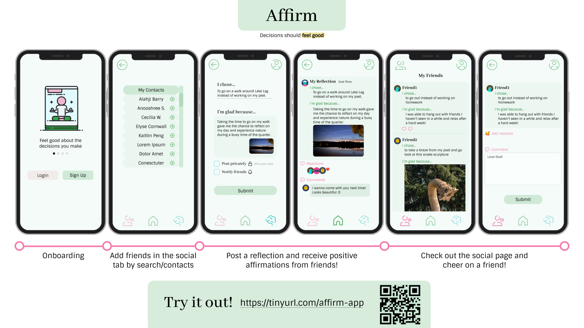
Click here to see the full draft prototype and here for the design file itself. The flows in our initial prototype were: Onboarding, Posting a reflection, Adding friends, and Social/cheering on a friend.
Onboarding (draft):

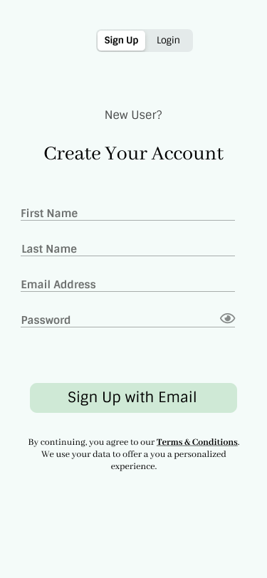
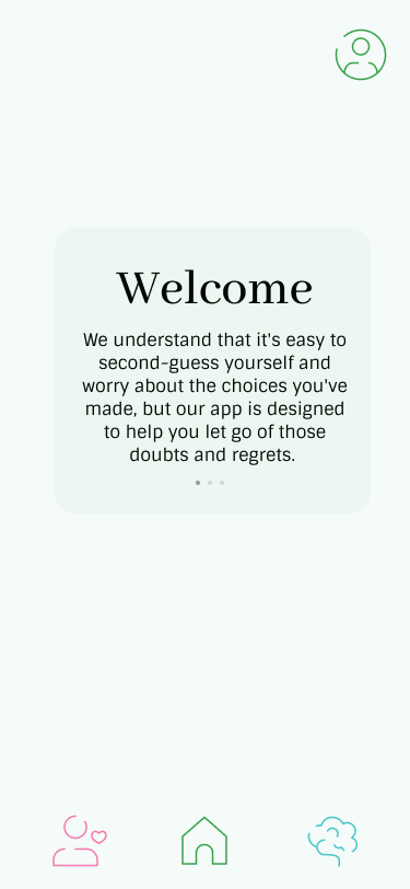

The user creates an account with their name, email, and password, then jumps straight into onboarding. The onboarding explains the purpose and main features of the app. This process was designed to be as simple as possible so the barrier to entry is minimal.
Posting a reflection (draft):
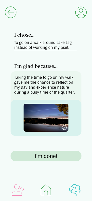
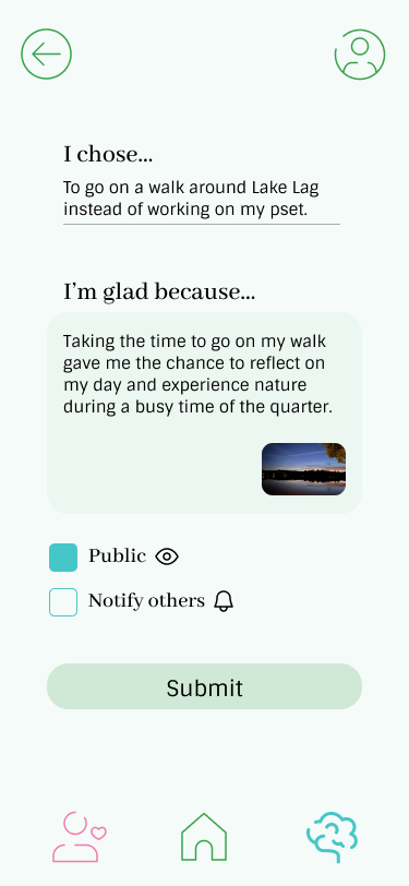
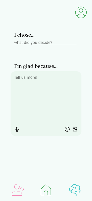
To post a reflection, the user clicks on the reflect tab on the navbar, and follows the prompts to input their reflection. They also have the option to add a picture, audio recording, or emoji that goes with the reflection. They can then choose to publish it publicly/to all Affirm users and notify others with the post. We chose to keep all the input on one screen then have the next screen be for sharing options and the submit so the user could focus on their reflection before thinking about the social aspect of the app.
Adding friends (draft):
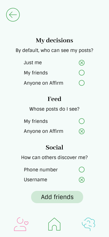
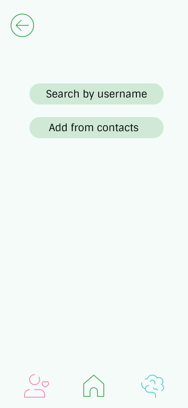

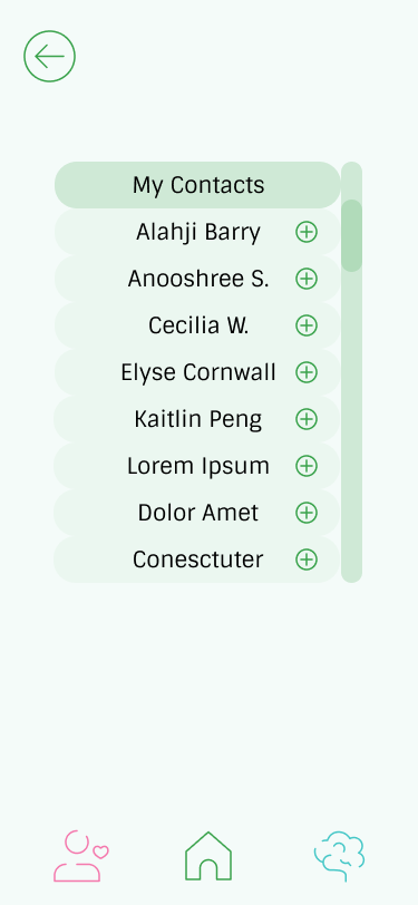
To add friends, the user clicks on the profile tab in the top right corner then clicks on the “add friends” button at the bottom of the screen. They can then add users by name or through their contacts. We decided to put the add friends button in the profile since it seemed the most intuitive place to put it, though feedback suggested it was not and it was changed in the final prototype. We also included adding by both username and contacts since most social apps do this.
Social/cheering on a friend (draft):

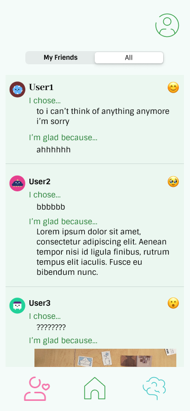


We chose for the social tab to let you see posts from both your friends and all users since it’s common for social media apps to do this, though this was changed in the final prototype after receiving feedback. To react/comment on a post, the user clicks on a friend’s post, chooses an emoji reaction and/or writes a comment, then submits it. For the flow, we also decided to add a submit button for the reaction/comment so users would have to take time to think about what they say.
Final Prototype
To access our final Figma prototype, head to this link or scan the QR code below (does not work properly if opened on a mobile browser). Here is also the link to the design file itself.

Our final prototype has one additional flow than the draft, so our finalized flows are: Onboarding, Posting a reflection, Adding/removing friends, Social/cheering on a friend, and Viewing own posts/affirmations.
Onboarding:

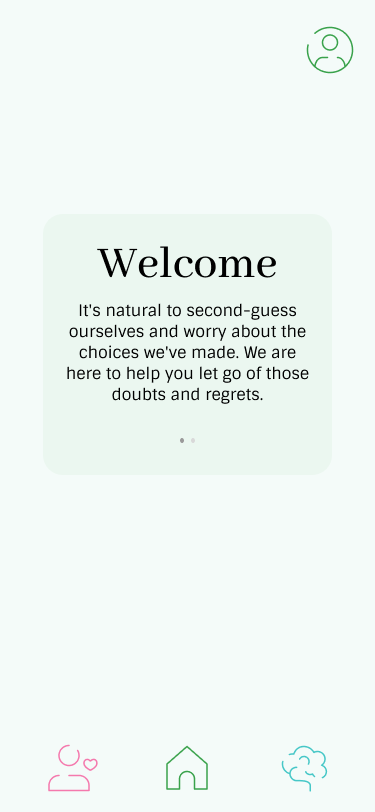

From the draft prototype, we made two small changes to the flow. We decided to remove the “Continue as Guest” option on the first screen since we want the app to be personalized for the user, and we also broke the onboarding text into smaller chunks as usability testing feedback noted that it was too much to read through at once.
Posting a reflection:
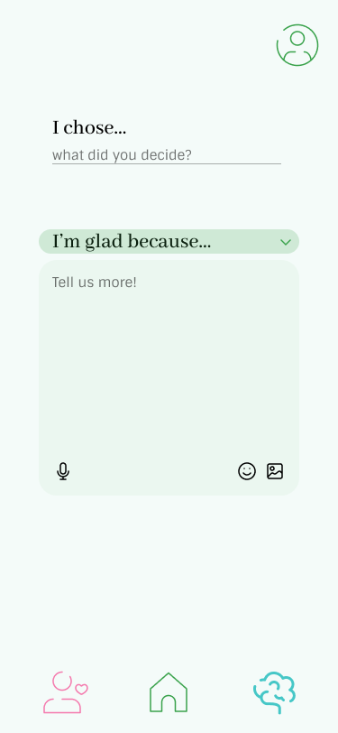


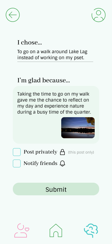
The flow didn’t change too much here from the draft prototype. We changed the sharing options from “post publicly” and “notify others” to “post privately” and “notify friends.” Most usability testers didn’t see the point of sharing/viewing reflections publicly, but did want the option to keep some posts private. We also added more prompts for the user to choose from, since some users thought the original prompt was too limiting.
Adding/removing friends:

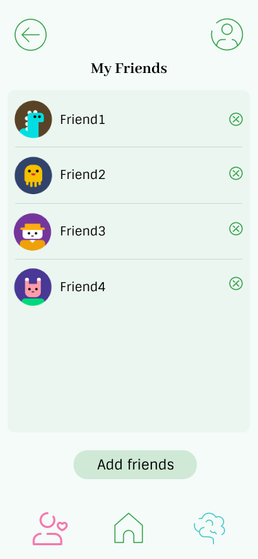
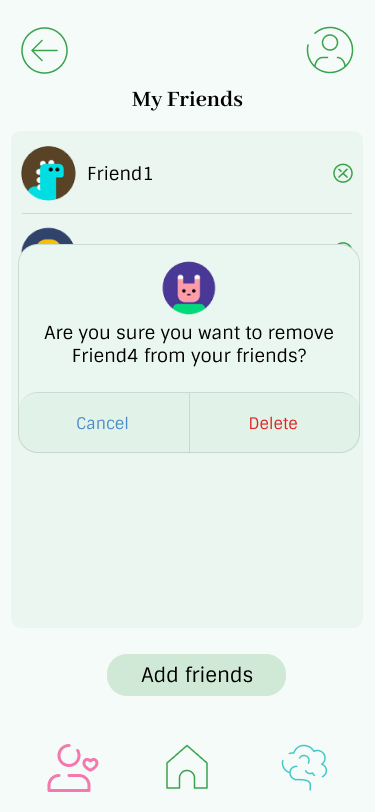

A lot of users pointed out that they would (1) like an option to remove friends and (2) found it most intuitive to manage friends in the social tab, so we changed the flow to reflect this. In the social tab now, there is a button in the top left corner that allows you to view your friends list and remove friends, then at the bottom is the add friends button that used to be in the profile page. The flow for adding friends is the same as the draft.
Social/cheering on a friend:


The most major change we made was removing the all users aspect from the social component as most people didn’t see the point of viewing reflections publicly, so the social tab now only displays a feed of your friends’ posts. Other than that, we added reaction buttons at the bottom of each post which take them to the react/comment screen since users found it unintuitive to click on the post itself to get to that reaction screen.
Viewing own posts/affirmations:

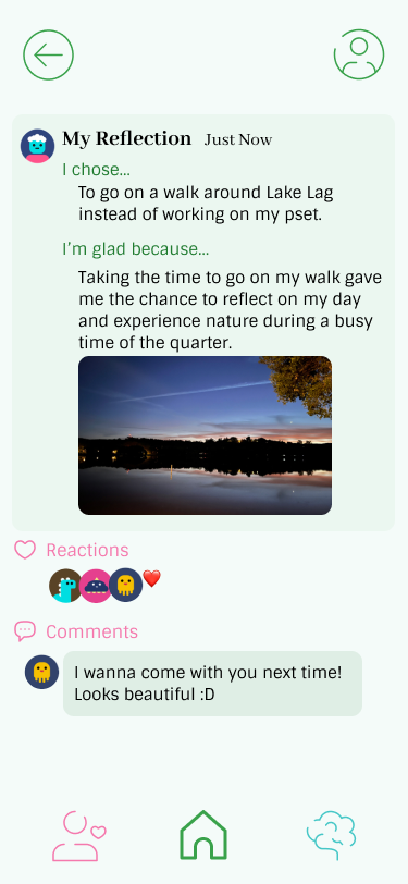
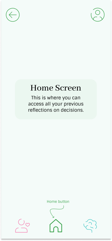
Two major points from our usability testing was that the home screen felt unnecessary and that users wished they could view their own posts. We turned the home screen into a self feed where users can see their own posts and the reactions/comments they received.
Ethics
Persuasive Technology
At its core, our final product is a persuasive technology: we have built a system that uses its UI to encourage users to build a very specific habit. And because we limit the ways in which users can reflect and react to others’ reactions, we mold and/or direct their behavior to a specific goal. During peer review, some of our peers raised the question: should all decisions be rewarded with positive reflection? If a user were to make a choice that actively hurt those around them, is positive reflection a valid choice? Furthermore, forcing positive reflection upon a difficult decision that was potentially forced by external factors (financial situations, limited resources, etc.) can be insensitive.
If we were to continue to build Affirm, we would need to acknowledge—as the persuasive technology reading argues—that no technological system is neutral. Shaping our system into a beneficial “moral actor” would require further diversifying our prompts and perhaps detecting and banning decisions that should never be validated.
Nudging & Manipulation
Our system also falls into the category of “libertarian paternalism,” as introduced in the reading on nudging and manipulation. Although we discourage a negative emotion (regret), we are restricting our users’ choices to experience the full range of emotions, and it’s unclear from the reading whether including intentional influence makes our system manipulative.
To definitively avoid manipulation, we could offer prompts preceding reflection that ask the user if they are ready to frame their decisions in the ways we offer. Moreover, the language in our application could be more general (e.g. “reflect on your decisions” instead of “decisions should feel good”) to grant users more agency in how they use it, even if doing so could contradict some of our initial research.
Privacy
Throughout the quarter, our team weighed the costs and benefits of including a social component in our product, considering that users are sharing relatively sensitive information. As described in the “Nothing to Hide” reading, “privacy is rarely lost in one fell swoop.” Access to multiple decisions of someone in your social network could reveal deeply personal facets of their life, such as their daily routine, financial situation, or even physical location. We did not build our product with protection against external actors in mind.
Protecting user privacy would require multiple additional steps. Right now, users determine the overall visibility of their posts in their settings page, which is not in the bottom navigation bar. Reintroducing every single fine-grained privacy setting each time a user posts would slow down the reflection flow, but would ensure they don’t accidentally reveal something they don’t want their friends to know. Furthermore, we could include blurbs on the consequences of sharing information in both the onboarding and reflection flows.
Rewards
Finally, our product relies on users building the habit of reflection due to the pleasure inherent in doing so! The reading on rewards explains that “dopamine responds to uncertainty in the form of reward prediction errors, . . . which means that we learn from unusual or unexpected rewards.” Because we prioritize consistency—both in personal reflection and in supporting others—the feature with the most potential for surprise is how friends choose to react to each of their friends’ decisions.
While surprises in reactions could be exciting at first, the uncertainty of not knowing if a reaction will be supportive or not could contradict habit-building, as we build habits when “our actions repeatedly bring us more pleasure than [we] expect.” As a result, our product should offer only wholly supportive reactions, or at the very least screen for social interactions that, while exciting, will not be consistently positive, such as a comment from someone the user does not know well or profane language.
Broader Impact
In total, we hope that this solution will make reflection and meditation—two proven practices for improved mental health—more accessible, especially to those facing frequent ambiguity and/or high-stakes decisions. That being said, including a social component, while exciting and encouraging, necessitates additional ethical considerations.
In an ideal world, our solution would offer a diverse but consistently healthy range of prompts and responses to facilitate positive interactions without feeling paternalistic or manipulative. If we were able to continue building Affirm, we would need to screen for dangerous or harmful content—which raises another suite of ethical questions—to ensure sustainable growth of the product.
Conclusion
As a group, we learned that designing behavior change interventions to promote more reflective decision-making is challenging, especially when users do not see the immediate benefits. This makes it harder to motivate them to adopt these behaviors. We also recognized the importance of designing interventions that are both effective and ethical, which requires careful consideration of potential impacts on users.
If we had more time to continue working on our project, we would like to investigate how to make our interventions more personalized to the specific needs and motivations of individual users. We would also like to develop a prototype that includes pre- and post-decision reflections to ensure a consistent user experience and increase the effectiveness of our interventions. Additionally, we would like to explore different incentives that align with users’ values and goals to motivate them to engage in more reflective decision-making.
Moving forward, we plan to approach our next behavior design effort by prioritizing user research and understanding their unique motivations and challenges. We will use the information to create interventions that are personalized, effective, and ethical. We will also continue to prototype with usability in mind and consider the ethical implications of our methods.
In summary, the project taught us the importance of designing interventions that are both effective and ethical and the challenges of motivating users to engage in more reflective decision-making. We look forward to applying the lessons learned in this project to future behavior design efforts, with a focus on user research, personalized interventions, and ethical considerations.

