Team 3: Alahji, Anooshree, Cecilia, Elyse, Kaitlin
Overview
We performed usability testing during class in Studio 9B on 4 total participants. We had each participant walk through our prototype as we followed our usability script; participants were specifically asked to perform the following tasks in order: complete the onboarding flow, post a reflection on a recent decision, and affirm a friend’s decision.
We discovered the following issues during usability testing. Each of the issues listed below was mentioned by at least 2 of our participants, and we determined each issue’s severity collectively.
Severe
Home screen feels unnecessary and has no functionality
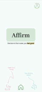
Home page has buttons to other pages but no functionality of its own
In order to address this issue, we will be documenting each user’s past decisions in a personal feed, which will live on the home screen. Doing so adds previously missing functionality to our product while also making its entry point more meaningful.
Moderate
It’s not clear where to add friends
Instead of having users add friends from their profile, which also contains personal preferences, we will have users add friends from the social page. This will make it clearer that the social features of our app – the social feed, friends list, and friend management features – live within one page.
The “I’m Done” button is confusing
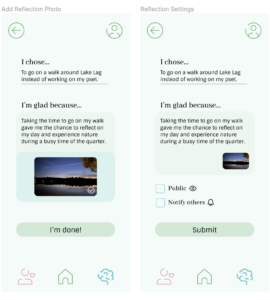
“I’m Done” button leads to “Submit” button
We will compile the multiple steps necessary to make a reflection into a shorter, more cohesive flow: users will draft their reflection and select media/privacy preferences on one page before confirming their post on a second. The second page will offer them the option to edit further before posting.
It’s unclear who can view reactions to reflections, and where they can do so

Emojis on social feed were confusing: are these the user’s reactions or other people’s reactions?
We decided that users will view others’ reactions to their posts on the revised home screen, but will be able to react to others’ posts on the social feed.
Trivial
Log In / Join Now wording is not consistent with mobile app standard practice
Rather than “Log In / Join Now” we will use the terminology “Sign In / Create Account” to describe the ways to enter our app. Since our app offers users a personalized experience, we will also remove the “continue as guest” option from our onboarding flow.
Onboarding text is in difficult-to-read chunks
We will reduce the amount of text in our onboarding screens and include more paragraph breaks to make the screens more visually appealing as well as easier to read.
Reflection prompt is too vague

Reflection prompt “I’m glad because…” wasn’t helpful
Instead of relying on a single reflection prompt across all user decisions, we will instead add multiple, more specific prompts that users can choose from while completing the reflection flow. We’ll also make it clearer that this reflection is meant to be positive.