
Mood Boards
The purpose of this mood board was to create a calming atmosphere and focus on animals because the gamification aspect of the app will feature a virtual pet. By using nature focused imagery and animals, the mood board helps establish the tone and theme we want to create. In addition to the images, colors also play an important role in the mood board. Pastel colors and light yellows are used to associate the experience with calmness, serenity, and joy.
One aspect of this board that we wanted to expand on was the more human and financial focused elements. We really liked how this board captured the more relaxed nature of our app, but we wanted to somehow communicate personal finance through this.

This mood board centers around more primary colors and harsher lines. It uses action oriented images (such as the waves and transportation) to communicate progress and user centered action. One part of this mood board we wanted to add was more center around cute animals, and a more gamified feel.

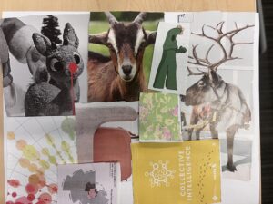
This mood board centered around a comfortable feeling, and the animal aspect of the app. This board used photos of pastel homes to 1) communicate the colors wanted for the app and 2) wanted to communicate a feeling of hominess. This board also used a picture of a desert to give a sense of happiness to the user. One part of this board we would like to expand on were the colors, for we wanted less of an emphasis on orange.

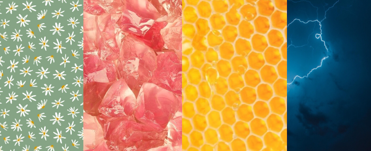
The final mood board is the result of synthesizing and combining the ideas and elements from the previous mood boards. The goal of this final mood board is to provide a cohesive visual direction that incorporates the most effective and relevant aspects of the previous boards.
The top section of the mood board appears to be more practical, focusing on inspiration for motivation and the gamification aspect of the app. This could be seen in the image of a cup of coffee, which is often associated with energy and productivity, and the image of an animal, which could be used to represent the virtual pet. We also organized certain areas by color so that we could see what themes seemed to be present in all of our brainstorming.
Style Tile
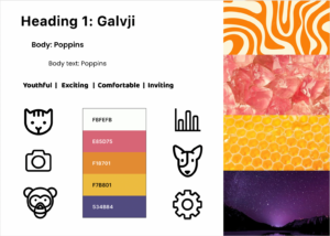
As our app is geared towards college-aged adults, we want it to appear youthful and exciting. Our final selected colors are vibrant, but not shocking. This is because we also need the app to appear comfortable and inviting, as users need to feel secure in giving us even moderate amounts of financial data. We’ve chosen icons consistent with many of the apps with which young people will be familiar – minimalist, black outlines, white/neutral fill, rounded/no sharp edges, etc. Our fonts are also commonly used across modern apps, lending that same sense of familiarity and security to users.


Comments
Comments are closed.