

Winter 2023
Overview
The problem space that our team chose to focus on was financial awareness among young adults. We knew anecdotally that college students struggle with learning to budget and how to properly manage their finances. Since many budgeting apps are designed for more well-established adults, with stable rates of inflow and outflow, we wanted to direct our attention towards providing a more holistic approach to finances.
From our need-finding process and analysis of the existing market and literature about financial management and behavior change, we found that there was a need for interfaces that understood the emotionality of money and that were fun and simple ways of targeting the challenging problem of managing money. Moreover, the rigidity of existing systems, when combined with the average financial literacy of our targeted market segment, largely contributes to increased resistance within these groups to financial tracking.
We created FO$TER as the solution to these needs, providing a simple and fun way for young adults to keep track of their spending habits. The interface leverages social interaction and anthropomorphic character health to encourage accountability in users and build on literature that suggest that the awareness of certain undesirable habits can be used to curb those habits and FO$TER is targeted at providing that awareness to users who might choose to take a more intuition-based approach to budgeting and spending.
Problem Finding
As a team of final year students who are transitioning from student life to (hopefully) earning full time salaries and have watched our friends struggle with this exact transition, we realized that there was a clear gap in the market for usable, approachable systems for young adults to use to track their money. Supplemented by a general lack of financial literacy and education in schools and ever-changing lifestyles and daily habits, financial tracking becomes a particular challenging problem to address. Having a uniquely empathetic perspective on this problem ourselves, we though it would be exciting to solve something that allowed us to employ aspects of participatory design and drew on the emotional and logistical experiences of our friends and ourselves.
What We Know
The first step to understanding our chosen problem space involved a literature review to equip ourselves with the psychological and theoretical factors that inform money management and behavior change.
Some studies pinpointed financial literacy as the focal point of changing budgeting intentions attitudes toward money management. However, other studies indicate that financial education itself is not sufficient in shaping financial behaviors. Some studies found that although traditionally behavior change has been viewed as a result of changes in people’s beliefs, attitudes, etc, we can also change behavior by subtle changes to the environment within which decisions are made. Additionally, the assumption that improved knowledge will result in more effective financial decision-making lacks nuance since factors such as income, financial satisfaction, financial confidence and education also matter. We also learned that recording personal spending helped spenders maintain their spending levels and better meet their own expectations.
We used these insights as a loose framework to analyze the existing market of personal finance apps. In researching personal budgeting and financial tracking apps, we did a deep dive comparative analysis of 8 personal finance apps to explore the existing solutions and look for new opportunities. The apps facilitated a range of functions within the personal finance space – from cent-for-cent personal budgeting to couples’ financial tracking and unnecessary subscription detection and cancellation.
For each of the apps, we identified their unique selling points and summarized their most valuable features to inform our own design. For example, Mint is a personal finance app launched by Intuit that allows users to manage all aspects of their financial life in one place. Some others target different user groups. For example, Personal Capital has financial advisors that can help users create a retirement plan; Honeydue is designed as a financial tracker for partners. Although their users are different from ours, we learned the benefit of narrowing down the target audience.
Simultaneously, we wanted to understand the points at which these systems fall short for the target market sector and what turns young adults away from used budgeting/tracking apps. A major weakness we identified in these existing apps was the lack of incentive. They mostly just provide functionalities to organize personal finance, but once the users become less motivated they barely have any way to bring them back to the app, leading to a low retention rate. We decided to combat this weakness in our design.
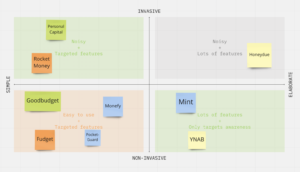
We identified the two major characteristic features that distinguished these apps from each other and used these features to inform the needs of the problem space we are attempting to tackle – simplicity and invasiveness. We then categorized our competitors on a 2×2 mapping simplicity vs invasiveness. Mint, for example, is on the elaborate side. If an app aims to change the users’ behavior by providing intrusive reminders or suggestions, it is on the invasive side. One key insight we draw from the 2×2 is the simpler the better. Most successful personal finance apps have a clear UX design and targeted features.
Reconciling the findings of our literature analysis and market deep-dive, we confirmed that an online personal financial tracking app that emphasized the simplicity, ease and the dynamism of young adults’ lives and the emotionality of money and spending. We chose to focus on the awareness and incentives aspect that seems to missing in system that are currently in use and help increase incentives to organize personal finances, designing features that can naturally fit in users’ daily routines to seamlessly change behavior.
Baseline Study and Synthesis
We screened for participants in the 18-25 age range. In our pre-study interviews, we asked about tools that young adults use for budgeting/financial tracking. We also wanted to test our hypothesis that financially independent participants would be generally better-aware of their financial state. We also asked for some context about their own concerns related to their spending. Finally, we asked them if they could divide their approximate spending into percentages. We used this to judge a participant’s financial awareness based on how accurate their pre-study prediction was. The interview script/responses can be found here.
For the baseline study, we asked participants to record their actual spending for each day as well as what they anticipated spending the next day, divided by category. We then followed up with a post-study interview that mimicked the structure of the pre-study interviews, to understand changes. We also asked if there was anything about their spending habits that had surprised them, to see if there were any patterns that they had noticed individually.
We then mapped our findings according to several configurations, including affinity mapping and story mapping as shown in the images below. Several key insights then guided our eventual intervention study design:
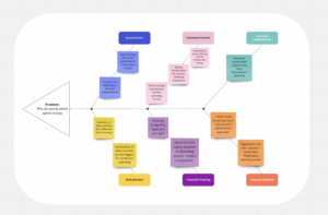
From our fishbone exercise, we were able to sort our data points into influence categories. From this, we found that the following factors strongly influenced young adults: Social, Emotional, Financial Independence, Daily Routine, Financial Tracking, Payment Methods. Social and emotional factors go hand-in-hand, as we found that young adults are likelier to spend money if they’re out having fun with friends, but these can also be separate from each other.

The affinity mapping unveiled several crucial aspects of our subject spending patterns. We found substantial portion of people’s expenditures is directed towards food. Furthermore, social influence is a powerful force that shapes spending decisions, as individuals often tend to follow the lead of their friends and partners.
We discovered that there was a need for straightforward and uncomplicated approaches to financial tracking that could help individuals manage their finances effectively and avoid the stress and emotional duress associated with budgeting. We used this theme to guide the rest of our ideation processes.
Find a more detailed description of our synthesis process, analysis and findings here.
Solution Finding
Intervention Study
The goal of our intervention study is to validate the effectiveness of helping users gain more understanding of daily spending habits through a small task. We brainstormed many different intervention ideas including sending simple, moderately intrusive reminders, buying every participant a bag of candy and letting them eat a candy every time they make a spending, etc. We hoped to make this study easy-to-implement and fun, thus we finally settled on the following approach.
Participants: we recruited five participants aged between 18-25 who are either college students or new grads who just start working. Two of them were participants from our baseline study.
Hypothesis: sending a selfie/emoji after making a purchase could make the users more aware of their financial habits, and force them to reflect on their emotions related to certain purchases.
Methodology: we asked the participants to take a selfie/send a emoji that represents their feeling every time they buy something and contacted the participants through text messages. Throughout the week, they send a selfie/emoji to the contact whenever they make a purchase. After the study, we collected and analyzed the photos/emojis and also did a brief post-study interview with all participants where we asked (1) Did this intervention change their spending behavior? (2) Did this intervention help them become more aware of where their money go? (3) Did they find anything surprising through the study?
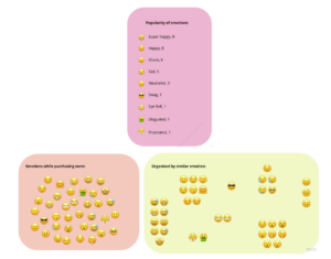
Synthesis & Insights: Although the participants reported that this intervention did not significantly changetheir spending habits, most of them mentioned that the process did remind them of their previous spending and made them more aware of how many times they spent money in a day. Many of them were surprised at the number of times they spend money when looking at the selfies/emojis they send by the end of a day. This reminds us of the importance of awareness. Even if we have a rough idea of how much we’re spending, we may not be aware of how many times we spend money in a day or week. Taking pictures or using emojis to track spending can help us become more aware of our spending habits and help us make better financial decisions. Below is a graph where we aggregate all the “emotions” about spendings that were sent by our participants (for participants who spend selfies, we transformed that into an emoji based on the facial expression). We can see although most of the emojis are positive, nearly 40% emojis are slightly negative (shock, sad, frustrated, etc) and through ourfollow-up conversations with the participants, we learned that these emotions often came from unexpected spendings and we noticed that the number of negative emojis coming from unexpected spendings tend to go down throughout the week. As a result, we think this study also highlights the value of emotionally budgeting. While it’s important to have a budget and track our spending, we can also benefit from taking a more flexible approach that allows for unexpected expenses. By adjusting our spending based on informed intuition, users can make better financial decisions and avoid overspending.
Design architecture
Based on our previous research on gamification, we decided to make a gamified personal finance app where we use a anthropomorphic representation of continuous login to provide motivation for users. As long as the users remember to log their spendings on our app, their “virtual pet” will stay healthy. We also decided to provide the option to take photos/select emojis when users log their spendings since we found this effective in the intervention study.
Bubble Map:
We were able to split our app into 3 large sections:
- Settings: This section is intended to provide the users with maximum customizability in terms of their goals, notification preferences and pet and privacy preferences. Do they want a publicly visible pet? Who are their friends on the app? What kind of pet is displayed on tier homepage?
- Logging: This is where we provide the user with the ability to take pictures and classify each picture by category of spending. They can also provide information about the amount and how the purchase makes them feel if they choose to.
- Pet Health: This section shows the user the status of their pet, the pet’s ‘health’ in terms of their personal goals as well as the status of their friends’ pets.

System path:
Our system path models how a new grad software engineer might navigate the app if they were to go through it a month or so after getting set up on the app. The center of the path is the homepage through which the user starts logging an expense. The map emulates the user using each feature in tandem with others as well as independently, if they choose to occasionally check-in on their friends or perform other such basic functions.
Through the bubble map and system path diagrams, we learned how to decompose functionalities of our app and had a better understanding of how we want the users to interact with it. We were able to order different functionalities of the app based on priority and knew better what to pay more attention on in later design process, which is the most helpful takeaway.
Assumption mapping & testing
We made multiple assumptions and mapped them on the plot below based on their importance and absence of evidence. Some important assumptions have been tested in our baseline study and intervention study or supported by research papers we read. For the assumption tests, we decided to test two assumptions from the Important – No Evidence quadrant.
Hypothesis:
- Assumption 1: WBT users will want to return to the app consistently because of anthropomorphic features.
- Assumption 2: WBT our approach will create a positive experience for users (not creating stress/anxiety).

Test:
We recruited 5 participants (4 of them participated our intervention study) and asked them send us “emotion” photos/emojis like they did in the intervention study throughout a day, and we texted them back the status of their “virtual cat” based on their “streaks” (e.g. “your cat is doing well! Keep going!”).
Measure:
At the end of the day, we asked them basic questions about the feelings that the pets and their streaks evoked. Also, we let the users quantitatively choose from a scale from 1-5 on how motivated they feel to text us their spendings and how anxious they are about fostering this “virtual pet”. We aggregated the data by average the motivation score and anxiety score from all participants
Criteria & Results:
All participants indicate positive attitudes and create motivation towards this gamified approach. An average score of motivation is 4.2 and and average score of anxiety is 1.4.
Insights:
Generally our test results validated our hypothesis given participants’ positive responses, high motivation score and low anxiety score. Besides, We also made some side insights from this tests as well. Some participants verbalized that “this [exercise] gave him the feeling that we are encouraging him to spend more money”, since by logging more spending he got more response from the pet. From that we learned that there needs to be a clear distinction between the pet being praise for spending and the pet being encouragement for awareness. Therefore, we will develop a clear input-pet reaction pipeline in the app that communicates to the user that the goal is awareness and logging, not spending more money. Even if the users make no spending a day, as long as they come back and log “no spendings today” their pet will stay health. And there will be no linear relationship between the number of spendings the users log and the pet’s level of well-being.
What’s left?
There are still a few untested assumptions, such as “WBT users will want to be alerted when they forget to log expenses”, and “WBT users will be motivated to come back to the app if nudged by friends”, etc. If time permits, we would love to test them to further validate our approach.
Building a Solution
From Wireflows to Sketchy Screens
Before creating our prototype, we used bubble and system maps to help inform the different screens needed in our wireflows. From there, we made four wireflows: logging spendings, pet health, settings, and statistics. Feel free to reference our Architectural Design of the Solution blog post.
Our synthesis process involved drawing a user story map to narrow down which screens to prioritize for our MVP. We made sure to encompass a basic screen that would assure the user both tracking visibility and social accountability as well as the aspects of gamification that we intended to incorporate into the system.
Using this map we were then able to map the basic functions needed to create a rounded MVP (below) that enabled the features that we determined to be priorities. We wanted to ensure that the MVP was delivering on the 2 main themes we wanted to tackle: simplicity and accountability, through gamification and social interaction as well as empathy-based accountability and encouragement to track.

The happy path we wanted to focus on encompassed basic interactions that further informed our wireflows. We wanted to show a high level of customizability as well as simplicity in our wireflows to enable users to set and track their own personal goals and evaluation metrics. Moreover, we wanted to prioritize nodes in the system map that were closer to the ‘Homepage’ to really flesh out features that would constitute larger chunks of the time spent on the app.
Next, we worked on our sketchy screens to capture more of the UI specifics. This is where we really honed down the “sketchy” animal aesthetic and specifics of the buttons and components. Below you can see some of the screens mocked up based on the wireflow. For a more detailed description, check out our Sketchy Screens assignment. Our app has many aspects to it, so we wanted our UI to be as clean and simple as possible.


Branding — Mood Boards & Style Tiles
As our app is geared towards college-aged adults, we want it to appear youthful and exciting. We want to evoke feelings of comfort, invitation, but want to make sure it keeps users interested. 
Our final selected colors are vibrant, but not shocking. This is because we also need the app to appear comfortable and inviting, as users need to feel secure in giving us even moderate amounts of financial data. We’ve chosen icons consistent with many of the apps with which young people will be familiar – minimalist, black outlines, white/neutral fill, rounded/no sharp edges, etc. Our fonts are also commonly used across modern apps, lending that same sense of familiarity and security to users. Check out more about this process with our Mood Boards and Style Tile.

Usability Testing
During our user test, we wanted our participants to complete three main tasks: sign up for the app, log a purchase, and change their pet into a dog. To see our script, check out our script.
During our testing we found amazing key insights for the users and TAs. Our biggest 3 issues were a need for onboarding, clarification on budget entry, and a clearer connection between login purchase and pet satisfaction. There were many other incremental changes made based on the usability results, but for this report we will focus on these three.
The need for an onboarding flow came from a few key bits of user feedback: need for an introduction to the concept of a pet, how this pet is related to one’s finance flow, and how the different navigation symbols relate to these key themes. Fixing these issues was relatively intuitive, and we added an onboarding flow any time a user registers or logs into their account.
Next, we fixed the budget entry flow. We got significant feedback that our logging flow was confusing for we did not have sample entries in the flow. To fix this, we added real values to the drop down category input along with the description. Along with this, we changed the amount input from a slider bar to text input.
Lastly, we made sure there was a clear linkage between user input and pet benefits. To do so, after the user logs a purchase, we make the flow show what new toy the pet would get. This way, the users can better understand the incentive portion of the app.
If we were to continue to move forward with this app, we would continue to add more features to the pet centered screens. In a full functioning version of this app, users could better customize their pets along with playing with their pets toys in the playground. We would want this aspect to be much more animated, and truly feel like a gamified aspect.
Prototype:
Our final clickable prototype can be found here.
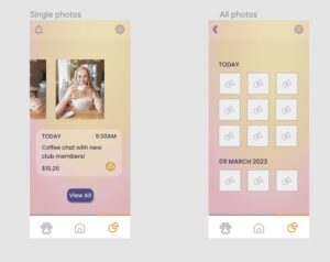
One main flow is the ability to log spending. Early drafts included just the important parts: navigating to the flow, taking a photo and filling in the information. This was one of the main behavior-changing mechanisms of the app, so it was important to implement in the early stages of the prototype.
We also implemented the ability to browse previous logs early on:
Another key flow was the ability to see your pet’s status and interact with the pets of your friends for the accountability aspect. This flow stayed pretty close to its original drafts, as can be seen by the draft photo below in comparison to our final product. This flow was also one of our most important behavior-change mechanisms, as it introduced an element of gamification and social accountability that would help users stay on track and engaged with the product.
We also implemented some basic settings and signup/login flows in order to make the app feel more fleshed-out.

Ethics
Our app incorporates quite a bit of social manipulation and nudging in order to help users achieve the behavior change they want. We decided to be as up-front about these tactics as possible, to the extent that we even used the term “nudge” as the term for what a user might do to remind their friends about their goals. It’s very clear from the get-go that using the “pet playground” is a social accountability tool, and users have to opt-in to using it by making friends to begin with.
We also use a rewards system in order to better gamify the experience and have something that users can work towards. While the behavior that we’re trying to change can be rewarding in and of itself, those rewards take time to manifest, and so we help with the desire for instant gratification by providing health and happiness boosts to the pet as well as little toys that the pet can play with. Since the behavior itself is one that any user has to choose to want to change, and since the user has to additionally recognize that waiting for the behavior to be its own reward doesn’t work for them personally, we were less concerned with the ethical ramifications of instituting this rewards system.
There are also some minor privacy concerns with this app, as there are with any app that asks for personal information (especially related to finances). To this end, we decided to make all information for a log completely optional. Photos, amounts, categories, and goals can all be skipped. Our studies showed that the most important way to get this particular behavior to change was to interrupt habitual spending but introducing a new activity that requires some awareness at the time of the purchase, and this can be achieved by simply logging into the app and recording that a purchase has been made. Of course, if a user wanted to add more information, they could. This could help them reflect on their past behaviors. However, the app can be used without uploading any personal information at all.
Financial health is not a monolith, and people who grew up in different contexts will have different approaches to how they handle their money. Many budgeting apps overlook this, and introduce features that can feel judgmental or invasive. By moving the goalposts from managing a budget to simply being aware of spending, we created a space that can work for everyone, no matter their circumstances. Users who want to be more private can opt out of adding extra information, and users who want to use this app as a diary can do that as well – it’s all up to them. To us, this feels like a step in the right direction – towards non-judgmental and inclusive financial awareness for anyone who wants it.
Conclusion
Our team learned a lot throughout the process of creating FO$TER. One of the biggest takeaways was the benefits of the iterative design process. By utilizing HCI principles, design mappings, sketches, and wireframes, we were able to constantly iterate and improve upon our initial ideas. This approach allowed us to identify and address issues and concerns early on in the design process, ultimately resulting in a more refined and effective final product.
If we had more time to continue working on FO$TER, we would love to investigate further the benefits of anthropomorphizing one’s financial habits. We believe that this approach could have significant potential for promoting behavior change and increasing financial awareness among young adults. By exploring this concept further, we could gain a deeper understanding of how users interact with FO$TER and how to further optimize its effectiveness.
Moving forward, our team will approach our next behavior design effort with a similar iterative design process. We recognize the value in constantly testing and refining our ideas, incorporating user feedback, and making improvements to our designs as needed. By following this approach, we aim to create effective and impactful products that meet the needs and preferences of our target users.
Thank you for a great quarter, and we hope you have enjoyed FO$TER!


