
After user testing on our figma, we were able to gather key feedback on how to make our application better for the user. Below, we have outlined positive features that the users pointed out, allowed with suggestions organized by the different screens. The symbols T, M, S represent the ranking of these issues as servere, moderate, and trivial.
Positive Features:
- User 1 described the app as “Mellow and Interesting”
- User 2 described the app as “Fun and Youthful”
- User 1 & 2 said they loved the colors
Feature Changes:
- REGISTRATION
- Change next arrow to say Login (T)
- -ONBOARDING SCREENS
- There is want for an introduction to the idea of your pet, its connection to your finances, and your friends (S)
- Both users expressed a confusion about the link between the pet and the financial awareness portion of the app (S)
- NAVIGATION BAR
- Logos at the bottom of the screen are misleading (S)
- Both users were confused about what the logos represented, found them not intuitive (S)
- HOMEPAGE
- Change “pet stats” to a more descriptive term (T)
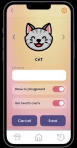
- PET PAGE
- Change ring stats to be more clear, and related to the pet (M)
- Want a more clear flow of an action, and how it benefits your pet (M)
- Want a number streak instead of percentage “7 day streak” (M)
- What does feeding your pet do? How is this different from benefits from logging a purchase? (S)
- SUBMITTING PURCHASE
- Wants a drop down for more emotions (T)
- Want amount slider to just be number input (M)
- If logging purchase a key part of app, that should be one of the key navigation buttons (M)
- If we can only can see history of purchases from the submission flow, that disincentivizes the photo part of the app, make this on the main screen somehow (M)


Comments
Comments are closed.