In our last post, we shared our clickable prototype for Shift, which helps chronic online shoppers reduce unnecessary and impulsive online spending. We ran some usability tests and uncovered the following core problems:
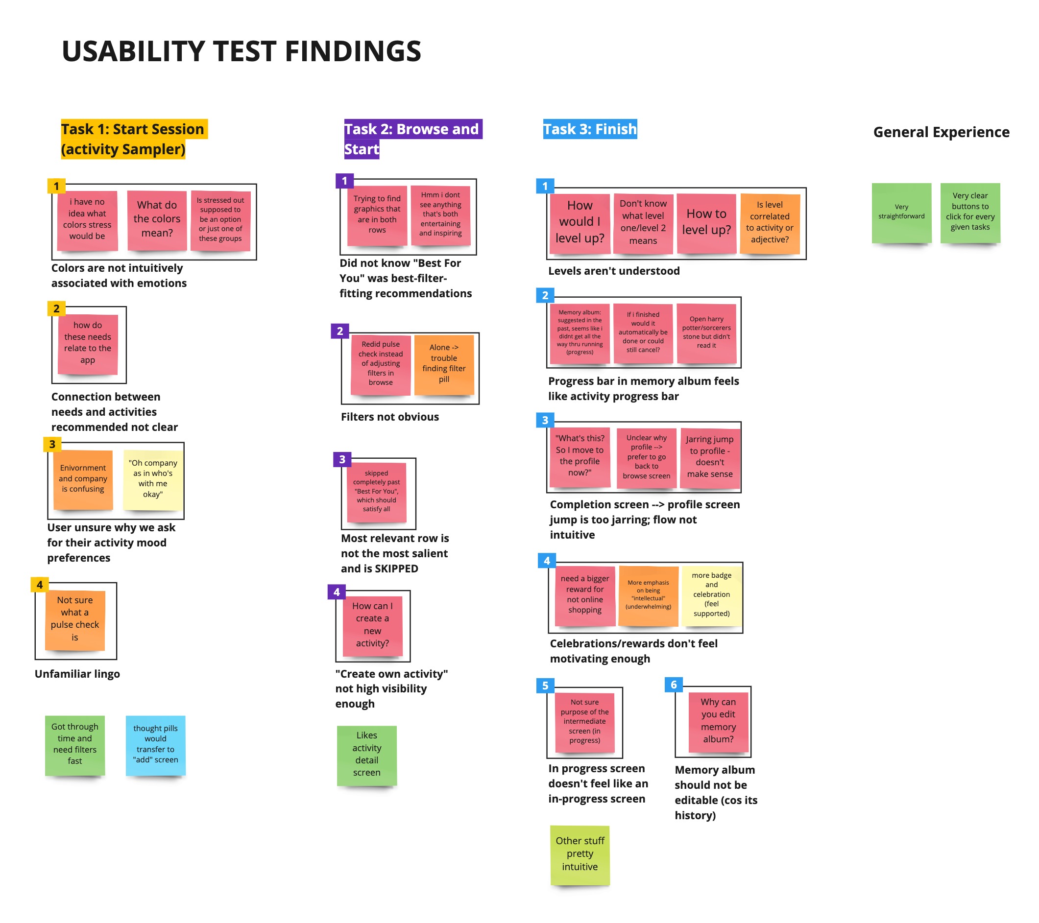
Top issues by task + plan of action
We’ve brainstormed corresponding solutions and are currently implementing them!
Task 1: Introspection + activity sampler
- Problem 1: Emotion family colors are not intuitive and don’t closely relate to the emotions
- Solution: Replace colors with illustrations that capture emotion groups
- Problem 2: Unclear if users select an individual emotion or the entire group
- Solution: Change the text color of individual emotions to dark gray, so it differs from the primary orange button that is pressable
- Problem 3: It is not clear what the inputted needs later influence
- Solution: Unify needs language/options across Pulse and Browse pages, add “Working on recommendations” loading screen before recommendations call out user inputs (e.g., emotion, needs, duration, environment, company)
Task 2: Browse activities
- Problem 4: It is not clear that the “Best For You” section is the output of the introspection quiz and that they auto-populate the filters on the browse page. In addition, both our participants skipped right past the first row (which is supposed to be the most relevant!)
- Solution: (1) Venn diagram imagery in the tray header, (2) Updated tray title to “Activities that fulfill All your needs,” (3) Increased tray title size for this row and decreased it for other rows.’
- Problem 5: The pill filters are not highly visible; most users scrolled right past despite requests to modify them during usability task
- Solution: Experiment with (1) spreading pills across two rows; (2) making pill color primary instead of neutral to bring emphasis to them
Task 3: Memory start and complete an activity
- Problem 6: Users were unsure of the purpose of the intermediate in-progress screen, specifically if it was necessary (e.g., is this screen playing the podcast?) and why there was a timer (e.g., could they jog for more than allocated time?)
- Solution: Clarify this point by changing the title to “You have selected to do [X activity]! Time committed: 15 min”
- Problem 7: The jump between the activity in-progress page and profile was jarring, as users desired a more salient reward for successfully stopping online shopping
- Solution: To make the connection clearer, we can add an animation of the identity (e.g., “You are an Intellectual!”) on the congratulatory page to the identity title in “Levels.”
Task 4: View MemoryAlbum
- Problem 8: Level indicators were understood as activity progress indicators (i.e., how far into the activity one is)
- Solution: Instead of “Memory Album,” call it “Levels.” Under this section, there should be a different tile for each identity type (e.g., “Intellectual”). To distinguish activities from identity levels (where multiple activities can contribute to a single identity), each identity should have an icon different from the activity tiles. There should also be a progress bar under each identity tile to show how close the user is to leveling up, and the labels should clearly indicate this.
- Problem 9: Users did not intuit levels and were confused by their relation to specific activities
- Solution: In the Levels section, under each identity tile (e.g., “Intellectual”), there should also be suggestions for how to reach the next level (e.g., what activities the user could do level up from an “Intellectual” to a “Scholar”).