
System Path
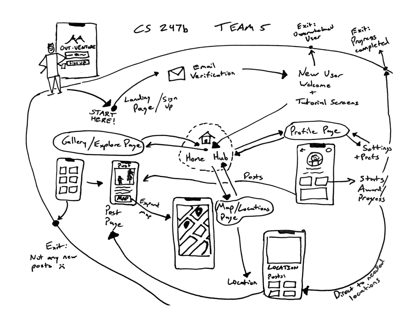
During the creation and refinement of our system path, an important characteristic that we discovered was how interconnected our application was going to be. There are many two-way connections between different pages of the application, which is a crucial piece to ensuring there is smooth and simple navigation throughout the app.
We also settled on 3 main areas in which users will use our app:
- Gallery/Explore page
- This page will be the hub for users to share their outdoor adventures as well as be inspired by others
- Profile page
- This page will be used to track personal stats, view past adventures, and control settings
- Map/Location Page
- This page will show locations users can visit and check in at during the day in order to gain rewards
During the process we also considered possible frustration/exit points which could lead users to not being engaged and leaving the app. There are others we thought of, but we highlighted a few important ones in the map like a lack of new posts from other users and completing progress.
Bubble Map
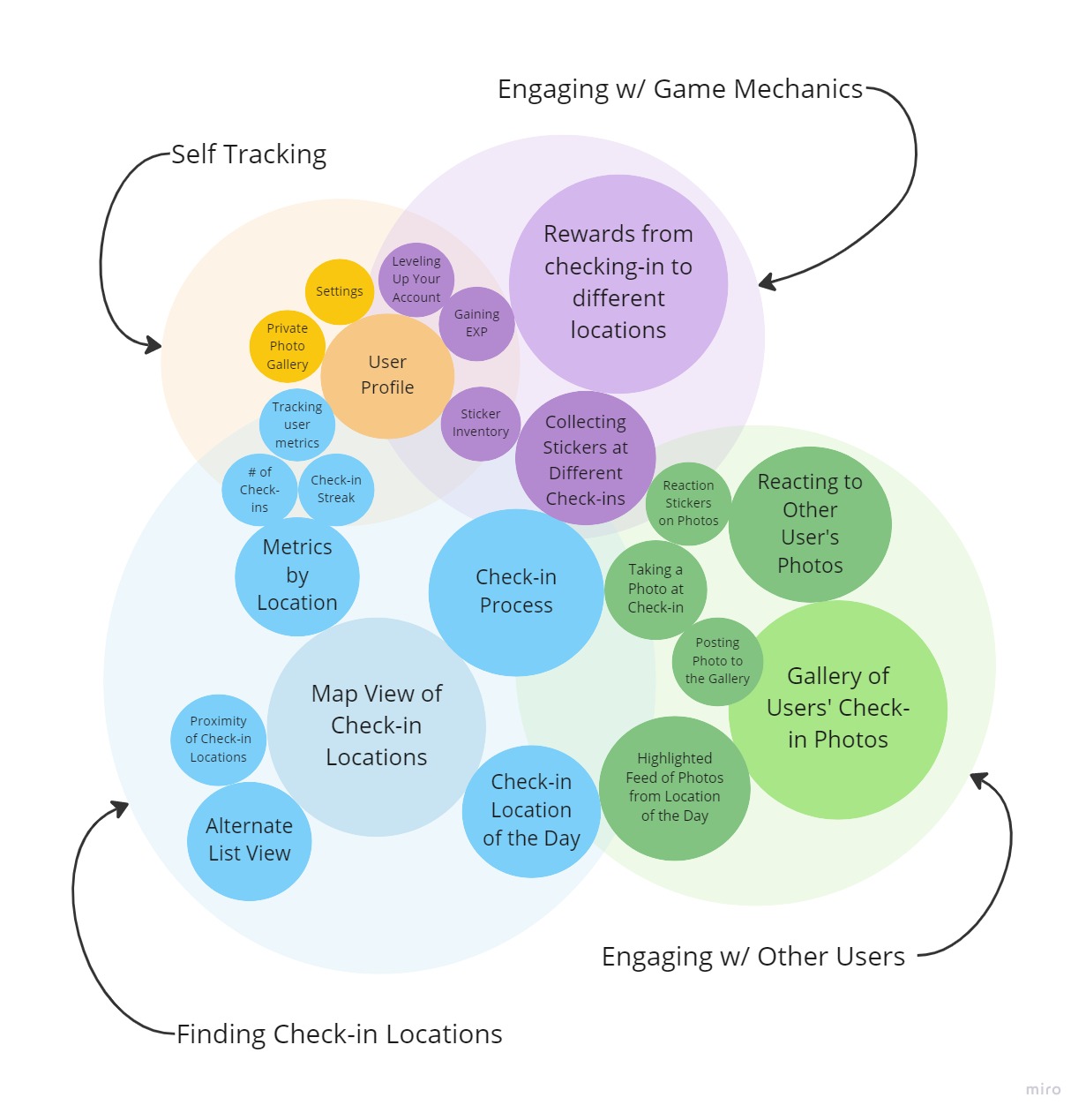
Note: The size of a bubble corresponds to the relative importance of that feature. The spacing between bubbles conveys the relatedness of different features.
Our team aimed to complete a bubble map focused on four core components of our app: finding check-in locations, engaging with social components, interaction with gamified elements, and self-tracking of outside activity. Let’s walk through the map starting with the largest blue area which constitutes the check-in locations. First, our main sub-features here include having a map view for all the locations, having a location of the day, and a check-in process that includes social engagement and gamification. Moving into the engaging with other users bubble, we see that the check in location of the day has a social component as people will upload a picture to a public gallery for people to see. The main components in this bubble is having this gallery and the reactions to other people’s photos which may help boost engagement.
Looking at the gamification bubble, we see that collecting stickers at check-in overlaps with the past two bubbles since people can display their stickers for other people to see and it rewards at check-in. The main subfeatures are different rewards at different locations, having a sticker inventory, and gaining exp to reward positive feedback loops of behavior. Lastly, the self-progress bubble has features of having a private photo gallery to see all the places you checked in and a user profile that tracks exp, areas that the user checked in, and other metrics like check in streaks (consecutive days a person has stopped by a check-in location). With the bubble map, we can walk through the important key features of app and understand how they overlap with each other in a visual hierarchy.
Wireflows by Functionalities
Functionality 1: Finding check-in spots to go to
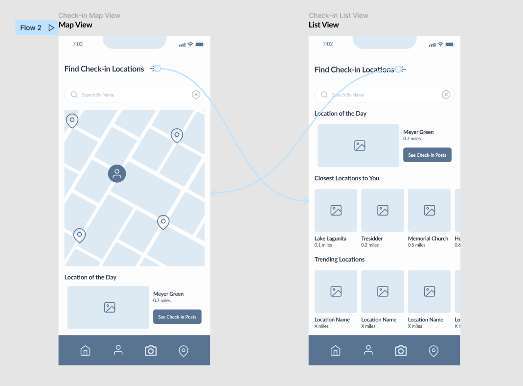
Users can find check-in locations in two ways. There is a map view which allows the user to see where check-in locations are relative to them. There is also a list view that categorizes check-in locations in other ways. For example, users can see locations that are trending among other users. Both views highlight a “location of the day” as a means of encouraging the user to venture somewhere new.
Functionality 2: Checking-in & getting a reward
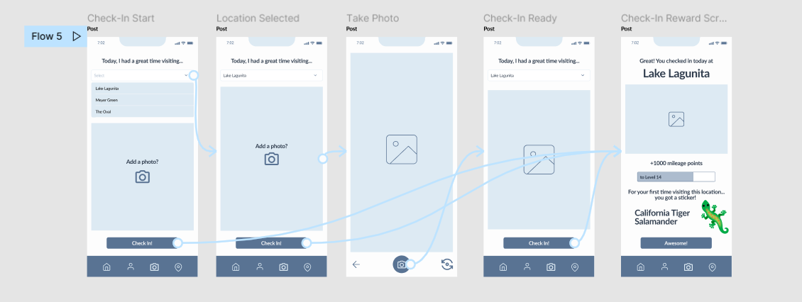
Once they’ve reached a check-in location, users can check-in by taking a photo. As a reward, they’ll earn a special sticker that is related to the check-in location.
Functionality 3: Looking at other people’s check-in photos
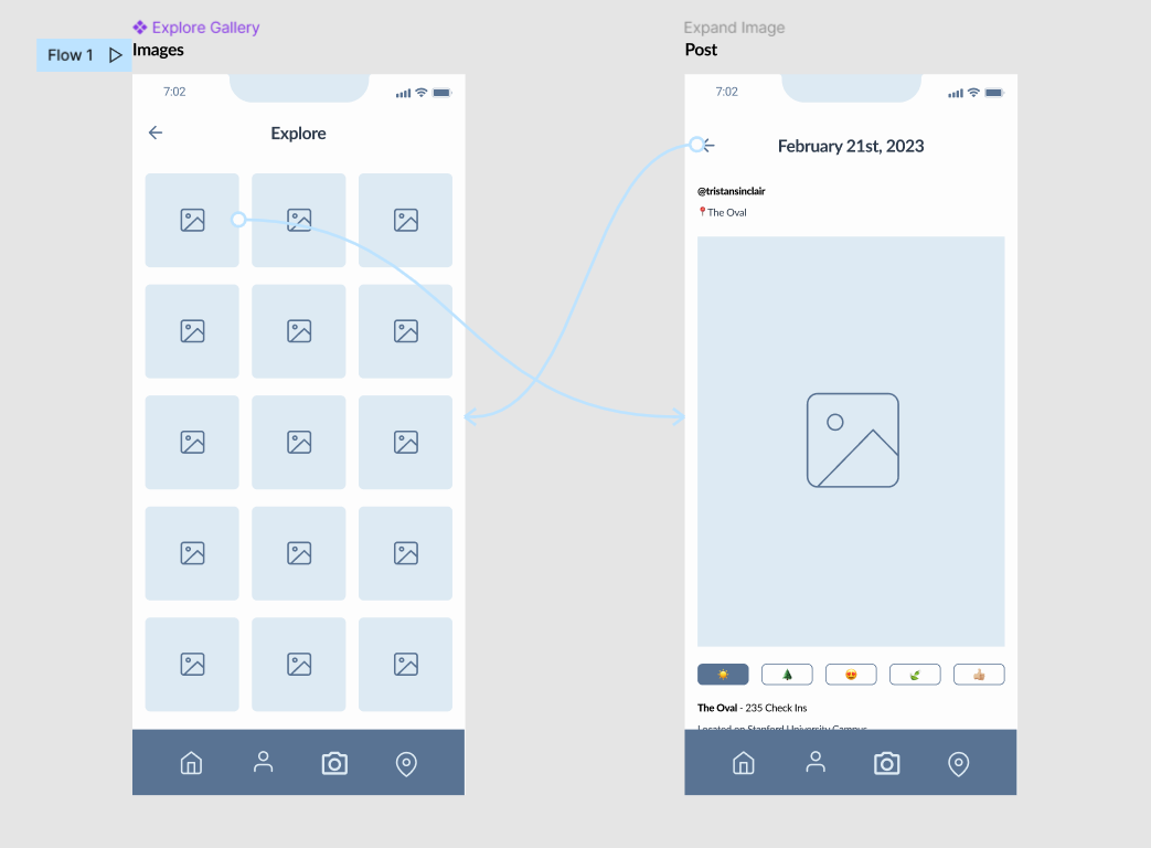
The gallery allows users to see check-in photos that other users have posted. They can even react with a handful of emojis if a specific photo catches their attention.
Functionality 4: Checking User Profile
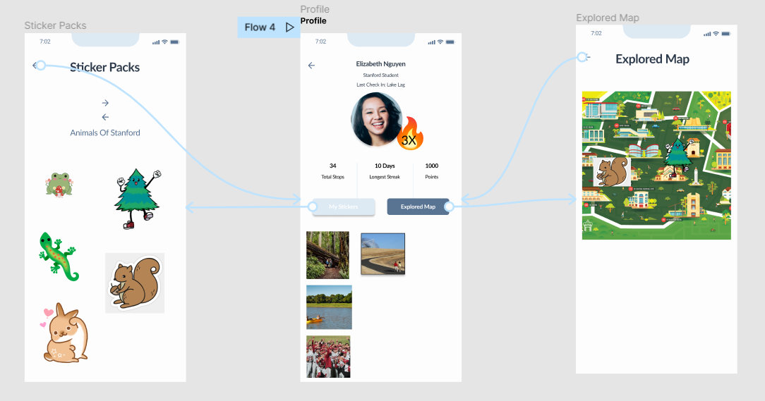
The user profile allows a user to track their engagement with the app through the stickers they have collected, the places they have visited, and the photos they have taken.
Functionality 5: Onboarding
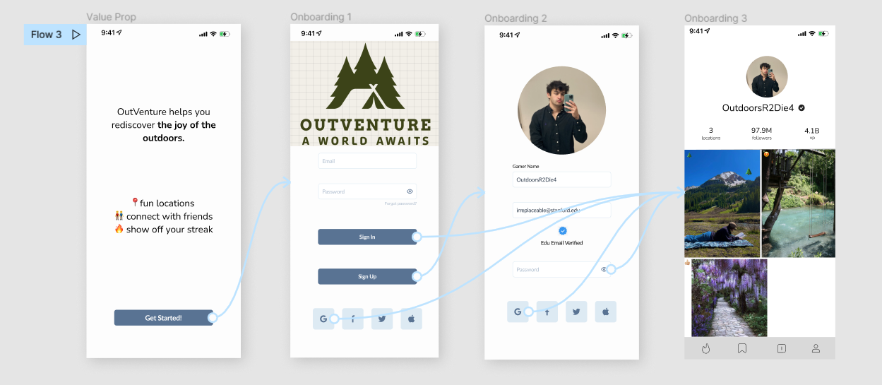
The onboarding flow abstracts away unnecessary user info and emphasizes having fun with the gaming interface. It offers a quick value proposition to explain the app.
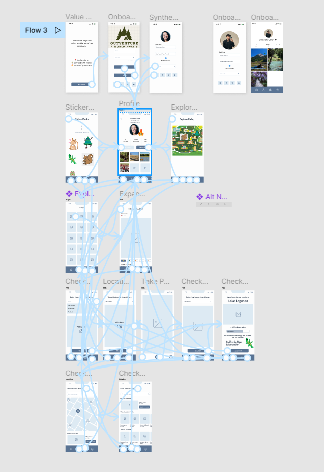
Cohesive Wireflow
Look at the cohesive wireflow in more detail here!
Final Design Decisions
Gamification slant over social-networking
Although the user has a profile that displays their images, the focus is far from about likes, comments, and engagement. Users can only comment from a selected emoji selection. Only offering a limited scope of social engagement keeps the application fun and shifts the emphasis to XP, having fun getting outside, and gaining a spatial awareness of your surroundings.
Privacy & Community Standards
During onboarding, the user will authenticate their school email. However, we do not gather unnecessary information that the Stanford email can act as a proxy for, not collecting age, gender, etc. that are not relevant to the game and mission. Additionally, the explore page does not feature likes, but instead a black-box recommendation algorithm not based on surface engagement, serving to our mission of shifting away from the upliftment of numerical engagement.
Google Maps / Pokemon Go Map Visualization
Using a spatial visualization helps users conceptualize where the check-in location is and helps them choose the most approachable one. We also found the map to be an engaging visual approach for our inherently location-based application.
Profile and Self-Tracking
On the user profile, the user has a private gallery of their photos from their check-ins and a bar showcasing some user stats like streak length, number of completed check-ins, and exp obtained from the check-ins. In addition, they can look at a separate page that showcases the stickers that they have collected and then a map which showcases where they got each sticker.


