
Each team member made a sketchy screens for an important screen for the task flow they previously did! Then each member wrote feedback for all other sketchy screens. Here’s the results.
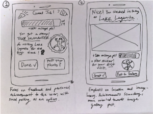
Description: These are two potential layouts for the finishing check-in screen, as there are several elements we should convey to the user. The first version focuses on affirming the user and showing their individual progress/achievements, secondarily giving the option to post their photo to the greater image gallery. The second version focuses on highlighting the location and photo they took, affirming the users task and providing a sort of preview to what posting the image would look like. Achievements are added as a more minor bonus underneath, but the prospect of social posting is stronger.
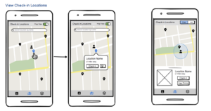
Description: Here, we explored two different ways (left and right) of presenting information on the map page where users can view nearby check-in locations. The left screens provide a more minimalistic map that only shows the positions of the user and check-in locations by default. Users can seek out more information about a particular check-in location by clicking on the corresponding marker. We thought this approach might help reduce clutter on the map. The right option has more information immediately available as a portion of the screen is dedicated to displaying the information of the closest check-in location by default. What we liked about this option was that it allowed us to include an image of the check-in location, perhaps providing visual motivation to users who want to know what is waiting for them if they go there. Additionally, we liked that the blue circle around the user icon was a way to indicate how close a user needed to get to a location in order to be able to check-in.

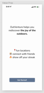
Description: These are two potential explorations of a sign-on screen. In the left design, I prioritized the branding of our app – Outventure. However, on the right, I minimized the branding and focused on the actionable items of the screen, aka typing in your email and password. I found it difficult to take a “sketchy” approach to this screen, as I definitely do not want to overwhelm my user, but the screen feels bland and boring. However, I would plan to put this after a value prop screen that would excite the user like below:
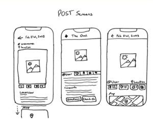
Description: These are 3 potential layouts for the “Post” screen, which will be the full sized display of a user’s post or check-in. We wanted to highlight a few central features which were: the photo itself, the location or the check-in spot, and the interaction/reaction buttons. We want users to see a post and be drawn to the location to check in themselves. Because of this, we wanted to emphasize the photo and then have the location be clickable in order to help send users that way.

Description: These screens highlight the profile screen which includes a gallery of photos which the user took at each check-in spot, relevant stats on their scores, current profile photo and chosen sticker, and also a button to view their stickers/locations found on the map. With the sketchy screens, I wanted to experiment with the placement of the chosen profile sticker that gives a feel of customizability and encourages users to collect more stickers throughout their use of the app. In addition, I experimented with the layout of the user statistics and also the button that displays a map of collected stickers to show the progress of collecting stickers. Given the feedback from teammates, they appreciated the clean layout and the grid approach to the new screens.
Examples Of Feedback Implemented:
- “I really like the icons on the map, themed for Stanford. It’s cool to have those attention grabbers on the map.”
- “I like the grid approach to the stickers and photos, feels comfortable like instagram and easy to parse information.”
- “I love it feels comfortable, but maybe a bit too social media-oriented? We want to focus on gamification, but I really like it.”
- “I feel a bit overwhelmed by the density of the screen, but I believe that is a function of the sketchy screen approach. I like the right design!”


