
Here are our wireframes for our main task flows. We also decided on the name of our app: Talko!
1. User Onboarding
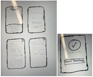
For the sketchy scenes for the onboarding, I tried to do a simplistic and intuitive design to garner information without being too overwhelming for the user. We only asked for information that is necessary when making an optimal match.
Two things that we were considering is the importance of getting a user profile, or would it be okay to stick to an animated icon for user profile.
2. Profile Swiping & Edit Profile
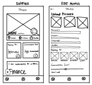
For the swiping interface, I attempted to utilize Gestalt’s principle to organize a profile’s descriptions using boxes to increase ease of reading. After conducting a competitive analysis of Hinge, we found that the “comment” function they implement would work in our case as well because we intend to encourage our users to start better conversations. The use of iconography to convey a profile’s basic info was used to minimize the amount of text we are using. The “edit profile” section allows users to input their data in an organized way, which will be converted into the “swiping” interface after they confirm their info. For the “Preparing for” part, I wanted to allow users to simply tap on which task they would like to prepare for rather than typing them manually (for efficiency), but also provided a custom box where they can suggest their own task. The commitment level is a slider so users can easily modify how committed they intend to be in practicing using this app.
3. Home Page and Messaging
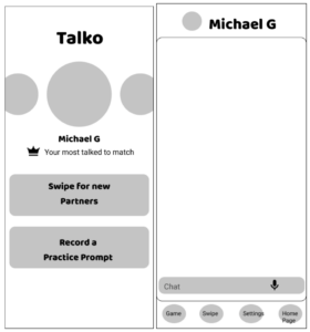
For the overview interface, I wanted to emphasize the aspect of the app about helping users cultivate relationships with long-term accountability partners. Therefore, the most obvious part of the overview page would be profile pictures of the user most-talked to matches. To accommodate for different types of users, I also presented easy-to-find options to swipe for new partners and record practice prompts by themselves. For the chatting interface, I decided to make it simplistic and intuitive. The four icons on the button bring users to different pages, and give users the option to send a speech game to connect to the match


