
For our sketchy screens, we each (Yesenia, Kimberly, Vinh, and Alonzo) made screens for different flows. We each tried to adhere to the 10 Usability Heuristics for User Interface Design linked below.
10 Usability Heuristics for User Interface Design.
Profile Creation
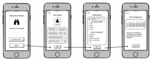
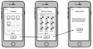
The first key flow users will engage with is the onboarding process, which includes profile creation. Users will first be given a chance to either create an account, which takes you through a personalized profile experience or sign in, which takes you straight to the next flow. The first page on the preferences have to do with basic information like name and photo. The second has to do with physical logistics, including location, distance radius, and transportation options. The third page has to do with temporal logistics, fourth with interests, fifth with social preferences, and lastly, with notification preferences. We based our design decisions off of Nielsen’s usability heuristics. First, we provide affordances for visibility of system status by having an active page dot carousel for the interests and add your friends page. Second, we allow for user control and freedom by having a back button to navigate backwards to edit responses. Third, we use recognition rather than recall by providing affordances for pre-set options or multiple choice input forms when possible rather than short-form/long form response. Lastly, we try to use minimalist aesthetic design and not crowd too much information on one page and rather separate out the buckets of information requested on different pages.
News Feed + Search
The first screen shown depicts the newsfeed. On the newsfeed, users can view others’ activity similar to one’s Facebook or Twitter feed, as one would expect, thus adhering to H2:Match between system and the real world. On the newsfeed, users can see user’s profile photos along with their usernames and their uploaded activities. At the top of the newsfeed is a search bar. When users tap on the search bar, they will be able to search through their friends and view their friend list.
Challenges + Logging
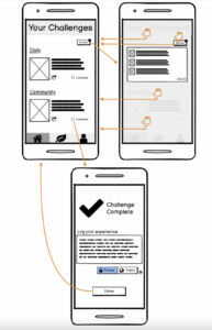
The primary screen that users will be greeted by when they open our app is their personalized challenges page. The bisected format of this screen aims to display information concisely while still giving equal importance to both the individual and social aspects of our application. For the “daily”, or individual, challenge, our user will be prompted to go outside with a challenge that is personalized to their interests. The community challenge is a weekly prompt that is given to a particular user and a subset of their “community”, or friends in the app. This screen also includes an invites button, which is used to access challenges that were sent to a user by others in their community. In line with our goal to establish clear distinctions and groupings of contexts in the app, the invites pop-out is designed to keep our user in the context of their challenges, and tapping anywhere outside of the pop-out quickly brings them back to their personalized challenges. The complete challenge checkbox, on the other hand, takes the user out of the context of their personal challenges and shows them the challenge completion screen. This screen is designed to make the user feel positively about their accomplishment. It also gives them the option to log their experience privately, such that their log will only be visible to them, or publicly, such that their log is posted to the community news feed (this distinction is detailed through the ‘more information’ button next to the public/private button bar). Once finished, the done button brings them back to their challenges screen.
Profile Screens
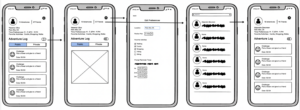
We didn’t include a bottom navigation bar in this wire flow yet because we haven’t gotten the chance to make it cohesive yet, but we plan to incorporate that in the future for easy navigation between parts of the app. At any rate, for the profile page we tried to adhere to the heuristic design principles. You may notice that the profile section is a mixture between instagram and venmo. It’s worth noting that we based this structure on instagram and venmo as they are very popular among young adults across geographical locations, so users would find this interface familiar and easier to navigate upon their first visit. This adheres to H2: Match between System and the Real World. The top part (Before Adventure Log) takes after the top portion of a user’s profile on instagram. Key differences include displaying general location the user spends time in, their time preferences to go outside, and their favorite activities. Additionally, where one would usually see the number of posts they’ve made on instagram, we have switched this for the number of adventures they’ve had. We also made the user’s friends list accessible from here, as it is on instagram.
For the bottom part, we based the user’s feed off of Venmo. Specifically, the feed tabs that say “public” and “private” are taken from Venmo. We adhered to H1: Visibility of System Status by indicating what tab the user is currently on by making that tab blue.
We also have a toggle switch to change the view of the feed. If someone presses on the switch they are taken to the second screen. The generic “X” block represents the monthly calendar view that the user will see, with this view the calendar will visualize how many days the people completed their challenge that month so far, which might encourage them to keep going outside. A trade off to this is that less information will be displayed within the calendar day’s block.
The third screen is a simple screen that allows the user to edit their preferences that they inputted during the onboarding process. This adheres to H3: User control and freedom.
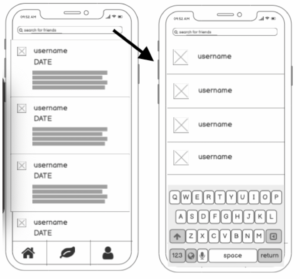
Next, the fourth screen is simply the user’s friend list. They can search for their friends here and click on their profiles. The fifth and last screen is a user’s friend’s profile. It is similar to the user’s profile, adhering to H4: Consistency and standards, except they can’t see their friend’s private log.


