
Mood Boards
Individual Mood Boards
Tyler
In my mood board I wanted to focus on the experiences we were trying to cultivate with our product: experiences of community, fellowship, and connection. I included a lot of images of social experiences and communal living experiences. I also emphasized intentional and reflective experiences, as our intervention encourages users to think more deeply about their social habits. From these images I pulled several colors that were reflective and energetic, and synthesized the energy of the images into several keywords. 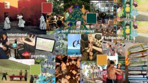
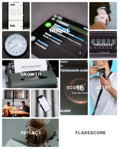
Vardhan
Justification: I chose to explore a clean aesthetic that reflects the life of a busy and successful person. By using blues and grays along with clean typography and lines, we get this sense of taste without making the interface the focus of the experience. We have a reflection on scoring, a daily routine, and nudges from devices to reflect a busy person’s focus on their day-to-day and how our solution could integrate into their lives, more as a background actor than a central piece.
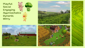
Katherine
Justification: I chose to explore the “farm” theme because it mirrors the playful, community-driven nature of our solution. A farm came to mind as a living ecosystem in which diverse contributors—animals, plants, and farmers—coexist and coordinate to sustain shared growth. This directly mirrors the social environment we are designing for, which is composed of multiple personas with unique behaviors, needs, and roles.
The green, plant-based visual language reinforces this metaphor. A green grass and landscape symbolizes growth and vitality — qualities we want our solution to embody. Just as plants thrive through care, balance, and regular interaction in their ecosystem, our product encourages collective progress and shared vibrancy. The farm setting allowed us to reflect complex character interactions while exploring our prototype themes of collaboration and growth.
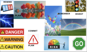
Sunny
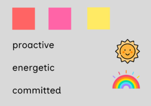
I chose bright colors because our intervention focus on alerting people that their texts/behaviors would lead to severe consequences and outcomes. For example, the red, orange, and yellow are aligned with the vibe of our intervention because they caution people against making rash decisions and plans without fully committing to them. Moreover, the bright colors in the score board and traffic light also symbolize an intervention strategy that asks people to pause and reflect before they proceed to agreeing on something that they would end up forgetting or regretting. The colors in the rainbow, butterfly, and the trees again echo the sentiment that people should be wary of what they say to other people and be as specific as possible about their plans.
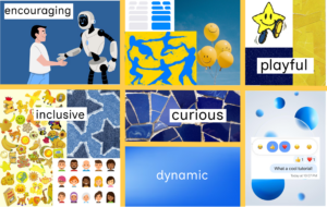
Collective Mood Board
Looking over our individual mood boards, we realized that we had each visually highlighted very different aspects of our solutions, so we got back together to make an entirely new collective mood board. We wanted to highlight the playfulness of our solution, since much of it hinges around a social “bot,” and we wanted to be specific about the personality and energy of our bot. Although our solution relies to a degree on nudging and pressure, we wanted to ensure that it was fundamentally encouraging in nature, promoting curiosity rather than punishment. We decided to anchor these choices in blue and yellow colors, and created the following mood board to capture them.
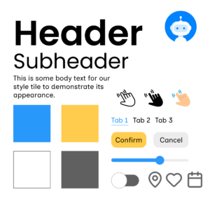
Style Tiles
Collective Style Tile
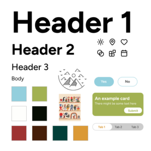
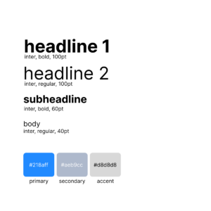
Individual Style Tiles
Tyler
Vardhan
Katherine
Sunny
Tyler Abernethy, Vardhan Agrawal, Katherine Sullivan, Sunny Yu. February 26, 2026. Mood Boards and Style Tiles.


