
ANTEATER: MOOD BOARD & STYLE TILE
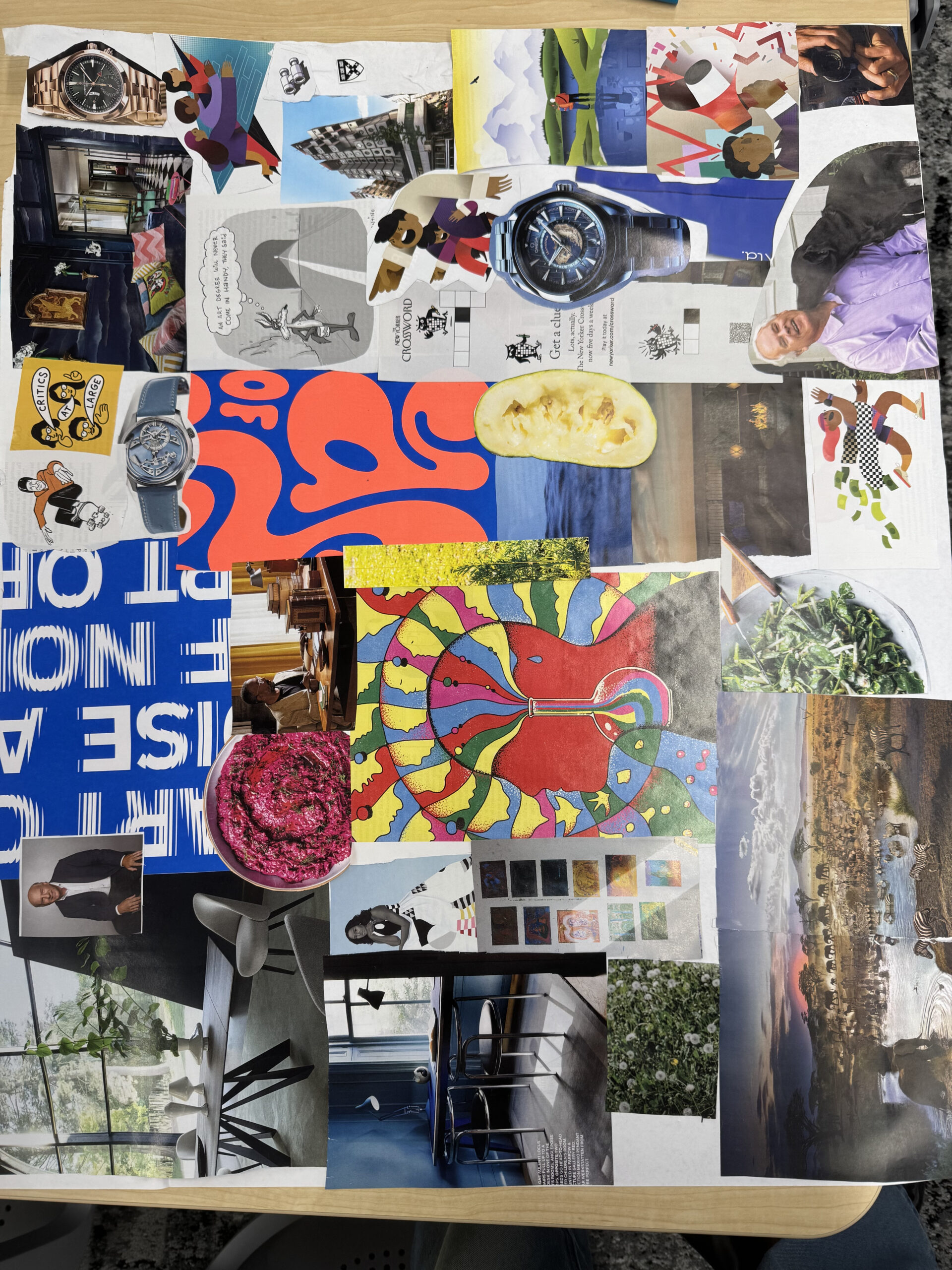
Our mood board conveys a playful, fun, and productive vibe through bright, lively images. It features visuals of people who appear engaged, successful, and productive, reinforcing our theme of productivity. While the board includes a variety of colors, blue is the most prominent. As a team, we chose blue because it evokes a sense of productivity while still maintaining a playful and inviting feel. Overall, we have many playful images and professional images that come together to set the mood for a Playful, Sleek, Straightforward, and Professional design.

Breaking down our Style Tile, the fonts we selected were Raleway Bold (Header/subheaders) and Nuninto (Body). These fonts were selected on the principle of emitting a playful, sleek, and professional vibe. Our color selection is a range of shades of blues. We have our main color as a bright blue to draw attention. In contrast, we have a lighter blue to be more fun. Likewise, we have a darker blue for potential subheaders, offer contrast from our bright blue, and evoke a professional feel. Lastly, we have a greyish tone for secondary buttons and black/white for all the words. This color scheme, we believe, best represents the essence of WeDo.



