
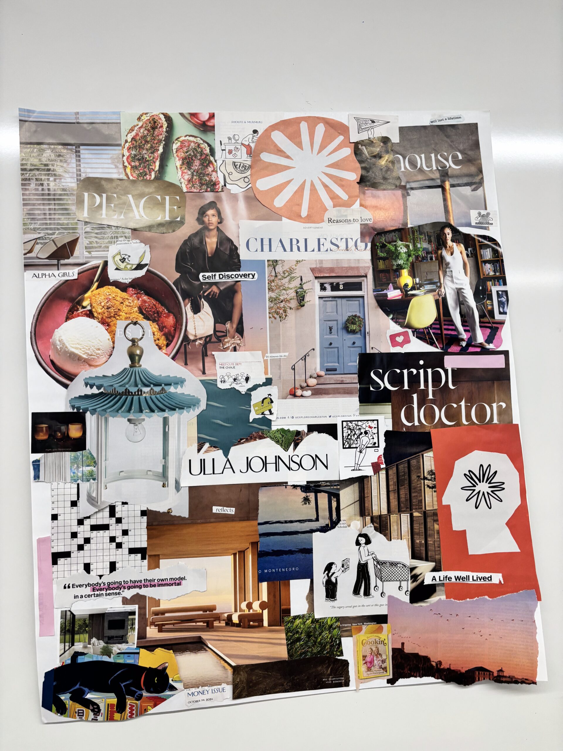
For our moodboard, we each selected images and text based off the collective words we decided on to describe our apps brand. Since our app is focused on creativity without actually consuming, and emphasizes sustainability and conscious purchases, we wanted something that was nice to look at but also didn’t encourage buying. Adjectives like “clean”, “welcoming”, and “aesthetic” came up in our brainstorm. In person form, our app would drink matcha lattes, recycle and compost, and hate Shein & Temu.
Our moodboard ended up containing a lot of clean, bright looking images, both in terms of color (bright and light pinks, blues, and beiges) and in terms of actual content (big rooms wit windows, fun lamps, etc.). We also added lots of fonts from publications like The New Yorker and The Atlantic, which we felt gave the correct brand sense that we wanted to convey. Smart, yet interesting and fun to look at. Not necessarily trying to grab your attention with clickbait- but with real content.
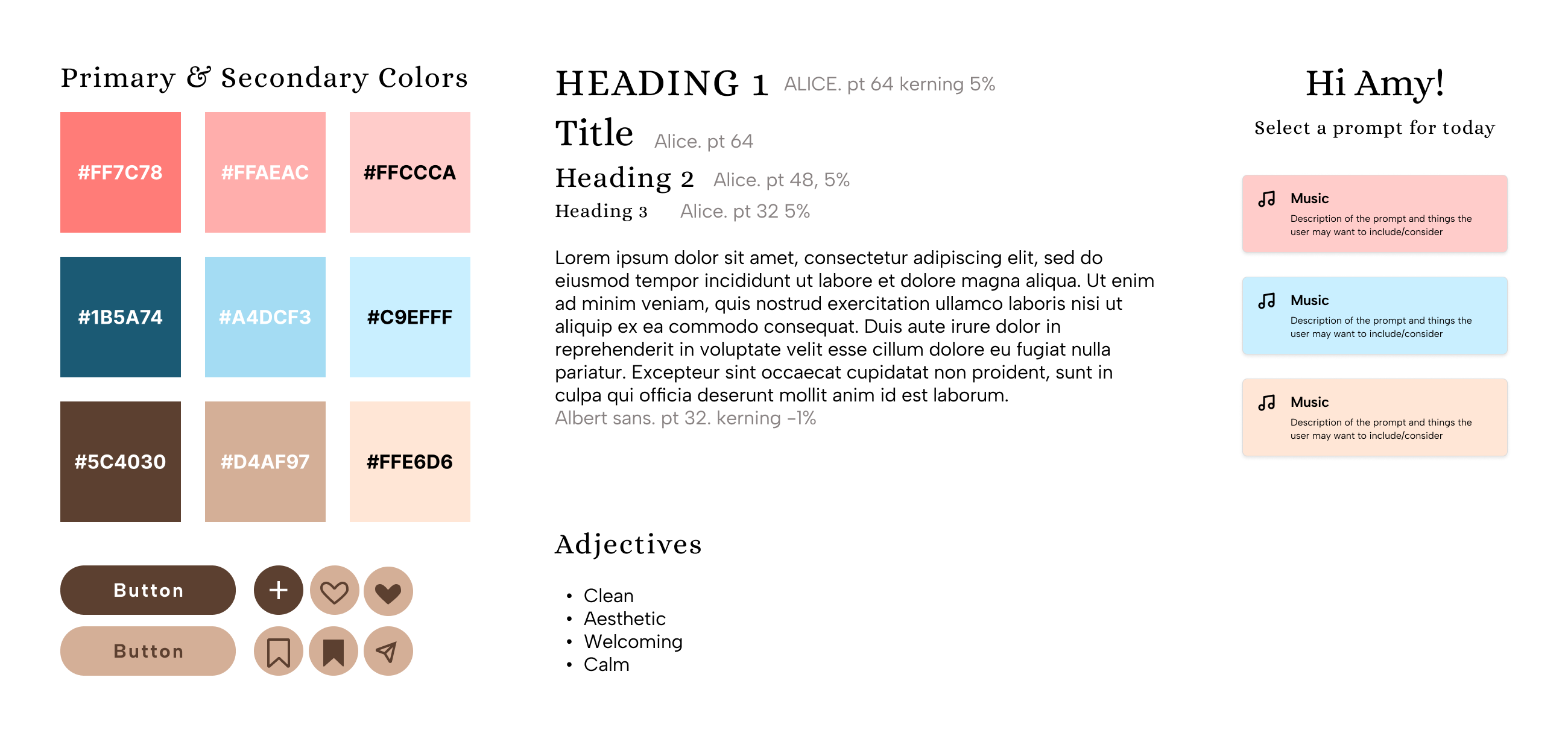
Throughout our style tile we focused on embodying the image of our brand through the values we formed during the “if your brand/app was a person” exercise in class—evident in our primary adjectives we selected for our design.
We synthesized the colors from our mood board, drawing out the browns, pinkish orange, and blues. To flesh out the palette, we created light, medium, and dark versions of each primary hue. We felt that the overall softer palette of colors would best create a calming and welcoming atmosphere for users.
For our fonts, we drew inspiration from text clippings we took from The Atlantic and The New Yorker, choosing a serif font for our titles and headers and a more readable sans serif font for our body text. We further elaborated on our text styles by creating multiple header types. The san serif font we chose as our body works to convey a clean aesthetic that our brand strives for while the header font
Utilizing all that we had formed for the style tile so far, we created sample components and a sample screen to ensure we were happy with the overall cohesion of the elements.


