
Vaish’s Moodboard
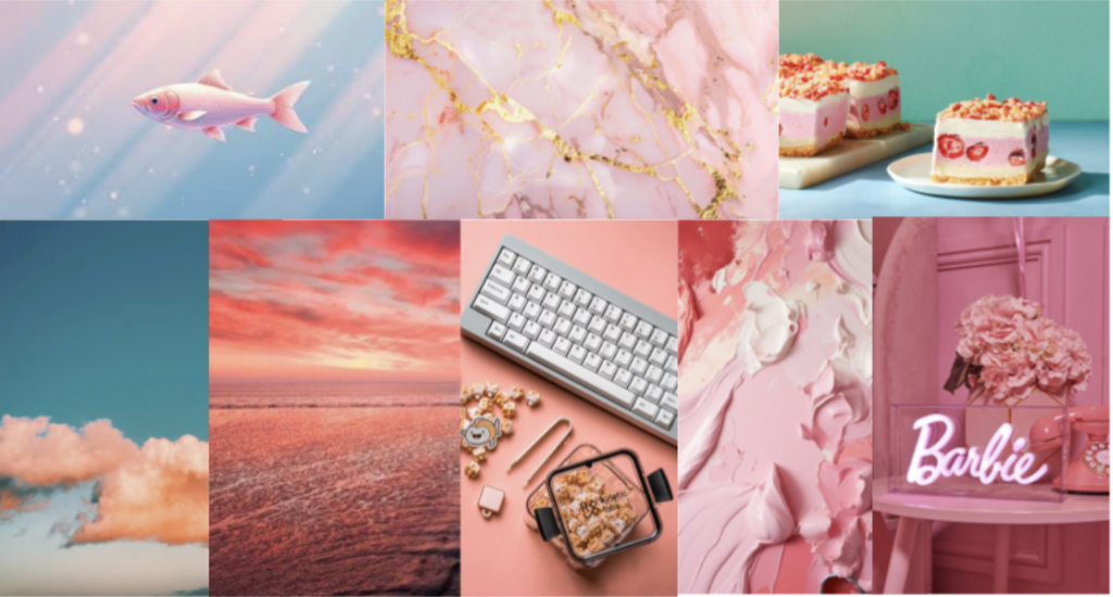
I created my moodboard around pink and orange colors to evoke a feeling of warmth. The goal of our app is to help users feel less overwhelmed and take more restorative pauses while working, and I believe that incorporating a warm vibe into our app will contribute to achieving this. The images I included are also mostly static/slow-moving, which contributes to the calming and peaceful atmosphere that we want to bring into our app. Since doing work/studying is often a stressful time for people, I wanted to have a moodboard that aims to decrease feelings of stress, and I feel pretty relaxed when looking at these images!
Lour Drick’s Mood Board

I envision our app as helping users to retain an air of peace and calm while they are studying, and I aimed to create a moodboard that reflects that. In my opinion, deep greens are a pretty calming color, and there is definitely a nature motif throughout the images I have included. Even when it comes to the images of the rooms I have included, the rooms are organized and tidy, which I think helps contribute to this refined vibe I think our app should have. For our app, I envision someone having a calm and peaceful study session outdoors in nature, and I believe the mood board I created here effectively captures that overall feeling.
Anavi’s Moodboard

The color purple is often associated with nobility, luxury, and ambition, and I think that this color would do well to create a premium feeling for our app. Additionally, several of the images I have included refer to nature (sky, flowers, waves), which I think many people would typically find calming. The goal of our app is to help people feel more restored after they take a break while working, so I think using some purples would contribute well to that. Additionally, I have a couple of images of desks, and they all have a cohesive purple aesthetic to them, which connects to the visual cohesion of our app.
Felix’s Moodboard

The images I have included for my moodboard all have an orange theme. I see orange as a very warm color, and I think that would be nice to have in our app. Additionally, I have a couple of pictures of lava, which are not only warm but also slow-moving, which connects to the idea that we want users to take a step back to pause instead of burying their heads in their work for hours on end. I included a couple of pictures of plants that are orange, which I find to be visually pleasing.
Synthesized Moodboard
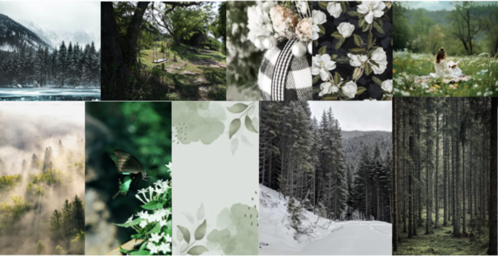
For our team’s moodboard, we all really liked the idea of having more of a nature motif, where we have green as a primary accent color supported by black, white, and gray. The idea here is that the nature theme evokes feelings of peace and calm, which is the exact vibe that our app should have. For this moodboard, most of our images show quite natural scenes, which aligns with the idea of making studying/working a less stressful time through restorative pauses. Additionally, by limiting the selection of colors we plan to use, we can prevent our app from becoming too bold and stimulating. Studies show that using muted/desaturated colors can help reduce overstimulation, and our goal is for users to do things other than turning to their phones when taking breaks, so the color scheme works well for that. While we each had different color schemes for our moodboards, the overall intention behind them was similar, and we felt that shades of green worked best for achieving this atmosphere of restoration
Style Tiles:
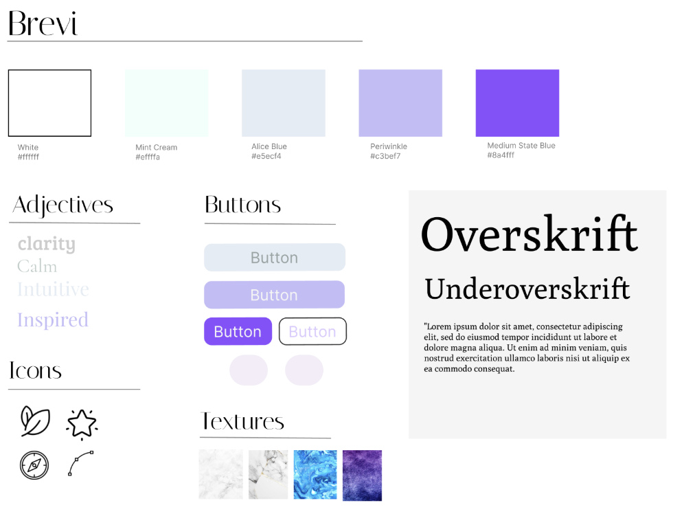
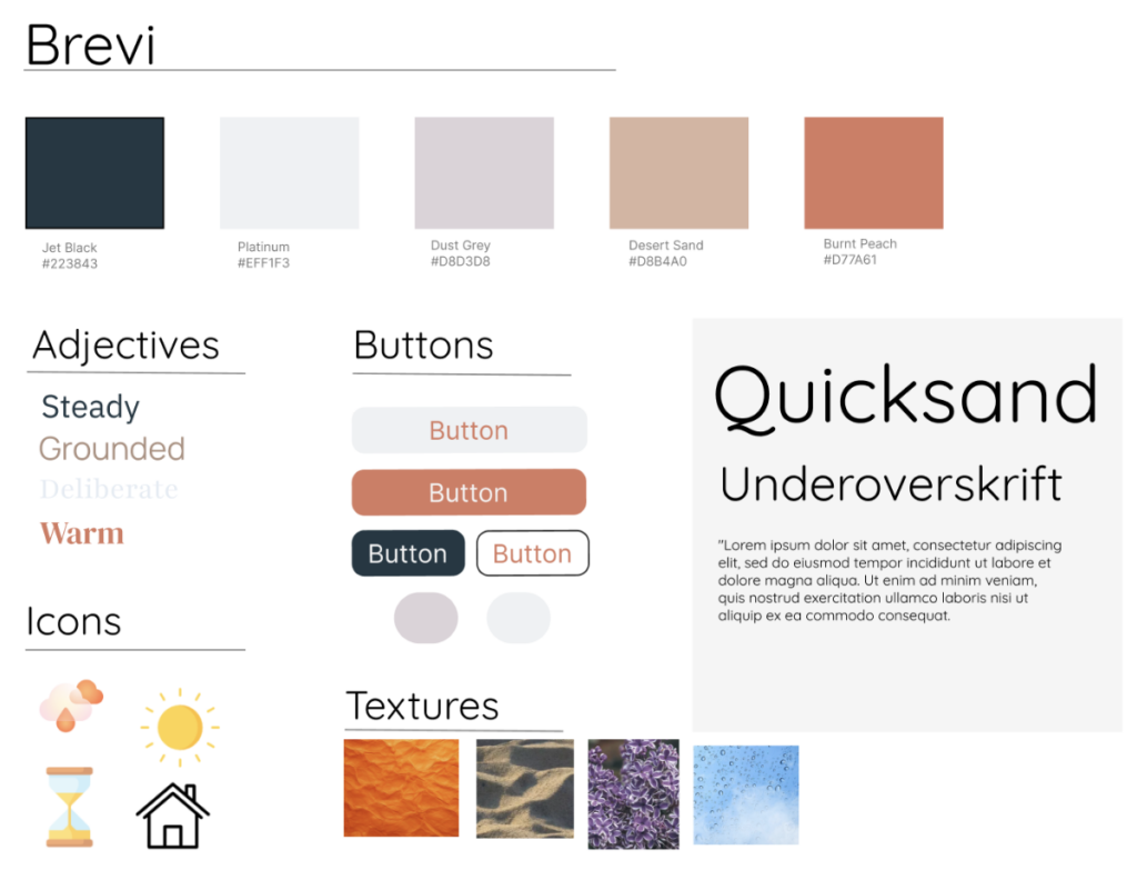
Each of us used the same Figma template and filled it in with our vision for the style tile. This made it easier to synthesize and compare them later.
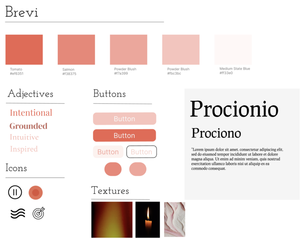
Vaish’s Style Tile
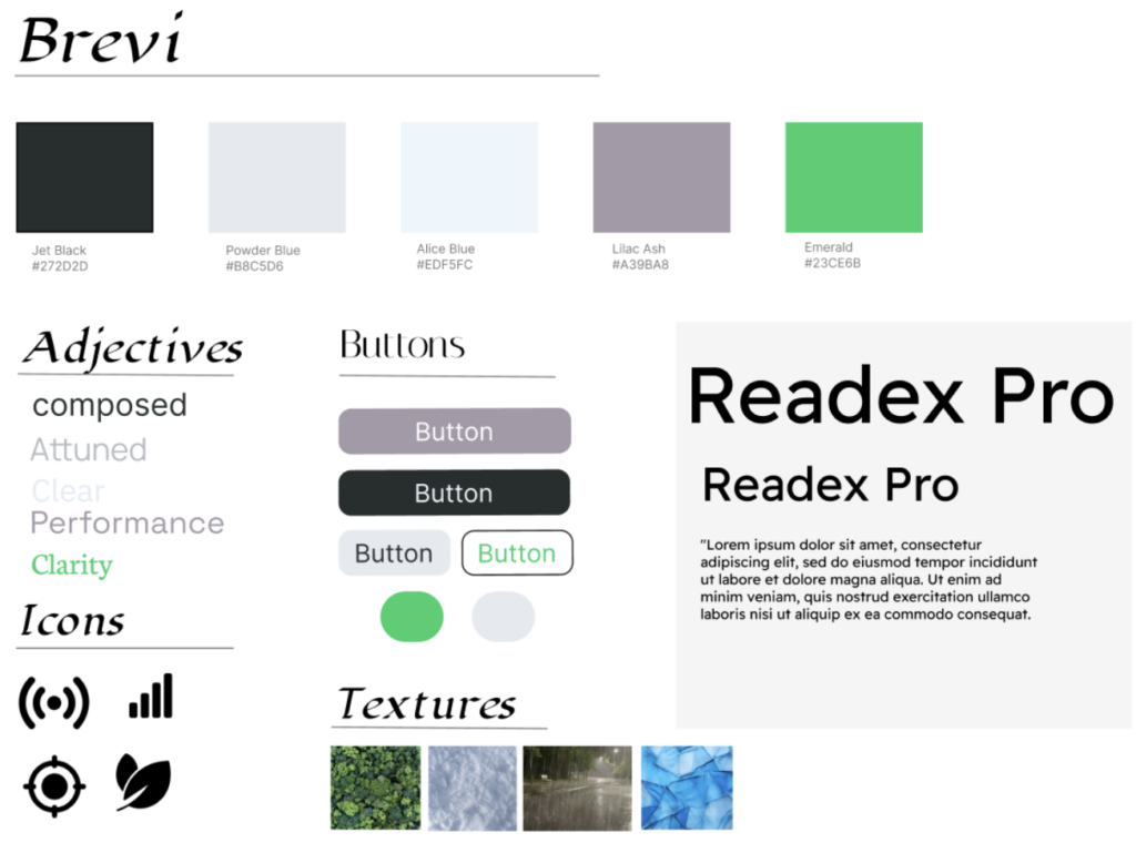
Lour Drick’s Style Tile
Anavi’s Style Tile
Felix’s Style Tile
Synthesized Moodboard

Explanation:
We sat together as a group and compared/contrasted our moodboards and style tiles. After deciding that the forest and nature theme most aligned with the mission and purpose of our app, we decided to use Lour Drick’s color scheme, but tweaked one of the colors to be a bit more muted. As Brevi is supposed to supplement our users’ work sessions, we want to ensure that the app is calming and simple, not detracting attention or cognitive load from the user’s actual work session. We chose the icons from Anavi’s tile, liking their simplicity and focus on efficiency/productivity. As a team, we chose the fonts that felt “rounder” and were not italicized, once again returning to that vision of clarity and minimalism. It was interesting to see that, as a group, for the most part, we were aligned about the types of words/adjectives and icons we were using, and all of us individually had that “nature” aspect.
Moving forward with this moodboard and style tile, we are incredibly excited to apply this and create an app that can truly benefit our users and their work habits.



