
Team Bison
Mood Boards – Individual
Benjamin

Armita

Philippe

Anthony

Tina
Mood Boards – Synthesized

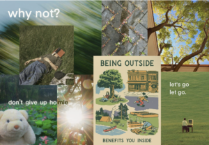
We combined the best from each mood board while determining a cohesive theme. Specifically, the blurred motion in the top left represents active motion and excitement that our app hopes to spur. It also signals a sense of spontaneity that we aim to foster. The top right represents a traditional nature scene and granola, representative of bridging between spontaneous activity and traditional hiking adventures. The words, LIVES, WONDERLAND, why not? emphasize exploration and adventure. The ostrich is funny and upbeat, balancing between the more formal hiking photo in the bottom left. The text at the bottom represents the push toward creating your own path through our app, seeking new adventures that define the student’s identity. Finally, the bottom right represents a child-like wonder we hope to foster.
Style Tiles – Individual
Philippe
Benjamin
Armita
Tina
Anthony
Style Tiles – Synthesized
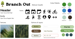
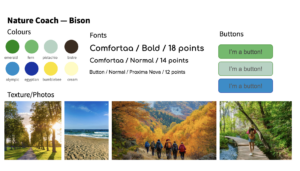
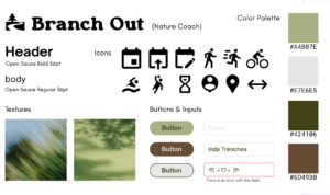
Our synthesized style tile draws upon elements of several different tiles from our team. The logo is a tree in light green, signaling an upbeat brand that still has structure and neatness. The name, Branch Out, is a pun and emphasizes our goal to have participants try new activities and meet new people. The fonts are structured, orderly, and trustworthy. Yet, the body font has sufficient deviation from formal fonts to signal lightheartedness in the application. The buttons range to represent tree and water colors. The icons are familiar and many signal motion. The color palette focuses on nature colors that will blend well with the theme of the application. Finally, the textures also align with the nature theme and encourage motion.


