
Wireflows
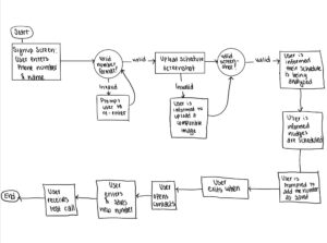
This wire flow depicts our user persona of a health-motivated student who wants to go outside because they recognize the health benefits, but feel they do not have the time to do so. The user flow is focused on being as simple, concise, and effortless as possible, only needing a phone number, name, and screenshot of their calendar. Every piece of information asked for serves a practical purpose: name for personalization, number for the nudge calls, and screenshot to identify free time. The calendar required to participate is something that this persona already has as a busy and motivated student, and thus does not require additional effort on their part. Once everything is set up, the work lies upon the schedule analyzer, making it easy for the individual to find free blocks of time in an otherwise busy calendar.

This wire flow is based upon our user persona of “Inda Trenches.” Inda is busy during the day and receives a phone call. The phone call is the nudge that is telling them that they should go outside. Because it is an involved phone call and is based on when Inda has free time, this nudge should be able to shift behavior and enable more outside behavior despite a busy schedule. Specifically, Inda’s biggest pain point is being busy and not feeling like they have time to go outdoors. Given that the nudge is initiated by the AI during times it knows Inda is free, little effort is required for proactive initiation on Inda’s part. Once a free block of time is found, the call is harder to ignore relative to other media (e.g. text, notifications, or email), increasing the likelihood of outdoor activity.
Sketchy Screens
Armita’s screens:
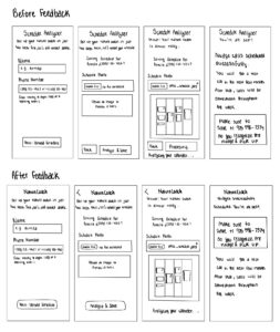
Team feedback:
- Change name from schedule analyzer to nature coach to make it more specific to the app and reinforce the brand.
- Change the shape of the buttons to better indicate difference between text field and button.
- Remove back button and replace with an arrow at the top to create a less crowded look.
- Reduce the amount of text on the last screen and create a more clear visual hierarchy.
- Provide more instructions on what files are accepted when uploading a photo.
- On the third screen, removing “processing,” text at the bottom is enough information for the user to know the state of the flow.
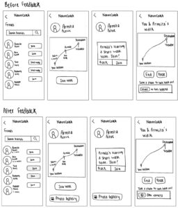
Team Feedback:
- “Send nudge” button is counterintuitive when friend is busy. Maybe replace it with a greyed out join button instead.
- The save a photo feature on the last screen feels a bit abrupt, maybe include it earlier on in the flow to illustrate this is something that is central to this section and can later be accessed.
- Maybe add the distance to the friends list for the active friends so users know the person closest to them who they can join.
- Rather than upload a photo, users can maybe take a photo to make it more spontaneous and in the moment.
Ben’s screens:
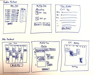
Team Feedback:
Screen 1:
- Make screens show virtual layout of the calendar.
- Show the times when not available instead of just ranges of when nova could call.
- Remove call log from page.
- Remove the opt in or out of day as can make range equal or do on modify step.
- Make modify button easier to see.
Screen 2
- Show visual of what times are blocked off.
- Show times where there is a registered calendar conflict.
- Allow user to add or delete existing calendar conflicts.
- Allow user to modify the minutes for the start and end time.
- Allow user to see the call history.
Screen 3
- Show the call history in a heat map so it more useful.
- Call the screen call history instead of view history.
- Remove view more and instead focus on the visuals you provide.
- Make it clear which times had a greater density of calls.
Tina’s Screens:
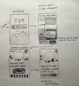
Team Feedback:
- Maybe activity suggester in app should be a parasocial character rather than an impersonal icon.
- Weird to have the buttons on the bottom, normally when we’re prompted to tap something it pops up in the middle of screen.
- The little people under “start” feels unnecessary and crowds the space a little.
Anthony’s Screens:
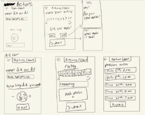
Team Feedback:
- Create more of a visual hierarchy in the specific features shown to not overwhelm the user and better guide action.
- Add an option to add more information about why the user gave the rating they did.
- Add potential feature to add images to tap into the aim of adding a social / personal element to outdoor activity.
- Show the option to revisit past activity / outdoor sessions to display the full functionality of this feature.
- Maybe better to put the reasoning option on screen 2 rather than two separate screen flows to reduce effort for the user.
Philippe’s Screens:
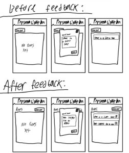
Team Feedback:
- Rules should be easy to delete, so user control and freedom are maintained.
- Labeling should be more clear to better inform the user of what each feature represents.
- Create rule button could be in the top right to better align with user expectations (based on how other platforms do it)/
- Should have more categorized constrained rules to allow for more enhanced personalization.



