Final Team Moodboard & Style Tile
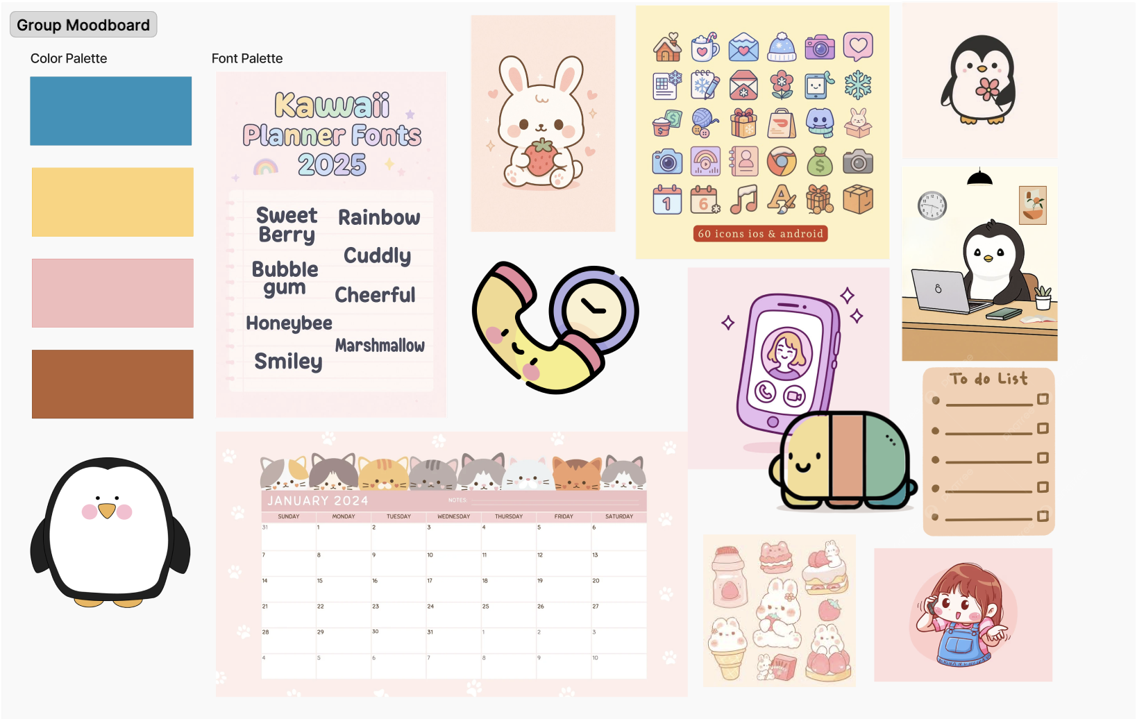
Mood Board Justification: In exploring the vibes of our prototype, we created our look and feel based on the essence of our name: Nudgi. We knew that as a team, we really wanted to create an inviting platform where people would want to engage with their friends in a friendly way. We wanted to lean into the friendliness and cutesy vibe to be inviting, to create a warm experience, and to want people to treat nudging as something desirable. These images represent our brand because we not only decided to do a penguin as our mascot, but we also wanted to have warm characters where cartoons pose the best way to capture the cuteness and bubbliness of our branding identity.
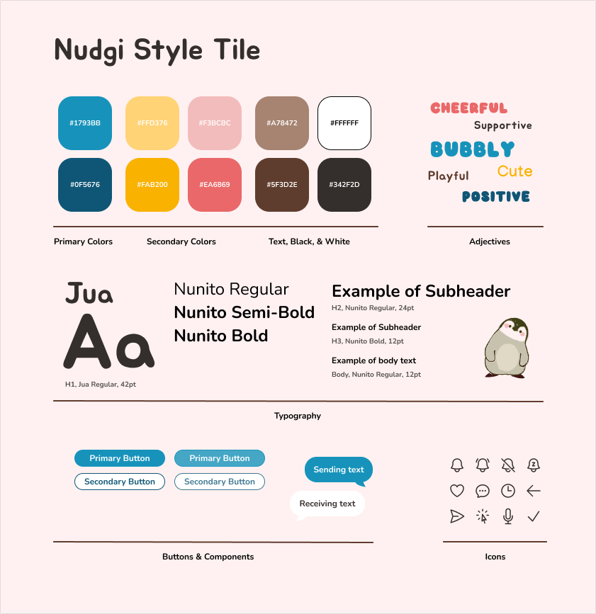
Justification: Our final moodboard leans on the cute, playful, and bubbly aesthetic. We decided on this style because of the positive and supportive elements, where pastels, rounded edges, and the “cutesy” vibe would be approachable to users. We want our app to come off as approachable, inviting, and easy to use, which we hope to communicate through the branding. We included rounded text with slight slants and made it simple and easy to read to resonate with our cute aesthetic. We also included rounded buttons and rounded icons, in which we wanted to keep simplicity and calmness throughout. We chose a cute, tilted head penguin with red cheeks to capture our brand identity, which we hope to include throughout.
Team Mood Boards & Style Tiles
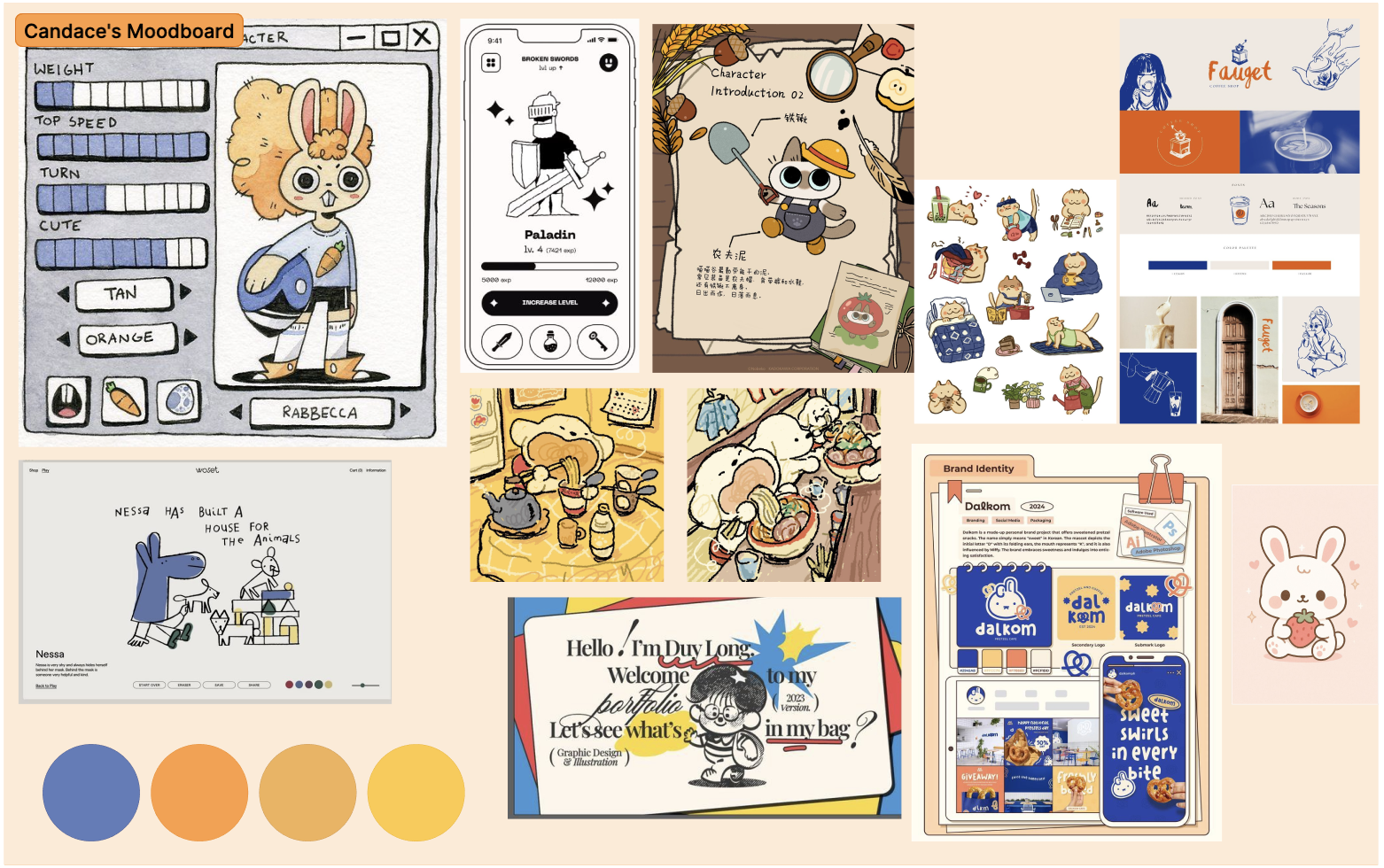
Candace’s Mood Board & Style Tile
Justification: This mood board and style tile focuses on the colors blue and orange to capture a scrapbook, retro, and calm feeling. I wanted to created a style that would be inviting for new users, while being a unique and approachable style of art. By including drawings and a sketch-feel, I hoped to capture the “rough on the edge” experience of texting.
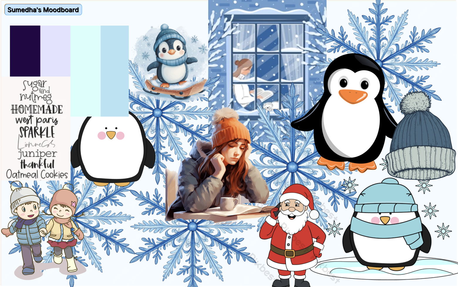
Sumedha’s Mood Board & Style Tile
Justification: I chose these Winter wonderland colors of snow blue and purple in order to invoke the
calm and cozy feeling of winter in users. Normally, people associate notifications with stress and chaos, so this cozy font and color pallette will help calm down users.
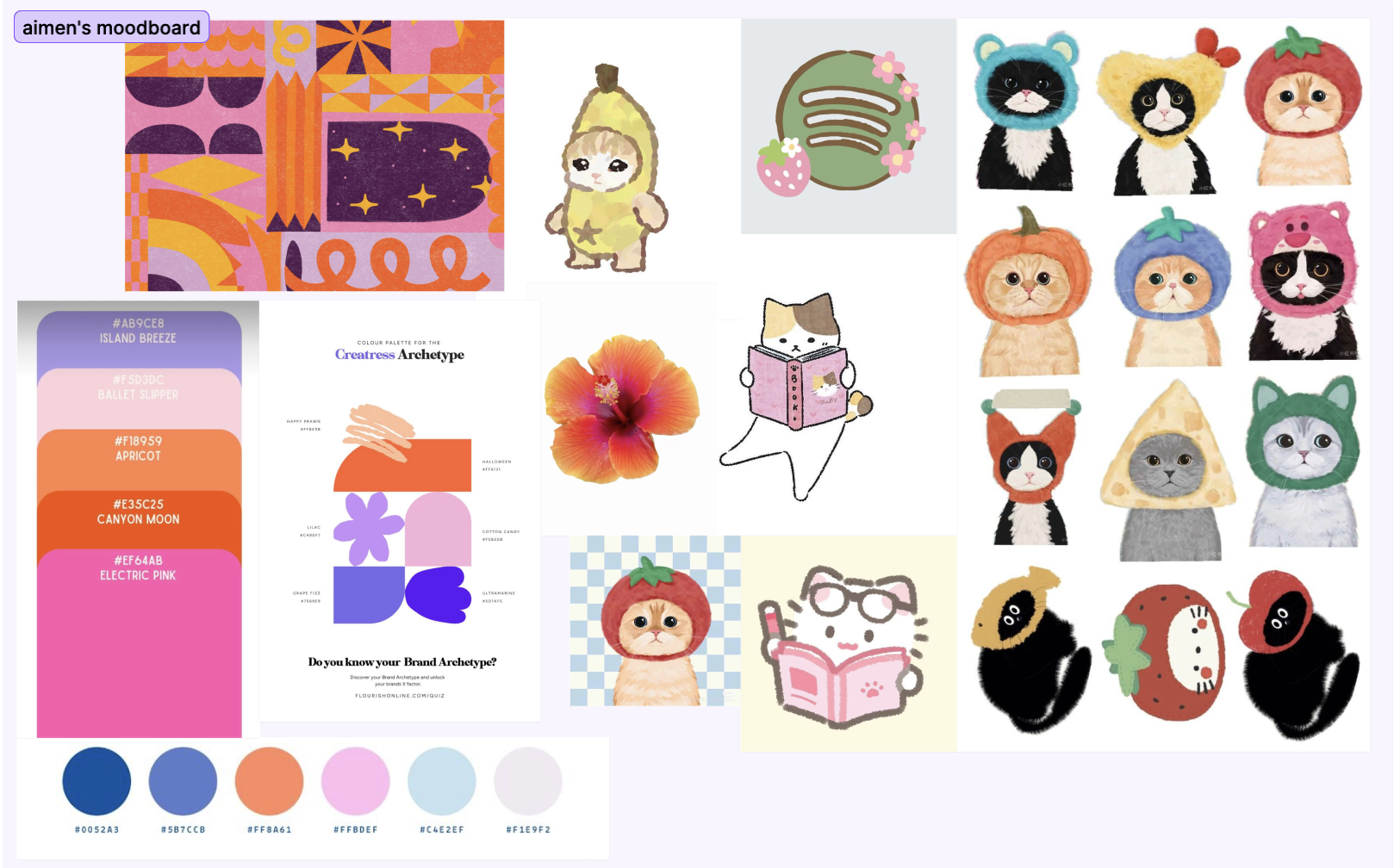
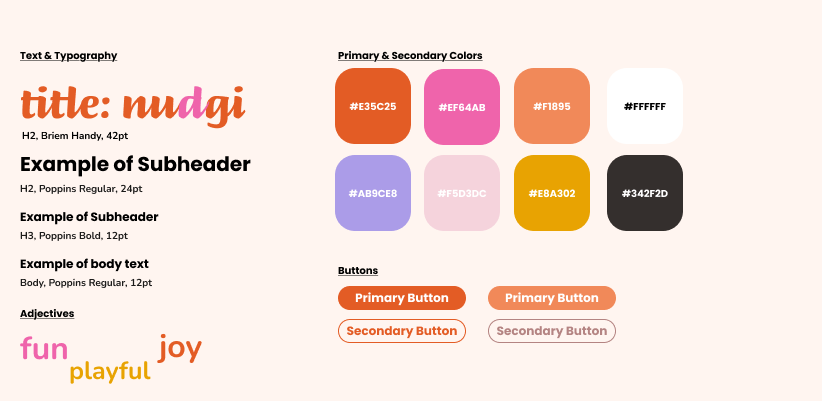
Aimen’s Mood Board & Style Tile
Justification: This mood board and style tile uses Y2K and vibrant colors like oranges and purples to give the app a very techno-cool yet warm and welcoming vibe. This futuristic vibe is balanced with grounded and cutesy animal characters to give it a more human and warm touch. This will be a very gen-z (the trend has shifted from using muted and calm/corporate colors to more vibrant/humane colors) along with very funny meme-able characters.
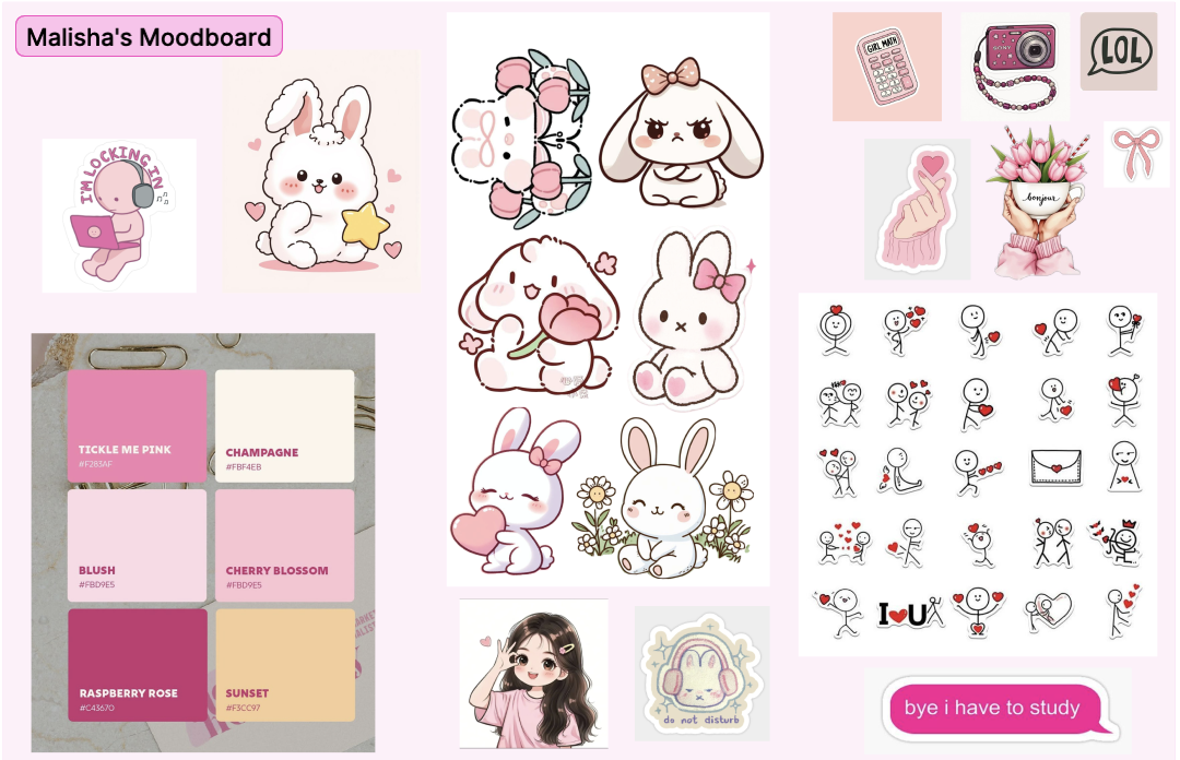
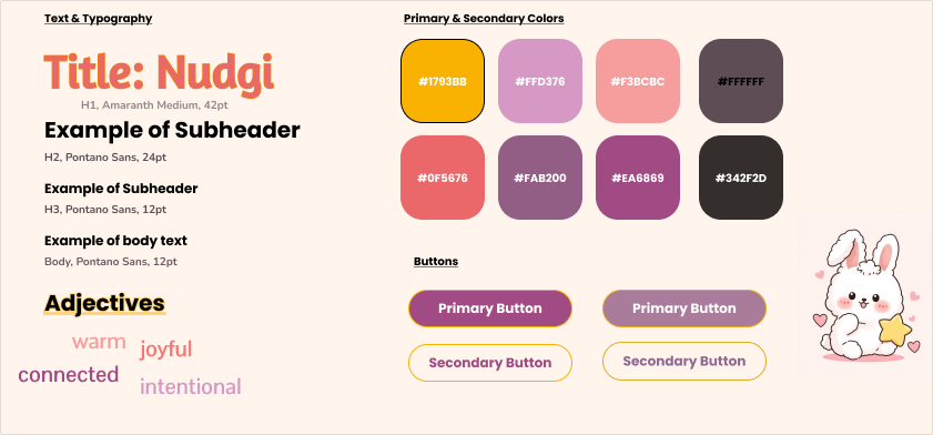
Malisha’s Mood Board & Style Tile
Justification: This mood board and style tile uses a warm, pastel palette of shades of pinks, golden yellows, and deep purples to design an app that feels both cozy and emotionally expressive. The typography balances bold, playful headers in Amaranth with clean body text in Pontano Sans. The kawaii bunny illustration and adjectives like “warm,” “joyful,” and “connected” anchor the design in a nurturing aesthetic, making it a perfect fit for an app centered around social support.
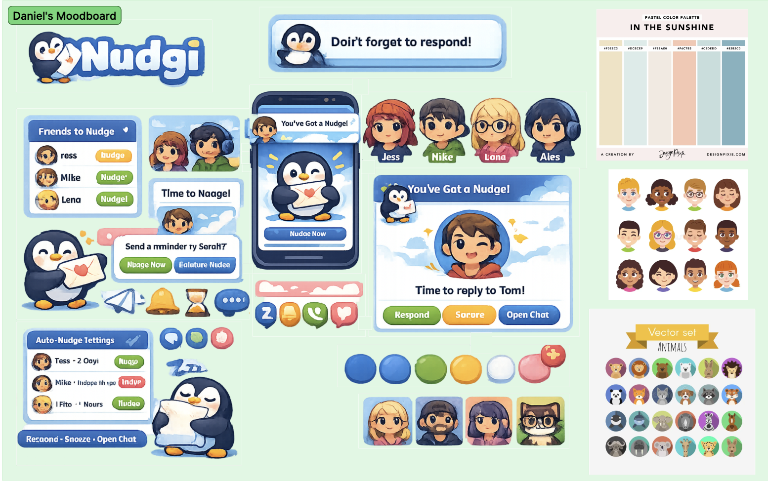
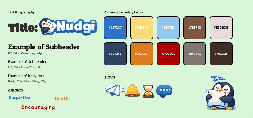
Daniel’s Mood Board & Style Tile
Justification: My style tile emphasizes a gentle, supportive, and comforting aesthetic that reflects Nudgi’s goal of encouraging connection without pressure. The design combines soft blues, warm neutrals, and friendly accent colors to create a calm yet uplifting emotional tone. The balance between clean layouts and expressive visuals communicates simplicity and ease of use,.The branding aims to make Nudgi feel friendly, reassuring, and emotionally intelligent.