
Wireflow
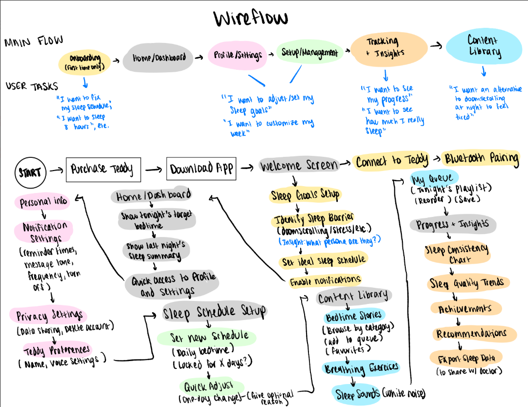
This figure illustrates the overall user workflow for TuckIn Teddy, our sleep companion app. It is a sleep improvement tool that combines a physical teddy bear device with a mobile companion app. The flow begins with onboarding, where new users complete a setup survey to identify their sleep barriers, establish baseline sleep patterns, and set their ideal sleep schedule before pairing with their physical Teddy device via Bluetooth. Once onboarded, users arrive at the Home Dashboard, which serves as the central hub displaying tonight’s sleep plan, recent sleep summaries, and Teddy’s connection status. From the dashboard, users can navigate to five main sections: Profile & Settings (for managing personal information, notification preferences, privacy settings, and Teddy customization options like name, voice); Sleep Schedule Setup (for creating, editing, or adjusting bedtime routines with optional commitment locks); Content Library (for browsing and queueing bedtime stories, breathing exercises, and sleep sounds); and Progress & Insights (for viewing sleep consistency charts, quality trends, achievements, and weekly reports). All user interactions and content selections sync with the physical Teddy device, which delivers personalized voice reminders, plays selected content, and provides physical accountability. This comprehensive flow captures the full end-to-end experience from initial setup through daily use, habit tracking, and long-term sleep improvement.
Sketchy Screens
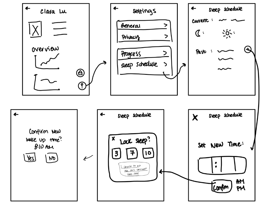
Setting New Sleep Schedule Sketchy Screen — Clara
Team Critiques:
Viviana: It would be nice if the overview section had headers such as “This Week’s Sleep” / “Sleep Quality Trend.” Also, consider adding shortcuts like “Start Tonight’s Routine” or “Log Last Night.”
Reid: Adding icons would make scanning easier and add visual interest. Additionally, there lacks some important settings. Where’s notification preferences, Teddy customization, app theme, or logout?
Bryant: The “Past” section might be vague. Maybe we should show recent schedule history with dates or a calendar view.
Browsing Content for Teddy to Play — Viviana
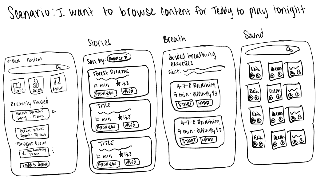
From our interviews, we learned that many of our participants admitted to their phone helping them fall asleep by doomscrolling or watching a show to cause drowsiness. However, as we discovered in our research, we also know that screen usage can deeply affect one’s sleep. Hence, we thought an alternative to that might be Teddy playing stories, or music, or breathing exercises to invoke drowsiness might be a better alternative. I tried to have these designs be similar to playing music on Spotify.
Team Critiques:
Clara: Visual hierarchy needs work is a little unclear. The three category buttons at top feel small and equal-weight. Consider making them larger, more distinct, or using cards instead of simple icon button.
Reid: “Add to Queue” button could be more prominent. It’s a key action but feels buried at bottom.
Bryant: Search functionality is missing. Users might want to search for specific content by name or mood. And the cards feel text-heavy. Maybe adding cover art/thumbnail images to make stories more visually distinct and appealing would help.
Reviewing Sleep Metrics — Reid
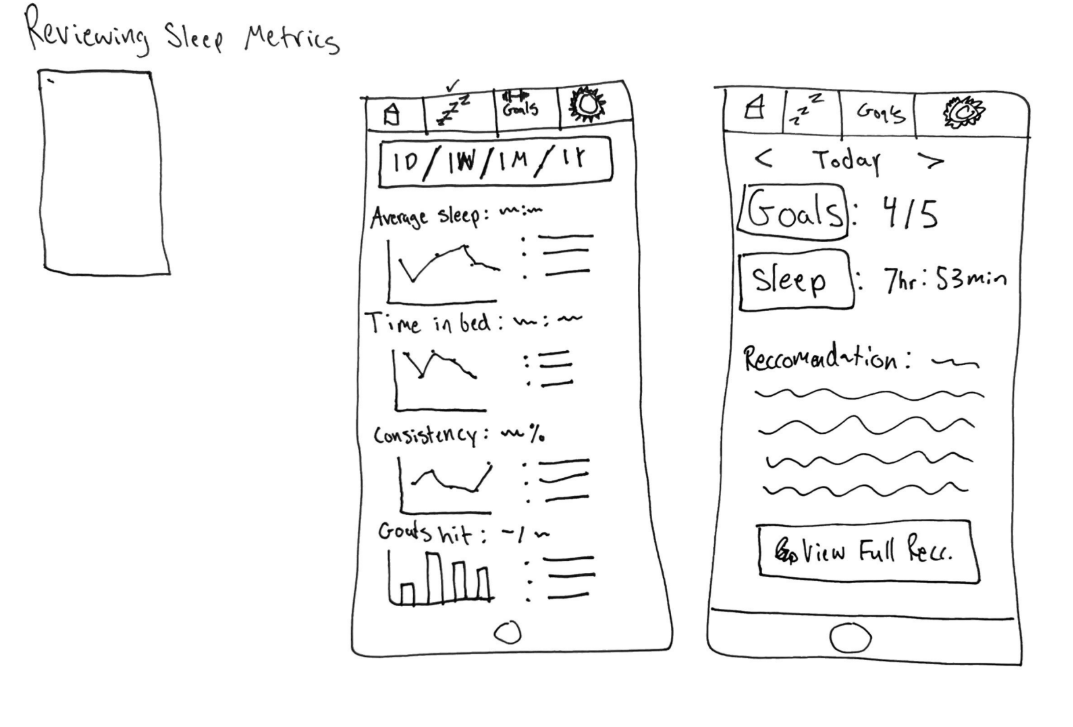
This sketchy screen depicts two mobile views for our app related to reviewing sleep metrics. The first screen is a metrics dashboard with a time-range selector (1D/1W/1M/1Y) and four tracked metrics displayed as mini line/bar charts: Average Sleep, Time in Bed, Consistency, and Goals Hit, and each list bullet points related to the trends and discoveries. From our interviews, our participants noted that being able to track their metrics, especially how well they are hitting their goals and how consistent they are, would help them hold themselves accountable and track progress. The second screen is a daily detail view navigable by date (e.g., “Today” with arrows), showing a Goals score (x/5), Sleep duration (x:hr y:min), and a Recommendation section with a text description and a “Go View Full Recommendation” button to lead to deeper insights into how to improve. Our participants noted that having guidance like a recommendation helps them gain insights into how they can improve.
Team Critiques:
Clara: The time range toggle on the metrics screen is a clean way to show trends at different levels, but the charts might be too small to be meaningfully readable at that size. Maybe we consider whether a summary stat above each chart could do more work than just listing the numbers.
Bryant: I like that the daily view surfaces a recommendation directly. I think it helps make it actionable rather than just informational. With that said, the “Go View Full Rec.” button you put suggests that more useful content is not on that screen but rather a tap away, so maybe we should ask whether the preview text gives enough to motivate clicking through.
Viviana: The visual hierarchy between the two screens feels a little inconsistent. The dashboard is super dense with data while the daily view is much more sparse. It would be worth aligning the design language so there is a more stable flow for users.


