
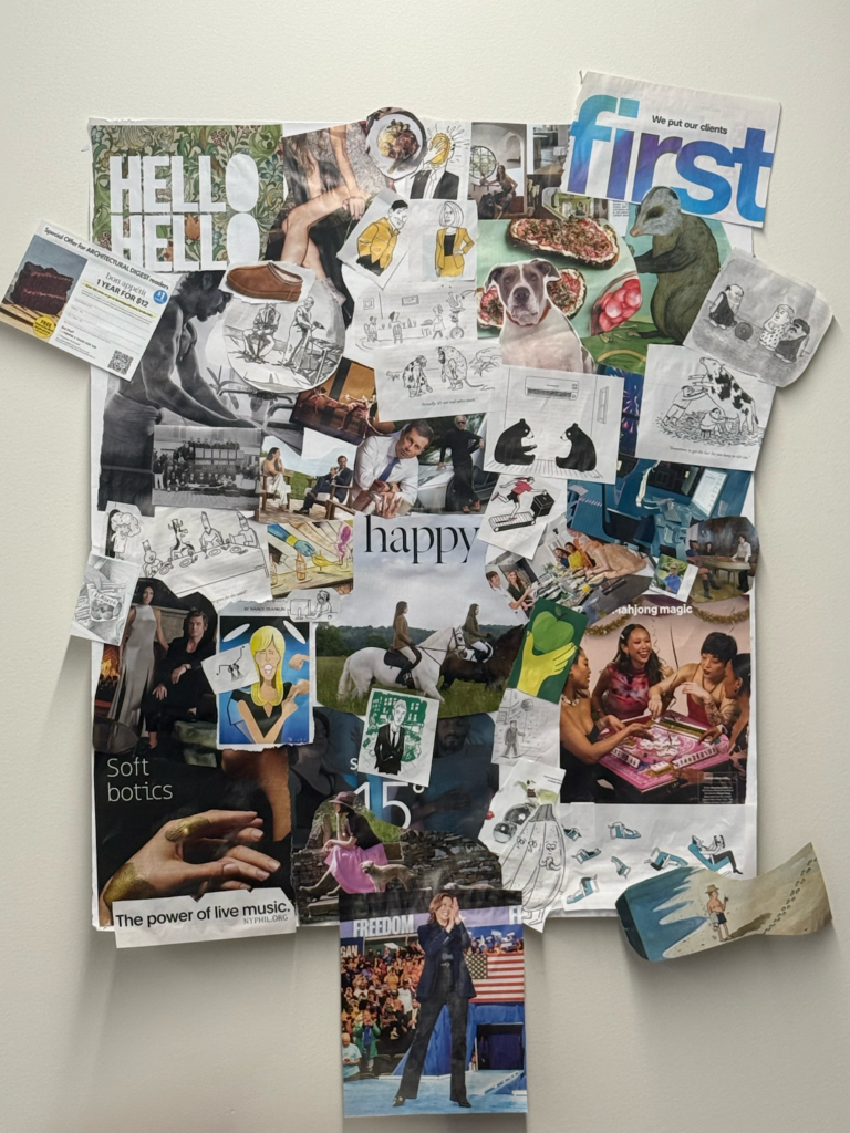
We created this moodboard together as a team in class! We chose a variety of images to represent different components of our app. For one, we included a bunch of images of people (or animals) with bad posture, as well as examples of good posture. This is to best represent our potential set of customers as well as what we aspire our customers will look like after using our app. We also included images of groups of people and friends who seem to be having a good time together to emphasize the social aspect of our app. One of the images in the mood board also shows a wearable, which is what our group plans on using to track posture objectively. Overall, we also decided that our brand is reminiscent of LA and the health and wellness culture there (overall fresh and a bit nature-related as well). As a result, we also used a lot of images related to nature or are part of the health culture in LA, like avocado toast or almonds. We also think our brand has a bit of a “chic” vibe, which explains the images that seem a bit higher-end, such as the fancy cocktails, cars, and the horseback riding.
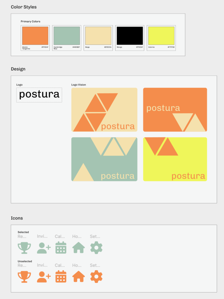
We built our style tile around making posture correction feel fun, social, and approachable. We know that posture correction could sometimes feel strict or like a lot of pressure, but we wanted our brand to feel inviting and engaging. We chose bright, warm colors to highlight the social aspect. Atomic Tangerine and Icterine show energy and positivity, and Cambridge Blue and Beige have more of a natural vibe, tying into wellness culture (similarly reminiscent of LA, like our moodboard). Our logo is simple and clean, and our design vision includes geometric elements to subtly reference structure and balance, which are key ideas in posture correction. We used the same color scheme for our icons, and chose icons for which it would be easy to recognize their purpose. Overall, we wanted our aesthetic to reflect social connection, health, and wellness.


