
by Greg Kalman, Austin Konig, Ananya Navale, Shuman Wang, Jasmine Xu
Mood Boards
Greg

Central to my moodboard was a spa-like relaxing vibe that couples well with the aesthetics of late-night productivity. Some motifs include: sunrise/sunset, green juice, and simplistic interior design. I chose the words “studious,” “homey,” and “wholesome,” to describe the vibes I was going for: academics and productivity first, while prioritizing lightness and wellness.
Austin
This moodboard seeks to capture the coziness of gathering with friends to share a healthy, feel-good moment around the table. The imagery feels warm and inviting, with soft light and casual compositions that suggest conversation, connection, and ease.
The food itself directly influenced the color palette. The greens from herbs and vegetables, the warm orange tones from roasted dishes, and the soft pinks from fruit and desserts are reflected throughout the board, creating a cohesive and grounded visual story. Together, these elements reinforce positive behavior by showing that choosing balanced, nourishing food can feel social, comforting, and genuinely enjoyable rather than restrictive.
Ananya

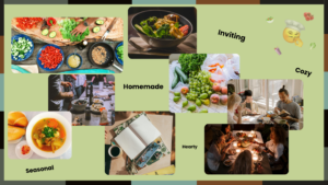
I envisioned a Southwestern, spicy palette for this product, something that combined the heartiness of homemade food, the playfulness of a retro dance atmosphere, and the warmth of the lights we turn on at night to work, to make our space feel cozier and safer.
Just because food is healthy doesn’t mean it needs to be boring, right? It’s fun to add a little spice to food and spice to life to give yourself some incentive to keep working at your health goals, keep your body strong by getting all the necessary nutrients, and enjoy what you’re eating!
The imagery brings out the wholesomeness of the experience of eating food, the comfort and joy that comes with food preparation combined with a pleasant home. Food is fresh, food is cooked, food is flavored. Food is something bold and powerful that provides energy, so the representation of an application that reflects those values should also be vibrant and have presence in the mind of the user.
The words I selected represented my own perception of food, and the perspective I felt that the app should be sharing – a sense of whimsy, being bold, being bright, being alive!
Shuman

I select green as the main color for the mood board as I think green is the color that is closest to healthy and gives users a sense of relaxation. And for images, I select good lifestyle images, like eating healthy food, exercising and studying. The two figures about studying at night are consistent with the challenges we want to use the application to solve–when you study at night and feel hungry and want to have a late-night eating, you can use the pre-ordering application.
Jasmine
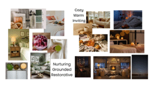
For this moodboard, I was aiming for a chic yet cozy, nurturing late-night atmosphere. I wanted the product to feel like something users naturally associate with self-care, comfort, and positive emotions, particularly because it’s intended to gently encourage more nourishing late-night choices.
The imagery emphasizes warm lighting, soft textures, calm interiors, and slow evening rituals (tea, blankets, candlelight), all of which help frame nighttime as a space for restoration rather than stress or impulsivity. At the same time, I wanted to incorporate elements of clean, chic, and subtly aspirational aesthetics, which may resonate with the target audience by making the product feel modern, classy, and socially appealing to use. The muted greens, natural textures, and fresh food imagery help signal nourishment, balance, and wellbeing while maintaining a polished, contemporary feel.
Overall, the moodboard aims to position the product as something that blends comfort with quiet sophistication, in line with our vision for our app to be a supportive companion for late-night routines that encourages healthier choices through positive association rather than pressure.
Final Mood Board
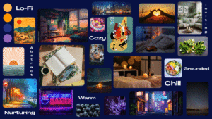
For our final group moodboard, we decided to pivot a bit from our individual boards and redirect towards something that conveys a warm nighttime atmosphere, where energies may be low but activity and vibes are up. This is a palette of deep blues and warm oranges, paired with rounded shapes and cozy imagery to make the experience feel calming rather than overwhelming. This direction supports users who want gentle structure and comfort late at night, while still keeping the interface playful and inviting enough to encourage action.
Food should be something that makes people take time for themselves, allows them to stop and savor, to enjoy energizing themselves. It’s not something that should make a person feel guilty later on, it is a safe space. For this reason, we used words such as “nurturing”, “warm”, and “chill” to make our app feel like a judgement-free zone that is only working in the best interest of the user. The goal is to make the user feel relaxed and supported, to make them feel like they can focus on their priorities while our app will take care of all the hard work for them.
Style Tiles
Greg
Austin

Ananya

Shuman
Jasmine

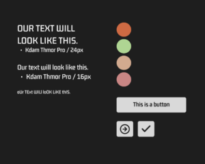
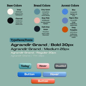
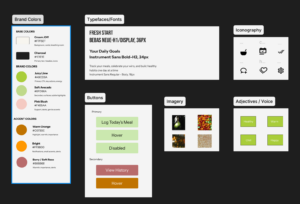
Final Style Tile


