Individual Moodboards
Each team member creates a moodboard with a 2-4 sentence paragraph describing the vision behind it, why it is the right fit for the prototype, and pros and cons.
Francis:
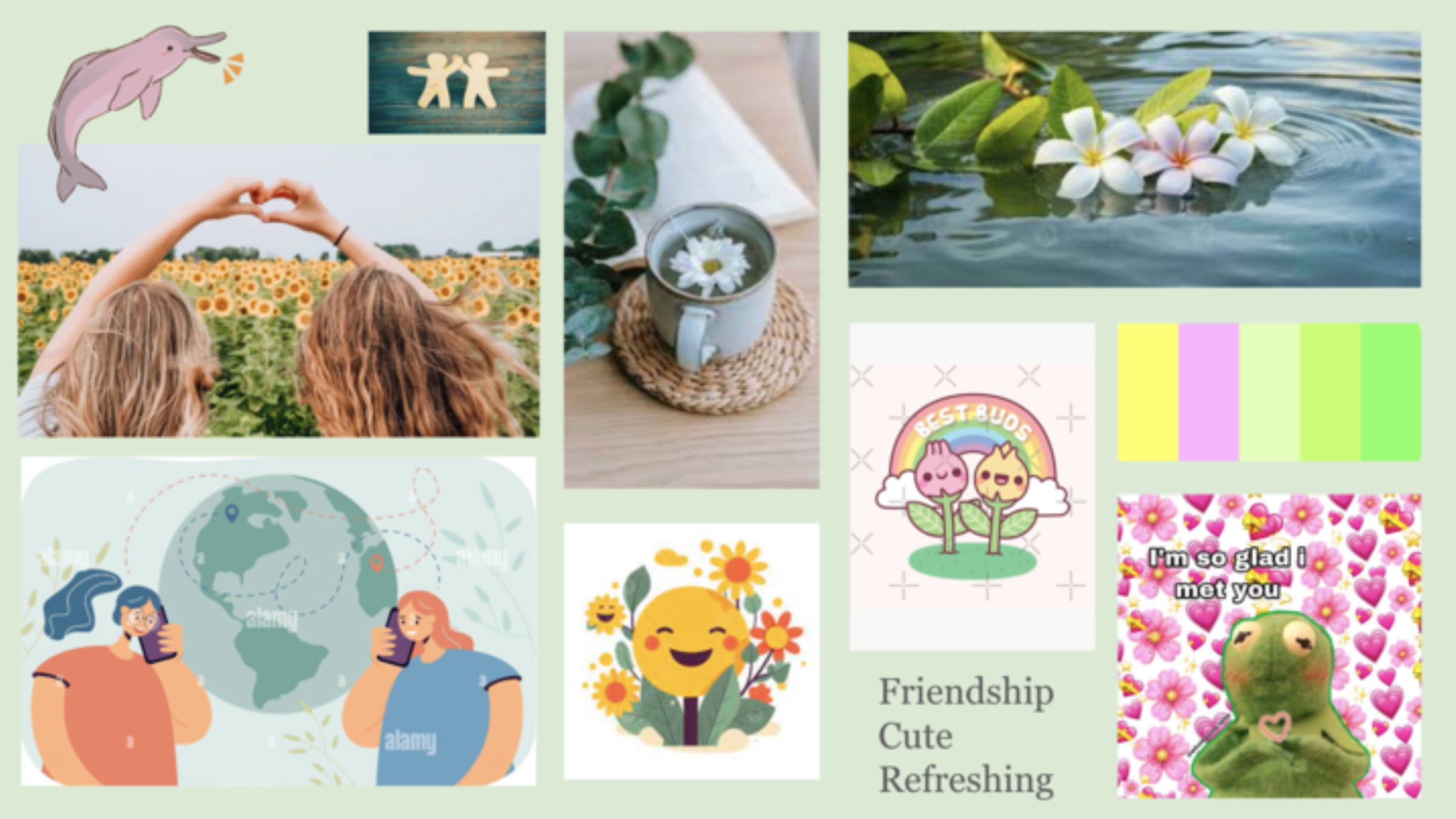
With this mood board, I aimed to capture the intersection between the wholesome aspects of friendship and nature’s more natural, refreshing vibes. Since our intervention centered around nurturing flowers, I wanted a cute vibe centered around affection and kindness. Because so many of our personas revolve around heightened emotional states or high levels of friction, the calm atmosphere created by this mood board aims to calm the user as they approach a task that once required too much activation energy. However, this approach may make our solution seem too childish and alienate users who don’t want to feel patronized or babied into improving their friendships – some users would undoubtedly prefer a much more energetic, adventurous aspect to their friendship maintenance.
EB:
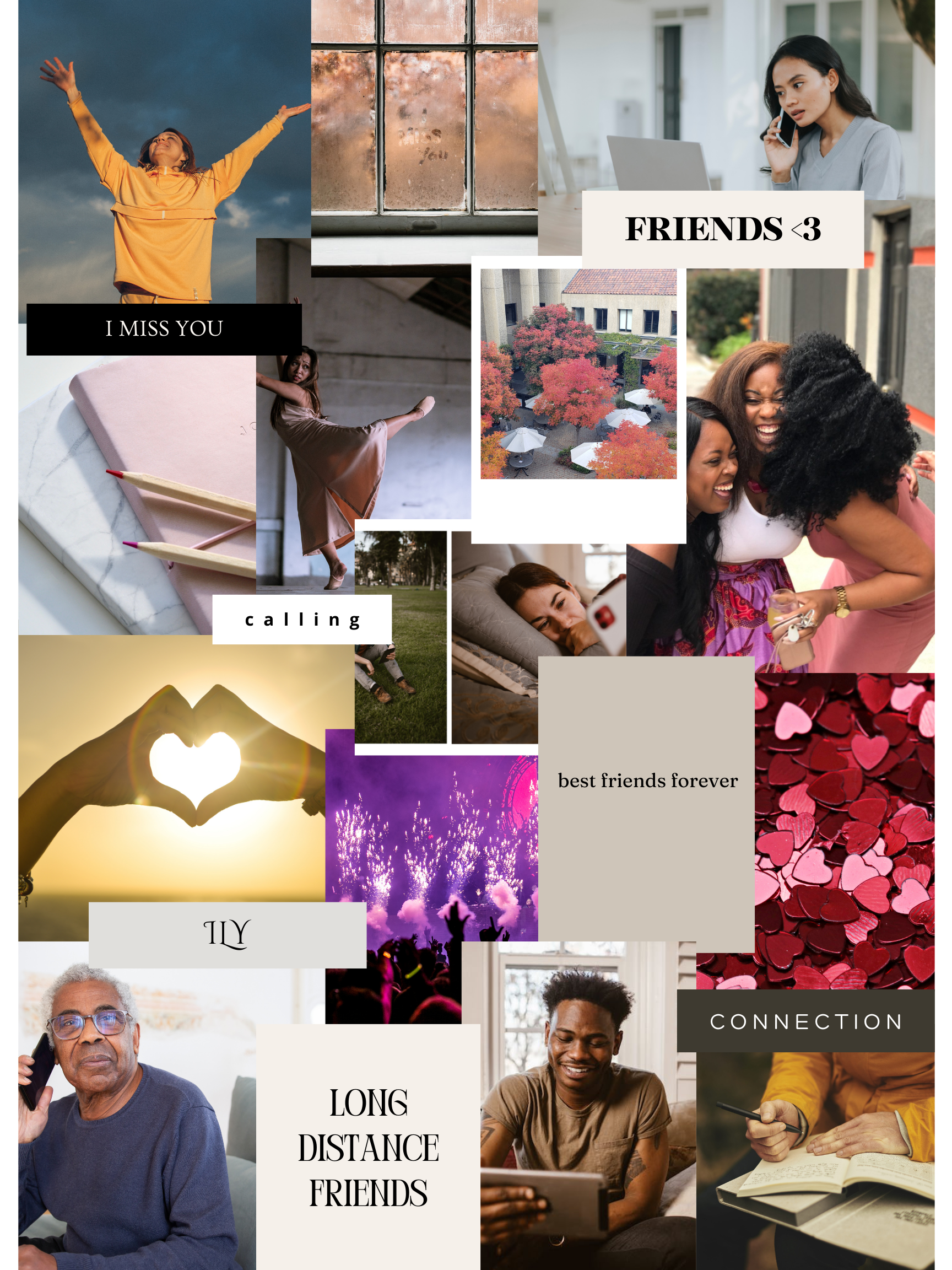
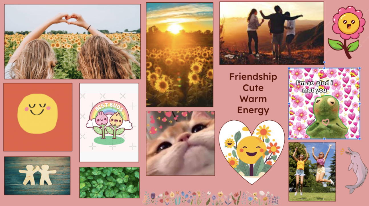
I created the moodboard below to focus on the importance of maintaining long-distance friendships. The design is sentimental, personable, and friendly, reflecting the love and care that should go into friendships. People are featured calling each other and otherwise interacting with each other and having fun. The images that don’t contain people focus on the abstract ideals of friendship, such as love, fun, reflection, and care, some of which we may attempt to symbolize as part of our project. Pros of this moodboard include its focus on people and the excitement of engaging with long-distance friends, while cons include it possibly being overly extraverted and social.
Cameron:
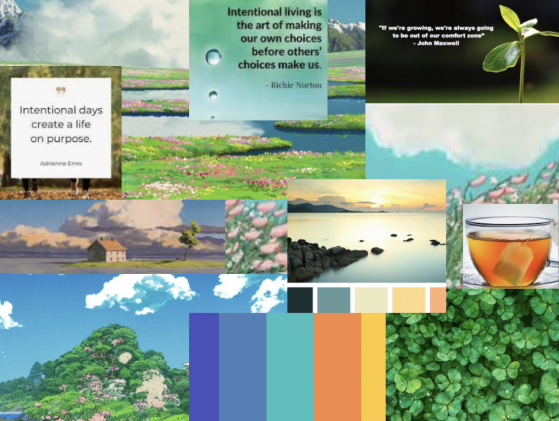
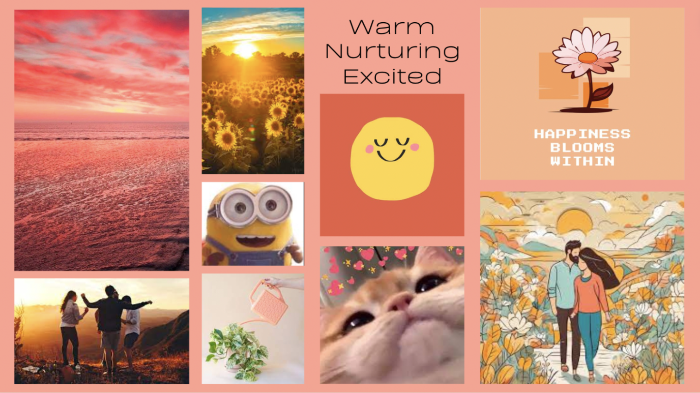
In my moodboard I wanted to emphasize the values of friendship, intentionality and calmness. Visually, I thought this would be best reflected via nurturing images and colour schemes that correlate both to these values, but also tie in well with our intervention study design. There is a heavy emphasis on nature and plants, both which I think speak to these values of growth, and symbiotic relationships very well. There are also added palettes of calm nature settings (eg. sunrise, and ocean view) which are meant to evoke the feelings of calmness and mindfulness.
There are various Pros and Cons to this moodboard detailed below:
- Pros: light, focuses on rejuvenation
- Cons: maybe too nature focused, too green centric
Daniel:
I wanted my moodboard to reflect the warmth and joy of connecting with long-distance friends. It’s designed with cozy, warm colors to represent comfort and features adorable, lively imagery to express the eagerness for connection. The two images on the right side symbolize our product’s desire to maintain people’s intrinsic motivation in wanting to keep in touch with their long-distance friends. The pro of this moodboard is that it emphasizes the positive emotions associated with maintaining long-distance friendships, and by highlighting the comfort and joyful aspects, we will hopefully alleviate the sense of stress or obligation often associated with maintaining long-distance friendships. The con of this moodboard is that it leans heavily into wanting to excite the user and remind them of their friendship through a nurturing symbolic representation, which might contradict the idea of wanting to intrinsically motivate people.
Team Moodboards
As a team, narrow down to a single moodboard by prioritizing or combining. Justify this decision. Include an image of your synthesized moodboard.
Based on our individual moodboards, we came up with a team moodboard mostly based on Daniel’s moodboard. We wanted to have excited vibes (from EB), a cute flower (from Francis), sunrise coloring (from Daniel), with included greens/blues (from Cameron). This helps us come up with a personable and refreshing design that motivates and excites people to engage with their long-distance friends.
Individual Style Tiles
Each team member does a style tile (and add to the blog with names!), then meet to choose and/or combine.
EB
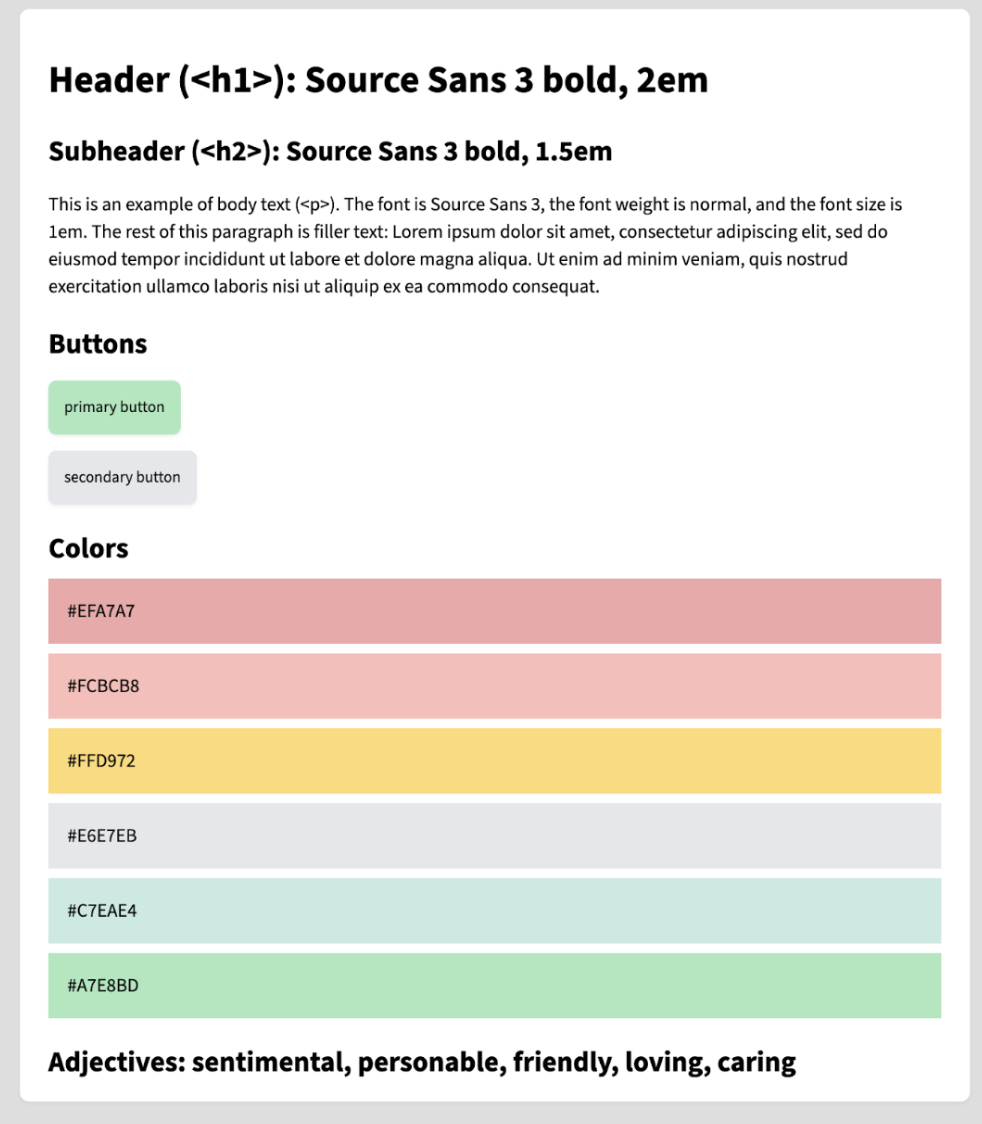
I created the style tile below to again focus on some of the core insights as to what makes long-distance friendships work: sentimentality, personability, friendliness, love, and care. I use Source Sans 3, a standard sans-serif font for web development. The colors are light and somewhat pastel-esque, again reflecting the key adjectives as described below.
Francis
Cameron
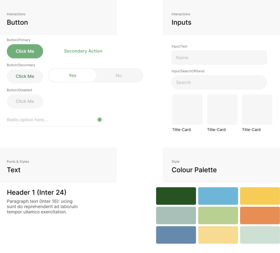
Team Style Tile
As a team, create a style tile for your prototype and upload an image to the blog! Include an image of your team’s style tile for your prototype.
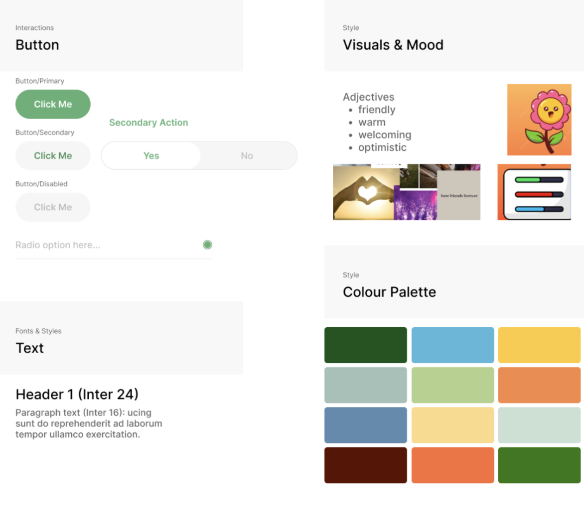
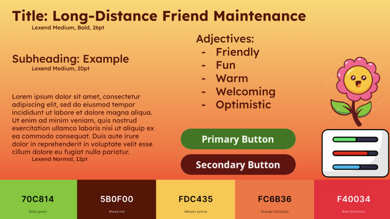
As a team, we created a combined style tile based on some of the elements of our individual style tiles. Our goal was for this style tile to use the professional-looking design of Cameron’s tile, combined with the color palette and flower imagery from Francis’ tile and the adjectives from EB’s and Francis’ tiles. Specifically, we replaced some of the more generic designs (ex: inputs) from Cameron’s style tile with the flower and status bar from Francis’. We also chose to use Cameron’s style tile as a base because it was designed in Figma (meaning future design for this class will be easier).