
Wireflows
We created wireflows for our two core interactions: anchor onboarding and microlearning session logging.
For the Pure Vibes persona—who struggles with consistency—the anchor onboarding flow is critical to making the habit stick. If users don’t generate a strong anchor statement that meets specific criteria, they may forget it, ignore it, or become desensitized to it over time. This can happen when the anchor doesn’t align with their intended microlearning frequency, when they don’t have access to the learning platform at the moment the anchor occurs, or when they aren’t mentally fresh enough to engage. To address this, we included optional examples of well-formed anchor statements and a checklist outlining what makes an anchor effective. Users can also edit or regenerate their anchor statement if it doesn’t feel right, ensuring ownership and alignment.
We also created a wireflow for microlearning session logging because the Pure Vibes user is motivated by experiences that feel light, positive, and emotionally rewarding. To support this, we designed a low-friction logging system with a simple mood tap (e.g. selecting a happy to sad face scale) and an optional short notes section for reflections. Viewing a history of past sessions adds a small but delightful layer of reinforcement, helping users see their progress and feel encouraged to continue microlearning.
Sketchy Screens
1. Onboarding
Before Critique
After Critique
Summary of Team Critique and Changes Made
The team’s feedback focused primarily on improving the guided introduction of anchoring (especially for users unfamiliar with the concept) and enhancing overall usability.
Based on this feedback, we added an introductory screen at the start of onboarding that briefly explains the purpose of the flow and defines what an anchor is. We also included a persistent “info” icon in the top right corner that users can access at any time if they feel confused. This icon opens a pop-up with a short explanation of anchor statements along with examples of strong anchor statements.
To improve usability, we replaced dropdown selection boxes with checkboxes since the limited number of options made dropdowns unnecessary. This reduces interaction cost by cutting the number of clicks from two to one. Finally, we added intuitive icons to key action buttons such as a checkmark for “Confirm” and a redo symbol for “Regenerate” to make actions clearer and more visually intuitive.
2. Notifications Set Up
Before Critique
After Critique
Summary of Team Critique and Changes Made
I started off by sketching the bare MVP for the notification task flow. The core functionality was there (onboarding for sources, a push notification, suggested content, and a quick redirect) but the overall experience felt too minimal and didn’t fully communicate the tone we want for the app. The team suggested adding a few supporting features to make the system feel more complete, such as notification settings so users can adjust timing, and an optional “log your micro-learning” screen to reinforce reflection and habit-building. We also discussed edge cases, like what happens if a user misses their anchor reminder, which led us to add a gentle nudge screen for skipped sessions.
Beyond functionality, we wanted the app to feel more intentional and engaging, yet simple. In the revised version, I introduced a more cohesive color system, used rounded-corner buttons to make CTAs feel more inviting, incorporated subtle brand colors to create warmth, and added recognizable app logos to make the suggested content feel familiar and personalized. Overall, the updated design feels more polished, supportive, and aligned with the lightweight, encouraging tone we want for a micro-learning habit app.
3. Context/Tips Set Up
Before Critique
After Critique
Summary of Team Critique and Changes Made
I started by sketching the bare MVP for the context and environment setup flow. The basic pieces were there. A loading screen, a welcome screen, options to add a widget or set wallpaper, and a widget selection screen with confirmation buttons. Functionally, it worked, but when we reviewed it as a team, it felt a little flat and disconnected. The hierarchy was not strong enough and the primary actions did not stand out clearly. The experience also felt a bit generic. The welcome message was neutral, the screens were floating without much context, and the widget display did not clearly show how it would actually live on a user’s home screen.
In the revised version, I focused on clarity, warmth, and context. I added the framing of a phone around each screen so it feels grounded in a real environment rather than abstract UI blocks. I personalized the welcome message so it greets the user directly, which makes the experience feel more supportive and human. I also made the final widget display much clearer by showing it directly on a home screen layout, so users can immediately visualize how it integrates into their daily environment. I strengthened the hierarchy by making primary buttons more prominent and cleaning up spacing, and I used softer, rounded buttons and cohesive colors to make the interface feel more inviting. Overall, the updated design feels clearer, more intentional, and more aligned with the encouraging tone we want for a microlearning app.
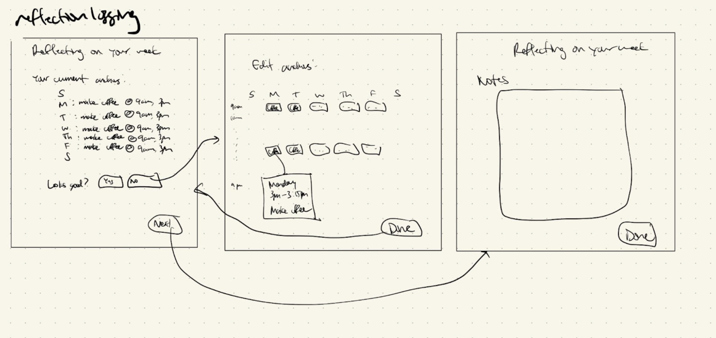
4. Logging
Before Critique
After Critique
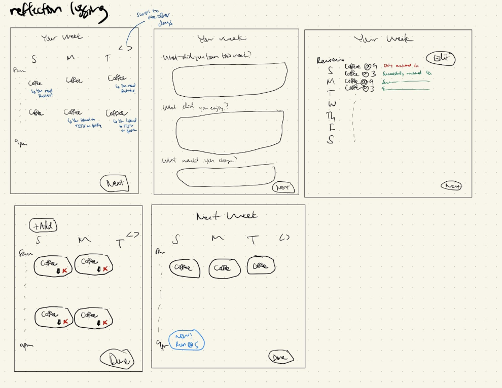
Summary of Team Critique and Changes Made
I sketched my initial thoughts for what a weekly reflection logging process would look like in our app. I included a review screen for reviewing anchors, an edit screen for editing anchors (or adding/deleting them), and a free-form reflection page where users could reflect upon their anchors, their week, and their learning.
My team noted that reflecting after editing might not make sense, and that reflection would cause users to realize they might want to adjust their anchors, so I moved reflection to be one of the first steps in the revised flow (screen 2). In addition, we realized that my initial flow put a lot of cognitive overload on users, forcing them to dig into their memory to think about what anchors worked, what didn’t, and what they learned. So, I decided to show the users their anchors and, depending on their activity, show them if they learned or didn’t learn when their anchors occurred that week (screen 1 of revised). Then, on the editing page, I similarly wanted to remind users again how successful their anchors have been, and then let them edit their anchors. Finally, users can see their anchors one more time, with new anchors or edited anchors highlighted in their upcoming week. In the revised version, I focused on reducing the cognitive overload of reflection as much as possible, and also made the reflection have prompts so that users didn’t have to think of anything on their own.


