
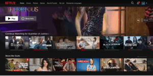
 Netflix’s interface is dominated by personalization: rows of content (“Because you watched …”, “Top picks for you”, “Continue watching”) and a large featured banner at the top of the screen highlight what the system thinks a user would stay on. The business model is about maximizing engagement time—the longer you watch, the more value Netflix gets (reducing churn, increasing retention). The algorithmic backbone reduces decision-fatigue: rather than expecting you to search, it suggests, you browse laterally and click.
The strengths are that there is very low friction to start watching something. However, because it emphasizes what “you’ll watch” rather than what you might discover, it risks echo-chambering. Netflix could improve by introducing more “delightfully surprising” suggestions or user-controlled switches (“show me something outside my usual genre”) to avoid tunnel-vision.
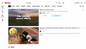
YouTube blends strong search affordances (you type a query) with algorithmic recommendations (homepage, sidebar suggestions after a video). The business model is oriented around ad inventory, the more videos you watch, the more ads you see. So it must both let users find exactly what they want and keep them watching additional content.
This is flexible as users can actively search, refine keywords, and discover via algorithmic suggestions. However, the algorithm-suggested “next video” flow can sometimes lead to low-quality or irrelevant content, hurting trust. YouTube might improve by giving users finer controls on “more like this” vs “something entirely new”, improving transparency of why a video is suggested, and adding filters (e.g., exclude short-form or certain channels) aligned to user preference.
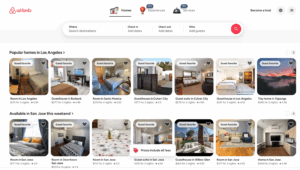
Airbnb’s browsing model is fundamentally different: users have a goal (book a stay) and need precise control (dates, location, budget, amenities, guest count). The interface emphasizes filters, map views, listing cards, and search refinement. The business model is focused on booking conversion—helping users find and complete a transaction.
This enables high-precision tools that can narrow down the set to viable stays; the interface supports exploration (e.g., map, list) while also driving towards booking. However, because the filter model is so structured, it can feel rigid or overwhelming (too many filters, too many listings). Airbnb could improve by adding more guided browsing—e.g., “If you’re flexible on dates, you might like …”, “Alternative locations similar to yours” or “Less-expensive options nearby”—to help users who are more in the ‘browsing for ideas’ mode than ‘exactly know what I want’ mode.
