How platforms handle search and browsing depends on what kind of action they want from the user. I looked at three different examples: Netflix, YouTube, and Airbnb.
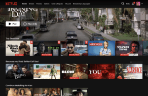
On Netflix, the first thing you see is a large banner promoting a specific show or movie. Below that are multiple rows of recommendations. These change based on your viewing history, but also include categories like top 10 or critically reviewed titles. The search function is visible, but small and placed in the top corner. Most of the page is designed to keep you scrolling, watching previews, and starting something new with as little decision-making as possible.
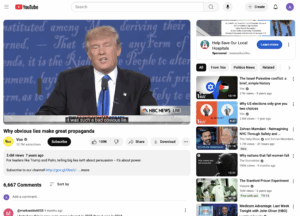
YouTube puts more emphasis on search. The search bar sits at the top of every screen and handles everything from specific video titles to general topics. On the homepage, there are recommended videos and Shorts, along with topic chips that you can tap to refine what you’re shown. When you’re watching a video, the sidebar fills with a mix of related and unrelated suggestions, and often includes a sponsored ad at the top. The platform makes space for both user-driven intent and algorithmic suggestions, which works well with its ad-based model.
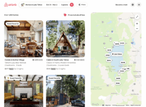
Airbnb relies less on recommendations and more on structured filtering. The homepage has a search form asking for location, travel dates, and number of guests. Once you submit that, results show up alongside a map, with price and location visible at a glance. The layout supports people who already have a destination in mind and want to narrow down options quickly.