Netflix
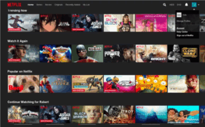
When I opened up Netflix, many of the recommended shows and movies filled my screen. I barely had to type in anything—the platform does most of the work for you, surfacing “Trending Now” and stuff you’ve watched before. Netflix wants you to keep watching, so its recommendation engine is super important, where it uses AI to shape your home screen around what it thinks will keep you glued for longer periods. That’s definitely a big part of Netflix’s strategy: driving engagement and keeping people subscribed by making discovery both easy and addictive.
Youtube
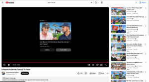
YouTube feels a little more active at first. I start by searching for a video (ex. golf content) but pretty much immediately, the algorithm takes over. The sidebar, home feed, and especially the “Up Next” autoplay queue all work to keep me watching, sometimes for hours. It’s designed so that even if I came with one specific thing in mind, YouTube wants to turn it into a longer session by constantly suggesting new, relevant videos. The homepage also serves up categories so I can just browse around if I don’t really know what I want to watch, turning a single click into an endless “rabbit hole” of content and ads.
Airbnb
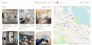
Airbnb couldn’t be more different, since when I’m searching for places near Stanford, tons of filters pop up—like price, amenities, Superhost, and map view. Booking feels more high-stakes than just watching a show, so the site is built to help me narrow things down fast and reduce any hesitation about making a decision. There’s social proof everywhere, with reviews and cancellation policies right up front. Airbnb’s core focus is on building enough confidence and clarity that I actually book, instead of getting lost in endless options and bailing on the process.