How different platforms help users discover content
Netflix (Recommendation-heavy discovery)
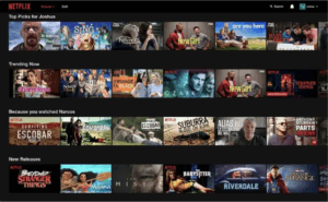
Netflix provides users with a personalized viewing experience through its infamous recommendation algorithm, analyzing user data like viewing history, preferences, ratings and viewing context like time of day to suggest content. On its home page, the feed uses large-icons for titles showcased in rows of carousels for each content bucket (ie. “Because you watched…” or trending lists), with the search button minimized on the top right and genre choices hidden in a separate screen. That’s because value creation for Netflix doesn’t start once a user hits play – it starts from the home page where users scroll to discover content that’s already been filtered to their preferences. Netflix’s subscription business model relies on user retention and engagement, and so if users can find content quickly and effortlessly, they’ll continue coming back to watch.
YouTube (Search + algorithm discovery)
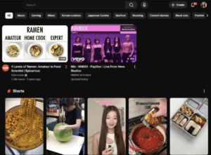
Youtube’s primary revenue source comes from advertising, and so their business goal is to maximize minutes watched per user to increase available ad inventory. Unlike Netflix which emphasizes personalized discovery, Youtube capitalizes on virality in a two-step discovery process that 1) filters by preference/intent and 2) sorts by likelihood of video being clicked (with virality being a major indication). After search is used for specific user queries, videos will be sorted by match with user intent and virality among other outputs. Youtube recommendations in the home screen, with the addition of shorts, can also influence consistent watch behaviors by surfacing a mix of content in all the users’ favored categories among those that are universally trending – this deceptive randomness creates an expectation that there will always be a video the user would want to click on with each refresh.
Airbnb (Filter-heavy browsing)
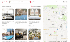
Airbnb users’ priorities during discovery differs from the above two in that they are looking for a best option, or even compromise, based on specific attributes they know they want in a home. This means Airbnb must help their users both understand their available options and evaluate them after they’ve been filtered down, which they achieve through both a list and map-based browsing interface, allowing users to test price ranges or visually compare options in a scoped down area. Given Airbnb’s success depends on booking conversion, its users need exact results rather than recommendations to book.