Instagram keeps onboarding friction low by focusing on the basics (quick signup, quick showcase of content from mutuals). This is intentional as they want users to immediately see value by surfacing their connections. The source of friction to me is choosing a unique username—if yours is taken, progress briefly stalls then you would have to repeat it again. Then comes the push to connect contacts: for users who are more wary about privacy, this prompt can be a notable drop-off point, as granting access is required for the “smooth” path (otherwise, manual matching is slower/less personal). Still, those downloading the app tend to have an intent to stay, so most push through, maybe 20% would still bounce at this step.

Notion
Notion’s onboarding is lightweight at first where just your name, email, and whether you’re using it for personal or work projects, then customizes the first workspace for either personal, team, or school and suggests curated templates. This snippet of personalization is thoughtful, but can make the profile setup feel a bit long for someone just eager to test it. The hurdle to me is after the signup: a step-by-step tour with checklists/tooltips, where it demonstrates value but can be overwhelming. Hence, Notion experiences more “late” drop-off, with maybe 30% leaving if the initial value isn’t clear.

Venmo
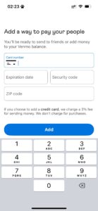
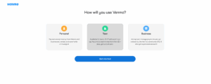
Venmo requires more steps up front—once registered, you have to verify your number and bank account and often confirm your identity. This can be cumbersome, but I think most stick it out because the need to pay (or get paid) is immediate, so people can tolerate the friction. I would guess Venmo’s drop-off is surprisingly moderate (maybe 15%) because users typically arrive with a pressing use case. Still, every annoyance in onboarding increases the odds that users might switch to alternatives like Zelle if it gets cumbersome.