
Amazon: One-Tap Speed for Conversion
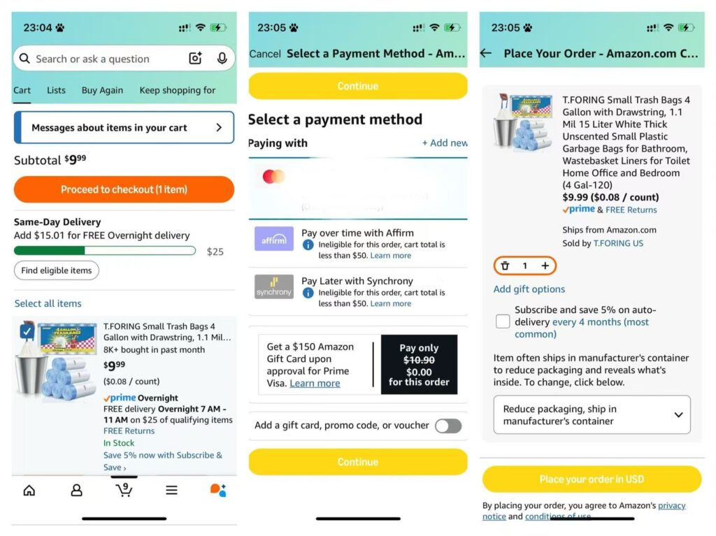
Amazon’s mobile checkout is famously frictionless, prioritizing speed. Every design choice streamlines the path to purchase. Returning users can skip forms entirely with 1-Click buying, using saved addresses and cards to instantly place orders. Minimal steps and clear progress indicators (e.g. Cart → Payment → Place Order) keep the process efficient. These choices eliminate friction and reduce cart abandonment, directly boosting conversion rate by making checkout completion fast and almost effortless
Warby Parker: Home Try-On Builds Confidence and Increases AOV
Warby Parker’s Free Home Try-On is designed to build confidence. Shoppers can try five frames at home for free, removing pressure and uncertainty. The cart shows progress (“1 of 5 frames chosen”) and encourages exploring more—gently increasing average order value.
Clear messaging, no upfront cost, and time cues (“Order by October 30”) all reduce hesitation. With a clean, reassuring flow, Warby Parker turns uncertainty into confidence—driving conversion and trust from the start.

Patagonia: Values-Driven Checkout Builds Loyalty
At checkout, Patagonia reinforces its mission with a values-focused badge row: 1% for the Planet, Ironclad Guarantee, Free Shipping, and Easy Returns.
These aren’t just perks—they’re trust signals. By reminding shoppers of Patagonia’s environmental commitment and risk-free policies right before placing the order, the brand reduces hesitation and strengthens emotional connection.
This clarity and alignment with values turn first-time buyers into long-term loyalists—directly increasing customer lifetime value (CLV).

