
Amazon (speed-optimized)
Amazon’s checkout process is pretty standard. You add things to your cart and press checkout. They have a “buy now” option which actually even skips over the whole cart step. This option is particularly symbolic of Amazon’s prioritization for speed. They value conversion rate, and want you to order, no matter how little or how much you order!
Additionally, there’s an entire page dedicated to recommendations, after there already being a smaller “Complete your basket with these items” widget on the cart page. It’s really up in your face, showing they also prioritize order value.
Warby Parker (confidence-building)
Warby Parker has a much longer checkout process. An interesting feature is that you can try glasses on virtually by connecting to your camera. This helps users to build confidence in knowing which pair they want. Additionally, they use a lot of affirming language, like “Yes, you can use insurance with us”. The steps are very thorough, with a separate page for each detail (prescription type, prescription numbers, etc.) Every part of the process is very reassuring and shows they value customer lifetime value, and want to help users get their perfect pair.
The “may we also suggest “ section is small in the corner on the cart page, unlike Amazon.
Patagonia (values-aligned)
When shopping at Patagonia you can show new or used. They have a worn wear policy that’s advertised pretty largely that says “we’ll buy back your clothes”.
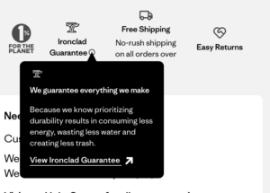
During the entire checkout process you see these little icons with the Ironclad guarantee, which shows their commitment to their mission. They heavily value customer lifetime value, by having all of these guarantees, and advertising them openly.
Again, there’s a “you might be interested in” widget but it’s subtle and underneath all the checkout stuff, more similar to Warby Parker.
