I’ve been looking at how Amazon, Warby Parker, and Patagonia handle checkout and it’s fascinating how different their priorities are.
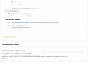
Amazon clearly optimizes for pure speed. You land, you click and you’re done. One-click checkout, stored cards, no distractions, it’s not designed to make you feel anything but rather it aims at removing any and every possible reason not to buy. For Amazon, efficiency = conversion.
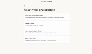
Warby Parker goes the opposite way. Their checkout is slower and more intentional with confirmation steps, return guarantees, even a gentle progress bar. Everything builds confidence (they even ask you if you want them to reach out to your doctor to learn about your vision). They’re basically saying that glasses are personal and that it’s okay to take your time. It’s less about pushing you to buy, more about reassuring you that you’re making the right decision.
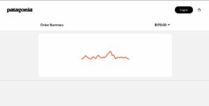
Finally, there’s Patagonia, which feels almost anti-ecommerce and aiming for sustainability. The page is quiet with lots of white space. They keep reminding you that 1% of profits go to the planet. It’s not trying to upsell you in any way, rather, it wants you both to align and to make you feel you are both there for the same purpose. Every design choice reinforces their and then your values, not just their product.
Overall:
- Amazon → conversion rate
- Warby Parker → trust and AOV
- Patagonia → values and lifetime loyalty