Rakali: Comparative Research
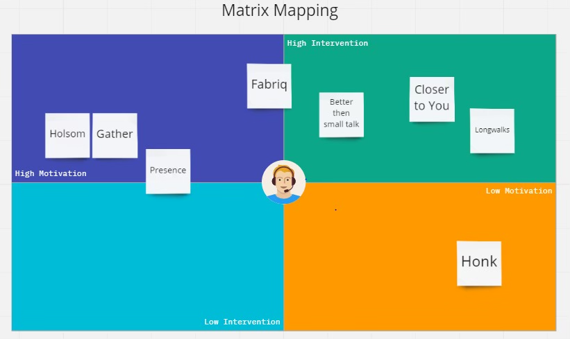
2×2 MapJasmine
Competitor 1: myfitnesspal
Brief description
Target audience: Individuals who want an “all-in-one” way to track food + calories/macros + exercise + weight toward health/fitness/weight goals. This may include those who:
Have weight change goals (lose/gain), including guardrails like using BMR/BMI to set “safe” goals
Are nutrition-conscious and want macro tracking (not just calories).
Already use wearables/fitness apps and want syncing across an ecosystem (Apple Health/Fitbit/Garmin/Strava etc.)
Unique features: MFP has several distinct features, including:
Fast logging workflows, including barcode scan, voice logging and photo-based meal logging (all premium features)
All-in-one integrated tracking approach: MFP emphasizes you can track nutrition, weight, exercise, steps, water, and intermittent fasting in one app
Integrations with other products: MFP promotes connectivity with 35+ apps/devices to auto-sync steps, calorie burn, weight, sleep, etc.
Market need they fulfill: “Help me turn fuzzy intentions into measurable, trackable behavior”. Provides clarity and sense of control over energy/nutrition inputs and outputs.
Image analysis
These MyFitnessPal screens present a tightly integrated behavioral self-regulation system rather than just a food tracker. The product is structured around a daily loop of logging, feedback, and adjustment: users record intake through meal-based entries, and receive immediate feedback on calories and nutrition breakdown (screenshots 2 and 4). Moreover, social features such as friends pages (screenshot 3) provide light accountability and norm-setting, while progress charts (screenshot 5) reinforce long-term identity and goal orientation. Overall, the interface reduces complex health behaviors into simple, actionable metrics (calories remaining, macro ratios, weight trends), and reinforces such behavior through progress and social incentives, making everyday decisions legible and manageable.
Analysis
Strengths:
Extremely low friction for tracking: tracking experience is optimized for speed and convenience
Massive data coverage as a moat: its food database (tens of millions of items, global foods, brands, restaurants) creates strong network effects: more users → more foods → better logging accuracy → higher retention. This is hard for smaller competitors to replicate.
Clear feedback loops and goal setting mechanisms: The calorie equation model (goal – food + exercise = remaining) gives users a simple mental model for self-regulation; Daily streak logic, repeated logging rituals, progress visualization, and longitudinal tracking support sticking with goal.
All-in-one ecosystem integration: nutrition, exercise, weight, steps, wearables, and third-party apps live in one system.
Weaknesses
Calorie-tracking feature can become counterproductive, as individuals may develop restrictive eating habits, rather than focusing on building a healthy and balanced diet, as demonstrated by a quote from one of our interviewees: “[When I used MyFitnessPal] it gets pretty bad, like, you’re trying to stay under really, really low calories, which is definitely not what you should be eating.”
Not very sensitive for those who may already struggle with maintaining a healthy relationship with food, and can exacerbate any disordered eating symptoms.
Our product will be built with psychological safety and vulnerability sensitivity in mind. For users who may already have fragile relationships with food (common among our target audience of young college students, as discovered through our user interviews), the system avoids triggering design patterns (e.g. hard limits, “remaining calories,” deficit framing, streak pressure) and instead supports gentle awareness, reflection, and self-regulation. Overall, our model is framed through wellbeing and sustainability, not control.
Competitor 2: noom
Brief description
Target audience: People who want to lose weight through behavior change, not just tracking. Noom especially resonates with users who see their struggle as psychological, not just informational, and would be open to psychology-based framing and coaching support.
Unique features: Noom is unique for its psychology-first model. It is not primarily a tracker, but rather a behavior-change program, drawing upon CBT methods, emotional regulation tools, motivational psychology, and habit formation science. While food logging exists, it’s subordinate to mindset change. Moreover, Noom also has a large educational component, as it uses daily lessons, modules, and micro-learning to break unhealthy patterns. This makes Noom more like a digital course + coaching system than a food tracking app.
Market need they fulfill: “Help me change my relationship and mindset with food, not just my intake.” It bridges the gap between clinical therapy (too heavy, inaccessible, stigmatized) and pure tracking apps (too mechanical and cold).
Image analysis
While Noom also has the traditional meal logging feature (third screenshot), it is also structured around guided behavior change rather than self-directed tracking. As seen in the second screenshot, features like daily lessons, emotional content (“your daily dose of laughter”), and behavior-based goals (movement, weigh-ins, logging) position Noom as a coach-led system that prioritizes habit formation, mindset shifts, and psychological support over numerical optimization. Moreover, health is framed holistically through the inclusion of broader metrics (e.g. blood pressure, glucose, movement, water in the first screenshot), and logging is embedded into a daily ritualized flow (“finish day”) that reinforces consistency and identity formation.
Analysis
Strengths:
Psychology-first design: informed by CBT-inspired framing, cognitive reframing, and habit-building models address motivation, emotional eating, and underlying mindset around eating
Educational component: the daily lessons and micro learning modules provide effective science-backed education.
Human-in-the-loop support: Noom integrates Health coaches, group accountability, messaging support, and social encouragement structures. These human interactions increase adherence and perceived care, which improves retention and trust.
Color-coded food system: foods are categorized (e.g., green/yellow/red) based on caloric density and satiety value. This reframes eating as quality + balance, not just calories.
Sustainable changes framing: The platform emphasizes balance, moderation, and long-term change rather than rapid results, positioning itself as a lifestyle change system instead of a crash-diet tool.
Weaknesses
Noom is primarily focused on weight loss as a behavior change, and does not extensively address other eating habits. Even when other eating habits (e.g. timing, fueling, patterns, emotional eating) are addressed, they are primarily framed as instruments for weight loss, rather than as independent health goals. As a result, Noom may not be able to support users whose primary goals are energy regulation, nourishment, performance, or relationship-with-food improvement rather than weight change.
Despite its psychology framing, calorie tracking and food categorization still remain central, which can still trigger control-based or obsessive behaviors in vulnerable users.
Our product fills this gap by decoupling eating behavior change from weight loss as the primary outcome. Instead of treating habits like eating timing, fueling patterns, hunger regulation, and emotional eating as tools for achieving weight change, we position them as core health goals in their own right to bring about effective behavior change. Overall, while Noom’s focus is on weight loss, our focus is on improving specific eating behaviors, such as late night eating, in its own right.
Ananya:
Competitor 1: EatBuddy
Brief description
Target audience: Individuals who want to understand their eating habits on an awareness level, and would rather avoid direct intervention strategies. As noted by the application itself, this platform hopes to reach its users on a more mindful level, to encourage them to cook for themselves, and find intrinsic motivation through the more passive task of recognizing their capacity for consumption in the moment.
Unique features: EatBuddy initiates the process of logging food through a fullness check, followed by the more typical aspects of consumption. This emphasizes to the user to recognize their reasoning for eating in the given moment, and perhaps pivot if they realize the food is not necessary. EatBuddy also offers challenges to users (on a premium level) to gamify the process and personalize their journeys and experiences with the app.
Market need they fulfill: Creating data to answer the “why” of eating → “Why am I choosing to eat now? Why am I eating when I’m not hungry? Why am I still hungry even though I ate [x] minutes/hours ago?”
Image analysis
The first screen depicts one of the onboarding screens – the pleasant colors of the central graphic emphasize the gentle, non-intrusive nature of the app, as does the question posed at the top: “How about eating more mindfully?” They also give the user the decision power to turn this feature on or leave off, again signifying that this is meant to be used to find internal strength and acknowledgement. The second screen shows the various levels of fullness that can be selected when logging a meal. Notice that the smaller the capacity to eat, the more “dangerous” the colors become, indicating to the user that they may want to reconsider eating (or having to log) a meal or snack if they meet these fullness conditions. The third and fourth images present the questions asked when a meal is being logged: The app sets no expectations for what or how much a user should be consuming → the dropdown menu for quantity lists “slice, bite, teaspoon, etc.”. The tag “#homemade” is the only tag available to select, representing that food produced at home has special value (perhaps is healthier, and thus something to be celebrated?). In the “More details” section, the app delves more into the emotional and mindful aspect of eating, asking for a general state of awareness as well as a level of satisfaction, encouraging the user to try to consume to a level that they are comfortable with and create an experience that they leave with happiness.
Analysis
Strengths: The app targets the mental side of eating that few other food-logging apps do, meaning they touch on a niche angle of the problems that could include: mindless eating, binge eating, entertainment eating, stress eating, etc. They request for the user to incorporate a sense of mental fulfillment, reinforcing the concept that food may be both for health and pleasure, most ideally both.
Weaknesses: The user is required to be honest with themselves when logging their level of fullness, which is not an easy thing for people to acknowledge. There is very little pressure to stop a user besides having them realize (based on smaller, subtler prompts) that a given time may not be the best time for them to be consuming food. The overall aesthetic design of the app is simplistic, but perhaps a tad basic to be retaining users to consistently track their eating habits.
Our product idea might seek to create an even more source-targeted intervention solution, to help our audience prepare in advance for consumption even after fullness has been reached. It could try to create more of an emotional impact on the user regarding the effects of eating beyond fullness, such as physical effects, morning-after effects, economic effects, etc. While EatBuddy attempts to be an abstract companion, we may attempt to solidify an image of a companion with which the user can relate to – a character they can see (that is yet not real beyond the virtual world of the app) could still provide enough intrinsic motivation if they see themselves in it.
Competitor 2: Loumi: Stop Snacking
Brief description
Target audience: Individuals who have trouble controlling their impulse to snack, whether mindlessly (although full) or due to hunger. This app was created as a habit-breaking tool to diffuse urges and create a sort of habit-stacking practice (e.g. instead of snacking, brush your teeth).
Unique features: Task redirection is a large part of what caught my eye in this product. The simple act of acknowledging: “Just for 2 minutes, let’s do something else” → that habit-breaking can be started in very small steps, and can be something that is suppressed or indulged without judgement and has a nonlinear trajectory. The cute mascot of the app was also a fun addition to the personality that I didn’t see as involved in the process of other food tracking apps.
Market need they fulfill: An external (and humanistic) guide to the habit-diffusing prompting and techniques that we have been reading about with our sketchnotes each week. An activity generator to divert the mind away from a temptation and towards a more productive activity.
Image analysis
The first screen is part of the personalized onboarding process and interestingly enough ties back to some of our design principles (in certain analysis and reflection stages): be specific! The app recognizes that a specific, personalized goal is more effective in the long run than a generic one. The second screen gives the user a sense of all the benefits they could receive if they try to follow through with their attempt to curb their snacking habits. The following 4 screens address the habit intervention process that is the core of the app. The first sets the tone for the moment, understanding that impulse and temptation are hard things to overcome in the moment, especially for a physical habit like eating. The UI is simple and calming, using the graphic to show companionship and togetherness. The temporary intervention process initiated by the “promise” made in the second screen makes the user commit to the app but also to themselves. It reduces the seemingly large commitment to “stop snacking” to a matter of stopping snacking for just 2 minutes, which seems reasonable and tolerable. The third screen suggests a substitute activity that is both healthy and should occupy the whole amount of time proposed. Additionally, this particular activity occupies the hands and mouth, the same areas of the body that are requiring stimulation at this point. Finally, the fourth screen demonstrates the success in small steps, not just through images but through words: “You didn’t suppress … You learned not to obey.”
Analysis
Strengths: There are strong aspects to be seen in this product, specifically its unique approach to snacking. Rather than taking a passive stance and making the user the responsible entity in the relationship, or being completely aggressive and preventing/shaming the user from indulging their impulse, it offers a pleasant alternative to the problem. It also acknowledges the difficulty of the task and the moment, and does not offer judgement, only encouragement.
Weaknesses: After a period of use, perhaps the activities suggested may not be as effective in curbing the habit, since it is still suppression of some sort. Additionally, the proposed activities may not be helpful based on the circumstance (e.g. a student working late at night on homework might not have the motivation, time or need to go brush their teeth in the moment).
Our product idea may address the habit in a similar way. However, our goal might try to avoid the act of diverting the user’s attention in a different direction and create suppressed desires to eat/snack, and instead find more productive, healthier ways to address a habit that our audience has resolved to maintain (at least, while they are still in college).
Shuman:
Competitor 1: See How You Eat (SHYE)
Brief description
Target audience: People who want the simplest possible food diary (two taps, photo logging), plus coaches/athletes who share logs for feedback.
Unique features: Photo grid that makes eating patterns visually obvious; emphasis on regular eating rhythm, sharing with a coach, and challenges for motivation.
Market need they fulfill: “I need to track consistently, but I refuse to do math.” A frictionless visual diary without calorie counting.
Image analysis
The figure uses a bright green palette and big, rounded cards to signal “healthy, friendly, low-stress,” while keeping attention on food photos rather than numbers. The UI highlights a photo-grid diary (“see your days at a glance”) plus sharing, reminders, and goal progress, which makes it feel more like habit-building and accountability than strict calorie tracking. Notably, the “AI Boost” badge and challenge tiles suggest lightweight personalization and gamified nudges, but the core value is still ultra-fast visual logging.
Analysis
Strengths:
Easy to use and easy to form a habit, you don’t need to spend a lot of time exploring this app. The simplest thing is to take a photo every meal. Extremely low effort and higher adherence (photo log, quick taps).
After a few times of recording, you can see what you have eaten recently, which helps you establish your awareness of your diet and gives you a sense of achievement.
“Non-judgmental” positioning lowers drop-off for users who hate calorie apps.
Clear “rhythm” framing. Supports regular eating habits, which is relevant because irregular daytime intake often leads to late-night hunger.
Love the green interface.
Can set meal reminders.
Weaknesses
It’s not purpose-built for late-night eating intervention (it documents; it doesn’t aggressively prevent).
Our product will add prevention via daytime balance: breakfast suggestions + daily nutrition planning that explicitly reduces night hunger.
Competitor 2: AteMate (Ate)
Brief description
Target audience: People who want mindful, low-pressure food tracking (often used with a coach/dietitian), and who dislike strict calorie-counting.
Unique features: Photo-first journaling with reflective prompts around why you ate / how you felt / context, plus broader habit tracking (food + movement + sleep + hydration + mood).
Market need they fulfill: “Help me understand my patterns without judgment or diet culture.” A softer alternative to macro/calorie apps.
Image analysis
The warm orange and the cute mascot make the brand feel friendly and “non-judgy”. The screenshots communicate value fast with big, high-contrast headings (“Awareness, not restriction,” “Notice patterns”), and the UI clearly supports multi-factor tracking (food, mood, sleep, hydration) with insights visuals. It also does a nice job showing a full loop: quick capture, reflection prompts (“Why did you eat?”), Pattern dashboards and social or support features, which makes the product feel comprehensive rather than just a photo log.
Analysis
Strengths: It aims to help users strengthen their awareness-building. Reflection prompts + pattern noticing (food + mood/lifestyle) is highly aligned with “behavior change, not dieting,” and there is “Non-judgmental” positioning, which lowers drop-off for users who hate calorie apps.
Weaknesses: Not specifically designed for late-night eating as a targeted behavior (e.g., how to avoid too much late-night eating).
Our product will add a late-night specific “episode” flow: What time? what food? calories? trigger/emotion? context? then auto-surface patterns weekly.
Austin:
Competitor 1: Eat Right Now
Brief description: A mindfulness-based app targeting those struggling with emotional eating, cravings, and stress-related overeating. It uses science-backed mindfulness training, short daily lessons, and craving-management tools to its user base, fulfilling the need for non-diet, behavior-change approaches to improving eating habits.
Image analysis
The app features habit-loop mapping, craving management tools, guided mindfulness exercises and simple check-ins designed to interrupt emotional eating patterns. Light colors that mimic nature are used to make the user feel safe and supported rather than pressured or judged.
Analysis (strengths, weaknesses, and how our product addresses gaps or improves the user experience):
Strengths: The craving tool + habit mapper help users clearly visualize their eating patterns, making it easy to see which foods they gravitate toward in both positive/negative contexts.
Weaknesses*: The stress test feels limited in depth, and the mindfulness exercises are largely meditation-based, which may not align with what users are looking for in an eating habit app per-se. Also, time-blocking isn’t a key feature for ERN, which makes its mission distant from late-night eating habit platform.
It will expand beyond mediation in some aspects, offering actionable, context-aware tools that pair pattern insight with concrete next steps rather than general stress relief.
*NOTE: This platform did have a cost-barrier, and seems to be provided primarily by health insurance providers as a supportive tool for eating.
Competitor 2: MyPlate
Brief description: MyPlate, a USDA (U.S. Department of Agriculture) program targets individuals seeking straightforward, evidence-based guidance on healthy eating with metrics. Its features include food-group-based daily goals (i.e. protein, grains, etc.), visual progress tracking, cooking recommendations, and light gamification (badges, challenges) to support sustainable habit building.
Image analysis
The UI uses bright, friendly colors that mimic food groups with clear labels, clarity and an intuitive welcome screen. Visual progress bars, checkmarks, and badges make healthy eating feel achievable and structured, reinforcing consistency over precision.
Analysis:
Strengths: It focuses on simple, USDA-backed nutrition guidance using food-group goals, visual progress, and light gamification, which lowers complexity and helps users across varying age-groups build healthy eating habits without calorie counting or diet pressure. MyPlate is also famously backed by one of the largest public health authorities, increasing initial trust and credibility.
Weaknesses: While being designed for general daily nutrition with action-items for healthy habits, it does not address timing, emotional context or specific behaviors like late-night eating.
It will add prevention from late-night hunger and habitual snacking, by addressing daytime under-eating, meal timing gaps and unbalanced meals earlier in the day.
Target audience: People who know exactly what they overeat and want to hard-stop. This is good for late-night snackers, “I’ll just have 1” types, and people who like physical commitment devices. kSafe has a physical time lock, it requires pre-commitment, and the effect is immediate. kSafe provides a simple way to reduce late-night eating that doesn’t depend on willpower in the moment.
Image analysis
This is the product picture from Amazon (link). The top interface features a countdown timer, and the company decided to include features like cookies, credit cards, and the phone inside the product to demonstrate its versatility for controlling modern-day vices.
Analysis
Strengths: kSafe has super high efficacy regarding impulse access (if the food is inside, you can’t eat it). Because it has no tracking or learning curve, it also has a super low cognitive load, and once the decision is made, it can’t be un-made. It is specifically good trigger food control.
Weaknesses: One big weakness is that it only works if you pre-load it. That is, if you lock your cookies in kSafe, you could just go out and buy some more, and still have access to your trigger foods. It is also simply a habit blocker, not a behavior re-trainer that teaches coping/hunger regulation/underlying triggers.
We would want our solution to go beyond physical restriction and fill in the behavioral change gaps, such as pairing the safe with guidance so the user learns what’s driving the behavior. Ideally, our solution will still work even if the user doesn’t physically lock the snacks. Also, we hope to establish positive routines and emphasize rewards and self-understanding rather than prioritizing denial.
Competitor 2: FoodTrainer (FoodT)
Brief description
The target audience for FoodT is people who snack on specific trigger foods and want a brain-based approach. This solution could also be good for people who like short daily exercises or anyone motivated by gamification. FoodT offers go/no-go inhibition training, which seeks to rewire automatic responses to target foods. FoodT improves the UX by instead of hoping that your internal habit-tracking/behavior-changing will intervene in late-night eating, you instead have a physical second party tool to stop you.
Image analysis
(Left) The start page, where “bad” foods like chocolate are circled in red and “good” ones in Green. Simple interface with clear signalling. (Middle) An in-session screenshot with another “bad” food circled in red. The user is prompted to only tap on green-circled foods, such as the blueberries at (Right), and to ignore those in red circles.
Analysis
Strengths: It has customizable images, quick sessions, and is inspired by research. It helps reduce cravings and automatic reach behaviors without strict dieting or extensive tracking; this is what makes it an “internal motivation” tool, as in our Miro board. FoodT is good at targeting automatic behaviors. Late-night eating is almost reflexive, and the physical intervention in that habit, which FoodT offers, aims at the reflexive nature of the habit. It also scales really well: just a few minutes a day, so it’s easy to distribute, and it has a super marginal cost to the user. Its personability can focus on the user’s exact temptations.
Weaknesses: Though this might be effective, it might not reliably carry over into real-life late-night eating habits, such as social settings or times when you’re really stressed. It also doesn’t address situational triggers like sleep deprivation, routine boredom, or your household food environment. Also, repeatedly setting the time delay could trigger engagement dropoff.
We would want a solution that, instead of hoping that training like FoodT will generalize to real-life behavior, shows up at the real risk window. While FoodT is customizable, a more customizable, prompt-based model that is more engaging can help people who eat late at night and want to stop.