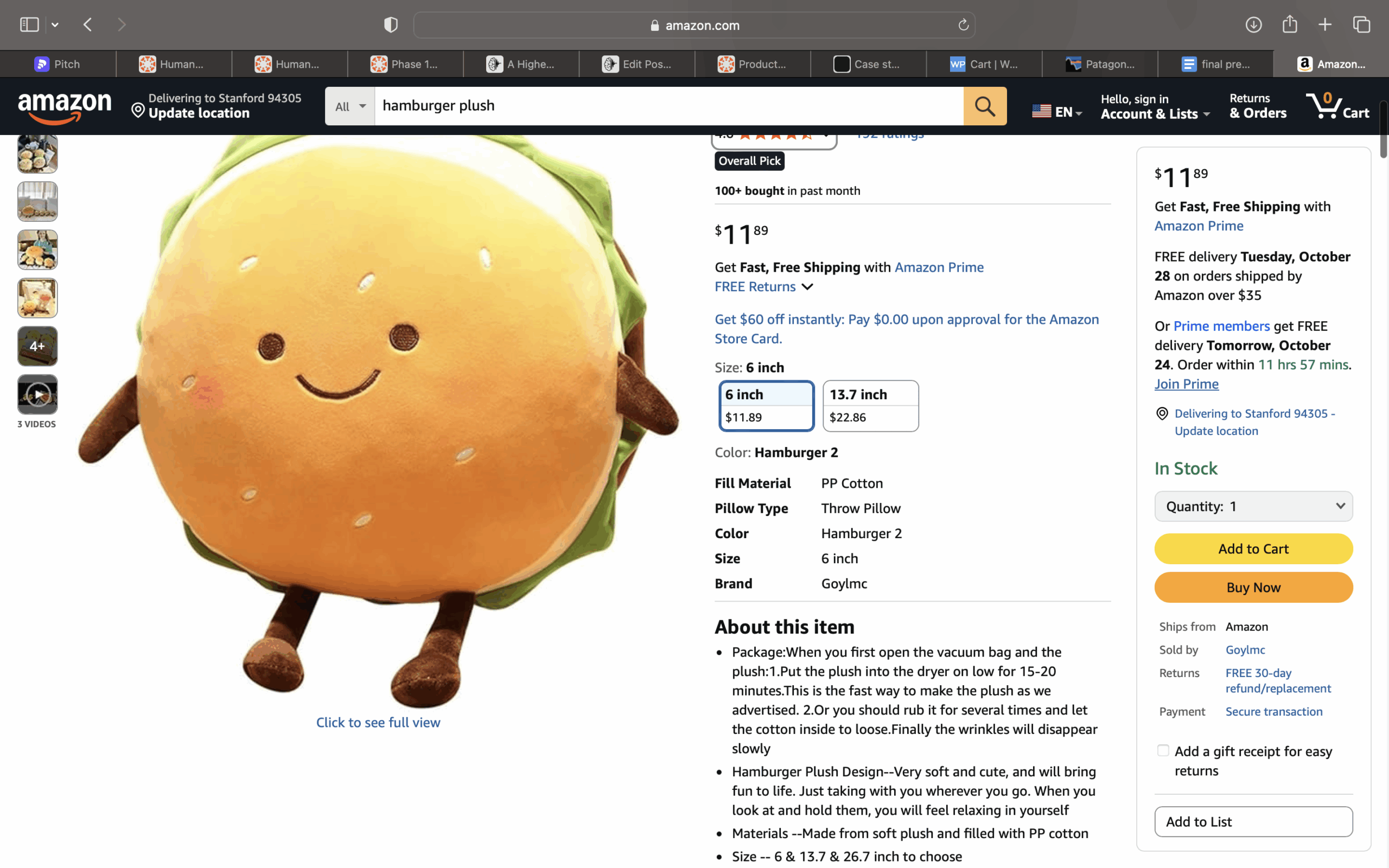
Amazon’s Flow
Amazon’s flow as depicted below, is speed optimized and minimizes friction for the consumer. They have two checkout options: “add to cart” for multi-item purchases, and “buy now” which bypasses the cart entirely and takes the user straight to checkout. Amazon also keeps your delivery and card information saved for maximum speed and convenience. Additionally, they provide information such as estimated delivery dates, stock levels, and return policies, emphasizing clarity.
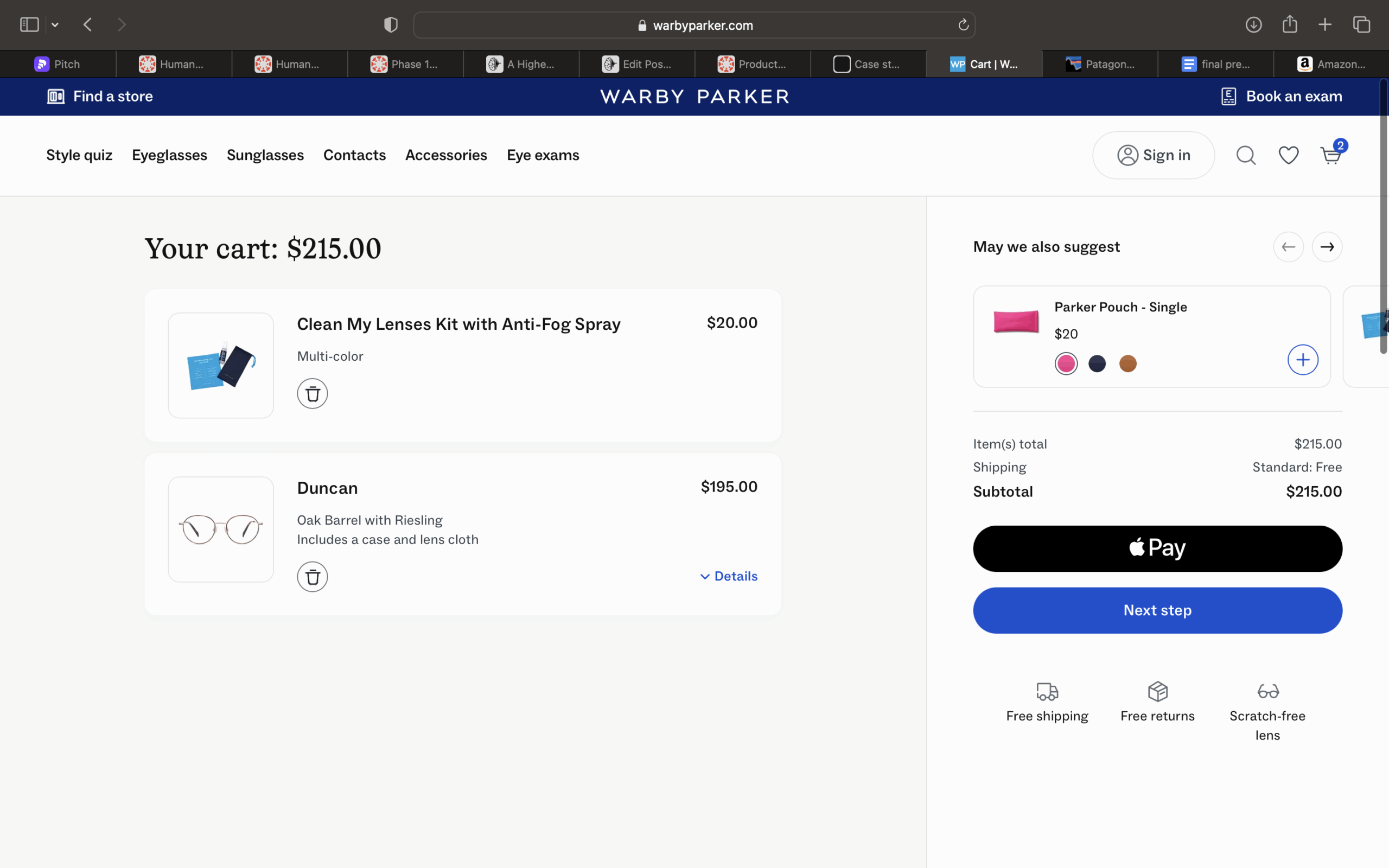
Warby Parker’s Flow
Warby Parker’s checkout flow is clean, minimal, and confidence-building. The design emphasizes trust and aesthetic clarity rather than speed. Each step is visually calm, with generous white space, large product photos, and reassuring information about free returns and easy exchanges. Unlike Amazon’s rapid “buy now” approach, Warby Parker intentionally slows the experience just enough for users to review their frames, lens options, and prescription details before confirming. The absence of clutter or upselling keeps focus on the purchase decision itself. Overall, the flow conveys professionalism and reliability, helping customers feel secure and satisfied with a higher-value, more personal purchase.
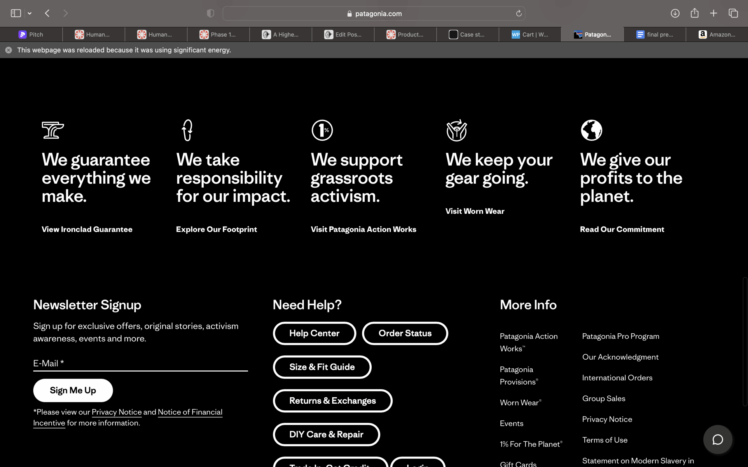
Patagonia’s Flow
Patagonia’s checkout flow is values-driven, reflecting the company’s environmental mission at every step. Rather than pushing quick checkouts, the design emphasizes transparency, sustainability, and trust. Clear messaging reminds users of Patagonia’s commitment to ethical production and durability, like highlighting recycled materials or repair programs near checkout. The tone is calm and conscientious, with minimal visual clutter and straightforward navigation that reinforces authenticity. Overall, Patagonia’s flow optimizes for long term costumer relationships, deepening loyalty through shared values.