The slide deck I selected was from Mixpanel’s 2014 Series B round, where the group eventually raised $65 million. Right off the bat, I see that the entire pitch deck was only 12 pages long, and that it had a visually cohesive blue and white styling.
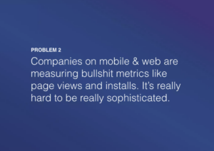
After the title slide, slides 2 and 3 immediately dive into problems. These slides were clear and concise, providing 1 sentence long summaries of larger issues of 1) making decisions and 2) selecting metrics. The lack of data also reduces overwhelm, as they focus on descriptive problems in an approachable manner (even using casual, ‘relatable’ words like “bullshit.”

Slides 4-5 directly put a solution and clear mission statement that seek to address the problems. Namely, it sets up Mixpanel as the obvious solution to the investors in the audience. The slides draw people in, though there is a sense of disbelief as none of these slides have data yet. I wonder if adding very concise data statements would improve the logos of the argument.

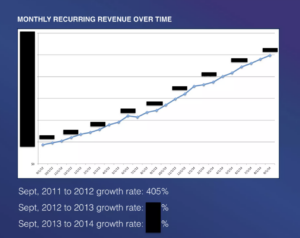
I was surprised by slide 6-7, as the company directly states “we are winning” within those slides and cleanly shows its revenue. It suggests either pride or confidence, and it grabs my attention. Given that the company is raising Series B, it makes sense that it briefly goes into its seemingly successful history since 2010.

Slides 8-10 lost me a little, as it felt like an onslaught of statistics and numbers after zero statistics in earlier parts. There is a tone shift, and the line by line text does not feel like the clearest way to include information.

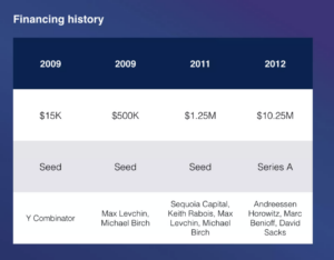
Slides 11-12 make competition and financing history easy to visualize, but I wish there was an end slide that more cleanly ties things together.

In conclusion, I find the slide deck to concisely convey key information, though I noticed weaker strategies in conveying the more statistical content. I would consider the pitch to be a strong one overall, hitting the key points of conciseness, clarity, and clear overall positioning as the ‘winner’ against competitors.
Post-script note: I know that the slides render as different sizes and I have tried to change the sizing to be more consistent. However, my attempts at fixing it haven’t worked. Please let me know if this detracts from the reading experience or if I should resubmit.