
Buffer’s pitch deck has a fairly simple format that shows how to tell a story concisely and with minimalist design.

SLIDE 1: Introduction with logo
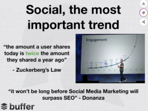
SLIDE 2: The first slide introduces Buffer by presenting the theme, social media, and writing quotes to show the growing market. I think it’s a good introductory slide to give the viewers an overview of why Buffer is entering this market. However, it could’ve been formatted better since it looks a bit sloppy. Nevertheless, the quotes add to the argument and I’ll try to incorporate quotes into my deck.
SLIDE 3: This slide asks a rhetorical question to make the viewers understand how Buffer operates. I like the simplicity of this slide and will use the rhetorical question format.
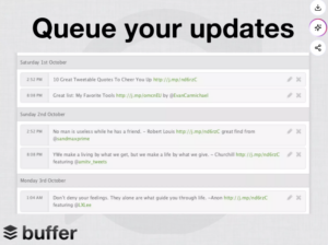
SLIDE 4: This slide presents the solution, which is queuing social media updates. I think it can be clearer because a reader could interpret the screenshot as a user’s post history, but the team likely explained the screenshot better aloud. It makes sense how they don’t want to clutter the page with sentences explaining the screenshot.
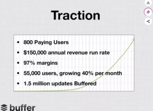
SLIDE 5: This slide has the strongest evidence of demand. I think they could add more color to the text to make the numbers stand out, but it’s a small stylistic preference. This is an important slide because it justifies the necessity of the solution.
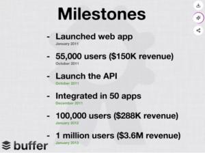
SLIDE 6: This slide connects the current metrics to future growth targets. I like this slide because it’s clear which are past milestones and which are future goals.
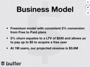
SLIDE 7: Here, they explain freemium conversion and customer economics, which are important points to cover for investors. It presents the information in a simple, easy-to-understand way.
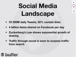
SLIDE 8: In my opinion, this slide is a bit redundant since points like Zuckerberg’s Law were already introduced in an earlier slide. I think this slide would’ve been more effective if placed near the beginning.
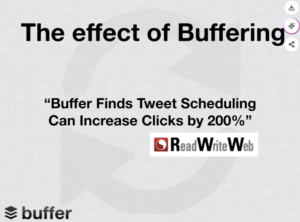
SLIDE 9: This has a helpful Buffer-specific metric that explains the tool’s current traction.
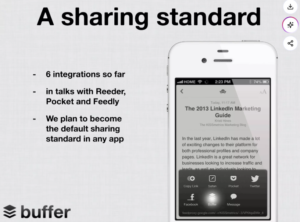
SLIDE 10: This explains current integrations and the plan in the future, which is a good ending slide.
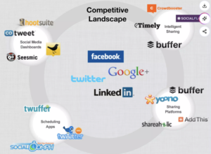
SLIDE 11: This maps the competitive landscape. It would’ve been clearer if it was on an axis.
As an investor, I would still want to know what types of customers pay for the solution and why the problem is urgent. I would also want to know why Twitter wouldn’t be able to build a tool like this in-house.
For the Sanity Check pitch, I would steal the simplicity and the slide showing quotes to demonstrate the importance of the product.
