Team-1 Alix Cui, Grace Zhang, Grace Zhang, Godsfavour Simon
Comparative Research
This quarter, as part of the CS 247B Design for Behavior Change studio, we are looking to design a product that helps college students maintain and foster their connections with others. To analyze where our project will fit in the already existing problem space, we conducted comparative research that related to our topic.
To that end, we researched nine solutions in the personal relationship management realm and summarized their strengths, deficits, and notable value propositions below.
Product Deep Dives:
Snapchat

Description
We’ve all had that moment of panic – you open your Snapchat, see the line of hourglasses next to your friends’ names, and frantically send a snap to keep the snapstreak going. You tap through your friends’ snaps, seeing random snippets of their life, like what they’re eating or where they’re at, or their facial expressions with a hilarious caption. Snapchat is a popular video-and photo based messaging app, used highly among students. Snapchat notably pioneered the idea of “stories” and “streaks,” which are core features that make it an extremely interesting product with its premise built on ephemerality. Snapchat is often cited as a way people loosely stay in touch with a larger variety of people because of its low level of necessary interaction and ease of connection.
Target users
- Snapchat currently has 293 million daily active users worldwide.
- 67.58% of Snapchat daily active users are based outside of North America.
- Snapchat reaches over 75% of the millennial and Gen Z population in the US.
- On average, 5 billion Snaps are created every day.
The average US Snapchat user spends 26 minutes per day on the app in 2021, which is a slight increase from 24 minutes per day reported back in 2016. Pew Research Center reports that 59% of American Snapchat users access the app on a daily basis, and 65% of US internet users aged 15 to 29 use Snapchat.
Features
Streaks: Snapchat’s “streak” functionality encourages people to communicate with each other daily to maintain the streak. It requires one snap a day from each person, and is a subtle but effective framework to nudge people to stay in touch.
Snaps/stories: Snapchat’s “snap” functionality is also extremely effective and insightful, and it was the first major social media app to leverage a photo-messaging framework as the core of its platform. These snaps allow people to send snippets of their day as messages, giving others a glimpse of their day-to-day lives, and also maintaining a connection.
Value proposition
Snapchat is a great app for maintaining a wider network of friends of varying degrees of closeness, and has a well-understood and effective framework for people to communicate at least once daily. It’s super easy and low-effort to use, and is a springboard from which you can initiate conversations with people you already have a streak with. It’s also delightfully personal because its photo premise gives actual snapshots into life and offers a dimension that plain text messages lack.
Costar
Description
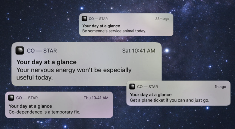
My phone lights up, and I see the newest notification pop up on the screen. “You’re still afraid, though you’re reluctant to admit it to yourself.” Thanks, Costar. I open it up to read the rest of my daily horoscope predictions – apparently, today, I feel torn between introspection and disassociation, and I’m encouraged to be vulnerable this month in order to break free of what limits me. It’s a staple part of my routines – I always look forward to getting my costar and ruminating about all these introspective topics. I scroll down farther to see today’s ice-breaker question: “What are your relationship goals?” My answer based on my costar reading is apparently deleting all my dating apps – my best friend’s is sharing a wardrobe with each other. And honestly, I think it’s pretty accurate for both of us. I screenshot it and send it to him, prompting the start of a fun conversation. Costar is a popular horoscope app that gives people a daily digest-esque report of their different horoscope aspects and interactions. It is primarily a personal-use application with a once-a-day prompt that refreshes daily. The insights are interesting to read and compare and ruminate about with others, and it is possible to see friends’ horoscope predictions as well.
Co–Star’s algorithm maps human-written snippets of text to planetary movements to display personalized content for each user.That content has been called “slightly robotic,” “wildly beautiful,] “truly insane,” “brutally honest,” and compared to “a free therapy session.”
Target users
The app has only been around since 2019, but has been downloaded by a quarter of all young women ages 18-25 in the U.S. 58% of American 18- to 24-year olds believe in the practice of astrology, and the app is incredibly popular within that niche. In giving users the option to add friends, compare compatibilities, and see live updates of each other’s readings, Gen Y may not only earnestly turn to their horoscopes for guidance, but also use it to break the ice and discuss friends’ actions or personalities.
“We thought there was a huge opportunity to create the first astrology experience that users actually love – one they actually want to use every day.”
Features
Friends’ costars: The app only has a couple different screens, which makes it easy to use and places it low on the activation axis. The Home Screen shows your own horoscope predictions, but also shows a snippet of others’ costars as well, which is a small glimpse into their “lives” and offers an implicit conversation starter.
Icebreaker/conversation prompts: The Home Screen also has a section of ice breaker prompts and interaction ideas. The icebreaker prompt will show your own response based on your horoscope and you friends’ as well, which is a small prompt to initiate conversation with them that already has a seamless way to start. It also has action ideas, which suggest various interesting activities based on your horoscopes.
Value proposition
Costar is an upcoming app that already has an incredible following in its target niche. It is meant to be a self-reflection/self-discovery/and self-improvement app with its core functionality, but also has seamlessly integrated a framework for social interaction based around providing conversation starters and topics, whether it be a light and humorous chat prompted by an ice breaker, or a deep and extensive discussion about personal horoscope interpretations. It’s super easy to use and requires little actual physical engagement and is a standalone app that can catalyze interactions on other more dedicated messaging or communication platforms. “It’s like sitting on a couch with your best friends and talking about yourself without judgement.”
When2Meet
Description
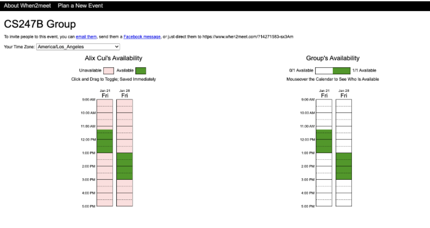
I’m sure a lot of us have used when2meet at least once before. It’s a scheduling website that helps groups find the best time to meet. With a unique shared link, members of a group go in and interact with a calendar where they can select time intervals that they are free. After everyone has filled out the when2meet, when2meet shows a heatmap-like calendar for times when most if not all people are free at. The user-interface is extremely basic and just gets the job done. There is not much styling (almost as if no UIUX was put into the development); however the interface is relatively straightforward. In addition, the website has no level of integration with other applications i.e. calendar/schedule applications. Users have to do that manual comparison on their own when inputting their available times.
Target users
When2meet targets a wide variety of people, ranging from students to some people that just want to get together. In addition, the simplicity of the UX makes it so that groups can send out a schedule almost immediately, therefore, the website is great for people that are in a rush and want to focus on more important things rather than just scheduling.
Features
Amazingly simple UX that people can fill out fast. At-a-glance solution. Shareable links and no need for account creation which make it really accessible.
Value proposition
A barebones group planning site that is very manual and has a high learning curve but gets the job done most of the time.
meetings.amazon.com

Description
When I interned at Amazon last summer, we had this scheduling web app that I found extremely useful. It was integrated with everyone’s Outlook calendar, and you could create meetings extremely quickly with anyone because of it’s time recommendation algorithm. If you want to start a meeting, you enter the people you want to have it with, whether or not their required or optional, and lastly a timeframe for when you want to create this meeting. Then, the algorithm returns a long list of times that work for everyone, and if there is no time that works for everyone, it shows who it works for and who it doesn’t. Then you can just immediately select one of the times and draft the meeting text and it immediately gets sent out to everyone in the meeting’s Outlook. Even better, the UI was extremely well designed unlike other internal tools at Amazon. This web app was a real game changer for me because I no longer had to manually look at people’s calendars and find little gaps where everyone was free; it was now all automated.
Target users
Because meetings.amazon.com is an internal tool that is specifically used at Amazon, the target user is definitely Amazonians. However, diving even deeper, it is people that often set up meetings who use this tool. That audience is most likely product/project/engineering managers or any manager in general.
Features
Very fast and informational recommendation algorithm. Clean UI and UX. Great integration with everyone’s Outlook calendars and Zoom (or Amazon’s Chime) meeting setup.
Value proposition
A web app that gives us what we all needed for setting up meetings, auto recommended times that work for all if not almost all meeting participants.
Nouri

Description
Nouri is both a mobile and web application that is aimed at nourishing the relationships that mean the most to you. It’s a new spin on your phone’s contacts app. Instead of just telling you who is contacting you, Nouri seeks to show that contact on a deeper level – through notes, interests, regular catch-up notifications, etc. Nouri focuses on giving you a view of your relationships with the people in your life, and what you can do to make them even more meaningful.
Target users
Nouri is built for everyone, however it offers features that may tailor to a certain group. For example, people that actively want to keep in touch with their friends or be social are definitely going to be more willing to use this app. In addition, people that are networking or business-oriented might find this app to be a good way to connect with people.
Features
Good integration with emailing, messaging, and emailing apps. In addition, it gives very nice reminders of important events such as birthdays days before the actual birthday instead of on the day of the birthday itself. Great brand identity that correlates with the theme of nourishing and brand color aligns with that.
Value proposition
A personal relationship manager that’s built to replace your contacts app because people are more than just emails and numbers
Clay

Description
Clay is an iOS and macOS personal CRM app that helps you remember who you’ve met, what matters to them, and how to keep in touch with them. Relationships are so important in everyone’s lives, but being more responsive, conscientious, and considerate with others can sometimes take a lot of effort. To that end — Clay is a streamlined system designed to help you be more thoughtful with your ever-growing network.
Despite having a lot of features, Clay ties all of them into helping you be more conscientious, which makes their app easier to understand.
Target users
Anyone and everyone looking to be more conscientious with the people in their lives and create deeper relationships.
Features
“Every feature in Clay is intentionally crafted to introduce serendipity and chance into your network, to recreate that feeling of running into someone on the street or seeing an old friend.”
- Contacts
- Collects everyone you know from your email, calendar, Twitter, Linkedin, and iMessage
- Populates people’s photos, bios, education and work history, location, and social profiles (i.e latest tweets) automatically, and keeps them updated over time
- Shows all the times you’ve connected and the next time you’re going to connect
- Set reminders for how often you want to catch up
- Notes with voice transcription machine learning
- Feed: shows a powerful, high-level view of all the updates from your entire network
- Get notified by people’s major life events, such as birthdays or changing jobs so you can be the first to congratulate them
- Search feature: in case you remember how you met someone, but not a person’s name
- Relationships feature: mention people in your notes and Clay will automatically remember the relationship between them
- Group functionality
- Easily add people to groups so you can organize people however makes sense to you
- Supports command bar, keyboard shortcuts and home screen widgets
- The design is beautiful and extremely detail-oriented
Value proposition
“The beautiful and private home for all your relationships”, “an extension of your brain, purposefully built to help you remember people”, “contacts, with context”
Ntwrk
Description
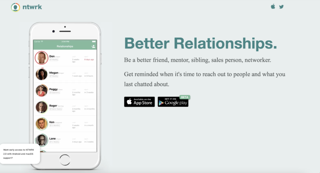
There are people in all of our lives that we would like to keep in touch with every couple weeks or every couple months. Whether that’s an old friend that moved away, a potential investor, an extended family member or a great customer. Ntwrk is a mobile app personal CRM that makes it easy to improve and maintain these relationships by reminding you when it’s time to reach out to them and what the two of you talked about the last time.
User review that really stood out to us: “With ntwrk, I decide which relationships matter, not some algorithm. These are mobile notifications I’m excited to receive.”
Target users
People who are looking for a simple, easy way to keep in touch with personal and professional relationships and pick up right where they left off. Ntwrk’s value proposition indicates that it’s an app for nearly everyone — “Be a better friend, mentor, sibling, sales person, networker.”
Features
- Gives users “soft nudges” to remind people to keep in touch
- View all of your important relationships and their status (i.e last time you talked, when you’re scheduled to talk again soon)
- See the last time you got in contact and any notes that you made
- Quickly get in touch right from ntwrk and track it automatically
- Add relationships from contacts, Facebook, and Linkedin
- Overall it’s simple, with not too many features, making it easy to use and understand
Call Your Friends
Call Your Friends aims to help you become a better friend, and to improve the quality of your friendships. Call Your Friends isn’t just an app that sends you regular notifications to call your friends, as the name might suggest. Rather, Call Your Friends is a system designed to easily fit into your daily life and to help you truly connect with close friends, family, and acquaintances. First, you indicate individuals with whom you’d like to stay connected with (and the frequency). Then Call Your Friends identifies people who you could connect with through gentle text nudges that existing users find unintrusive. Finally, you connect with that person and reap the benefits of being on the Call Your Friends platform.
Target users
Call Your Friends is targeted to all users who have relationships that they’d like to strengthen, and who want a simple system to help them do that.
Features
- Add a friend, along with how frequently you’d like to connect with them
- Daily, gentle nudges in the form of text messages to connect with people.
- Identifies who is farthest out of your orbit for you to connect with.
- Birthday reminders
Marco Polo
Description
Marco Polo is a video messaging platform that helps you connect with those closest to you. Often compared to a walkie-talkie, Marco Polo allows users to communicate with one another back and forth, but with video. You share short video messages to your close ones and respond to their messages, akin to Snapchat’s functionality. Marco Polo’s dedication to solely fostering close relationships for anyone through video differentiates it from other apps like Snapchat.
Target users
Marco Polo is targeted to any user with close friends or family that they’d like to stay in touch with.
Features
- Allows you to connect with saved contacts on your phone on the app.
- Upload your address book to know which of your friends are on Marco Polo.
- On Android and iOS platforms
- Cloud storage
- Free, ad-free use.
- Group or 1:1 conversations
- Filters and voice effects
Comparative Matrix
To have a better high level understanding of all the research we conducted, we created a comparative matrix. Since many of the solutions we examined highlighted the amount of effort and integration in their value propositions, we chose these as our two axes of comparison.

Through mapping our data this way, we found that solutions can lie in all four quadrants of the axes, but the majority are high integration and low activation. We defined activation as the level of effort required to engage with the app’s core features (activation energy, per se), and we defined integration as how seamlessly the app fit into one’s’ routine phone usage and other apps.
From this matrix, we found ourselves interested in developing a solution that is high integration and low activation. This is because from what we’ve gathered from our comparator research, maintaining friendships or keeping in touch with your friends should be a seamless process that people would want to enjoy, not one that feels like a chore.




I’m an angel for Marco Polo. LOL!