
Wireflows
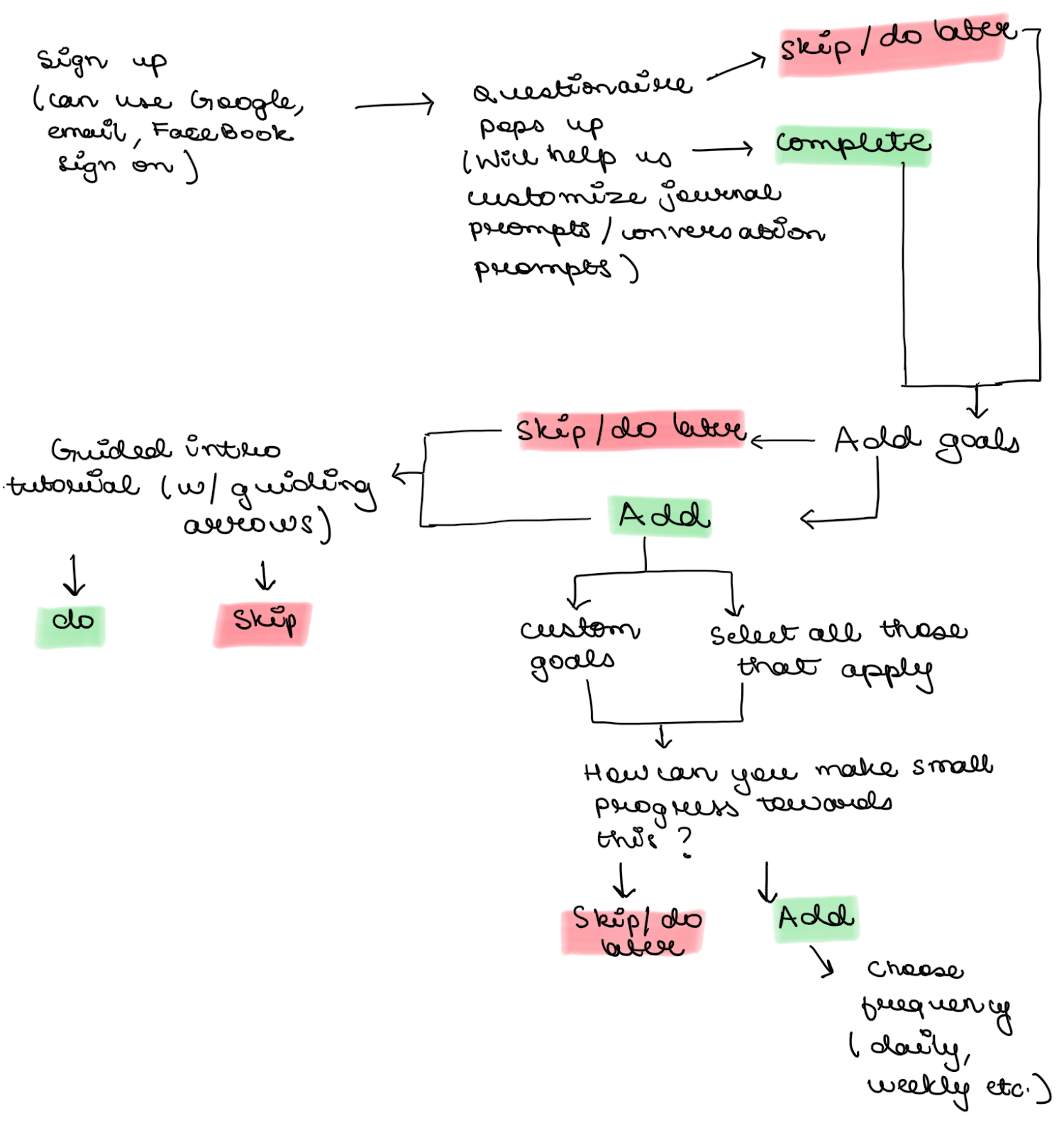
Onboarding Wireflow
Version 1 (Ananya)
Version 2 (Qi)

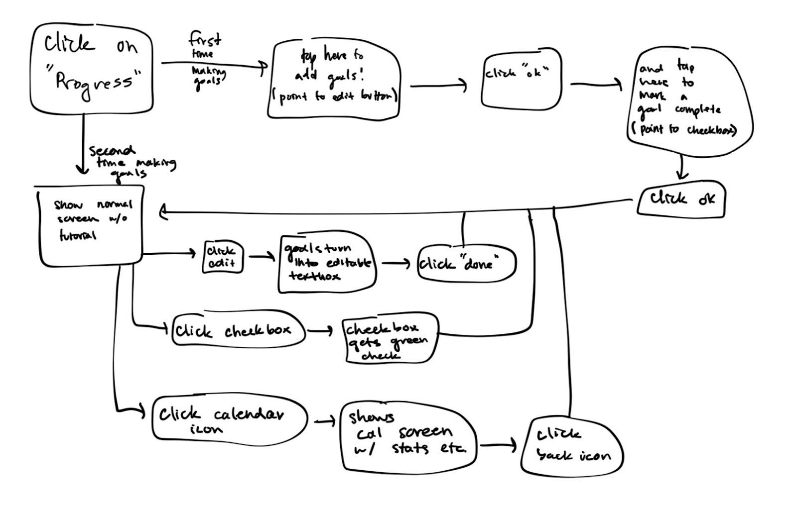
Progress/Accountability Tracking Wireflow
(Nick)
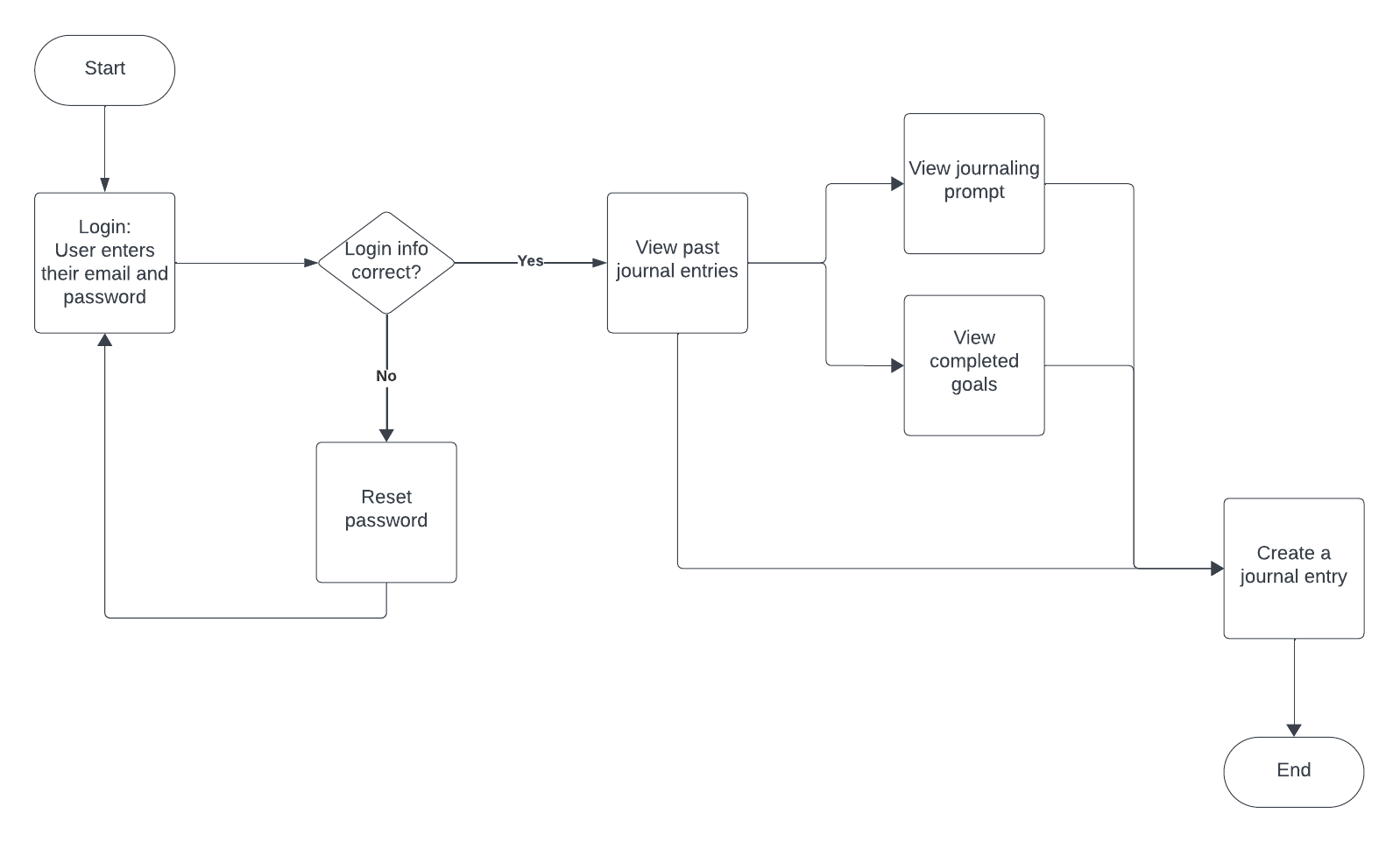
Journaling Wireflow
(Anna)
Sketchy Screens
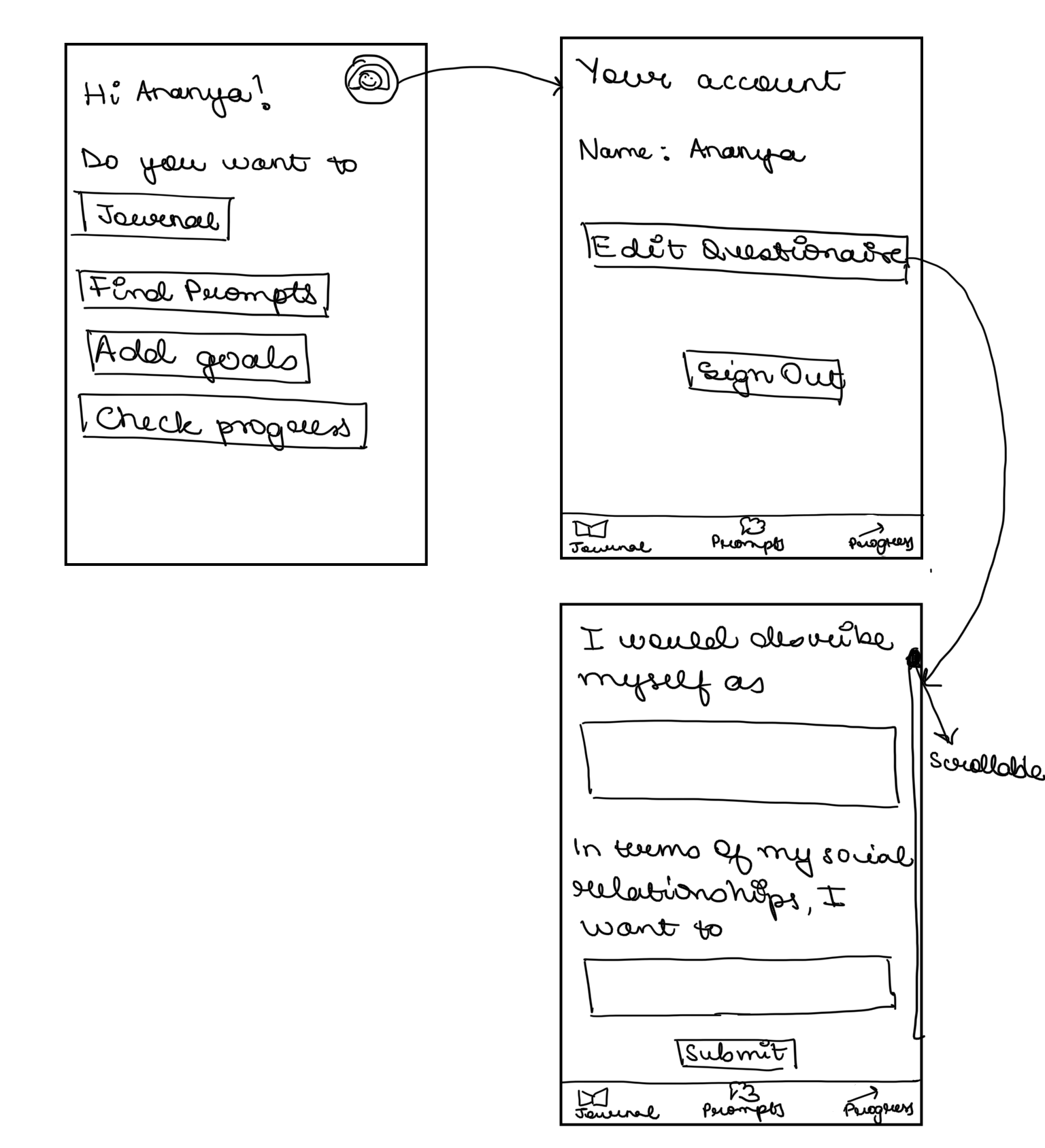
Profile (Ananya)
Initial Sketch
Feedback
Nick’s Feedback
– instead of sign out, maybe delete account?
– maybe edit questionnaire could just be a scrollable feature in the account page instead of clicking a button to a new screen
– add edit name
– what’s the difference between add goals and check progress?
– maybe instead of just buttons for journal, find prompts, etc. could add like bigger buttons that are squares, like a 2×2 grid that takes up more of the screen, with little icons in each one
Qi’s Feedback
– for 2 questions on the 3rd screen, we could add an option to skip answering
– maybe add a pop-up window to prompt users start a tutorial along with a skip option
– overall it’s really clean and looks straightforward to use!
Anna’s Feedback
– I think organization would be better if you used a bottom navigation bar vs just asking them what they want to do on the homepage, that way they can more easily navigate. But i see on your next two screens that there’s a nav bar
– Maybe change “edit questionnaire” to “edit profile/preferences”, something more specific to what they are actually doing
– rather than having them type text to answer the questions, it might be easier to have them select from multiple choices, using dropdowns or something
Revised Sketch

Justifications of Changes
- Changed the Home Screen layout to a grid to make it look fuller and also combined add goals and check progress into one since we want it to reside in one place
- Added an option to edit name since people might want to change that
- Added a button to see the tutorial incase people want to go through the tutorial again as well as a delete account button incase someone wants to delete their account. I decided to keep the sign out button since delete account and sign out are 2 different actions (what if 2 people are using the same device and both have their separate accounts?).
- Instead of adding a skip button for the questions, I added an optional tag so that it doesn’t feel as cluttered and still serves the purpose of letting the users know they can not answer this question if they don’t feel like
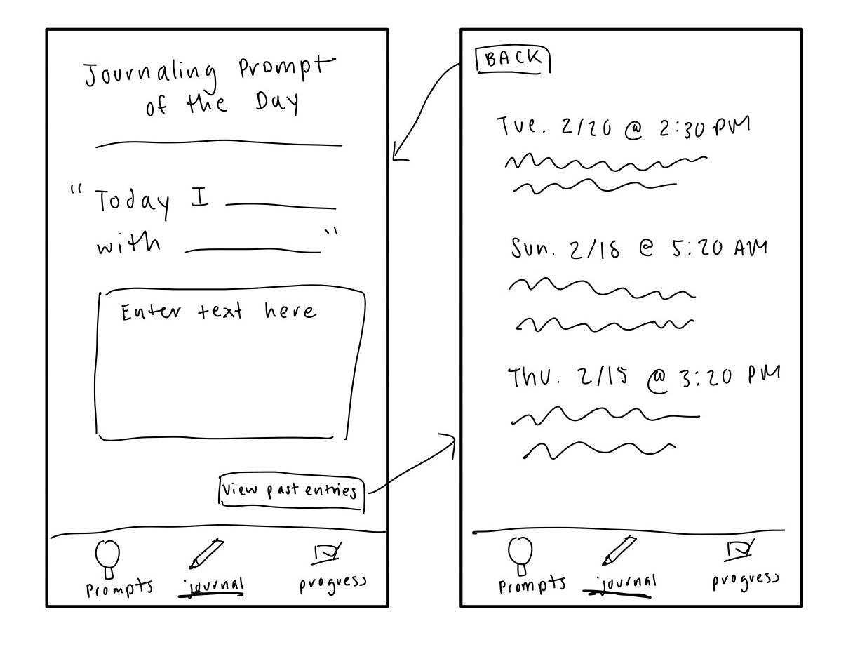
Journal (Anna)
Initial Sketch


Feedback
Ananya’s Feedback
I think icons in the bottom nav bar would be great! And instead of showing previous reflections, we can maybe have a button that takes you to those?
Qi’s Feedback
I like how we have different versions! It would be helpful if we present a template for the reflection, like “I talked with ___ about ____”
Nick’s Feedback
Maybe if there are trends in what the user is not completing in their goals/accountability tracking section, we can have a prompt for that in journaling that says “we notice you didn’t complete ___ for three days
Revised Sketch
Justifications of Changes
- While I considered giving users variety of options to select from for journaling prompts, I decided to simplify the journaling process by providing them with a simple prompt/template (suggested by Qi) to give them a place to start, without too much structure/restrictions.
- Past entries are kept separate from the page for creating new journal entries, making the page less distracting for users (suggested by Ananya).
- Perhaps there could be a place to attach/tag related goals to each journal entry (suggested by Nick).
- I added icons to the navigation bar (suggested by Ananya).
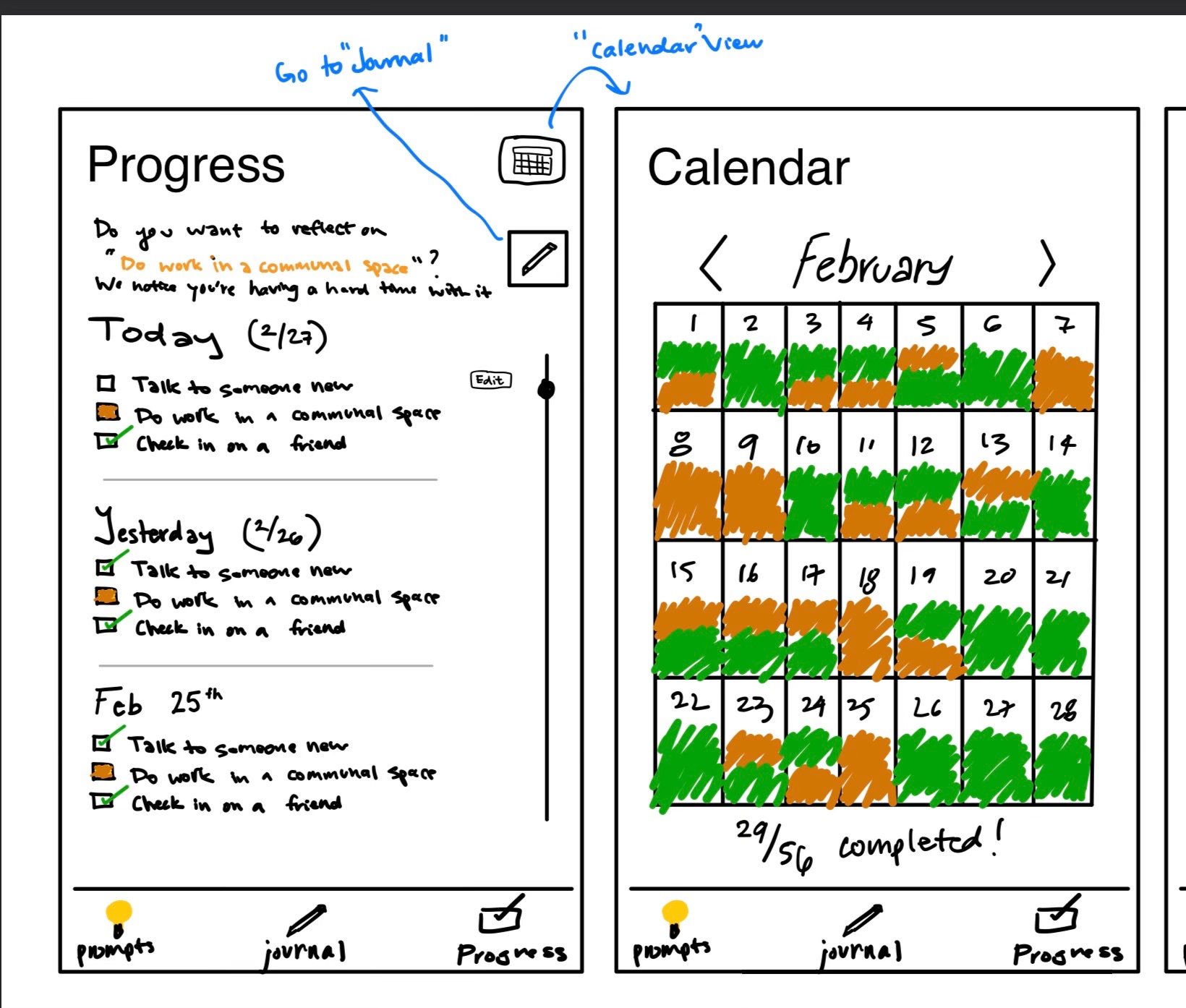
Progress (Nick)
Initial Sketch
Feedback
Ananya’s Feedback
1. What’s the difference between red and empty check boxes? (The today one)
2. We might also need a button for add and edit goal/subgoals?
I think right now the edit button looks too small maybe? And it just feels like it’s for todays stuff, not like overall goals and sub goals
Anna’s Feedback
– I would maybe remove the text at the top asking them if they’d like to reflect on a goal — I think it might confuse them about what they are doing on this page (if they want to reflect on something they should themself be able to go to the journal tab using the bottom nav bar)
– what does the 29/56 represent?
– not completely sure what the different colors represent yet, but I wonder how the calendar view will work if they set a lot of goals for each day. maybe the date is colored if they simply completed any goal that day?
Qi’s Feedback
I really like the design and one potential improvement idea I had is to make the “24/56” complete rate a percentage bar to communicate more visually.
Revised Sketch
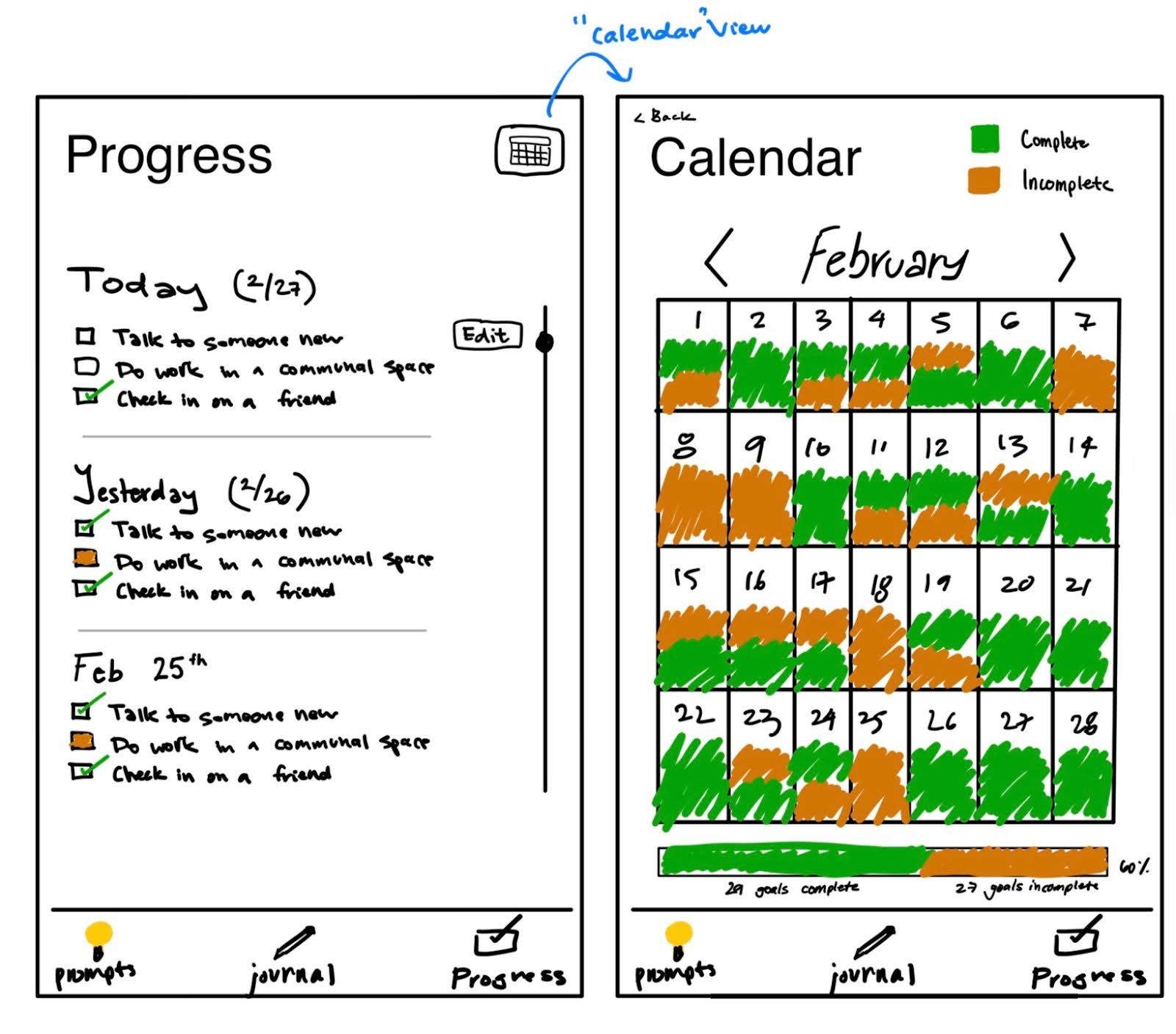
Justifications of Changes
- Progress:
- Made edit button slightly bigger so it’s more apparent for users and easier to press
- Cleared up the check box under “today” from orange to clear. The orange should appear under incomplete goals since the user can no longer complete the goal. The goal should be clear if the user still has a chance to complete the goal today
- Removed journal nav button from top since it was no longer needed
- Calendar:
- Added back button to nav back to progress screen
- Added complete/incomplete key at the top right to help the user understand what the green/orange means throughout the days
- Added progress bar at the bottom with more descriptive labels and a percent to show how many goals were completed this month
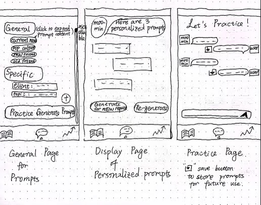
Progress (Qi)
Initial Sketch

Feedback
Nick’s Feedback
– “click here to generate” could just be a “+” icon or something
– add a way to get to the exercises from the general page
– I think the general page could be a scrollable page where there are sections with ~3 prompts each going down just like the general header: general, new friends, old friends, current events, pop culture, etc.
Ananya’s Feedback
1. Maybe the screens can be a little emptier? Feels a little overwhelming rn
2. Do we need all that info under general and specific? Or can they just be buttons and you can see more within them? This can also replace the click to generate button
Anna’s Feedback
– To clean up the second screen, maybe just generate one prompt at a time, if they don’t like it, then they can hit a regenerate button
– I don’t think we should cap them at 3 per day
– What is listed under “general”? Are those general prompts? I feel like all prompts should stay on the same page
– I think having the ability to generate prompts themself is an interesting idea, but I’m not sure if it’s completely necessary if they are already able to generate specific ones
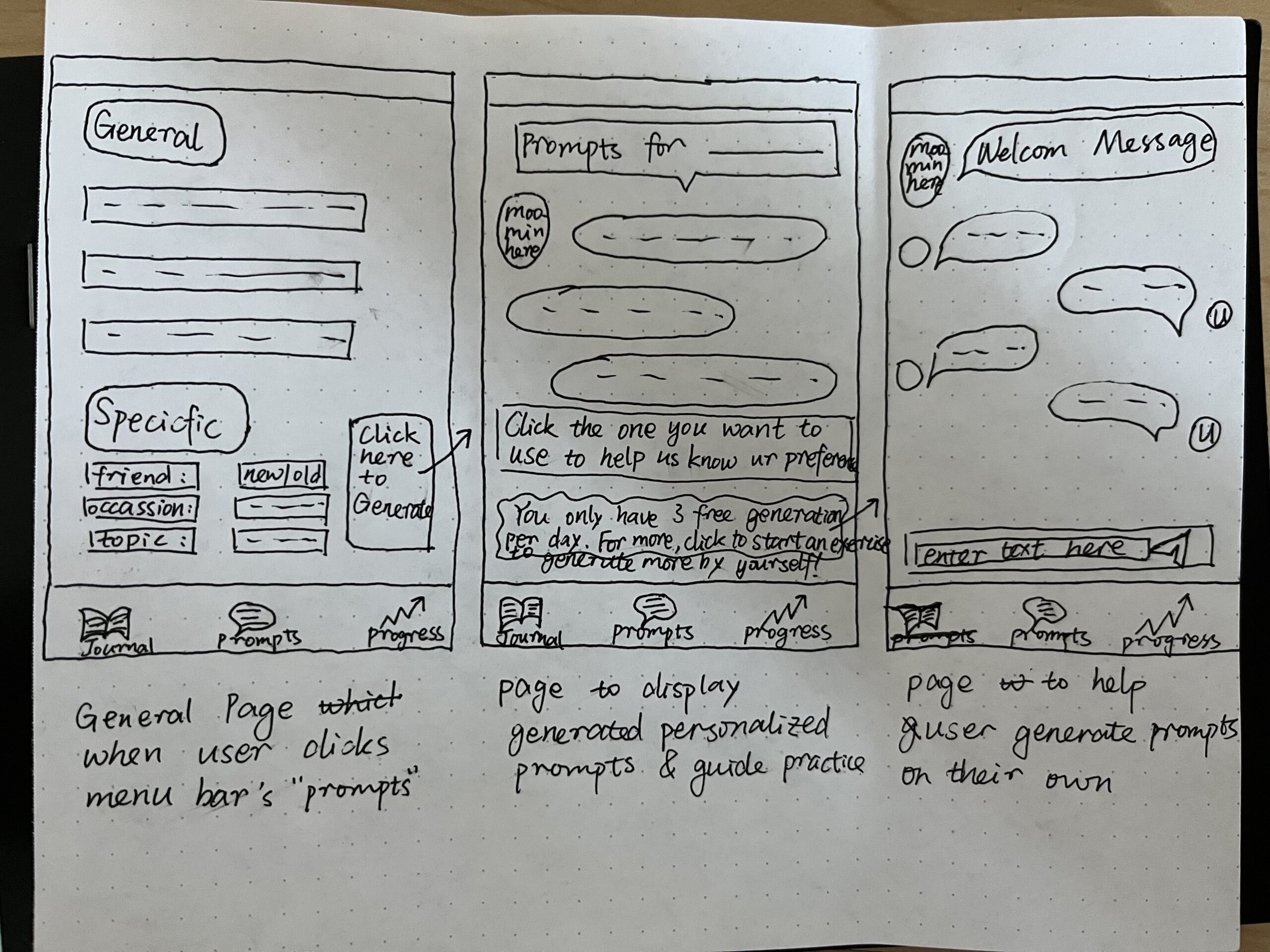
Revised Sketch
Justifications of Changes
General Page
- I added a scrollable function on the general page to be compatible with the expandable buttons of the sub-topics under the “general” text box, so the users could click and see specific prompts when they click the specific topic button.
- I modified the previous “generate” button for the personalized prompts generation to be a simple “+” symbol according to the feedback to simplify the visual perception.
- I also added a clickable text box on the general page – “practice generating prompts” so that the users can directly be linked to the practice page.
Display Page
- I added two buttons for new functionalities – the “generate for new request” button guides users back to the selection page to generate prompts for different demands and the “re-generate” button allows unsatisfied users to see more prompts under their previous requirements.
Practice Page:
- I added a “save” button beside the text response sent by users so that if they like the prompts they self-generate, the APP will save them for later use.


Comments
Comments are closed.