
Introduction
Project Name: Moment
Date: 03/17/2024
Team Members & Roles: Anna Chang, Qi Han, Ananya Kapoor, Nick Hafer
The work was equitably distributed amongst all team members – we did not have any roles as such.
Project Summary: Moment is an app that helps you be more mindful of your social interactions by allowing you to reflect, track your social efforts, and socialize better with strangers and friends by providing you with conversation prompts.
Problem Space
In the busy life of a college student, juggling coursework and social life can be challenging. Many students struggle to find the time to connect with others, but they also believe that these connections are crucial for their well-being and overall college experience.
“Moment” is an app designed with this challenge in mind. It helps students navigate their social lives more mindfully. By offering simple, straightforward tools to guide and track social interactions, Moment supports students in building meaningful relationships, ensuring that they can stay socially active and connected, even amidst a demanding academic workload. This makes Moment a valuable companion for any college student looking to balance their studies with a fulfilling social life.
We searched 8 papers and conducted literature reviews. Here is a summary of our takeaways:
- Suite-based housing diminishes community feeling, while cluster housing with upgrades enhances it, and pre-acquaintance among dorm mates improves community sense.
- Engaging activities and cozy communal spaces foster social connections, though emotional ties require further action to strengthen.
- Common friends and dense social networks predict friendship formation while overcoming racial and cultural segmentation is challenging
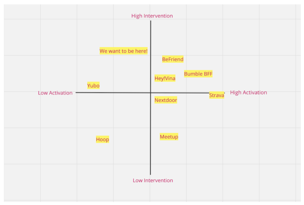
We also selected 8 social applications from AppStore in the same/adjacent problem space (Hey! VINA, Yubo, Meetup, Befriend, Bumble BFF, NextDoor, Strava, and Hoop) and performed comparator analysis. The key points in the analysis are:
- The platforms cater to specific demographic needs or interests, such as women seeking friendships in Hey! VINA, or teenagers and young adults in Yubo
- Apps also face challenges related to user engagement and safety, such as low active user counts and unmoderated content, respectively.
- There’s a tension between facilitating genuine connections and the mechanics borrowed from dating apps, which may not always align with the users’ intentions to make friends
For a more visual comparison of these apps, we also created the following map:
The impacts of literature review and comparator analysis are
- We want to find and specify a niche target for our app.
- We want to design features/functions that can engage users with social activities that promote personal growth.
- We are excited to help users build genuine connections.
For our sources and more detailed analysis, see our previous Literature Review post and Comparator Analysis post.
Baseline Study
We performed a week-long diary study on 8 students who live in campus housings that have bigger communities (i.e. dorms, large suites, etc.) and who wanted to get to know their communities better. We believe that these two features together cover most of our target users. We circulated a screener on the basis of which we chose our final 8 participants – the screener was to ensure that we had a diverse set of students and that they were interested in creating/maintaining friendships and community. We chose students from a variety of years – Freshmen, Upperclassmen, Coterms, and Graduate students – so we could understand the problems unique to each of them and find similarities.
We tracked answers to the following key questions in our study:
- Students daily frequency of meeting up with people in their community (duration > 10 minutes)
- Number of new/old people students met during the day
- Was the amount of social interaction you had today normal for you? Why or why not? What was different if it was not?
To have a comprehensive picture of their situations, we also asked attitudinal questions in our pre-study and post-study interviews to have a personal baseline and match their words with their actions reported. From our pre-study interviews, survey responses, and post-study interviews, we identified that both non-freshmen undergraduates, terms, and graduate students face difficulties in forming new friendships and maintaining old ones due to a variety of reasons like lack of social events, lack of common spaces, busy schedules, or even personal habits.
For details of the baseline study, see our previous documentation of the baseline study.
Synthesis & Intervention Study
System Models
From the result of our baseline study, we developed the following grounded theories for our application design:
- Students prefer dorm events over initializing social interactions by themselves to meet new friends.
- It is harder to make new friends later in the year / later in your college journey.
- It is hard to start friendships without knowing common interests or backgrounds before.
- Different architectural designs impact people’s social style greatly.
- Primarily introverts are interested in forming new relationships.
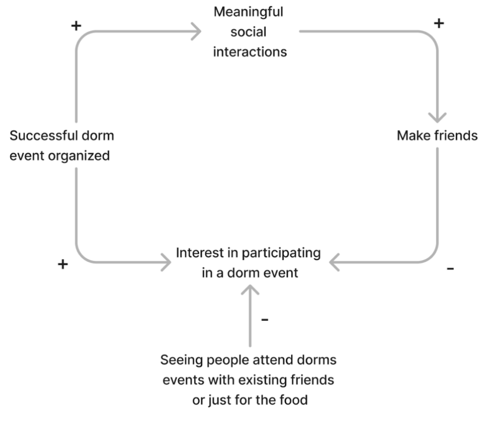
These grounded theories provide a foundation for us to build target user personas in terms of their physical environment and personal social habits. Here are two system models with their insights explained below the graphs:
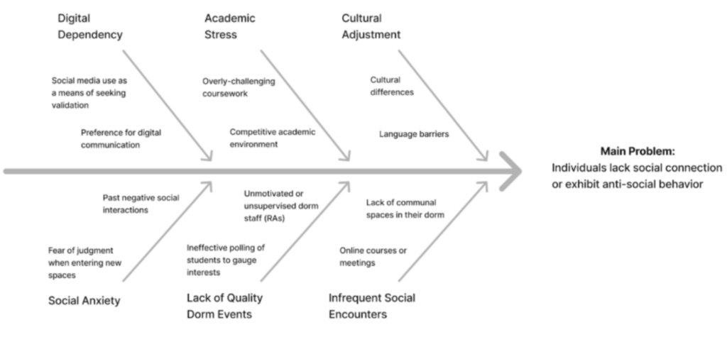
We found a plethora of reasons why people exhibit anti-social behavior (especially introverts). We compiled these, grouping them into categories and providing examples shared by interviewees.
 We noticed that dorm events are a common pain point for people. People have issues with (1) a lack of dorm of events, (2), being uninterested in existing dorm events, and (3) seeing people attend dorm events (ie. on calls) simply to take food and leave. However, successful dorm events can serve as a good medium for meaningful interactions, and consequently, friendships.
Personas & Journey Maps
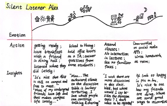
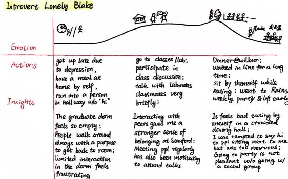
To facilitate our design process, we construct two personas: Silent Listener Alex and Introvert Lonely Blake. Alex is a coterm student who has a group of existing friends and finds initiating conversations nerve-racking. Alex prefers listening to speaking, so even when they are on social media apps like Instagram, they only browse but do not interact with friends. Blake is a first-year master’s student who knows very few people on campus and is experiencing loneliness as their introvertedness hinders them from making new friends. Blake’s limited source of getting to know new people has required lab meetings and course lectures. These traits are further demonstrated in our journey maps for each persona in our detailed synthesis post.
1st Persona: Introvert Lonely Blake (Pictured Below)
| Drawing | Name | Silent Listener Alex |
 |
Activated Role | A coterm student who is open to socializing but still finds meeting people tiring and sometimes pressuring. |
| Goal | They love exploring and want to meet new people and have good interactions; deepen their current relationships inside and outside their residence. | |
| Motivation | They love knowing people more, seeing people where they go, and feeling comfortable wherever they go (by knowing them, it’s easier to talk to them). They really want to expand on these relationships and get to know people better by having longer form conversations instead of quick hellos. | |
| Conflict | They are worried about having a bad time socializing. They usually prefer spending time in their room working, instead of outside in more public/social settings because they find social interactions quite draining. They are stressed when they have to think of things to say and would much rather play a listening role in a conversation. | |
| Attempts to Solve | They try to spend more time working outside of their room when they are back at their dorm, such as in the dorm lounge, dining room, outside in the yard, etc. They also try going to dining halls during busy hours so they have a higher chance of running into people they met before and starting a new conversation. | |
| Setting/ Environment | Most of their interactions happen in their dorm (bathroom, hallways, dining room, lounge, room), but some happen on the way to class or in the class where they are a TA. | |
| Tools | Common social APPs like Instagram and Slack. They do not initialize conversations on those APPs often. They also have conversations with their existing friends online or offline whom they feel more relaxed to talk with. | |
| Skills | They are fantastic listeners who always get what people try to convey. They also make time for others and stick to plans instead of flaking. |
Journey Map of Silent Listener Alex
2nd Persona: Introvert Lonely Blake (Pictured Below)
| Drawing | Name | Introvert Lonely Blake |
 |
Activated Role | Super introverted grad student who is new to campus |
| Goal | They want to make friends and develop a sense of community on campus, specifically in their dorm. They want to feel less lonely and feel more adjusted to this new environment. | |
| Motivation | Navigating their first year at Stanford has been difficult without a strong support system. They do not have many people to spend time with outside of their classes. This sense of loneliness is impacting their mental health. | |
| Conflict | They have a strong motivation to make friends and spend time with others, but their shy personality makes them feel hesitant and nervous about approaching people. Furthermore, they live in a graduate student apartment where there are no common spaces, so opportunities to see new people don’t come often. They also don’t have a roommate. | |
| Attempts to Solve | They have tried to attend some events on campus, but they find that a lot of them are targeted towards undergraduates, whom they find that they cannot connect well with. Or, in many cases, they find that those who attend these events tend to go with people that they already know. Trying to join in on these existing groups feels uncomfortable. Occasionally, they will see their neighbors walking down the hallway, and they will greet them, but these conversations usually don’t last longer than a minute. | |
| Setting/ Environment | Most of their time is spent in their apartment alone. Most interactions with others in their day-to-day life are on the way to class (walking down the hall, in the elevator, walking across campus) or in their classes. Sometimes they sit and study in the yard outside their apartment or in public buildings like Old Union. | |
| Tools | They attend lab meetings and department gatherings but not really more personal social events. They use social apps like Instagram and follow friends’ feeds, but they do not react to the stories shared nor initiate conversations. | |
| Skills | They are dedicated to making their friends feel supported. They have a wide range of hobbies and interests. |
Journey Map of Introvert Lonely Black
Ideation
To design an app around these 2 personas, there were 4 main ideas that our team came up with to help upperclassmen including co-terms have better social experience on campus:
- Idea 1: Perform automatic matching given people’s calendar schedules
- Pro side of idea 1: The matching is designed to be very flexible for many kinds of needs according to different personality types or hobbies.
- Con side of idea 1: There is a safety concern since the APP offers random matching with strangers, so there should be more features implemented to prevent incidents.
- Idea 2: Automatically match people based on the restaurants they want to explore together
- Pro side of idea 2: Match people based on the restaurants they want to explore together, so they could go to the place they want and be accompanied.
- Con side of idea 2: Stanford students are still flaky when they make plans so we want to implement punishment features like lower ratings on personal profiles or publicizing the percentage of flaking to ensure a good experience with the APP.
- Idea 3: Regular notifications to remind people of their social goals and give out rewards
- Pro side of idea 3: Logging and reflecting on social interactions offer a clear lens for users to examine their behaviors and increase awareness of potential changes.
- Con side of idea 3: It might not be enough incentivizing for people who do not have a strong initiative to change their social behaviors, thus it won’t be as useful for these users.
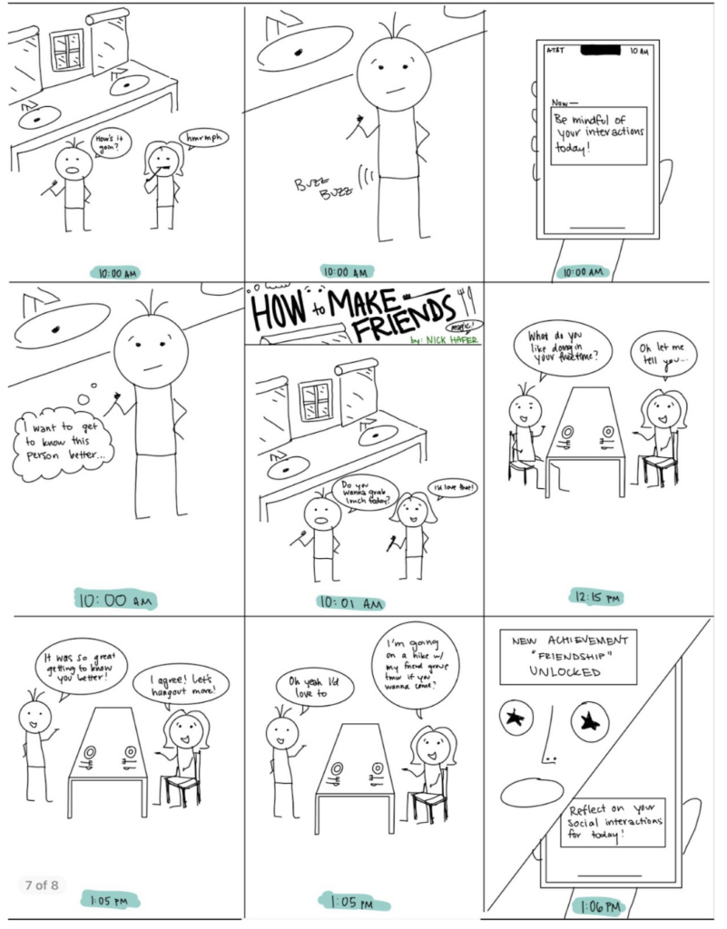
- Idea 4: Lock the phone to nudge people to have a 5-minute-long talk instead of just a breif “hi” to get to know each other better
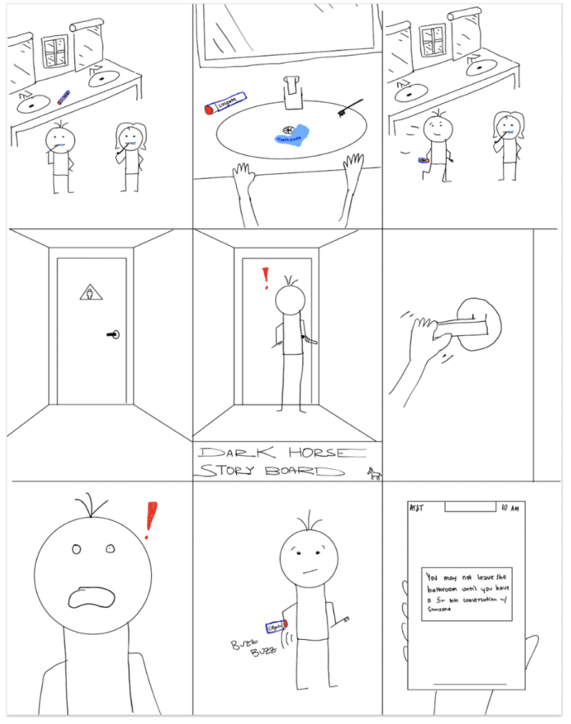
- Pro side of idea 4: Have a measurable task for people to make progress so that they can focus more on the action and less on being stuck and not knowing where to start next.
- Con side of idea 4: This setting might scare some portions of potential users away.
The first two ideas are centered around our goal to reduce the friction of starting a conversation with new or existing friends. The last two ideas are to bind people to a standard set of actions to encourage their change of actions. We expect the matching idea to remove part of the stress of inviting people without understanding their potential interests. The last idea is our black-horse idea that directly challenges both Blake’s and Alex’s fear of speaking to new people.
Intervention Study
The intervention adopted in the study is a combination of ideas 3 and 4 above. The motivation is to empower users with the capability to have a meaningful conversation if they want. Another reason why we decided to test if conversational prompts are effective is that they fit the 5-day study time scope better than matching people randomly and asking them to meet at the busy time of the quarter.
In the intervention study among 9 participants, we collected 44 Google form responses over the 5-day study. 39 out of 44 responses completed the challenge to start up a conversation with a friend or a stranger. Among responses that successfully used the prompt and completed the challenge, 82% of responses stated that the prompt helped their conversations. Among all initiated conversations, 30.8% of them led to a future meeting plan.
Here are examples of conversational prompts on our Monday survey:
- Ask about their weekend
- Ask whether they watched the Super Bowl
- Ask how their week is looking and whether they need any support/help with the craziness of week 6
- Share one thing about yourself (recent joy/concern) and ask for feedback/help
There are many insights from our intervention study:
- 89.7% of conversations happened between people who already know each other. The common reason is that participants still find it difficult to talk with strangers and do not have many opportunities to meet new people.
- Provided prompts are effective and easy to use. 82.1% of responses agree that having these prompts ready is helpful.
- People prefer questions that fit the context. The keyword ‘natural’ is mentioned in multiple responses complimenting the usefulness of the provided prompts.
- 64.1% of the conversations felt great for the participants and 30.8% of the time still ended better than expected despite the awkwardness at the beginning.
For more details, check our previous post on the synthesis process and intervention study(edited).
Solution Design
Story Map
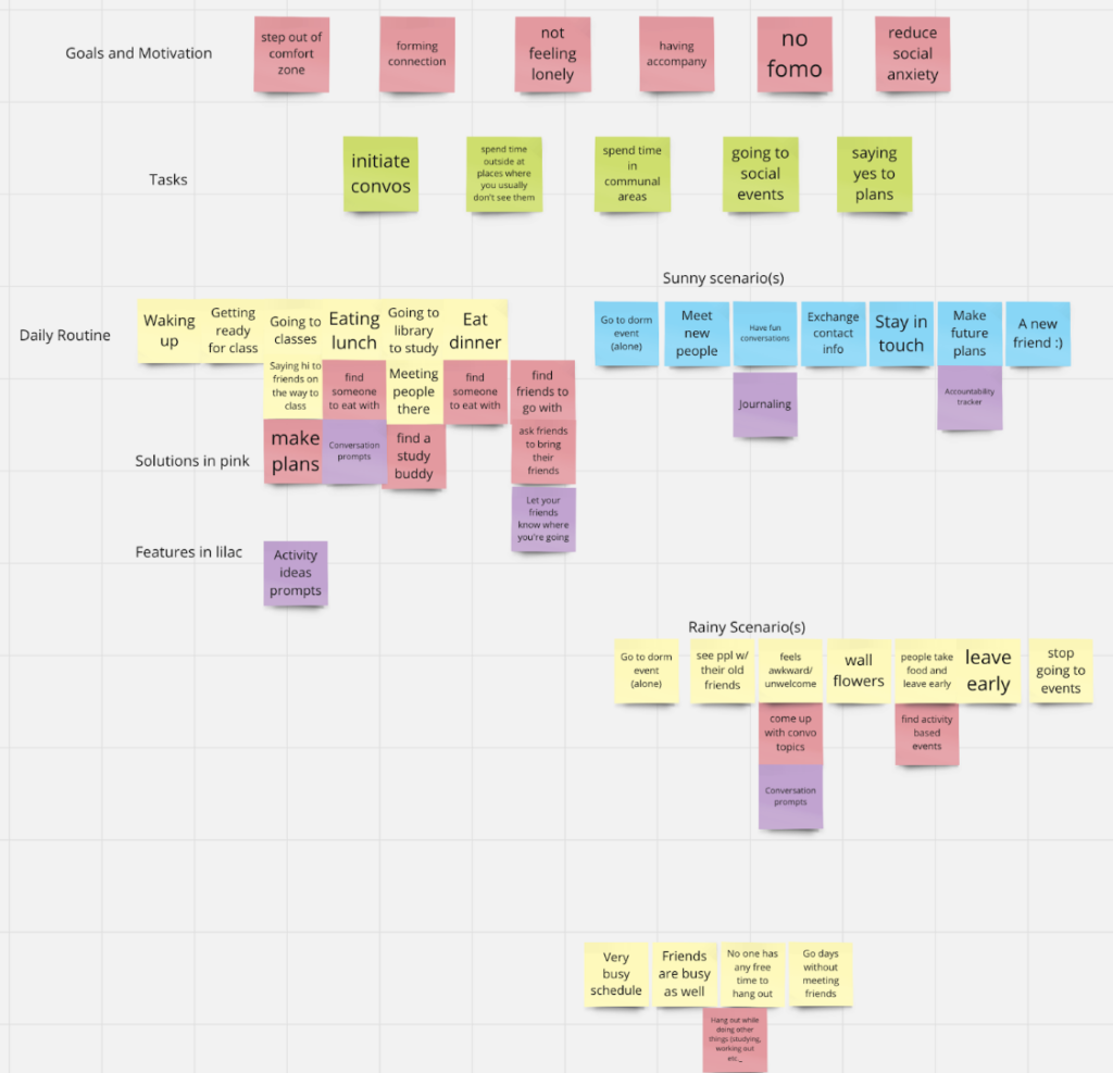
We started by coming up with goals and motivations for our users which are stepping out of their comfort zone, forming connections, not feeling lonely, having company, “no FOMO”, and reducing social anxiety. From here, we figured out tasks for our users that might help achieve these goals, such as initiating conversations, spending time in communal areas, going to social events, and saying yes to plans more often. We came up with a general daily plan for Stanford students living in dorms which includes getting ready in the communal bathrooms in the morning, going to class, eating lunch in the dorm, going to study or more classes, eating dinner, and working later that night or exercising. From here we diverged this general storyline into a sunny vs. rainy day scenario.
Sunny: Essentially meeting lots of new people and making connections, plans, and friends whenever possible while going to lots of dorm events.
Rainy: Goes to dorm events alone, feels awkward/unwelcome, lacks community in their dorm, this user stops going to social events, they see their old friends hanging out with other people. They also have a very busy schedule, their friends are busy too, and they go days without seeing people they know.
MVP Features
- Activity idea prompts
- Conversation prompts
- See events near you
- Journaling
- Accountability Tracker
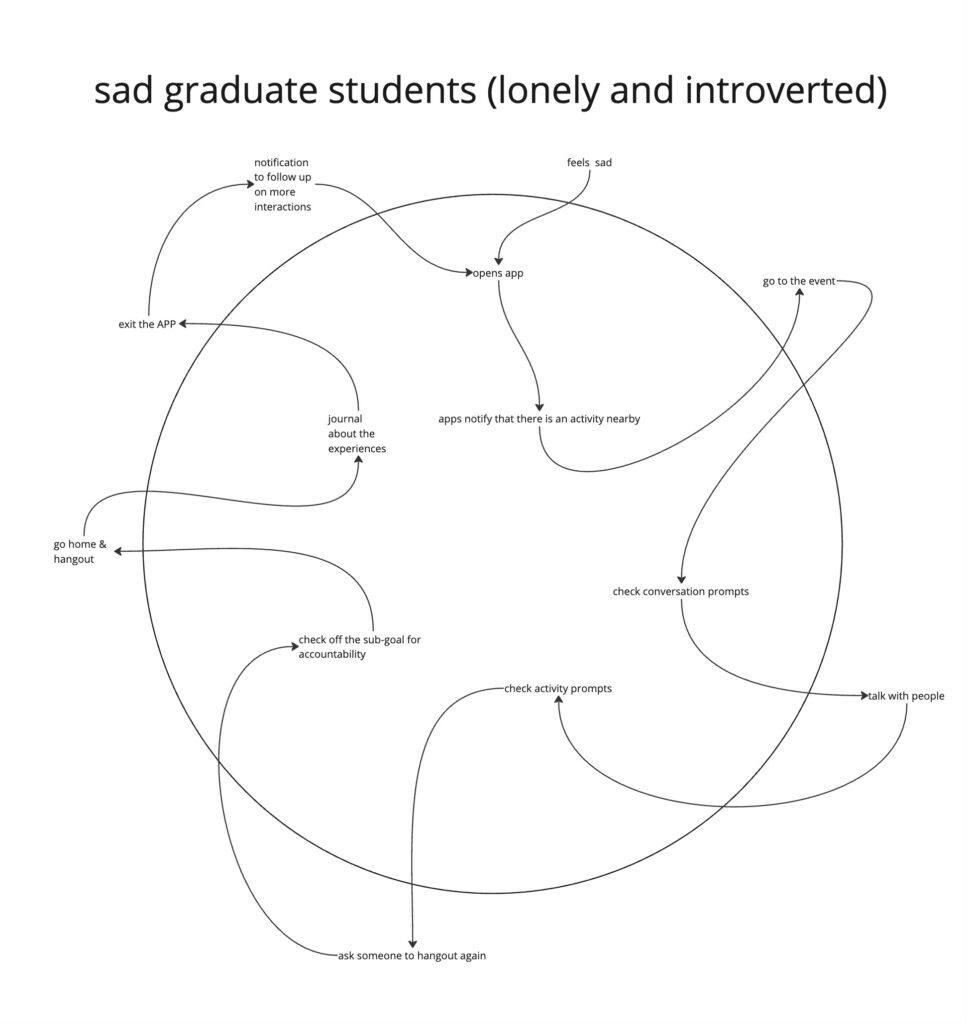
System Paths
To draw out the system paths for two personas, we imagined how each persona would be best helped to solve their problems. Each persona opens up the APP for different reasons and goals of usage, illustrating the point that the APP could help both log emotional status about social life and get nudges about making a change to the user’s social life. Comparing the two system path graphs below, we can see that the first system path focuses on goal-setting and progress-tracking while the second system path focuses on providing prompts. These paths helped us delineate the main functionalities of the APP and how they are connected as one single flow. ![]()
Bubble Map
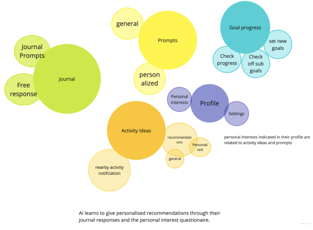
Once we figured out our System Maps and the list of features, we decided that our app would have 5 main tabs (Profile, Journal, Prompts, Activity Ideas, and Goal Progress). We wanted the user to be able to take some actions within each of these tabs:
- Profile
- Personal Interests – a questionnaire to help us get to know the user better so our AI can start providing them with custom ideas (optional)
- Settings – a place to change account details, profile picture, etc.
- Journal – This would be a place where the user can journal about their feelings and their interactions, we give them some journal prompts to help guide them in case they feel stuck or are new to journaling. They can also choose the free response option if they believe that is more suitable for them. We will also use these responses (if the user gives us permission because of privacy) to get to know the user better so our AI can start providing them with custom ideas
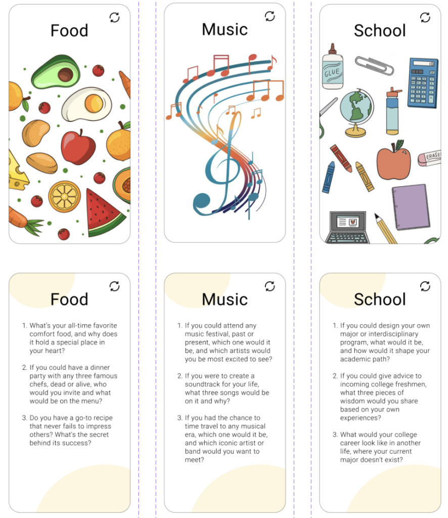
- Prompts – This is a tab that the user would open if they are looking for conversation ideas. We provide general conversation ideas that would be updated daily to be made relevant to events/occasions (eg. Super Bowl, Valentine’s Day, etc.) as well as personalized prompts generated by our AI, especially for each user.
- Activity Ideas
- Nearby activities – If the user shares their location, they can see events happening near them
- Recommendations – These include ideas for activities you can do with someone. These are again general and personalized depending on what the user prefers.
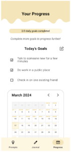
- Goal Progress – This is a way for us to help keep our users on track
- Set new goals – The user can set new goals related to making/maintaining friendships here. They can divide their goal into subgoals to make it more manageable
- Check off sub-goals – They can check off their sub-goals once they achieve them
- Check progress – A way for them to check their progress towards their goal
While doing this activity, we were able to really put ourselves in the shoes of the user and think critically about how we can help them achieve their overall goal of making/maintaining friendships through our app. It allowed us to break down bigger features that we had come up with and figure out what would go into each of them and make solid progress towards our final project.
Assumption Map
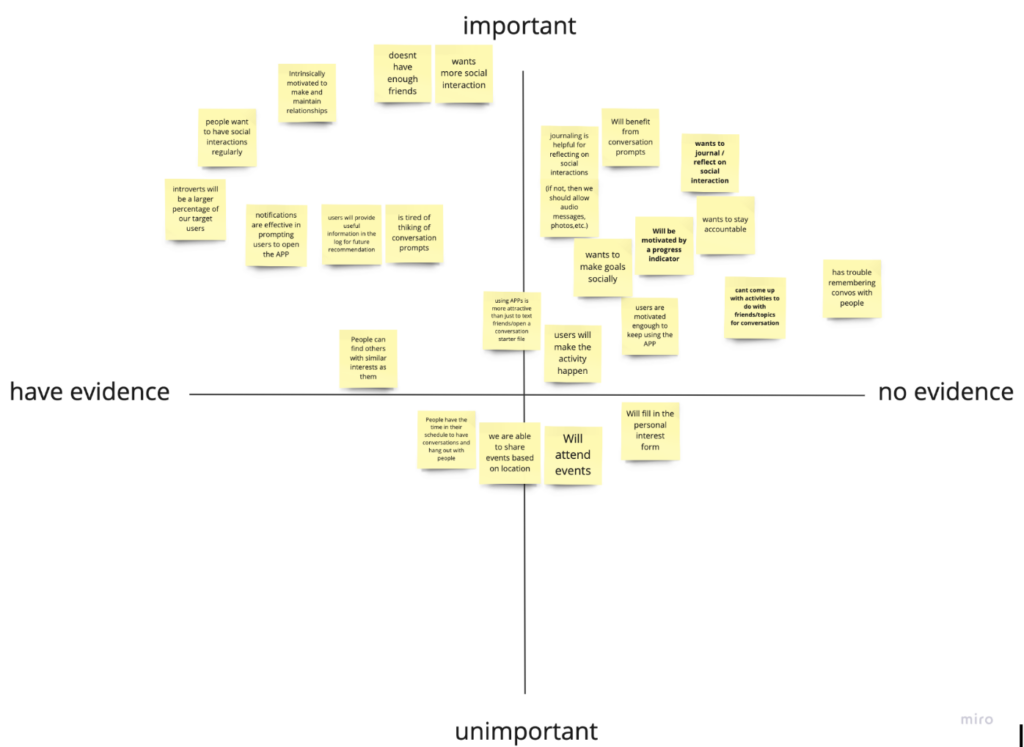
We created an assumption map, from which we identified five key groups.
- Intrinsic Motivation for Relationship Building
- Communication Challenges and Assistance
- User Engagement and Motivation Factors
- User Privacy
- Real-life Interactions and Event Participation
We picked 3 significant assumptions from the quadrant for our assumption test and summarized our findings below the question statement:
- Are people motivated by a progress indicator?
We found that a progress bar motivates users if they understand what contributes to making progress. Whether or not there is a progress bar on the main progress page, users want some visual indication that checking off a box does something. Adding a “+1%” animation when the user checks a goal off their list will make the user feel like they’ve achieved something and help them understand what contributes to the progress bar.
- Users can’t come up with topics for conversation
We learned that conversation prompts definitely help users by giving them a few keywords to latch on to or remember throughout their day. We should add topic customization and allow users to remove certain topics if they don’t relate to the user, or add/ask for new topics that they would like to see prompts for. We should also look more into personalization of prompts/topics so the user feels like they actually care about the prompts shown in the app
- People find it helpful to journal / reflect on social interaction
Users said they could see themselves using the journaling function for self-progress, but not necessarily right now. They mentioned they liked the way the initial diary study was conducted because they had to reflect on prompts rather than just open-ended journaling with no prompt. We should keep/add more guided reflection prompts for users to journal on. We need to make sure to keep a collection of new guided prompts so that it doesn’t get repetitive for users, and that there exists a sense of novelty in journaling every day.
To read more about our assumption testing process, you could read this website. Another link to our detailed assumption results is here.
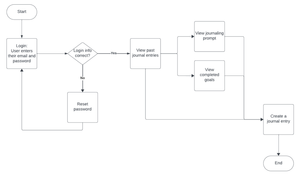
Low-fi prototype
We developed wire flow graphs for different functions of our product. One example is the journaling feature. Users will log in and enter their social experience for the day or review their past experiences.
Another example is the progress page where users can track their goal completion rate.
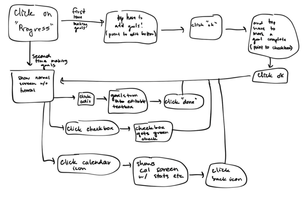
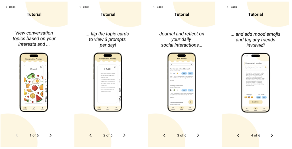
We also created an onboarding flow to collect user information and help them familiarize with the app by going through a tutorial.
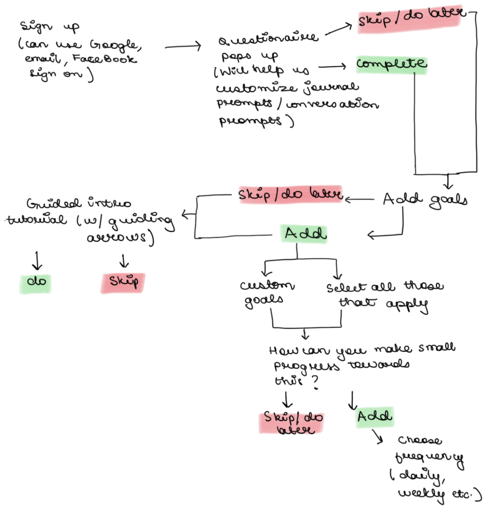
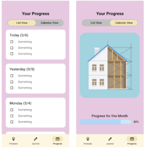
Below are the sketch screens for our progress page. We designed a checklist to imitate a goal-setting environment for the user.
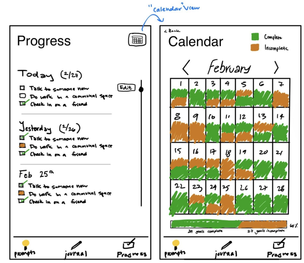
The rationale for this revised sketch screen is:
- Progress Page:
- Made the edit button slightly bigger so it’s more apparent for users and easier to press
- Cleared up the check box under “today” from orange to clear. The orange should appear under incomplete goals since the user can no longer complete the goal. The goal should be clear if the user still has a chance to complete the goal today
- Removed journal nav button from top since it was no longer needed
- Calendar View:
- Added back button to nav back to the progress screen
- Added complete/incomplete key at the top right to help the user understand what the green/orange means throughout the days
- Added a progress bar at the bottom with more descriptive labels and a percent to show how many goals were completed this month
If you would like to see more examples the low-fi prototype, you can go to this link.
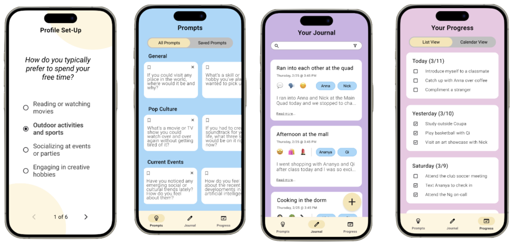
Medium-fidelity prototype
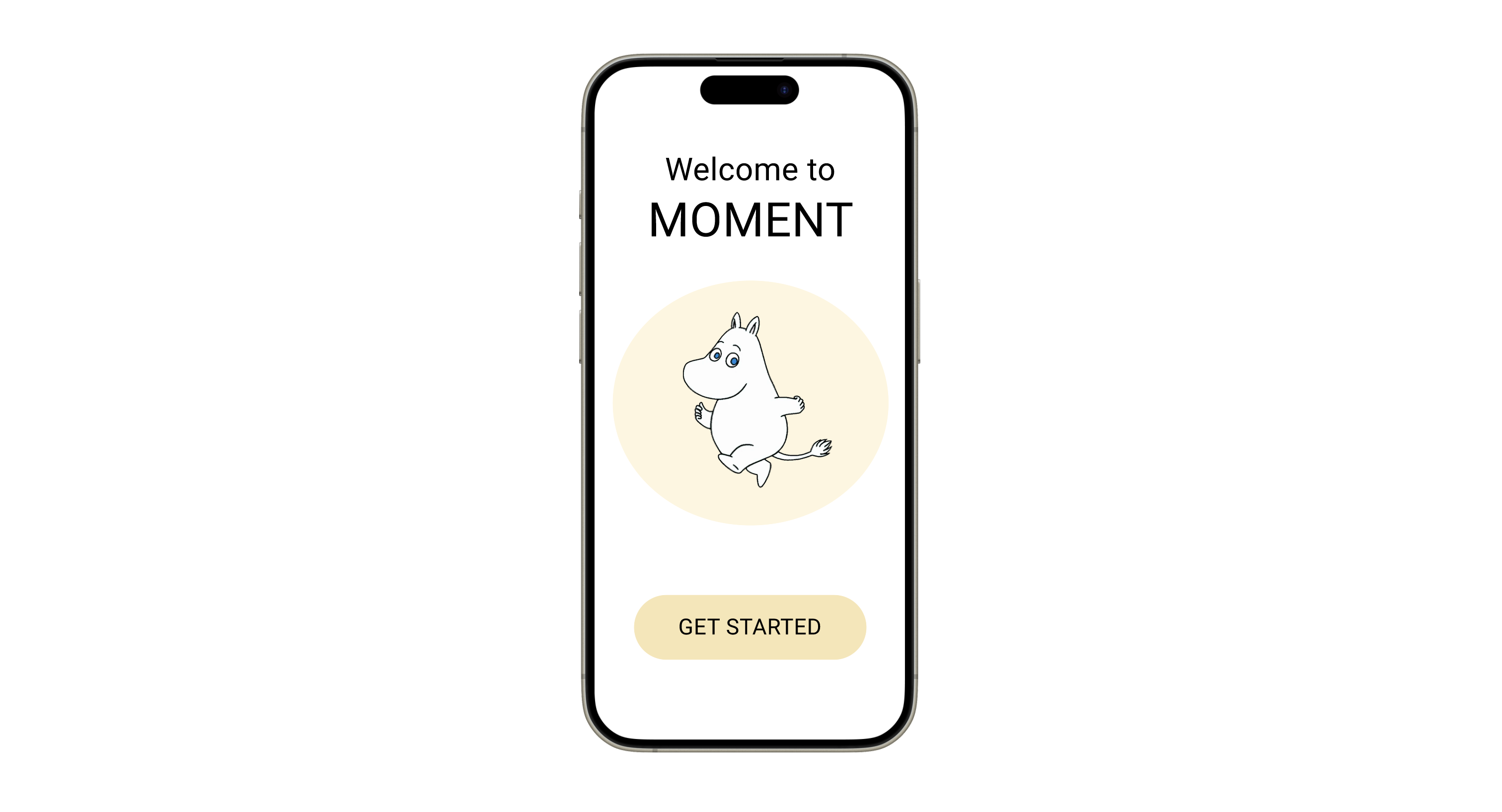
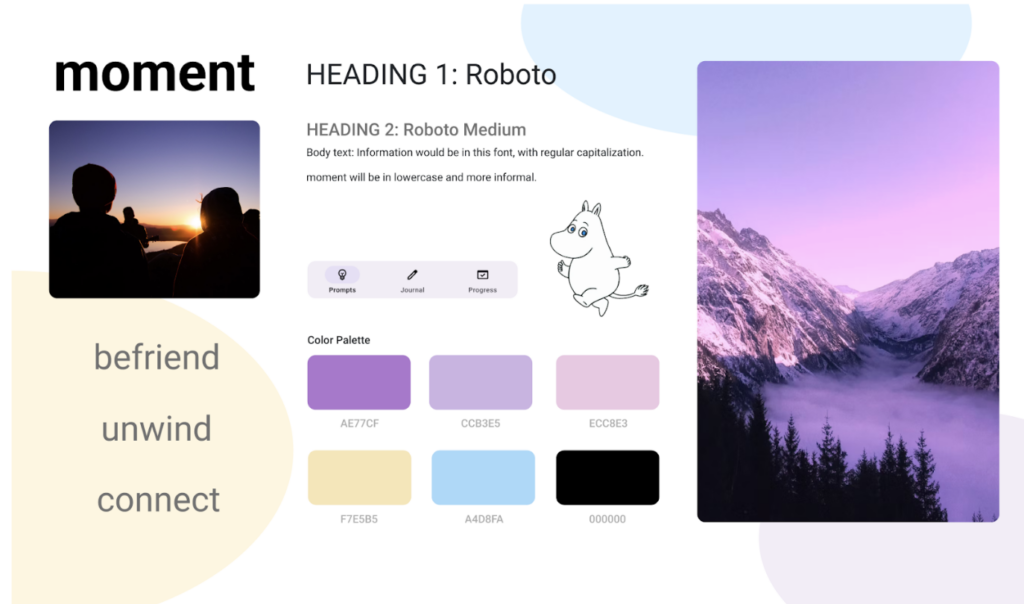
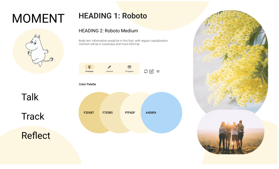
Focusing on reflecting and encouraging people to build social connections, we design the following tile board. The choice of purple is to provide a calm feeling for users to reflect their social interactions. The yellow tone is to create a sense of welcome and vibrance. Moomin, the Swedish hippo cartoon character, is borrowed as a personification of the app to accompany users through the process.
We have 3 main functions in the APP’s menu along with an onboarding flow:
- prompts page that provides users with a variety of conversational starter sentences,
- journal page where users can use tags,
- hashes to record specific details of their social interactions at the day, and a progress page where their daily goals are checked.
We believe that these 3 functions combined cover essential tools users need before, during, and after each memorable interaction. This draft of onboarding was designed to help us understand each user in more detail. The saved prompts page aims to provide extra flexibility and personalization for users’ saved history. We also allow hash-tagging in the journal so that users can filter the contents they want to review.
To view details of our medium-fidelity prototype, you can click this link.
Usability Testing
We tested our medium-fidelity prototype with 4 participants (2 in class and 2 outside of class). Since our target audience was upperclassmen (including coterm and graduates) students, all of our testers belonged to our target audience. To streamline the process, we developed a testing script about our app’s functionality. Here is a list of all the feedback we got (we divided it into different priorities and checked off what we could address for the final prototype) – document.
The main tasks we tested our participants are:
- Task 1 – Imagine you just downloaded an app called “Moment” and this is the first screen that you see when you open the app. What actions would you take? And how would you navigate this?
- Task 2 – You are going to meet Alex today. You two just met for the first time yesterday from a class. You want to avoid awkward silence/find something to talk about. How do you think you can do this?
- Task 3 – You had a memorable lunch today with your friend, Hannah and want to reflect on it. How would you do that?
- Task 4 – You want to check your progress on your goals, how would you do that?
- Task 5 (open exploration in lieu of our homepage tour) – Explore the app as you wish and let us know what you think!
There are 3 key issues we identified from all of the feedback:
- Issue 1: The prompt page is text-heavy and does not look readily usable. The personalized prompts function is not obvious. “Prompt” as a name is vague.
- Prototype Solution: We changed the prompt page from list view to a click-flip interaction page. Additionally, we added more visual graphs to give the APP a more vibrant personality.
- Issue 2: The checklist/to-do list does not fit well with the goal of pushing progress. We need a more visual way to motivate users.
- Final Prototype Solution: We reduced the number of records shown on the progress page to decrease the text load.
- Final Prototype Solution: We reduced the number of records shown on the progress page to decrease the text load.
- Issue 3: Overall, the color palette design across pages needs to be consistent. Color-coding might help.
- Final Prototype Solution: We changed our overall color scheme to use pastel yellow for an encouraging and warm vibe.
- Final Prototype Solution: We changed our overall color scheme to use pastel yellow for an encouraging and warm vibe.
- Prototype Solution: We changed the prompt page from list view to a click-flip interaction page. Additionally, we added more visual graphs to give the APP a more vibrant personality.
Final Prototype
The general feedback we received was about the color inconsistency in our previous prototype. To finalize our design, we decided to use yellow as the main tone with different shades and brightness to create a welcoming and warming vibe for our users to positively reflect and change their social behaviors with friends.
Final Moodboard

Final Style Tile
Full feature presentation video
This video demonstrates the onboarding flow, how to find conversational prompts and generate new ones, how to track and update personal progress, and how to journal a social encounter.
Example of modifications
-
- Changes on the Progress Page
- Before:
- After:
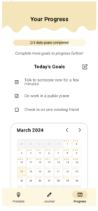
- Justification: We combined two pages into one for functional simplicity and changed the color tone from pink to yellow for overall style consistency. We also added a sentence of encouragement right under the progress bar to remind users of their motivations. Another edit we made is the edit text box button next to “Today’s Goals” to make more apparent that user can add/remove goals.
- Before:
- Changes on the Prompts Page
- Before:
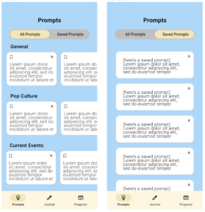
- After:
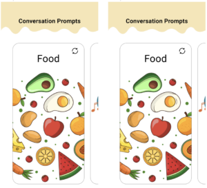 Justification: We changed from a list view to a flashcard-like carousel view for more dynamic interaction with our users. We also change the color and curvy line design to introduce a sense of chill to users. The key motivation is that the older version is too text-heavy. Reducing the amount of text eases the user experience.
- Before:
- Changes on the Progress Page
- To read more about our modification choices, you can view the document here.
Conclusion
Ethical Design Fiction
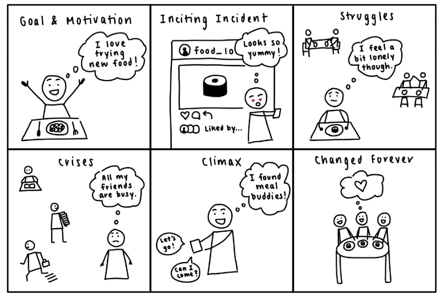
The ethical implication we decided to focus on for our app Moment was – that the progress bar could be addicting. As humans, when we check something off of our checklist and see our progress go up, we feel very good – our brain releases dopamine. And once we get a taste of that feeling, we tend to crave it more. Goal creation and progress tracking are a significant part of our solution. While our intention is to allow users to keep track of their progress and be more accountable as they work towards their personal goals in the context of maintaining existing friendships or creating new ones, there could be a situation where users try to gamify working on social relations – they don’t really put effort into maintaining existing friendships or creating new ones anymore and just check off their goals since seeing the progress bar go up is just so addicting. With this design fiction project, our goal is to make our audience more aware of the fact that while seeing the progress bar go up is a great feeling, if you lie to yourself and just check off tasks to see the progress bar go up, the happiness will soon fade away and you will begin to feel discontent since you did not genuinely work towards your goal. True and lasting happiness comes from pushing yourself to complete your goal to become a better version of yourself. The way we decided to address this in our app is by emphasizing meaningful interactions – a private space for reflection (journaling) so you can be as honest to yourself as possible as well as thoughtful and intentional prompts to help facilitate more meaningful interactions.
We leave our readers with a question at the end of our design fiction story instead of giving them the answer since we believe this allows them to think more critically about the issue. To view our storybook of this design fiction, please click this link.
Team Reflection
As a team working on this social app, we have learned greatly about the trickiness of measuring user social activation energy and habits. Though the information we acquired from the baseline study to the intervention study has been consistent, the results still show a wide coverage of users. Some users enjoy solo journaling and prefer journaling posts not to be seen by others, while some users want to have some interactions with their friends when they document moments with them. We also find the use of graphic models such as the fishbone model advantageous to accumulate structured materials for group consensus and later brainstorming. Working as a group, we also learned from each other’s strengths and distributed work accordingly. We have also practiced how to work together with conflicting schedules. We developed a consensus to openly communicate each other’s expected workload every week to make sure everyone is on pace.
If we had more time to work on this prototype, we would love to
- Add a way for users to make and save their own prompts if they come up with them.
- Make journaling a shared experience with friends so they can view it too.
- Add discussion groups and people with similar interests with hashtags to find mutual interests.
- Add visual indication (like “+1% progress”) that checking off goal/task adds to the progress bar.
- Gamify the goal-tracking progress by building a house/puzzle to incentivize users.
For our next behavior design effort, we will pay more attention to the compatibility between our style tile and app positioning. We will also focus on developing screens with consistent color choices to ensure a smooth user experience. Another area we want to explore is to nudge a different type of behavior in which the product plays a more active and involved role than providing conversational prompts. Overall, we are satisfied with our final prototype as its color choice and function design work together to establish a supportive and warm space for users to grow socially.


