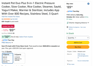
The checkout flows of Amazon, Warby Parker, and Patagonia provide vastly different experiences to the user which reflect the diverse business models each site uses. We can observe that the checkout flow for Amazon is continuously encouraging the customer to complete checkout as fast as possible – there is a one-click “Buy Now” button in addition to the standard “Add to Cart” option. Even when purchasing from the cart, much of the information is pre-filled with your billing/shipping details from previous purchases, making the checkout process seemingly instant.
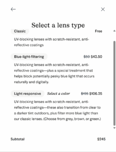
Warby Parker on the other hand, intentionally slows the process of getting from selecting and item to purchasing it – a method that aligns with the fact that purchases made for glasses are likely less frequent and more expensive than Amazon purchases. Instead, the checkout flow incrementally allows the user to add additional features to the their glasses, justifying to the customer the value they are delivering in their product and the steep price following it.
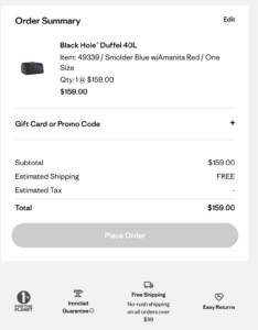
Patagonia has a distinct checkout flow as well. Though not as smooth and easy to use as the other two sites, it chooses to highlight its company values, such as their contributions to environmental causes and customer service guarantees. While the checkout flow may benefit from a more streamlined approach, this lack of UI optimization seemingly further plays into their brand. By avoiding optimizing their site for customers to spend money, Patagonia positions itself not as a “greedy corporation” but as a genuine brand whose product quality is enough to drive sales without further customer manipulation tactics.