
Onboarding – Jianna

This screen captures key information to guide users’ experience: their dietary habits/preferences, as well as their food waste goals. The former shapes the menus they see– for example, someone who is vegan would likely not want to see meat options. Their inputted current leftovers and their goal for leftovers is used as their food waste is tracked to remind them of their goals and show them progress related to their starting point.
Home Screen – Griffin
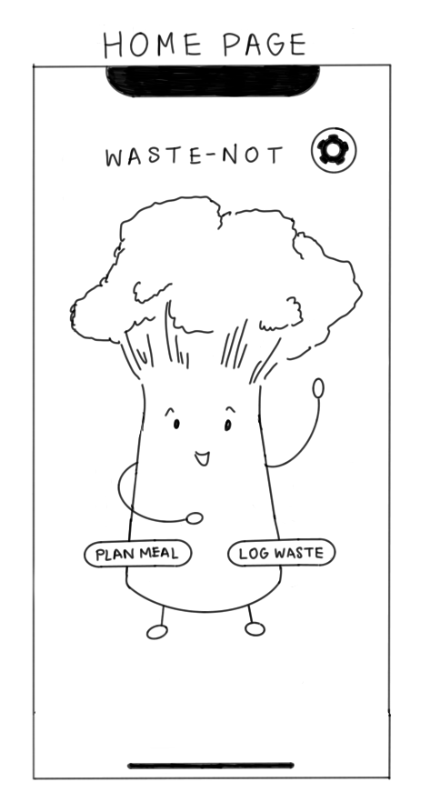
The home page was designed to be minimalist and fun with the avatar greeting the user upon entering the app. The three interactions a user should be able to complete on this screen are navigating to the meal planning section, navigating to the food waste log, and navigating to settings and personal information. The last interaction could be split into two buttons to have a profile button and a settings button.
Meal Planner – German


I designed the screen to simultaneously show the user what they have on their digital plate (to not burden them with memorization) and also see options available to them via a menu pop-up. Menu has course sections which can be expanded by clicking on arrows. Items are dragged / clicked onto the plate.
The plate was originally at a 45% angle to allow for more space for menu items, but we decided it is more difficult to ration it (we learned from assumption tests rationing is valuable to potential users of the app). Therefore, we changed the design to have a circle for a plate in the top half of the screen and menu that can be expanded in the lower half.
Food Item Detail – Dana

This detailed view of food shows the dish name, image, ingredients and dietary information including labels for special diets/dietary restrictions.
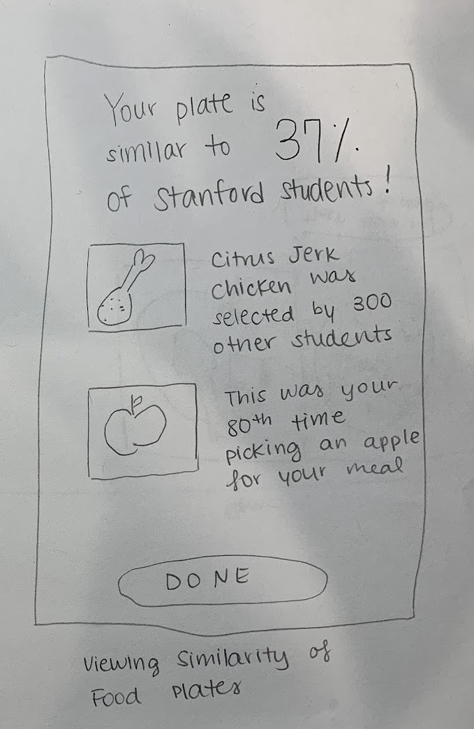
Food Stats – Dana

Eating with Avatar – Griffin
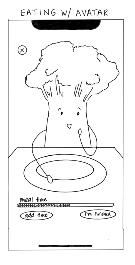

As an intermediate between meal planning and waste logging, this screen was created to add a novel and fun activity. The avatar will eat the digital plate the user planned out. The old version had a time feature, but this was scrapped because it would be disruptive for the user to have to continually add time if they are eating slower and could lead to the user feeling rushed. Instead, the avatar will finish eating whenever the user is finished and will make positive comments about the food the user planned out.
Onboarding and Logging Leftovers – Jianna
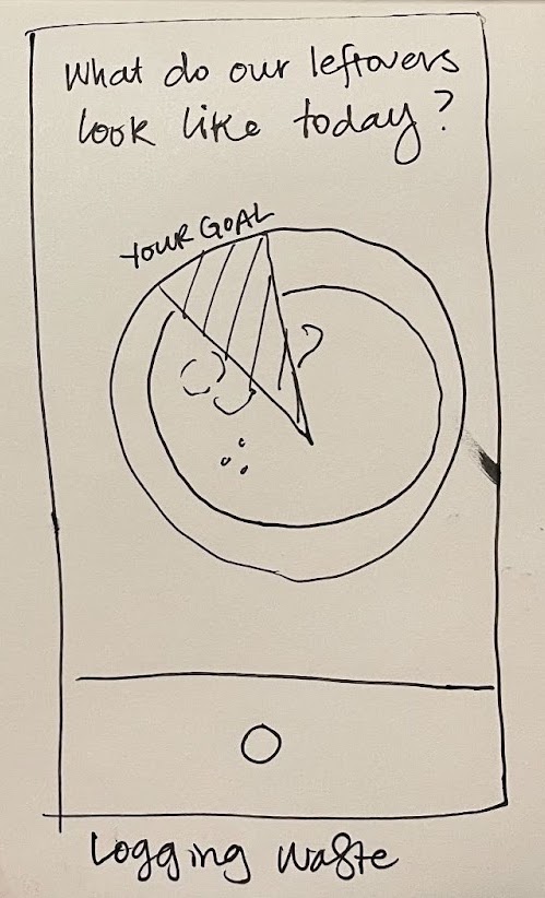
This screen provides a circular overlay with the users’ food waste goals (from onboarding) to facilitate logging their leftovers and provide immediate feedback on their leftovers compared to their goals.
Food Waste Log – German

This view provides an overview of the user’s food waste journey. It looks like a calendar because it encodes temporal information and is familiar to people. Each circle shows % of the plate the user wasted that day.


Comments
Comments are closed.