Creating a high-fi prototype for our mobile-based online shopping intervention.
Shift helps chronic online shoppers reduce their impulsive online spending by:
- Intercepting them when they’ve just started browsing
- Encouraging them to reflect on what emotional needs are driving them to shop
- Then encouraging them to pursue a more fulfilling substitute activity that also satisfies the needs they’ve identified
This week, we were able to get Shift into users’ hands(ish) – if you count a high-fidelity Figma prototype. Nonetheless, we were able to run a quick usability test and get some invaluable user feedback to iterate the designs further.
The prototype you see in this blog post is our first draft and has not yet been updated (aka it includes a ton of usability issues we now are aware of!)
Hi-Fidelity Prototype
- Design System based on our brand personality and style tile
- High-Fidelity Clickable Prototype with detailed screens but limited interactivity
Usability Testing
Three tasks
-
- Start a session: Complete an emotional “pulse check” and receive sampler of recommendations
- Find another activity: Browse additional recommendations and choose one to start
- Complete activity and view achievements
Task #1: Start a session (introspection + activity sampler)
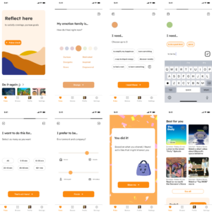
Figure 1 – Home screen and introspection flow by Nicole
- Upon opening the app, users are directed to the home “Pulse” page where they can begin their introspection as well as view previously completed activities
- The pulse check is a four-part module that prompts users for their emotion family, needs (with the ability to add their own), duration, and environment
- Emotion families allow related feelings to be grouped without explicitly naming the category and evoke commonly associated colors-emotion pairs
- Users see a congratulatory page after completing introspection as the first reward for diverting browsing, decorated with confetti and our supportive mascot
- Lastly, users can peruse their activity sampler (crafted from the introspection answers) and opt to explore more activities, or redo the pulse check if desired
Task #2: Find another activity (browse)
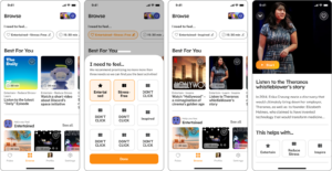
Figure 2 – Browse and start activity flow by Elsie
If none of the sampler activities stand out to the user, they can explore further via the “Browse” tab. The user can use the filters at the top of the screen to adjust their needs, and tap on any activity tile to view its details. The prototype currently only supports tapping on the “Listen to the Theranos whistleblower’s story”.
Task #3: Complete an activity and view achievements
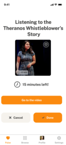

Figure 3 – Complete Activity flow by Sean (with help from Elsie and Nicole)
- Upon starting an activity, users get redirected to the “Pulse” page, which now shows the in-progress activity. The minimalist layout is designed to avoid distractions and get the user to focus on the in-progress activity. The page also shows other info related to the activity:
- Countdown timer showing the amount of time left in the activity. While a video has a built-in duration, many other activities do not (e.g., jogging). The timer is designed to remind users of the amount of time they committed to the activity.
- Relevant links to the activity, such as the Ted Talk video in Fig 3, reduces the friction to start the activity.
- Users may mark an activity as done (if they decided to finish early) or exit the activity (if they changed their mind).
- Upon completion, the user sees a congratulatory page that celebrates the user’s success in avoiding shopping. If the user completes a type of activity many times, they also see themselves “level up” and receive a new identity label. The goal of this scheme is to boost the user’s motivation via intrinsic rewards.
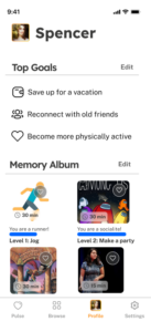
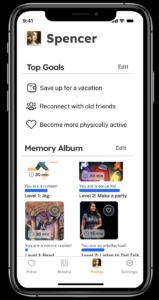
Figure 4 – View Memory Album flow by Sean
- After the completion celebratory page, the user gets redirected to “My Profile.” Their personal goals are shown on the top, and the bottom shows their “Memory Album”, comprised of all activities completed in the past (can scroll vertically).
- Each completed activity in the “Memory Album” shows a level progress bar for identity labels. If the user completes an activity many times (e.g., jog), the user levels up to a new identity label (e.g., runner). This section serves as centralized location for users to view all their past achievements, and the reward system aims to boost the user’s motivation via intrinsic rewards.