
CS 247B: Design for Behavior Change
Team 15: Mindful Movements
Amantina Rossi, Uma Phatak, Nadia Wan Rosli, Melody Fuentes, Rui Ying
Introduction
Our team is interested in helping people move more mindfully throughout the day. To better understand the problem space and what solutions exist for the problem, we analyzed a variety of mindfulness, fitness, and well-being apps to see how effective each was at encouraging its users to improve their physical and mental well-being. We then specifically analyzed each app by comparing the level of intervention implemented, to the level of activation required, and placed our solution somewhere on these dimensions.
Deep Dive into Comparators
Apple Fitness
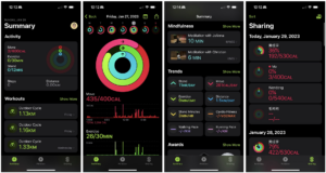
Overview
Apple Fitness is iOS’s built-in app for fitness tracking. It tracks various exercise data, such as workouts and mindfulness activities, most of which come from the user’s own Apple Watch or Apple’s Fitness+ program. The tracked data is consolidated into three major sections: Move, Exercise and Stand, which show up as three colored rings. It also offers trends of many metrics based on the user’s historic activity data. For people who have completed certain fitness goals, the app rewards them with badges. The app also allows users to share their activities with others and compete with them if they wish. It also sends periodic notifications reminding users to close their rings, such as stand for a minute, walk for 10 min, etc.
Apple Fitness integrates lots of functionalities into one app, which provides many helpful features to motivate users to exercise, move and stand. It exclusively targets users who are deeply inside the Apple ecosystem, which offers unbeatable and seamless native experience while adding traction if users want to leave for another platform.
Pros
- It’s tightly integrated with the iOS system. Everything just works, regarding data tracking and health data updates.
- It’s an all-in-one app, which provides ease of use at a single place for people who want to track their activities.
- The design of rings can motivate people to “close the gap”, therefore encouraging them to hit previously set fitness goals.
- It has a dedicated section for mindfulness to promote the idea of being mindful.
- Trends are very useful for people who want to have changes (move differently) to keep track of their plans.
- Awards can be used to motivate people to meet certain goals in certain scenarios (New Year workout goal, Thanksgiving walk goal, etc.)
- Sharing with friends and family also encourages people to compete and therefore move more.
- Timely notification reminders can help people remember their fitness goals and also motivate them if the goal is close.
Cons
- It’s tightly integrated with the iOS system. Users can’t simply import data from other sources or export it. Before iOS 16, you had to have an Apple Watch to use this app.
- There’s no skip or remedy features for unclosed rings, which may cause users’ burnout for chasing streaks or complete give-ups due to frustration. See I’m free! Just broke a ~3.5 year long streak because I’m sick, and I no longer feel the obligation to continue it : r/AppleWatch.
- Users can’t manually add/edit/remove a data entry.
- There is no dedicated ring for mindfulness activities.
Our Take
We can learn from how it motivates moving and standing and apply it to encouraging mindful movements. It also features hourly standing up notifications, which seems pretty useful for our cause, but its effectiveness may need further validation. The entire progress/reward system is also worth looking at: rings, awards, etc, which are too common in behavior change apps to ignore.
Apple Watch Mindfulness

Overview
Mindfulness is a built-in app on Apple Watch. It allows users to practice mindfulness such as reflecting and breathing. It provides prompts to guide users through the process, accompanied by appropriate animations on the watch screen to set the mood and indicate progress. For breathing, it also utilizes Apple Watch’s haptic engine to tap the user’s wrist to guide breathing speed.
The Apple Watch Mindfulness app targets people who buy the Apple Watch to be more active in their daily life, especially those who focus on keeping up or improving their mental health. It’s short of features compared with other third-party apps, but provides an easy entry into mindfulness practices with good integration of the Apple ecosystem.
Pros
- The Apple Watch is just on people’s wrist, so they can pick up mindfulness exercises almost any time and anywhere.
- The animation is so aesthetically pleasing that users would really look at the screen while doing the practice, which in turn might make sure users are following the instructions correctly.
- The animation and haptic feedback make the instructions more tangible and personal/intimate, providing a very pleasant user experience.
Cons
- There is no motivation or rewards from the app itself to make sure people can keep up the behavior if they wish to practice mindfulness more.
- There are limited selections of activities: only Reflect and Breathe, whereas many other activities can also help cultivate mindfulness.
Our Take
The Apple Watch Mindfulness app provides some insights on how to make a simple app that guides users to practice mindfulness. The implementation (animation and tangible feedback) is something that we can learn and build upon. However, we also need to think about how to incorporate more types of mindfulness, especially mindful movements, and how that incorporation may change how we build the product.
Calm
Overview
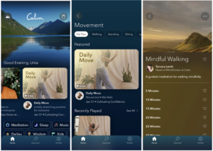
The “Calm” Meditation App is an app that offers thousands of guided meditations on topics ranging from the common, like sleep and anxiety, to the niche, like work and pregnancy. It includes many meditations focused on mindful movement, such as the ones shown above. All meditations are given appealing titles, thumbnails, descriptions, narrators, and more; the user can even sometimes select their desired length of meditation, as above. Thus, the app’s target audience is mainly people who want to get into mindfulness but don’t know where to start, as well as people who are familiar with meditation. To this end, it provides guided and customizable meditations on specific topics, for a moderate subscription price ($70/year). I was able to get this product for free using its partnership with Johns Hopkins Hospital, where my parent works.
While this app is hugely popular, it is not very unique compared to its competitor app, “Headspace”, which is discussed below. Aspects including the landing page, bottom icons, and meditation topics, are all extremely similar between the two. Given its more toned-down UI and work-specific meditations, “Calm” seems to be marketed a bit more to working professionals. The screens and the app name clearly project the value of intention.
Pros
- Tailored to the user – Provides really specific guided meditations for a lot of purposes (sleep, movement, kids, check-ins, for work, etc.) that many people face regularly. Many are offered with customizable lengths too, for people with different amounts of free time. Even the home screen picture is configurable.
- Novelty – Lots of new meditations are added all the time, with new narrators (e.g. Lebron James, Selena Gomez).
- Ease of access – The user can download meditations to practice offline.
- Good UI – The “Big” daily meditations (Daily Calm, Daily Move) are at the top of the home page for quick use.
- Nudges offered – the user can enable push notifications for the app that will encourage them to meditate daily.
- Low-activation options offered (e.g check-ins) alongside higher activation (e.g. Daily Move yoga).
- No ads.
Cons
- Costs a moderate amount ($70/year).
- Overwhelming – the home page almost feels like Netflix but for meditation in the amount it expects you to scroll and swipe. There are too many meditations shown, making it hard to find previous ones that the user liked but didn’t favorite, or new ones (paradox of choice).
- The search functionality is not the best (many things are named similarly, and you just get the top hit back, not the hit most relevant to what you searched.)
- No obvious way to track how much you’ve been meditating.
Our Take
The “Calm” App, while maybe not perfect, is quite good at what it sets out to do: motivating those new to mindfulness to cultivate a new habit. We can learn from its pricing model, its layout (using the good features while removing the “Netflix for meditation” feel), and the features that resonate most with users (variety of options, search functionality for meditations, a recommendation algorithm, a calm interface.) Our product can use many of these aspects, while focusing more on movement.
Headspace
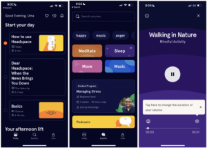
Overview
As mentioned above, “Headspace” is extremely similar to Calm. It offers the same types of meditations, level of customizability, and general app layout. The three above screens are the exact parallels of the screens shown in the “Calm” app section. The broad target audience is the same group – those who want to get into mindfulness and meditation, but need guidance and flexibility – and it fulfills the same market need. Even the price is the same ($70/year). I was also able to get this product for free using its partnership with the City of Berkeley (they are offering headspace free to residents until September 2023.) So, the two apps are offering different but comparable discounts.
There is a noticeable difference in the UI – “Headspace” seems more marketed towards Gen-Z (lowercase letters, brighter more cartoon-y images, a player that is reminiscent of Spotify, etc.) Its meditations are also shorter, which would be more appealing to students with lots of work and lower attention spans. Thus, I think “Headspace” is a little more targeted towards younger users than “Calm” is. The screens and the app name also seem a little less focused on being calm, and more on being motivational.
Pros
- More streamlined – “Today” page offers a clean and concise “mindfulness journey” every day. The design is generally more standardized (i.e. spacing, icons, and images).
- Offers an easier way to track how much you’ve been meditating (in the “Uma” tab).
- Similarly tailored to the user – Diverse topic-based meditations with customizable lengths.
- Nudges are also offered.
- Low-to-high activation options are also offered.
- No ads as well.
Cons
- Costs the same amount ($70/year).
- The bright colors are not super calming – still feels like an app that’s trying to grab your attention.
- The “Today” page, while useful, presents an array of options that could be overwhelming to a user (it might be too much to expect meditation in the morning, afternoon, and night.)
Our Take
While “Headspace” is almost equivalent to “Calm” in purpose and layout, we can learn from the things it does differently. Specifically, we can adapt its cleaner UI, use of “streaks” to get people excited about cultivating a new habit, and use of colors, depending on the emotion we want to evoke in our users. Our product can use the habit-cultivating aspects of these meditation apps for the more niche genre of Mindful Movement.
DailyYoga
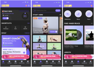
Overview
The Daily Yoga app is a platform that provides health benefits for both your mind and body with multiple yoga poses, various guided yoga classes, and weight loss yoga challenges. The app is for both beginners and more advanced users to increase flexibility, improve strength, maintain good posture, or get fit and healthy. The app’s unique display of a large selection of content allows users to find the yoga videos best suited for them.
Pros
- Daily Goal to move everyday.
- Guided yoga videos for many categories.
- Search feature for keywords.
- Guided meditation audio collections.
- Music for sleep and relaxation.
- Community feature to see other people’s yoga journeys and challenges.
- Tracks daily and all time yoga/movement statistics.
- Can set a daily reminder to do yoga flow.
- Smart Coach with customized yoga videos everyday.
Cons
- Huge paywall with lots of reminders to purchase premium packages.
- Almost too much content to look through on the app on each of the 5 tabs at the bottom, gets overwhelming.
- All of the options give it a cluttered UI.
- Can’t do multiple daily reminders, only once a day.
Our Take
This app provides an abundance of content ideas to take from (guided yoga videos, meditation audio, ebooks, smart coach) and narrow down from instead of including all of the above. The pricing model of this app is a bit overwhelming and a simpler method should be used. DailyYoga provides a nice example of a UI flow with the tabs at the bottom and a dashboard display. I think this is a good blueprint to follow as we work to create something simpler and more catered to a specific type of mindful movement as well as more consistent reminders throughout the day.
StretchMinder
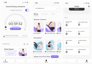
Overview
The StretchMinder App is a work break guide for people who sit at their desks often or want to take regular movement breaks. The app helps to nudge its users to add more movement into their workday by sending notifications with small “exercise snacks” that can be done anywhere. The app’s unique use of hourly notifications ensures users are consistently reminded of when they should be taking movement breaks.
Pros
- Can set hourly reminders to take a movement break.
- Offers a guided stretch/movement/breath break at each reminder.
- Can favorite certain exercises.
- Can keep track of how many minutes and sessions you’ve done of each type of exercise.
- Can connect your Apple Health data to sync details.
- Can set daily goals.
- Can choose the duration of break from 5 or 15 minutes or can snooze break.
- Clean UI that isn’t cluttered and is very easy to use.
- Can choose if a break is a movement, walk, or breath.
Cons
- Need a premium account to access all movement routines and breathing exercises.
- Limited number of exercises for each category.
- Can only set a walk timer to 30 minutes.
- Can’t search for keywords in the list of activities.
- Quite easy to snooze the break or ignore the notification.
Our Take
This app is a great example of something we can implement to help people incorporate more stretch breaks throughout their day. The clean UI and notification features are definitely aspects of the app we can draw from for our own implementation. It would be interesting to expand on their attempt at behavior change with our own knowledge of behavior change techniques and research, since it seems pretty easy for users to ignore the notifications.
HabitMinder
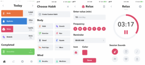
Overview
Habit Minder is an all-in-one habit setting app. The mission of the app is to help consumers form healthy habits, keeping them accountable with tools like mini apps and session screens. Users can choose one of 50 pre-set habits that an average person wants to improve, having somewhat unique session screens that align with the habit. Non-paying users have a maximum of 3 habits they can track, whereas paying members of the app can set unlimited habits.
By the reviews, it appears that response time is a bit slow for customer service through email, but they get to it eventually. There are no real relationships with the customer through email lists or forums, the app itself is the extent of the community.
Pros
- Elegant, customizable interface.
- 50+ preset habits that users can choose to focus on.
- Complete customization of habits.
- Can create new, custom habits with a customizable mode of tracking.
- Notifications based on the user’s desired time interval.
- Unique session screens depending on what habit is being tracked.
- No ads.
- Apple watch compatible.
- Session screens give users the space to track their habits.
Cons
- Can easily become overwhelming by letting paying users track an unlimited number of habits.
- Only compatible with Apple watch (i.e. not fitbit).
- No real incentive other than the progress bar and arbitrary streaks.
- Limited to how many times/at what points in the day you can get a reminder.
- No guidance on how to complete a habit- completely self-guided.
- Can be difficult to navigate.
- Often crashes, small bugs.
- Tries to, but does not sync correctly with Apple Health as tracked habits do not contribute to the goal.
- Does not support activities more than once per day.
- You can increase a habit’s goal, but can not reduce it (ex: you can increase water intake goal from 25 oz to 30 oz, but can not decrease it once you have set it.)
- You HAVE to set days of the week (Ex: user wants to exercise three days per week, but not on set days, which is not possible to track on app.)
- App tracking is limited to set days, so you can not have something like bi-weekly tracking.
Our Take
This app, functionally, serves the same purpose of the “Notes” app on a phone- it is just a way to be reminded of your goal and provided a space to do it, but apart from the progress bar and streaks, there is no incentive or motivation to stick with a habit. This app completely embodies the context prompt (from Tiny Habits). Good for one-time activities in a day, creates the option for a habit’s visibility through your phone or apple watch, but if a user tries to track too many habits, can become desensitized to the notifications and overwhelmed by how much they have to complete throughout the day. The app would be greatly improved if the habits were guided (i.g. Provide exercises or mindful movements).
Takeaways: Elegant UI. Easy habit creation. Great session spaces for users to time their habits. Customizable
To improve: Narrow down the amount of what can be done to avoid overwhelmingness. Guided practices. Incentives/stakes. Customizable times/notifications/habit goals.
StandLand

Overview
StandLand is an integrated app that connects with your Apple’s Fitness app and Apple watch. Every hour, Apple Watch users get a message to stand for one minute. If they successfully complete this consistently, this data is sent to StandLand in return for in-game points/currency, which could be used by the user to create a virtual fantasy land. This app is designed for users who want to improve their incentivization for moving at set intervals throughout the day. The app itself is free, though there are many in-game add-ons that are available for purchase. The purpose is to make a game out of your health, to give stakes to your standing.
Pros
- Cute, customizable lands.
- Elegant tracker/visual for your standing habit.
- Apple watch compatible.
- Very interactive, unique based on the user.
- “Collectable” lands and creatures give incentive for users to follow through on habit.
Cons
- Only tracks standing, can not be customized for other habits.
- Only compatible with Apple watch and Apple health.
- Once you max out everything you can buy with in-game points, no more incentive to continue.
- Limited to how many times/at what points in the day you can get a reminder.
- No guidance on how to complete a habit.
- Often crashes, small bugs.
- Does not give breaks to users. If users are not wearing the watch for hours and miss a standing notification for good reason, they are still penalized for it.
Our Take
This app is a simple, cute add-on that addresses the Apple Fitness’ apps problem of not incentivizing users to “close their rings”, providing stakes and rewards for following through on their goals. Users don’t interact with this app at all to track their activities, the only user-activated portion of the app involves their customization of their fantasy land that is created through the in-game points they earn from completing their habit. This app seems to be very receptive for users, with many having high retention rates and keeping the app for years, becoming very invested in the lands they tend for. It makes a game out of your standing habit. Aside from the land’s customization, it provides a visual to see how consistent your standing has been.
The app would be greatly improved if it weren’t limited to just standing, and instead could be a customized habit that users could manually track so that they could have a consistent relationship with the app.
Takeaways: Elegant UI. Customizable. Fun. Dopamine release, almost addictive. Incentives/stakes
To improve: Customizable habits, more user interaction with the app itself.
Movejoy
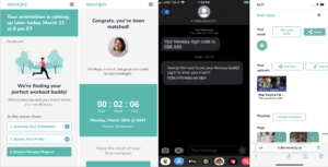
Overview
Movejoy (beta version) was a startup that connected people interested in building wellness and fitness habits by pairing users with each other to act as accountability partners (“buddies”). User compatibility and matching was based on their schedules, preferences, backgrounds, and goals. Buddies were connected via scheduled text and Zoom meetings, which served as reminders for them to meet up and work out. In addition to these texts, Movejoy had an accompanying website with optional features to help users get started on their fitness or wellness plan, such as a curated media library with playlist suggestions, or a weekly planner. Movejoy was created with the intention of being for everyone who had difficulty working out regularly, especially beginners or people who started off being more casual about fitness and wellness with an interest to do more. However, while in beta, the target demographic was specifically adult women, especially those of similar affinities (for example, moms of young children).
Pros
- Having a compatible accountability partner increased the frequency of users actually executing their fitness plans (e.g. working out, meditating).
- Buddies were not just a form of accountability but also could be forms of support or encouragement. Movejoy emphasized that by connecting with other users and not just a fitness coach or program, people could form genuine connections and see each other as “real” and fallible, allowing flex room for failure in case life got in the way.
- The core concept of receiving regular reminders and meeting links with buddies is simple and easy for users to understand and act on.
- The virtual format allowed people to have more options for pairing with others in different locations. Though it is worth noting that some users also found value in matching with people from their local areas too, so they could also meet up in person if they wanted to.
Cons
- It was challenging to get users to take the “first step” of attending the first meeting with their buddy, even if they went through the entire onboarding process and scheduled a meeting.
- Users could only meet other users through 1-to-1 matching. Even though they could request rematches, they could not view through any sort of list of other users nor pick out buddies for themselves. This was intentional design but may turn off some people.
- The supplementary website and its features could be confusing to navigate and offered little value to most users, who would usually just do their own routine. While this is all right for people who already had fitness plans, not being able to provide guidance to people who might have needed more of it was a missed opportunity.
- The focus was mainly on movement like exercise, meditation, and stretching. While filling this niche is fine, some users also expressed a desire for more options to build healthy habits around things like nutrition, so that they could use Movejoy as their centralized hub and primary for all things related to wellness.
- Paid monthly subscription model. Hard to justify why people should keep paying for a subscription once they get matched with a buddy they like.
Our Take
When Movejoy worked at matching people, it demonstrated that having an accountability partner is an effective way of getting people to “show up” and work out more regularly. The issue was getting onboarded users to commit to showing up for the first meeting at all. Those who did found the buddy system effective and stuck with it for a significant amount of time. We can glean from this information that even a successful method of building healthy habits can fail if the activation energy required to take the first step is too high for most people. Committing to be buddies with another person can be a daunting ask. Also the way the product matches people and determines compatibility is not transparent, and with a small user pool, matches were mainly made based on schedule availability and not other forms of compatibility that may be more valuable. It was also interesting that users who felt attached to Movejoy expressed wanting the app to do more for them beyond movement. While focusing on building one type of habit might be better, it is worth noting that users are people who are probably juggling many different things, so having an additional app to manage may be burdensome. When designing our own app, we should consider what factors will make users want to start and keep using an app (so long as it’s helpful) while also helping them succeed in their wellness goals.
Burn Your Fat With Me!!

Overview
Burn Your Fat With Me!! is a “romance adventure” fitness app/game in which anime characters act as the player’s workout partner to motivate players to do fitness exercises. In order to progress through the story and unlock more features in the app, such as more characters or voicelines, players must complete fitness challenges of increasing difficulty and accumulate points. Players can also track their fitness progress and schedule reminders to work out. This app targets anime fans and gamers who want to exercise more. These users may feel more motivation doing so with an anime character/coach guiding their fitness routines, than they would on their own. It is also clearly targeted to fitness beginners because the only exercises offered are basic, although there is a notable increase in intensity as the player progresses.
Pros
- Makes exercising a more engaging experience by supplementing it with visuals, story, and character interaction.
- Players can view a character as an accountability partner or coach without having to actually be with a real person.
- Players might be more emotionally invested in continuing their progress if they like the characters or story.
- Gamifying exercise and setting milestones that must be unlocked may make exercising more fun or structured with clear goals for the player to achieve. For example, locking new characters behind point progression dependent on fitness progress, the alternative being a paywall, gives people something tangible to work towards.
- Variety of different characters and personalities allows people of different preferences to choose the type of coach that works best for them.
Cons
- Types of exercises available are basic and progress in intensity through increased repetition but not necessarily in a way that encourages best exercise practices.
- Can take a long time and a lot of work to earn points and progress through the story or unlock features, causing some players to be frustrated. Some of these things can be unlocked faster by just paying, causing some users to feel paywalled.
- Each story route has an ending so players who complete all endings might lose interest in using the app and maybe building their habits when there is no longer anythingmajor to unlock.
- Difficult for users to do some exercises while also tapping on phone to count reps.
- UI is like classic visual novels and fairly outdated; sometimes even a bit too simple and not providing enough instruction.
- Should treat health more holistically since weight and weight management can be affected by other things besides exercise, like medical history or nutrition.
- Heteronormative assumptions and some problematic interactions, like a character fatshaming and saying derogatory things to the player. The reception to this varies. Some players are discouraged or offended by it, while others find it funny. Some players even report the disrespect makes them want to work out more out of spite.
Our Take
Burn Your Fat With Me!! appears to be the only app of its kind currently available with over one million downloads on global app stores, indicating it is filling a niche or at least piquing people’s interest and curiosity. Positive reviews on the app stores reveal a significant amount of people are working out more often and consistently because they are motivated by the characters and story. However many people note that the app functions more as a basic motivator and they must supplement their routines with other exercises not found in the app. The way the app approaches exercise and user interaction with the characters and story also does not appeal to everyone who is initially interested in the app (for example, the derogatory humor meant to serve as a motivator is quite divisive). Even within the target demographic, the app seems to fulfill only certain niches. However, for the ones it resonates with, it seems to provide value that only a fictional boyfriend or girlfriend can offer by simulating an overall positive relationship, with both the characters and the idea of exercise. It’s worth investigating how we might also consider offering users guidance, contextualization, and emotional investment into their journey to build healthier habits.
Summary
Competitors
Most participants from our baseline study indicated that they wanted to move more for the sake of their well-being, but had difficulty keeping at it. Therefore, we focused on some fitness/health apps to look at how they promote physical health, as well as a handful of mindfulness apps for mental well-being. Furthermore, to better study how comparative apps understand their users’ behavior and make efforts to change it, we researched apps that feature fitness/mindfulness tracking, results of which would help our intervention solution. It’s also worth mentioning that we covered two built-in apps within the Apple ecosystem; they showed us the importance of user experience and the charm of seamlessness in reducing friction and activation.
Competitors and Mindful Movements
The competitors come from a variety of spaces:
- Some competitors focus on fitness and its tracking, such as Apple Fitness and Burn Your Fat With Me!! They do a good job at motivating people to move, but not necessarily in the direction of mindfulness. Apps like Burn Your Fat With Me!! gamify the behavior change process and should be a good inspiration for our intervention idea.
- Apps such as StretchMinder and StandLand, however, are promoting small movements. They do a good job of helping users form the habit of moving, but are limited to a certain set of activities. Many of the apps in this space also offer Apple Watch integration, which is something we should definitely consider.
- A few apps tackle mindfulness, such as Apple Watch Mindfulness and Calm. However, they only deal with mental health and lack support for physical movements. Focusing on mindfulness, they all share great design elements that are refreshing and calming; our product should be aesthetically pleasing, too.
In short, apps that do tracking feel more motivating; apps that start small might do better in habit forming; apps that focus on mindfulness can be lacking in the mental health aspect.
Based on the analysis above, we think it’s important to have an app that is not only good at motivating physical health (movements) but also effective in mental health (mindfulness). We clearly see that there is a huge vacuum in such space and we plan to fill the void with our product.
Where Our Competitors Stand
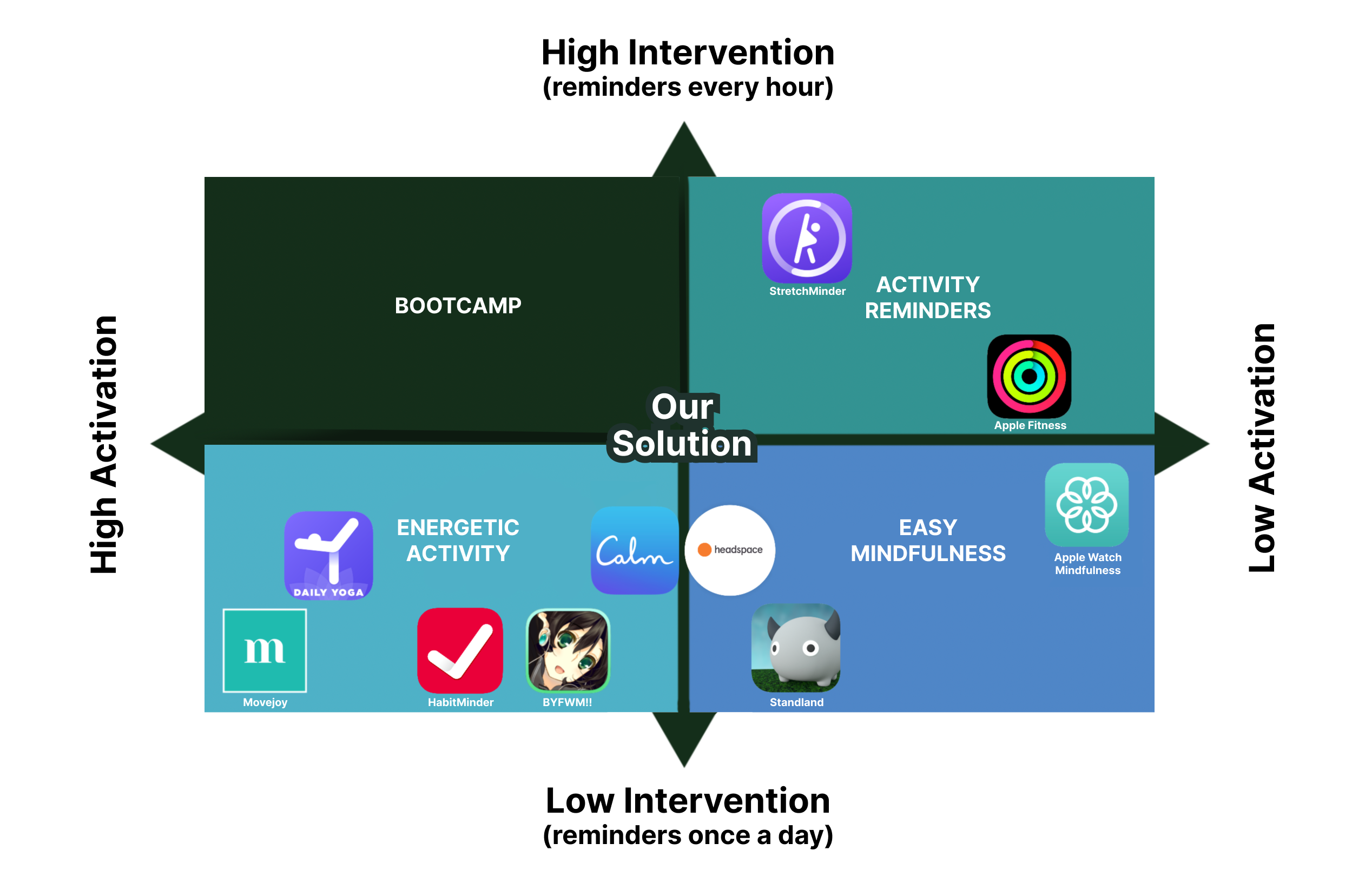
To further understand our competitors and to help us pin down the design directions of our final product, we did 2×2 mapping for all apps.

We found that the apps researched above can be roughly mapped onto a matrix of two axes: level of activation (energy needed to use the app) and level of intervention (how often the app reminds users to do something).
We have labeled each quadrant according to the type of apps that fall into that category. We can see that none fall into the “Boot Camp” quadrant with both high activation and high intervention: this makes sense, because it is hard for a phone app to play the role of a demanding and omnipresent coach. This is therefore a “desert” quadrant (concept adapted from Stephen Blank’s Frequency/Passion Canvas), and we will not be developing in it.
We are seeing more diversity in apps in the other three quadrants. The apps focusing on “Energetic Activity” tend to require higher user motivation (low intervention), and take more time to prepare and use (high activation), like yoga apps. “Easy Mindfulness” apps encourage “light” activities (low activation), but in general, guide users only when they themselves are willing, like breathing apps. The apps that utilize push notifications (high intervention) but aren’t demanding (low activation) usually only track fitness data or make reminders on easy activities: we thus called this quadrant “Activity Reminders”.
Where Our Product Will Stand
From the findings of our baseline study and the comparative research, we decided to place our product somewhere in the “middle”, with a “smart” intervention level and a “flexible” activation level that comes from personalized movement choices.
We believe that the app in the “middle” can provide enough nudges to effectively change users’ behavior while not being too intrusive or annoying to be disencouraging; and an appropriate level of activation that caters to individual users’ preferences will make the behavior change much more enjoyable.
“Smart” Intervention
Even though we categorized most of these apps into “high” or “low” levels of intervention, we aim for “smart” intervention: this means intervening at times that are actually useful to our user, instead of a set number of times throughout the day. That is, we don’t want to be too “noisy” like StretchMinder, nor appear almost non-existent in the behavior change process like Standland. During our baseline study, many participants expressed their expectations for features such as auto-logging and disliked the intrusion of manual logging/reminders. In the competitor deep dive above, we also saw the power of the Apple ecosystem which just works because of the high confidence detection from its system-level data tracking. Thus, we want our product to be intelligent enough to intervene at the right time, no more, no less.
“Flexible” Activation
Additionally, considering the variety of mindful movements that exist as well as different people’s preferences and their work-life environments, we think it’s reasonable to set the expected activation of our product to be flexible. We will allow personalized mindful movements as long as it fits users’ needs and we expect that the majority of movements will have the medium activation level.
Conclusion
In this Comparative Research, we analyzed a variety of mindfulness, fitness, and well-being apps. They each have different focuses and target audiences, but offer varying solutions to the same broad problem. We can learn from the shortcomings of apps with too high/too low intervention to achieve a more proper level of intervention; we will also think about the way of incorporating all kinds of mindful movements and how that can affect the product’s activation level.


Comments
Comments are closed.