Mood Boards
Our team’s goal is to encourage people to go outside–this includes inspiring a sense of excitement, comfort, and safety in the outdoors. We took this into account when creating our mood boards, starting with the first version of our mood board that we created collectively in class. From this mood board, we split up the task of creating individual complementary mood boards to help refine our vision for the app.
In-class mood board
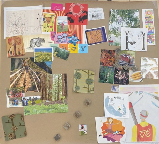
Our focus in one half of this mood board was introducing restorative and calming elements associated with the outdoors. This was captured through the greenery, such as the trees and trails, as well as the inclusion of white space, such as in the individuals lounging in the hammock. The other half of the mood board served to inspire more active interaction with the outdoors–through this, we put on display the range of possibilities for outdoor activity.
Alonzo’s mood board
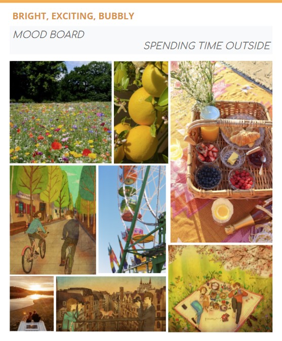
This mood board focuses on finding excitement in the outdoors with the hopes of encouraging shared spontaneity, an element that is vital to our vision for our app. Through use of brighter colors, such as yellows and greens, it instills a poppy and bubbly energy. Most importantly, the activities that are depicted through this mood board oftentimes social, and they represent the variety of ways that people can spend time outside together, whether it be at a fair together, biking through their neighborhood, or having a picnic at a local park.
Kimberly’s mood board
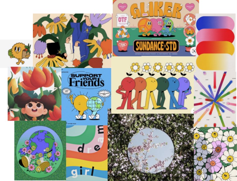
One of the key motivators for our project is a feeling of disconnection with their surroundings that was shared by many of the people we interviewed. As such, this mood board focuses on exploring the connection between an individual and their environment. This is addressed through images that personify the earth and others that inspire self-reflection when surrounding by nature. The variety of colors used in this mood board demonstrate the vastness of the outdoors and the ways in which people can interact with it.
Yesenia’s mood board
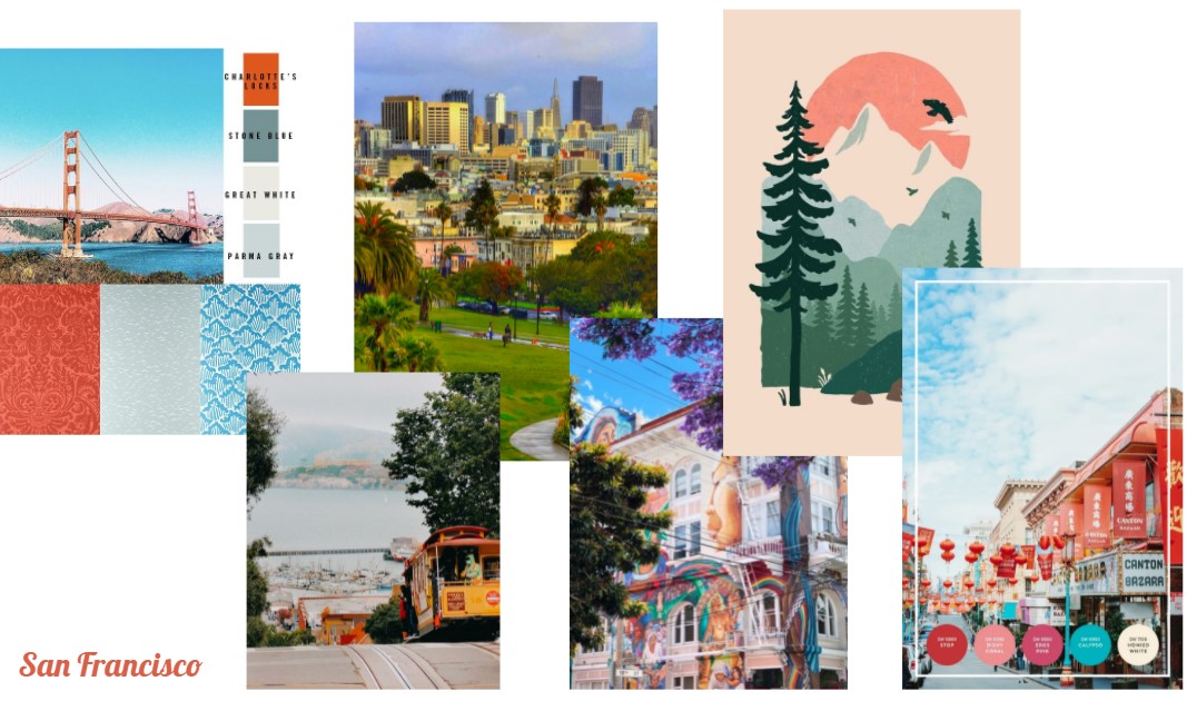
This mood board looked at San Francisco for inspiration, both in the city’s structure and its color palette. Big green open spaces are strong features in the city, as well as viewpoints that help ground an individual. The city’s inclusion of these spaces, its proximity to natural landmarks, and its colorful, yet calm, color palette make it a great source of inspiration for this mood board.
Style Tile
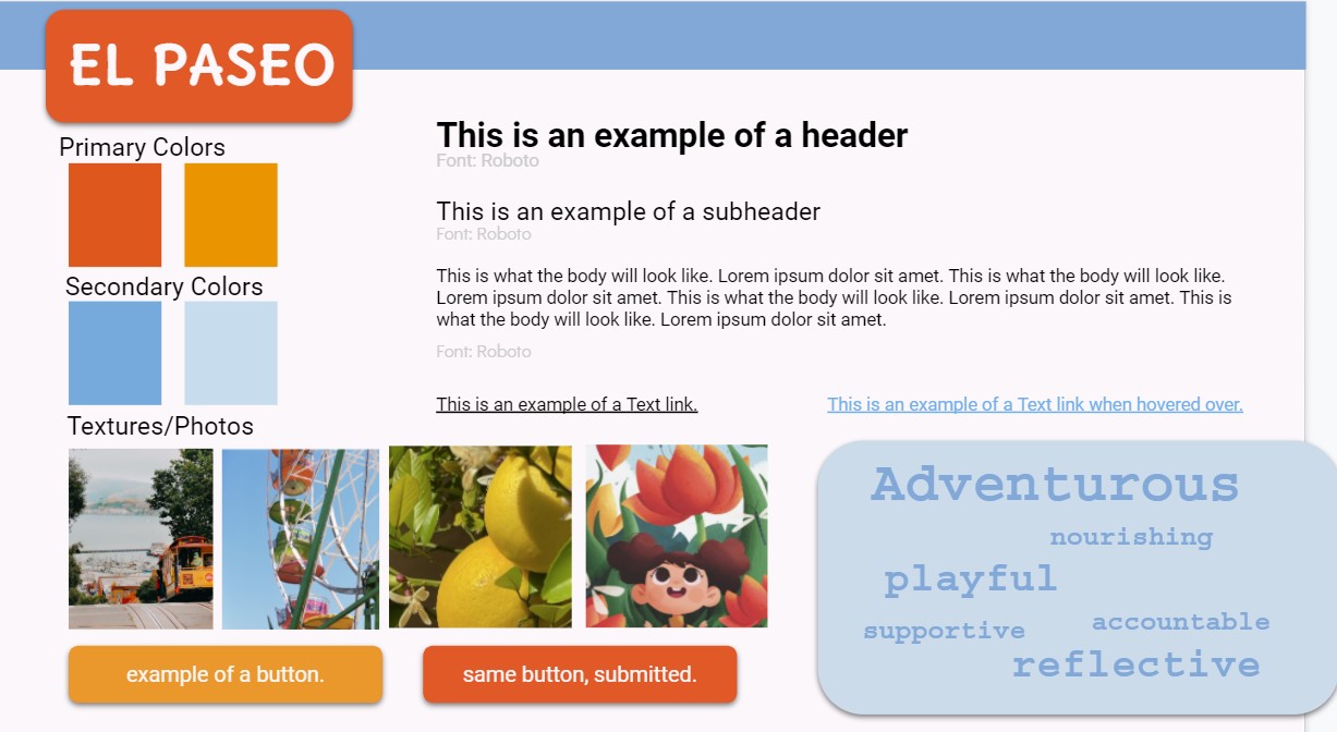
Our style tile was driven by the emotions that we want our users to feel when they use our app. Its primary colors serve to call forth warmer, exciting feelings associated with the outdoors that are reminiscent of a sunny day, while its secondary colors are meant to achieve calmer emotions. For our buttons, we decided that it is important to have these primary colors reflected in them to achieve bright calls to action, and we rounded the corners of our buttons to establish a welcoming and playful feeling. We chose Roboto for our font to be easily readable and non-distracting, and to contrast the adventurous elements of our hero font that was chosen to look like a font you’d see on natural landmark signage. Our reasoning behind all of these elements of our style is driven by the adjectives we listed out–these are the emotions and feelings that we hope to evoke through our app, and they’re what we want our users to feel when they use our app outside.

Comments
Comments are closed.