
Our sketchy wireframes were designed independently and then refined as a group. The group refinement focused on creating consistency for layout and design choice between pages. We focused on the following key screens:
Landing page | Login | Dashboard | Bot Overview | Edit Bot
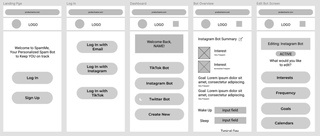
Overall, our interface is designed as a website loaded on a mobile device. We expect users to primarily access our service through the same device as their social media apps (ie. their phone). Since our service is primarily intended to be set up once and thereafter only accessed once in a while to update preferences, we believe there is no reason to create an app for our service and instead opted for a website to be viewed on a mobile phone.
For navigation through our product, we chose a top bar navigation to keep it simple and align with the common mental model for many websites. We did not foresee an extensive number of pages in our product, since many of the screens we envisioned would be accessed via either creating a bot or editing a bot. A more sophisticated navigation method seemed unnecessary and may confuse the user.
We opted to make the login, dashboard, and edit bot screens as simple as possible to reduce the cognitive load on the user. To do this and as shown in our image, we limited the UI on the screen to contain a simple message (depending on the screen) and very few buttons that the user can select from. This service is intended to feel simple and casual so we aim to keep the UI in line with this. We made our buttons to be fully rounded so that it’s in line with current design trends and further enforce a casual and modern look.
The user can access and view the bot overview screen after they select one of their created bots from their dashboard. This overview is meant to give the user a convenient way to review the settings of their bot. If they find that they want to edit any of the fields (interests, goals, or schedule), then there is an edit icon they can select and proceed with editing.
Set Interests | Set Goals | Set Post Frequency | Connect calendar | Manual Calendar Entry

For this set of screens, they represent the main interactions a user would have when setting up their bot for the first time, and later on, adjusting their bot settings. While we did have some additional screens planned within this flow, the ones we have created above were the ones we believed to be the most crucial to the flow. The main difference we envisioned between setting up a bot for the first time and returning to adjust settings is that for the former, the user will go through this whole setup in a wizard format. For the latter, users would only interact with the screen that’s relevant to what they want to change. For example, if users wants to update their schedule, then they would only interact with the schedule screens.
When the user is going through the wizard for the first time in their bot setup, it is important that the user fills in the required information. We made these steps short and simple, and plan for the process to take 5-6 steps. Once the bot is complete, the user can simply select the bot summary from the dashboard, and edit the relevant features for their needs.
In terms of the UI, we continue with keeping the style simple, casual, and modern. We included a gallery view for when the user is selecting interests so that it’s easier to differentiate visually what each category is, as well as allowing multiple selections. For goals, we kept it in a list format where users can add in however many goals they want via a textbox that only shows after they select “Add Goal.” For the “Set frequency” screen, we wanted to give users the ability to also adjust how often they wanted to see posts that were relevant to the interests and goals they inputted. To adjust this frequency, users can select from 5 different “buckets” on a bar to indicate how often they wanted to see posts of the corresponding interest or goal.


