
Team 3: Alahji Barry, Elyse Cornwall, Kaitlin Peng, Anooshree Sengupta, Cecilia Wu
Initial Sketchy Screens and Critiques
Sign Up Page (Alahji)

Critiques:
- Having first/name may not be necessary
- Logging in with different platform might be useful
- The 3rd screen does not contain the option to login if user already has an account
Drop Down Setting and Password Reset (Cecilia)
Critiques:
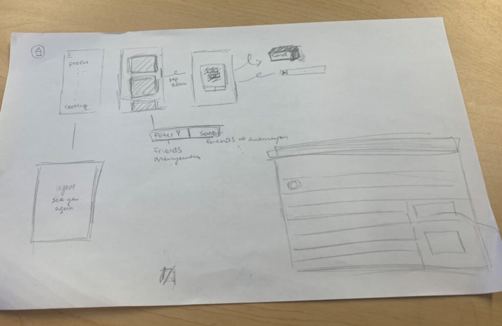
- Offer more details in terms of the options on the profile page such as specific options
- Inset information regarding the verification process for password reset
- Should be more specific of the information needed process of resetting one’s password – add more screens
Reflecting on a Past Decision (Anooshree)
Critiques:
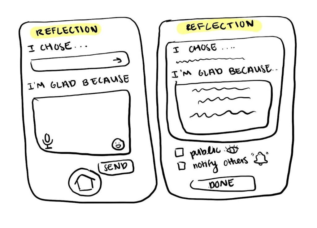
- Offer more media options
- Keep sharing screen separate from input screens
- Maybe split the input screens so it’s less cluttered
Present Decision Making (Elyse)
Critiques:
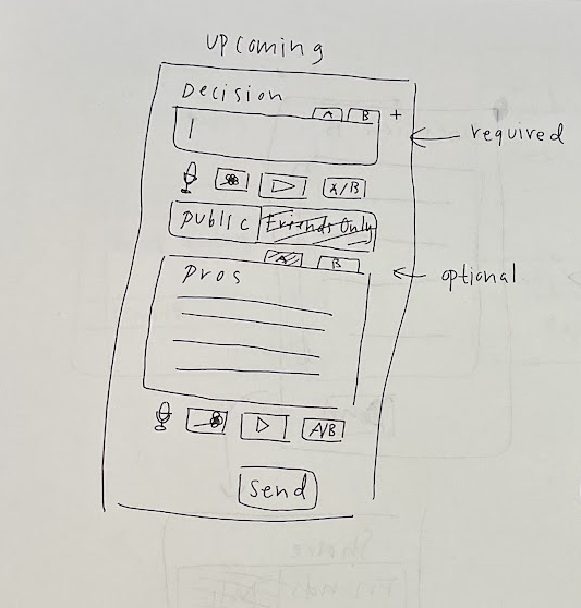
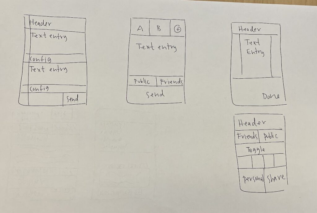
- Don’t need a separate button for every type of input
- Probably want to separate input from sharing screen
- (From architectural design TA feedback) Focus on reflecting on decisions, and not making decisions
Giving Positive Affirmations for Others’ Decisions (Kaitlin)

- (From architectural design TA feedback) Focus on giving affirmations for others’ reflections, and not helping them make decisions
- Keep design minimal
- Add other possible screens the user can see depending on other user’s input type
Final Sketchy Screens and Explanations
Sign Up Page (Alahji)

To create an account, we decided to keep the sign up page simple and familiar for easier navigation, allowing users to get started with the app faster. We followed the usual format of other apps that enables the audience to create an account with an email and password or with a different platform’s account (e.g. Google). If users create an account through another platform, the basic information would have to be collected through their other account like full name. We attempted to keep everything almost the same so the barrier to use the app is minimal. At the bottom of the screen, there’s also the option to let the user login to an existing account, which takes the user to another page where they could login through their email and password created from this screen.
Password Reset and Setting Drop Down (Cecilia)

For the password reset page, we decided to keep everything simple and convenient while ensuring the user’s account security by verifying through their email address before allowing them to change their password. More complicated instructions in a simple task of changing one’s password would only discourage them in rejoining the app.
In terms of the settings drop down page, we decided to have some of the basics functionality like setting, notification, about, profile, but in addition, we also added the archive page, which is a place for users to view their previous post about curtain decisions as well as the saved page for advice or motivational information one may come across on their pages.
Reflecting on a Past Decision (Anooshree)

We don’t want our users to feel overwhelmed when reflecting on past decisions, so we decided to split this flow into 3 different screens so the user can focus on one task at a time. In the first screen the user focuses on inputting the decision they’re reflecting on, in the second screen they focus on inputting the positive outcomes of the decision, and in the third screen they can think about sharing their reflection with others.
We want the user to be able to reflect about their decisions through different forms of media since we think it might be helpful for people to express themselves, so below the text input boxes, there is a button that allows the user to upload an audio recording, photo, or video recording (either in addition to the text input or just by itself). Below the text box of the second screen, we also added an option for the user to add a (positive) emoji that goes with their input. If they choose to add an emoji, the emoji in the last sharing screen will reflect what was chosen.
For sharing, there’s the option to share your reflection with friends or publicly, but the default option will be to have the reflection private so users who click through the screens quickly don’t accidentally share something they don’t want to. We added a copy link button at the bottom as well so users are able to manually send the reflection to those they want to share it with.
Present Decision Making (Elyse)
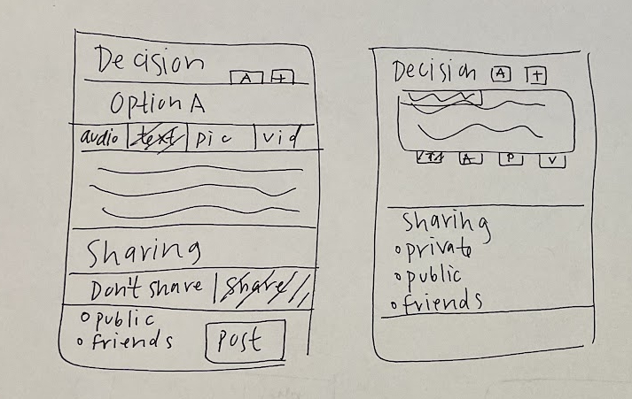
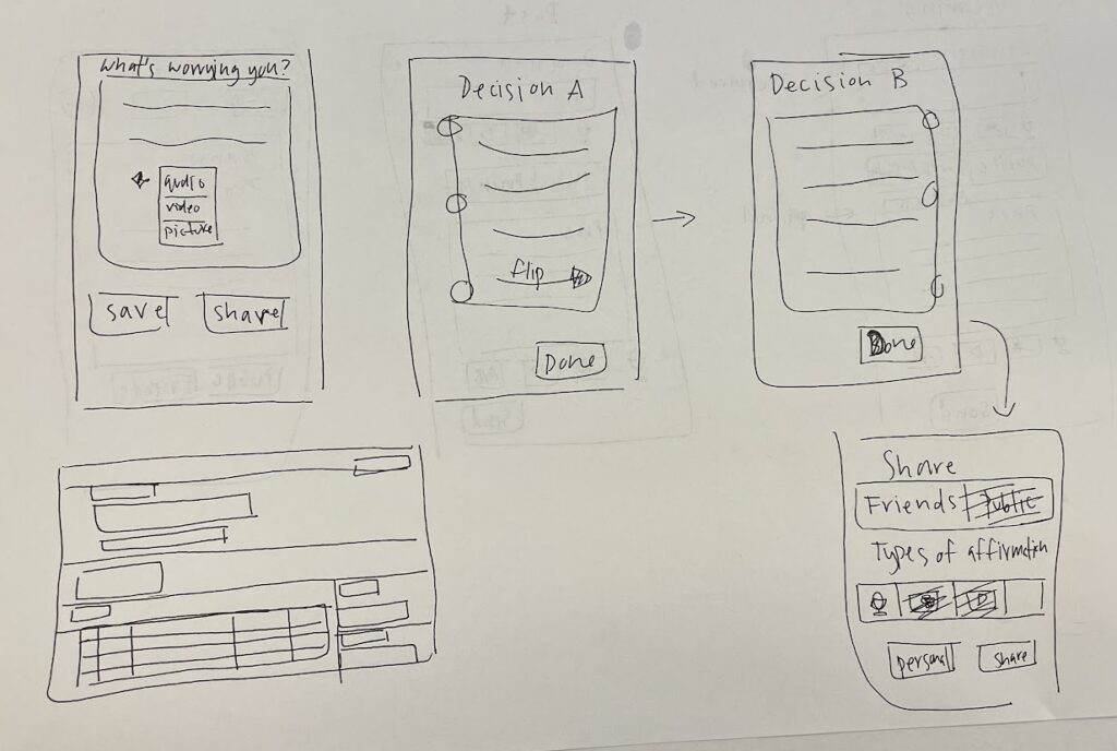
For deciding present decisions, we thought to leave more freedom for the user to customize their posting depending on the structure of the decision that is currently bothering them. Since the format could be any form of media, we left a blank space for them to upload any photos, audio or the classic text to share what is on their mind. After inserting the two or more choices, the users had the option to decide where that post would be visible to the public, allowing everyone or only to their friends. Depending on the situation, not everyone wants advice and would rather have some other form of support / assistance, so we also have the option for them to choose what is needed at the current moment such as advice or affirmation. They can share their post and update their users on their decision accordingly from there on.
Giving Positive Affirmations for Others’ Decisions (Kaitlin)
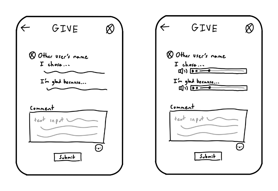
For the social aspect of our app, we want users to be able to give positive affirmations to those who decide to share their reflections. The above image shows two possible screens the user can see depending on what kind of media the other user decided to use for reflection. We tried keeping the design as minimal as possible so users aren’t overwhelmed since giving affirmations to others can be difficult. We also decided to only let the user giving the positive affirmation give it through text and emoji input since we want the receiving user to be able to easily go through their affirmations.




Comments
Comments are closed.