
Bubble Map
Keeping in mind our targets from the previous experiment, simplicity and accountability, we were able to split our app into 3 large sections:
- Settings: This section is intended to provide the users with maximum customizability in terms of their goals, behavior preferences (monitor just logging / monitor my goals) and pet and privacy preferences. Do they want a publicly visible pet? Who are their friends on the app? What kind of pet is displayed on tier homepage?
- Logging: This is where we provide the user with the ability to take pictures and classify each picture by category of spending. They can also provide information about the amount and how the purchase makes them feel if they choose to.
- Pet Health: This section shows the user the status of their pet, the pet’s ‘health’ in terms of their personal goals as well as the status of their friends’ pets. We also allow them to review their personal goals in this section and provide them with basic information about what recurring expenses seem to be positively/negatively impacting their goals the most.

System Map
Our system map models how a new grad software engineer might navigate the app if they were to go through it a month or so after getting set up on the app. The center of the path is the homepage that leads outwards into the 3 major areas that were highlighted in the bubble map. The map emulates the user using each feature in tandem with others as well as independently, if they choose to occasionally check-in on their friends or perform other such basic functions.

The happy path in both the system map and the bubble map encompassed basic interactions that further informed our wireflows. We wanted to show a high level of customizability as well as simplicity in our wireflows to enable users to set and track their own personal goals and evaluation metrics. Moreover, we wanted to prioritize nodes in the system map that were closer to the ‘Homepage’ to really flesh out features that would constitute larger chunks of the time spent on the app.
Wireflows
Logging spendings

Pet Health

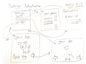
Settings
Stats

Synthesis
Our synthesis process involved drawing the following user story map to narrow down which screens to prioritize for our MVP. We made sure to encompass basic screen that would assure the user both tracking visibility and social accountability as well as the aspects of gamification that we intended to incorporate into the system.

Using this map we were then able to map the basic functions needed to create a rounded MVP that enabled the features that we determined to be priorities. We wanted to ensure that the MVP was delivering on the 2 main themes we wanted to tackle: simplicity and accountability, through gamification and social interaction as well as empathy-based accountability and encouragement to track.





Comments
Comments are closed.