
Creating mood boards and style tiles for an antidote to compulsive spending.
📌 TL;DR on our solution
Compulsive shoppers often end up on hedonic treadmills, continuously pursuing pleasure from the act of shopping and accrual of new items, but are ultimately left feeling unhappy and unfulfilled. Our goal is to help compulsive online shoppers reduce unnecessary spending and exit this toxic cycle, so they can refocus on long term gains and happiness.
To this end, we designed a solution: when users begin to browse, we’ll intervene and encourage them to reflect on their emotional needs that led them to turn to online shopping. Then, we’ll serve up activity recommendations that could substitute those needs.
✨ Describing Shift – your confidante and cheerleader
In class, our team met and completed the brand personality activity to nail down the vibe for our potential solution. You can find our brand personality chart below.
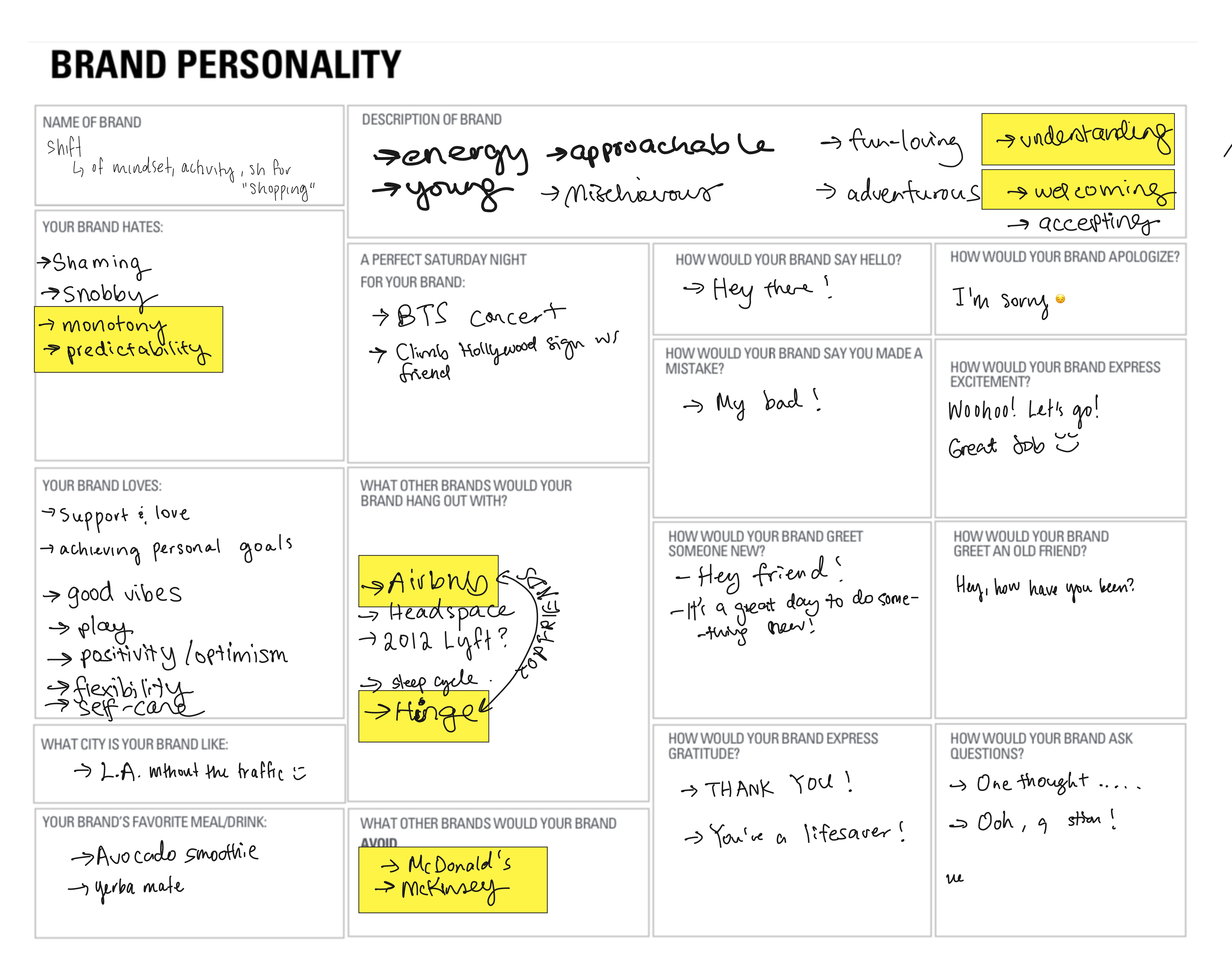
Figure 1 – Brand personality planning sheet
We strive to be a user’s closest, non-judgmental friend – who never shames your habits but encourages you soak up all the world has to offer; to create a rich tapestry of varied experiences.
Shift has an ethos of encouraging users to “be themselves”, to get to know themselves on a deeper level, to free themselves from the hamster wheel of emotional online spending, and to ultimately – similar to our brand bestie Hinge – delete us.
🖼️ Mood Board
We individually clipped photos, titles, and illustrations that captured the vibe of our solution within our imaginations.
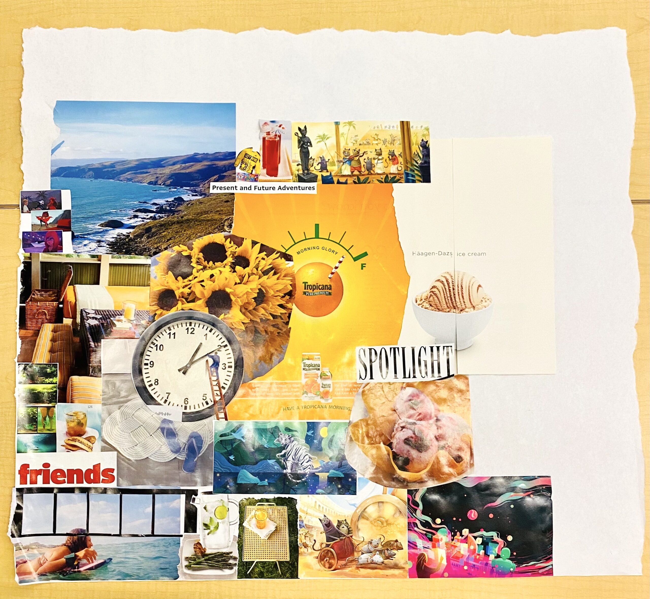
Figure 2 – Mood board
- Common across all contributions were photos that spoke to ‘getting outside,’ from mountain ranges and surfing, to picnic items and foliage
- Warmth, curiosity, and comfort are all present inviting themes that are contrasted with a few stressors like time and chaos to capture the user’s emotional experience with our product
- Motifs of mysticism and wanderlust that captured the wonders and mysteries of life and were conveyed through some of our digital art clippings
🎨 Individual Style Tiles
Nicole’s Style Tile
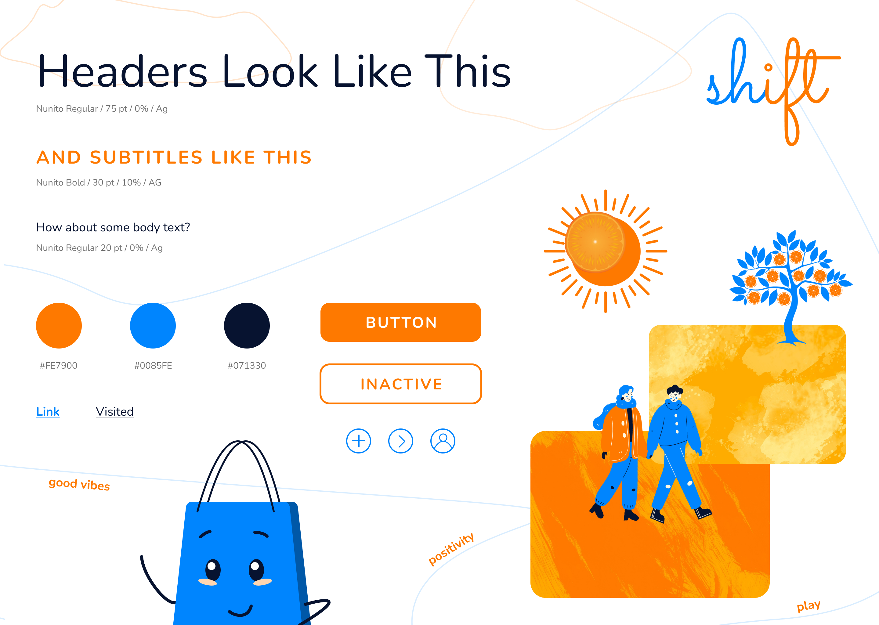
Figure 3 – Nicole’s Style Tile
- Titled ‘shift’ to call out the introspection and reframing, as well as activity and context changes that we hope to trigger with our intervention
- Utilizes zesty, heated orange as primary accent and complementary ‘primary’ blue as a secondary accent to emulate positivity and encouragement themes
- Shopping bag mascot adds emotional element and support towards achieving personal goals
- Furthermore, the shopping bag symbolizes this notion of being there when the user returns, highlighting that browsing isn’t urgent
- Selected graphics hit on mood board concepts of getting outside and spending time with people, doing activities that are fulfilling
Elsie’s Style Tile
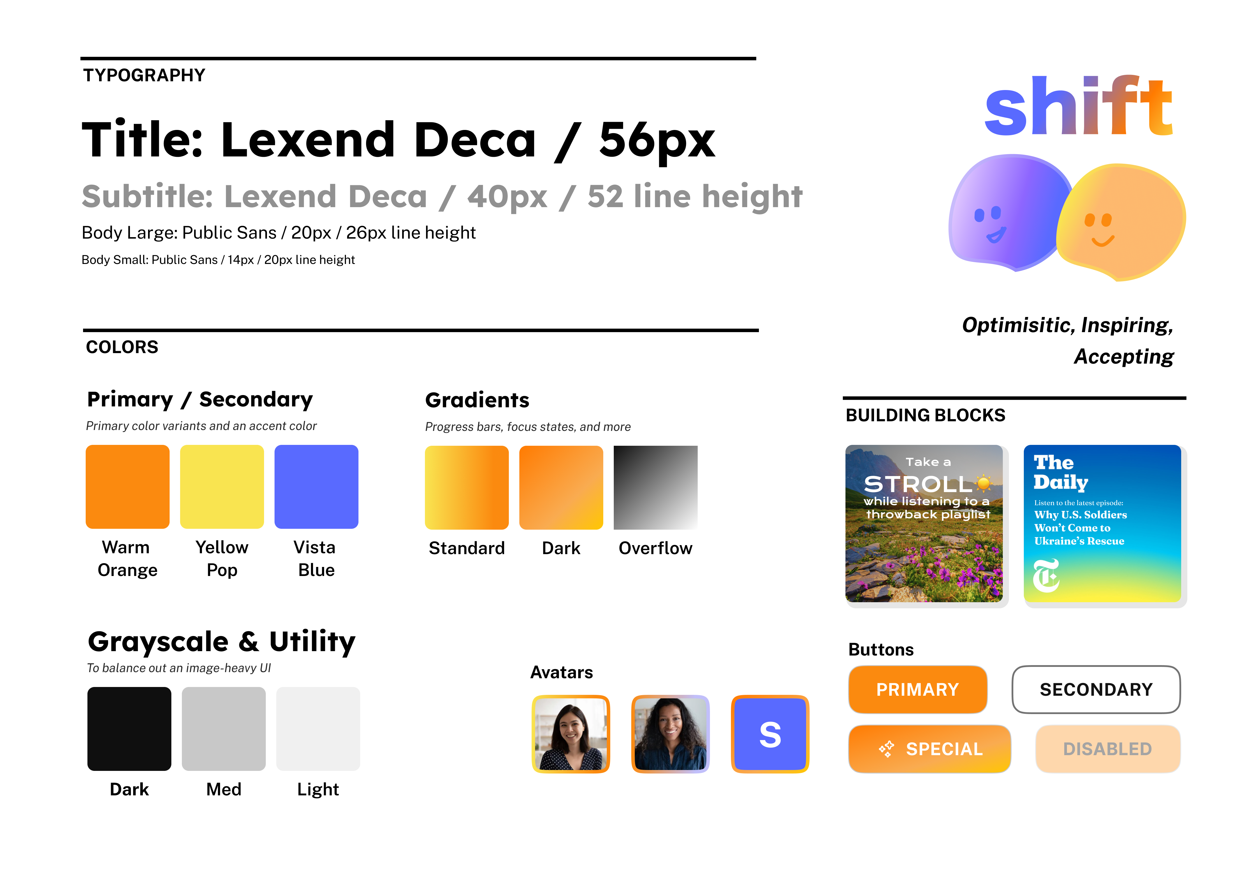
Figure 4 – Elsie’s Style Tile
- Warm Orange to create a safe and warm context for users and evoke a sense of wonder
- Vista Blue to round out palette, evoke a sense of calmness, and express trust and empathy
- Orange-to-yellow and Blue-to-purple gradients to evoke a playful and optimistic vibe (emulating sunrise, emulating starfall); represents the gradients of soaking up all the world has to offer; to create a rich tapestry of varied experiences.
- Lexend Deca for titles because they are bold, easily readable, and accessible
- Public Sans for body text because it is both easily readable in longer chunks of text, but also more playful than Inter, Helvetica, or Arial.
- Blobby avatars so our app feels approachable, playful, and lovable
- Building blocks are displayed on the style tile because our UI will be incredibly image-heavy, so it’s important to show how the colors and various elements might work together on the same UI
Sean’s Style Tile
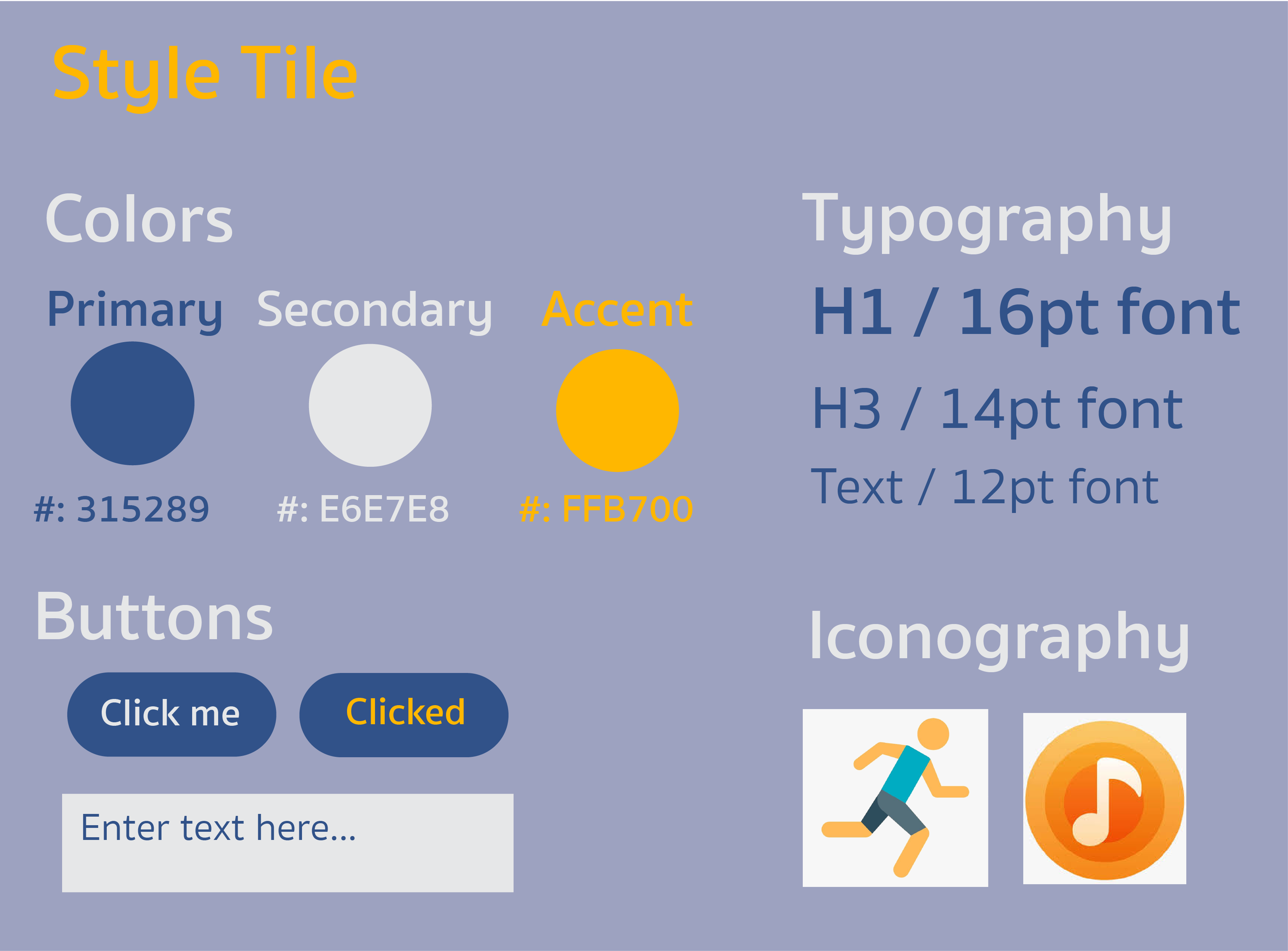
Figure 5 – Sean’s Style Tile
- Warm orange: accent color that pops from the background and captures the sense of energy and spirit of our brand
- Desaturated, blue gray background to serve as a base color and complements the orange accent
- Dark blue to serve as a non-accent plain text color. Evokes a sense of calmness and comfort and complements the energy and playfulness of our brand personality.
- Toned down white: serves as another non-accent plain text color and is easy-to-read.
- Playful, rounded icons to match the theme of our brand personality. Orange and blue to match the color themes of the app.
- Sukhumvit Set font for all headers, subheadings, and text. The rounded corners give off a feeling of casual playfulness.
Synthesized Style Tile
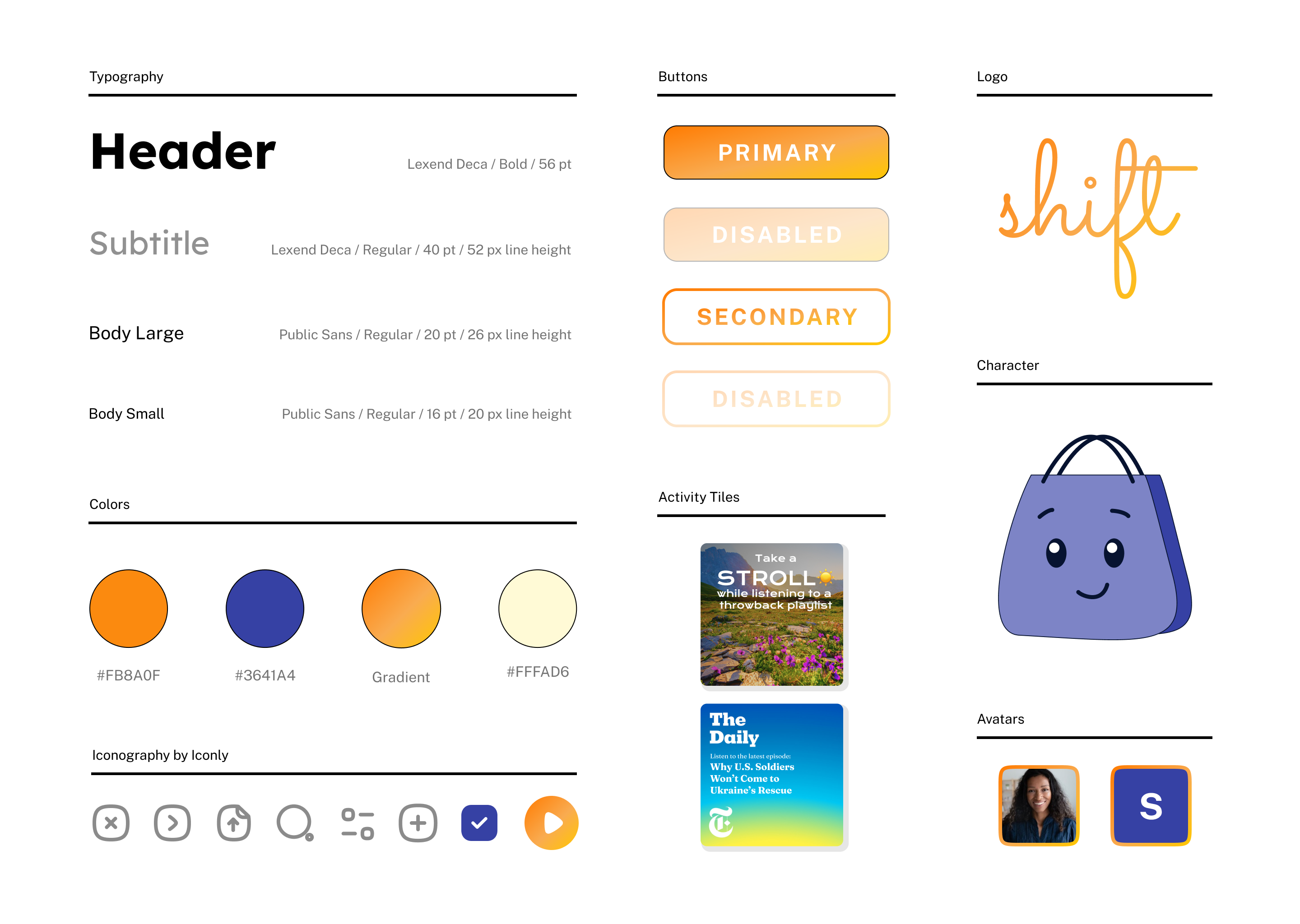
Figure 6 – Synthesized Team Style Tile
- Warm orange and muted blue colors create a contrast between vibrant energy and calming trust
- Rounded-style text to emphasize the sense of playful and holistic character of our brand personality
- Shopping bag “buddy” mascot/companion to provide emotional support along the user’s journey; so interactions between the user and the app can feel more conversational and less transactional
- Activity tiles: white, rounded text against pictures of nature or colors that capture the energetic, playful, or wanderlust feeling we want to evoke from our users
- Profile avatar design matches the color scheme of our app (blue/orange) and helps make the journey feel more personal
- Cursive, orange logo captures the sense of warm and playful vibe of our brand personality


Comments
Comments are closed.